Best Selling Products

Upgrade Duolingo Super
29 USD

Capcut Pro 1 Year
39 USD

Windows 10 & 11 Pro Key
36 USD

ChatGPT Plus Account (GPT-4)
16 USD

Adobe Photoshop Copyright - Full App
120 USD

Adobe Premiere Pro Account
99 USD

Upgrade genuine Capture One account
120 USD

Plugin Retouch4me
69 USD

Upgrade Genuine Office 365
49 USD

Freepik Premium Account
59 USD

Genuine Cheap Canva Pro
39 USD

Genuine Adobe Illustrator account
99 USD

MidJourney Account
29 USD

Copyright Adobe Lightroom Account
59 USD

Autodesk All App Account Copyright
120 USD
The Tet 2026 Packaging Battle: Pepsi – 7Up – Mirinda – Coca-Cola and a Spectacular Visual Showcase
Nội dung
Tet packaging is not only meant to be seen but also to be felt. Pepsi, 7Up, and Mirinda have transformed design into a language for conveying brand messages and springtime emotions. Every can tells a story of luck, joy, and hope for the new year.
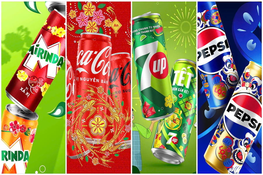
1. Pepsi: The Fusion of Tradition and the Spirit of “Golden Moments”
Pepsi continues to reinforce its leadership in creative branding with the launch of its Tet 2026 packaging collection carrying the message “Golden Moments.” This is not merely a visual concept but also a story about time, togetherness, and the emotional values the brand seeks to connect with consumers during the beginning of the year.
The iconic blue color remains the core of the brand identity but is elevated through the addition of luxurious metallic gold tones. This combination creates a feeling that is both familiar and refreshing, preserving the brand’s DNA while embracing the festive spirit. Gold symbolizes prosperity while also evoking light, hope, and memorable moments of the new year.
The standout element of the design lies in its stylized lion dance and dragon motifs interpreted through a modern visual language. Rather than relying on traditional illustrative imagery, Pepsi presents these cultural symbols through bold graphic lines and fluid movements, creating a sense of energy and vitality. The patterns wrap around the can like a continuous flow, symbolizing luck and the transition into a new year.
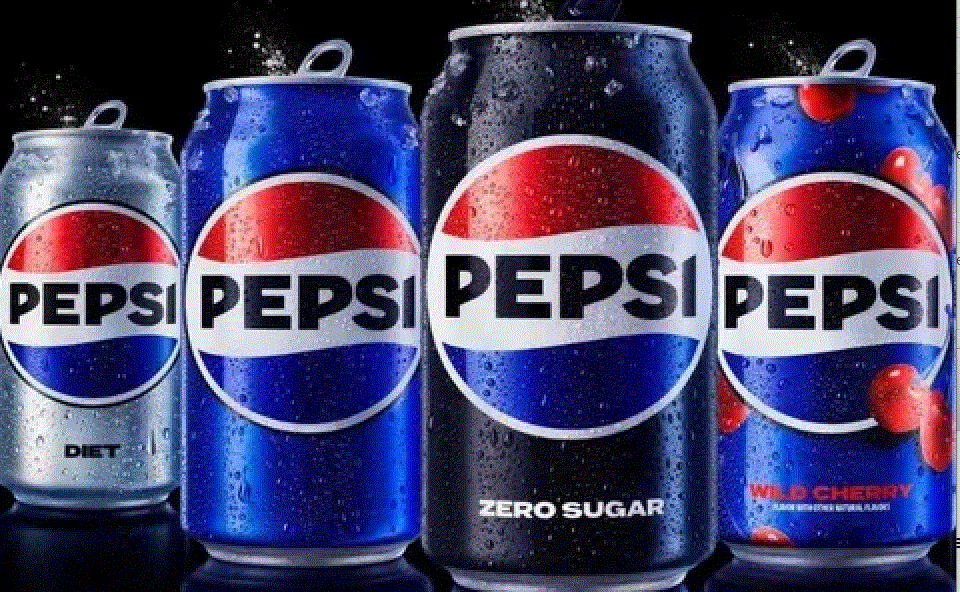
Beyond visual appeal, material selection also plays a significant role in the overall experience. The metallic gold can edition features a reflective surface treatment that helps the product stand out on display shelves while providing a premium feel when held. This is a familiar yet highly effective strategy, transforming a fast-moving consumer product into a symbolic Tet gift.
The “Golden Moments” message is consistently communicated throughout the campaign, emphasizing the value of gathering with family and friends. Rather than focusing on excitement and celebration alone, Pepsi aims for emotional depth, where every can becomes part of Tet memories. Packaging, therefore, is not just design but a storytelling medium that connects the brand to Vietnamese cultural life.
2. 7Up: “Refreshing Spring Adventures” with Vibrant Green Tones
In contrast to Pepsi’s brilliance and luxury, 7Up chooses a softer yet equally sophisticated direction. Its Tet 2026 packaging carries the message “Refreshing Spring Adventures,” focusing on freshness, freedom, and the journey of exploring the festive season.
The brand’s signature green remains the central visual element but is refreshed through brighter and clearer tones that evoke a cool, energetic feeling. Against this green backdrop, yellow apricot blossom branches are illustrated in a gentle graphic style stretching vertically across the can. Without being overly complex or overloaded with details, 7Up’s design creates visual breathing space, allowing viewers to experience a sense of lightness and purity.
One of the most creative aspects lies in the collection of travel-inspired symbols such as passport stamps, seals, and location markers. These elements are cleverly integrated into the layout, suggesting movement, exploration, and connection. This is how 7Up communicates with younger consumers who see Tet not only as a time for family reunions but also as an opportunity for experiences and adventure.
%20(1).jpg)
The minimalist design style remains far from monotonous because every detail is carefully calculated to create visual rhythm. The balance between negative space and graphic elements helps the packaging maintain a modern aesthetic aligned with contemporary design trends. At the same time, retaining the dominant green color ensures strong shelf recognition, even when placed beside other vibrant Tet-themed designs.
The message “Refreshing Spring Adventures” carries more emotional value than direct advertising, encouraging users to enjoy their own unique journeys. 7Up does not attempt to create grandeur but instead focuses on feelings of freedom, freshness, and gentle new beginnings. This consistency allows the brand to maintain a distinctive personality within the competitive Tet marketplace.
3. Mirinda: The Color Festival of “A Vibrant and Joyful Tet”
If Pepsi represents elegance and 7Up embodies freshness, Mirinda is the spark that ignites the visual celebration. The brand’s Tet 2026 packaging bursts with the concept “A Vibrant and Joyful Tet,” where colors, energy, and emotions blend together to create a true festive atmosphere.
Mirinda utilizes three color palettes representing its signature flavors, with each version expressing a different mood while remaining part of a cohesive overall identity. Warm colors such as red, orange, and yellow are used extensively, generating a lively and energetic impression. Beyond background colors, the entire can surface becomes a canvas filled with festive motifs such as apricot blossoms, peach blossoms, fireworks, and pop-art-inspired graphics.
%20(1).jpg)
The pop-art style gives the design a youthful, modern, and highly dynamic appearance. Elements are layered to create depth and a sense of visual explosion. This strategy is particularly suitable for younger consumers who appreciate fun, energy, and strong visual experiences.
Notably, Mirinda does not strive to make everything look perfect or luxurious. Instead, it focuses on delivering joyful emotions. The packaging feels like an invitation to join a festival filled with laughter, colors, and energy. This spirit helps Mirinda maintain its brand image associated with fun and youthful enthusiasm.
The message “A Vibrant and Joyful Tet” extends beyond color and speaks to a state of mind. Every can becomes a symbol of an exciting new beginning, encouraging consumers to enter the new year with positive energy. This is how Mirinda transforms packaging into an emotional experience rather than merely a design exercise.
4. Coca-Cola
As a brand long associated with Tet celebrations, Coca-Cola continues to maintain its storytelling approach rooted in traditional values and family emotions. The Tet 2026 packaging does not chase novelty for its own sake but instead focuses on deepening familiar cultural symbols.
The signature red remains the central visual element, representing luck and happiness. However, this year’s red is enhanced with subtle gradient effects and complemented by gentle gold accents, creating a warm and elegant atmosphere. Imagery of family reunions, calligraphy couplets, apricot blossoms, and swallows is illustrated in a soft storytelling style that strongly emphasizes narrative.
Coca-Cola has always excelled at building emotional connections, and this year’s packaging follows the same path. Rather than relying on dramatic visual effects, the design focuses on familiarity and memory. When consumers hold the can, they see more than just a beverage—they experience the atmosphere of Tet, family meals, and moments of reunion.
%20(1).png)
A noteworthy aspect is Coca-Cola’s skillful balance between global identity and local culture. Although the design is deeply rooted in Vietnamese traditions, it retains the simplicity, clarity, and recognizability of an international brand. This is a challenging balance to achieve, yet it effectively helps Coca-Cola maintain its iconic status during every Tet season.
Coca-Cola’s Tet 2026 packaging does not need excessive visual spectacle because its strength lies in emotion. The brand is not merely selling products but experiences, memories, and family values. This consistency over many years has made Coca-Cola a familiar part of spring celebrations.
As consumers increasingly value experiences, packaging design is no longer simply a protective layer but a story, an emotion, and a memory. Every Tet season, this creative race continues, transforming familiar beverage cans into symbols of spring, family reunion, and hope for a fulfilling new year.


VIP Products


Best Selling Products
Upgrade Duolingo Super
29 USD
Capcut Pro 1 Year
39 USD
Windows 10 & 11 Pro Key
36 USD
ChatGPT Plus Account (GPT-4)
16 USD
Adobe Photoshop Copyright - Full App
120 USD
Adobe Premiere Pro Account
99 USD
Upgrade genuine Capture One account
120 USD
Plugin Retouch4me
69 USD
Upgrade Genuine Office 365
49 USD
Freepik Premium Account
59 USD
Genuine Cheap Canva Pro
39 USD
Genuine Adobe Illustrator account
99 USD
MidJourney Account
29 USD
Copyright Adobe Lightroom Account
59 USD
Autodesk All App Account Copyright
120 USD