Best Selling Products
Things to Know When Designing a Professional and Attractive Magazine
Nội dung
- 1. Determine the Purpose of the Magazine
- 1.1. Identify Your Audience
- 1.2. Deliver a Clear Message
- 2. Magazine Layout Must Be Harmonious
- 2.1. Choose the Right Magazine Size
- 2.2. Divide Items Into Clear Arrays
- 3. Choose the Right Color
- 3.1. Colors That Match Your Brand
- 3.2. Background Color and Text Color
- 4. Use Images Correctly
- 4.1. Choose High Quality Images
- 4.2. Images Must Be Compatible With Layout
- 5. Choose the Right Font
- 5.1. Primary and Secondary Fonts
- 5.2. Font Size
- 6. Ensure Aesthetics and Professionalism
- 6.1. Use of White Spaces
- 6.2. Check for Printing Errors Before Printing
- 7. Conclusion
Magazine design is more than just a combination of images and text. This article will share important tips to help you create an impressive and professional magazine product.
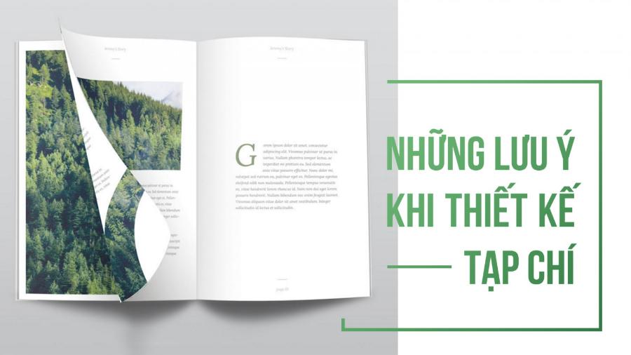
Magazine design is a job that requires creativity, meticulousness and a deep understanding of visual trends. It is not simply a matter of arranging content in a reasonable way, but also how to make every small detail from images, colors to fonts match the message you want to convey. In this article, Sadesign will provide important notes to help you create a magazine publication that is both aesthetically pleasing and easy to reach readers.
1. Determine the Purpose of the Magazine
Before you start designing, you need to understand the purpose of your magazine. Different types of magazines have different audiences and purposes. Having a clear goal will help you choose the design style, colors, fonts, and layout.
1.1. Identify Your Audience
Defining the magazine’s objectives plays an important role in content development strategy and communication orientation. Defining the audience is a key step in ensuring that the content is built in accordance with the needs, interests and expectations of the target audience. This not only helps to increase the appeal and value of the magazine but also contributes to improving the effectiveness of access, thereby creating a solid foundation for sustainable development in an increasingly competitive environment.
.jpg)
One of the most important factors in determining the success of a magazine is understanding the audience you are targeting. For example, if your magazine is aimed at teenagers, a dynamic design with bright colors would be ideal. On the other hand, if your audience is business people, you should prioritize an elegant, professional design style.
1.2. Deliver a Clear Message
Defining the purpose of the magazine is an important step in ensuring that the content and message are communicated clearly, consistently and appropriately to the audience. An effective magazine must not only attract attention but also convey core values, meet information needs and build trust with readers. Therefore, shaping the message specifically, while maintaining professionalism in each article, will contribute to enhancing the reputation and position of the magazine in the media market.
Your magazine should convey a clear and easy-to-understand message. Each article and image in your magazine should highlight the overall theme you want to convey. Always make sure that the content of your magazine is well-connected from section to section.
2. Magazine Layout Must Be Harmonious
One of the important elements in magazine design is layout. Layout not only helps organize content scientifically, but also affects the first impression of the reader when holding the magazine in hand. The layout needs to create a balance between text and images, making it easy for readers to follow and search for information.
2.1. Choose the Right Magazine Size
When designing a magazine, choosing the right size plays an important role in creating harmony and professionalism for the layout. Size not only affects the presentation of content but also determines the reader's experience. A reasonable size will ensure that elements such as images, text and white space are arranged in balance, making the magazine easier to see and more attractive. At the same time, choosing the size also needs to consider the purpose of use, target readers and printing budget to achieve optimal efficiency. Therefore, designers need to research carefully and make appropriate decisions to create a professional and impressive magazine product.
.jpg)
Magazine sizes can vary depending on the intended use and design style. Some popular magazines today use sizes such as A4, A5 or even compact. Larger sizes often provide ample space to display beautiful images, but can increase printing costs. On the contrary, smaller sizes are easier to move and store.
2.2. Divide Items Into Clear Arrays
The layout of a magazine needs to be designed in a harmonious and scientific way, to ensure aesthetics and create convenience for readers. Dividing sections into clear blocks not only makes the content more accessible but also creates professionalism in the presentation. Headings, illustrations and content need to be arranged reasonably, avoiding clutter or information overload, while maintaining a balance between white space and graphic elements. A good layout not only attracts attention but also enhances the reading experience, contributing to highlighting the value of the magazine.
A good magazine is one where the content is divided into clear sections. You can divide the magazine into sections like “News,” “Interviews,” “Guides,” “Trends,” etc. This makes it easier for readers to find the topics they are interested in and at the same time makes the magazine look more professional.
3. Choose the Right Color
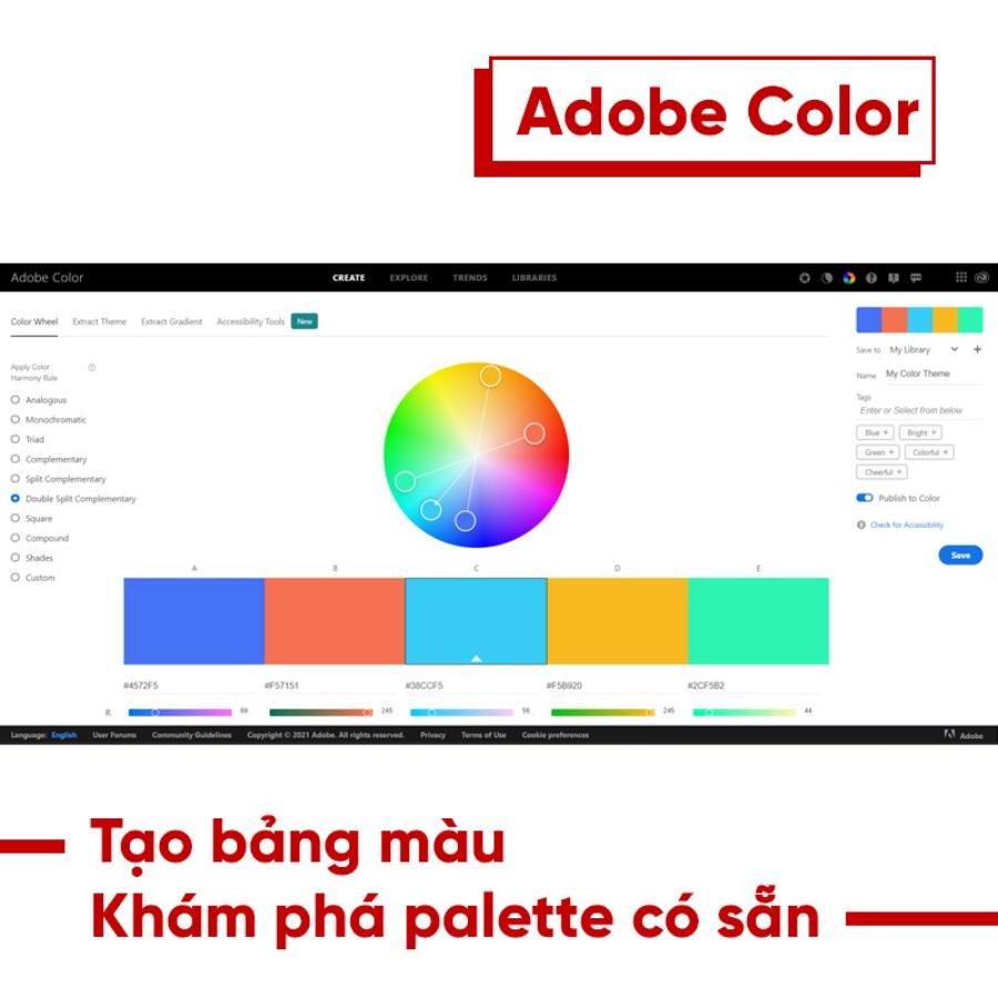
Magazine layout plays an important role in conveying content and attracting readers' attention, so choosing the right color is an indispensable factor. Color not only helps create highlights but also contributes to building the overall mood and style of the magazine. To achieve harmony, it is necessary to carefully consider factors such as readership, main content, and modern design trends. Subtle color coordination, avoiding overuse of too bright or inconsistent colors, will help the magazine become more professional and attractive in the eyes of readers.
3.1. Colors That Match Your Brand
If your magazine represents a specific brand, the colors of the magazine should be consistent with that brand identity. For example, high-end fashion brands often use elegant colors, such as black, white, gold, while young, dynamic brands prefer bright, bold colors.
3.2. Background Color and Text Color
The background color of the magazine and the text color should have a reasonable contrast to help readers easily access the content. A bright background color will highlight decorative elements, but at the same time, avoid using colors that are too bright, as they can make readers feel uncomfortable. Similarly, the text color should be easy to read and not too flashy.
4. Use Images Correctly
Images play an important role in attracting readers and highlighting articles. A magazine design would be bland without impressive, high-quality photos. However, the use of images also needs to be carefully considered.
.jpg)
4.1. Choose High Quality Images
Blurry, low-pixel images will reduce the quality of your magazine and leave a bad impression on readers. Therefore, make sure that all images used are high resolution and clear. These images need to be directly related to the content and highlight the message you want to convey.
4.2. Images Must Be Compatible With Layout
Images should be placed properly in the layout to highlight important content. Images should not distract the reader but should create harmony with the remaining elements such as text, headlines and icons.
5. Choose the Right Font
Fonts are a big factor in the reader's experience when accessing a magazine. A beautiful and easy-to-read font will help readers not feel tired when following the article.
.jpg)
5.1. Primary and Secondary Fonts
Choose a primary font to use for the main body of your magazine and a secondary font for headings, short paragraphs, or tables of contents. The primary font should be easy to read, while the secondary font can be used for emphasis, but should not be too complicated.
5.2. Font Size
Font size is also a factor to consider. The font size in the main content should be large enough for readers to easily follow, while the font size for headings should be larger to attract readers' attention.
6. Ensure Aesthetics and Professionalism
Magazine design is not just about creating an eye-catching product, but also about ensuring professionalism and balance between design elements. This helps the magazine not only attract readers but also build a brand and credibility in the hearts of readers.
6.1. Use of White Spaces
White space plays a very important role in magazine design. Leaving empty space helps other elements such as images and text stand out more and does not cause confusion for readers. Leave reasonable white space between paragraphs, images and text to increase the aesthetics of the magazine.
6.2. Check for Printing Errors Before Printing
Before printing your magazine, check carefully for elements such as color, image resolution, and spelling errors in the article to ensure product quality. A thorough check will help you avoid unnecessary errors and create a complete, professional magazine.
7. Conclusion
Magazine design is not an easy task, but if you keep the above factors in mind, you will create a publication that is both beautiful and accessible to readers. Every detail from layout, color, font to images needs to be carefully considered to bring the best experience to readers. Remember, a successful magazine is one that can tell its story through each page, build a connection and leave a deep impression on readers.
