Best Selling Products

Upgrade genuine Capture One account
120 USD

ChatGPT Plus Account (GPT-4)
16 USD

Copyright Adobe Lightroom Account
59 USD

Genuine Adobe Illustrator account
99 USD

Genuine Cheap Canva Pro
39 USD

Upgrade Duolingo Super
29 USD

Freepik Premium Account
59 USD

Upgrade Genuine Office 365
49 USD

MidJourney Account
29 USD

Adobe Photoshop Copyright - Full App
120 USD

Windows 10 & 11 Pro Key
36 USD

Adobe Premiere Pro Account
99 USD

Plugin Retouch4me
69 USD

Capcut Pro 1 Year
39 USD

Autodesk All App Account Copyright
120 USD
Tips for Choosing the Right Colors on Canva for Perfect Design
Nội dung
- I. The Importance of Color in Design: More Than Aesthetics
- 1.1. Color – The Language of Emotions and Messages
- 1.2. Color and Brand Identity
- 1.3. The Role of Color in Visual Guidance
- II. Explore Basic Color Palettes on Canva
- 2.1. Color Options In Canva
- 2.2. Using the Photo Colors Tool
- 2.3. Explore Canva's Preset Color Palettes
- III. Basic Principles of Color Theory Applied on Canva
- 3.1. Color Wheel and Color Classification
- 3.2. Popular Color Schemes and How to Apply Them on Canva
- 3.3. The Importance of Neutral and Background Colors
- 4.1. Start With One Main Color
- 4.2. Using the 60-30-10 Rule
- VII. Conclusion
Explore Canva's basic color palette and expert color tips. From color theory to smart color matching tools, this article will help you create harmonious, impressive, and eye-catching designs.
In the world of graphic design, color plays an important role in conveying messages, creating emotions and attracting attention. Canva, with its user-friendly interface and huge resource library, has become a powerful tool for millions of people. However, to truly master this tool and create professional designs, it is essential to understand and effectively apply the basic color palette on Canva. In this article, sadesign will delve into how to choose the right color, making your design not only beautiful but also effective in communication.
I. The Importance of Color in Design: More Than Aesthetics
Colors are more than just decorative elements; they are a powerful language, capable of evoking emotions, conveying meaning, and shaping perceptions. In graphic design in general and on Canva in particular, choosing the right colors is the first step to creating a successful piece of work.
.jpg)
1.1. Color – The Language of Emotions and Messages
Each color carries a distinct psychological meaning and can strongly influence how viewers perceive your design.
Red: Often associated with energy, passion, urgency, or danger. Red is a powerful attention-grabber and is often used for calls to action.
Blue: Represents trust, stability, peace, and professionalism. Blue is popular in designs related to technology, finance, or healthcare.
Yellow: Represents optimism, joy, creativity and energy. Yellow is often used to create accents or evoke feelings of warmth.
Green: Represents nature, growth, harmony and health. Green is popular in the environmental, organic food or financial sectors.
Purple: Evokes luxury, mystery, creativity, and royalty. Purple is often used in high-end designs, beauty products, or spiritual realms.
Orange: A combination of the energy of red and the joy of yellow, it represents enthusiasm, friendliness and adventure. Orange is often used to create a youthful, dynamic feeling.
Black: Represents formality, power, mystery and sophistication. Black is a popular choice for high-end, modern brands.
White: Represents purity, cleanliness, simplicity and freedom. White plays an important role in creating breathing space in the design.
Understanding the psychological meaning of each color will help you make intentional choices, ensuring your designs convey the right message and emotion.
1.2. Color and Brand Identity
Color is one of the most important elements in building and strengthening brand identity. A consistent color palette makes a brand easily recognizable and leaves a lasting impression in the minds of customers. Think of Coca-Cola red, Facebook blue or McDonald's yellow – they become an integral part of the brand.
When designing in Canva for branding purposes, using a brand color palette (Brand Kit) is essential. Canva allows you to store your brand's color codes, fonts, and logos so you can easily apply them to any design, ensuring consistency and professionalism.
1.3. The Role of Color in Visual Guidance
Color also plays an important role in guiding the viewer's eye, creating emphasis and hierarchy of information.
Create emphasis: Use contrasting colors to highlight important elements like headlines, call-to-action buttons, or main images.
Information hierarchy: Different shades of color can help distinguish levels of information, for example, darker colors for main headings, lighter colors for sub-content.
Create harmony and balance: Subtle color coordination helps your design look professional, pleasing, and uncluttered.
Understanding the power of color is the first step to turning simple designs in Canva into more professional and effective ones.
II. Explore Basic Color Palettes on Canva
Canva offers a wide and flexible color system, from preset palettes to deep customization. Mastering these options will help you maximize your creativity.
2.1. Color Options In Canva
Canva is designed to make color easy to access and use. When you select an object (text, shape, icon, photo, etc.), a color palette appears.
Default Colors: Canva provides some basic colors right out of the box for you to choose from quickly.
Document Colors: These are the colors that have been used in your current design. This feature is extremely useful for ensuring color consistency throughout a project.
Brand Colors (Brand Kit): If you have a Canva Pro account, you can set up a Brand Kit with your own brand color codes. This helps you quickly access the right colors and stay consistent.
Suggested color palettes: Canva often suggests color palettes based on elements in your design (for example, from a photo you upload). This is a great starting point if you're unsure about color schemes.
Gradient Colors: Canva also supports gradients, allowing you to create smooth transitions between two or more colors, giving your designs depth and modernity.
Advanced color options: You can enter HEX, RGB, HSL codes or use the color slider to select the exact color you want. This is especially useful when you need to work with specific color codes.
2.2. Using the Photo Colors Tool
One of Canva's standout and incredibly useful features is its ability to automatically extract color palettes from images you upload or use from Canva's library.
How to use: When you add an image to your design, click on it, then select a color option. Canva will automatically display a "Photo Colors" section with the dominant colors taken from the photo.
Benefits: This feature makes it easy to create a harmonious color palette that matches the central image of your design. It's especially useful when you want to create unity between text, shapes, and images, making your design look more cohesive and professional without needing to have in-depth knowledge of color theory.
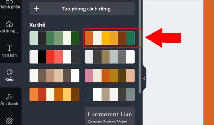
2.3. Explore Canva's Preset Color Palettes
Canva offers more than just color picker tools, it also offers a treasure trove of pre-designed color palettes that suit a variety of styles and purposes.
.jpg)
"Styles" section: In the left toolbar, the "Styles" section allows you to quickly apply preset font sets and color palettes to your entire design. This is a great way to experiment with different styles without spending a lot of time.
Canva Color Palettes: Canva has a dedicated color palettes website where you can explore thousands of pre-combined color palettes based on different themes, emotions, or industries. This is an endless source of inspiration and a quick solution for anyone looking for a harmonious color combination.
Making the most of Canva's color tools and resources will save you time, boost your creativity, and ensure every design looks professional.
III. Basic Principles of Color Theory Applied on Canva
To use Canva color palettes effectively, it's essential to understand the fundamentals of color theory. These principles will help you create color schemes that are harmonious, have depth, and convey the right message.
3.1. Color Wheel and Color Classification
The color wheel is a fundamental tool in color theory, helping to visualize the relationships between colors.
Primary Colors: Red, yellow, blue. These are the three basic colors that cannot be mixed from other colors.
Secondary Colors: Green, orange, purple. These colors are created by mixing two primary colors.
Tertiary Colors: Created by mixing a primary color and a secondary color (e.g. red-orange, green-yellow).
Understanding the colors on the wheel makes it easier to apply color matching principles.
3.2. Popular Color Schemes and How to Apply Them on Canva
There are some basic color scheme principles that you can easily apply when designing in Canva.
3.2.1. Analogous Colors
Definition: A combination of three colors that lie next to each other on the color wheel (for example, blue, emerald, green).
Characteristics: Creates a sense of harmony, comfort and relaxation. This color scheme usually has a main color, a supporting color and an accent color.
Apply in Canva: Use the "Photo Colors" feature or search for similar color palettes on Canva Color Palettes. This color scheme is suitable for designs that want to convey nature, peace, or soft professionalism.
3.2.2. Complementary Colors
.jpg)
Definition: A combination of two colors that are opposite each other on the color wheel (for example, red and green, yellow and purple, blue and orange).
Features: Creates a strong, striking contrast that attracts attention. However, if not used skillfully, it can cause glare.
Apply in Canva: Use one dominant color and a complementary color for accents or important elements like call-to-action buttons. You can use Canva's "Color Wheel" tool to find complementary color pairs.
3.2.3. Triadic Colors
Definition: A combination of three colors that are evenly spaced on the color wheel (for example, red, yellow, blue).
Characteristics: Creates balance, vibrancy and dynamism. This color scheme brings richness while maintaining harmony.
Apply on Canva: Great for designs that want to express playfulness, creativity, or variety. Choose one color as the main color, with the other two as accent or secondary colors.
3.2.4. Tetradic Colors
Definition: A combination of four colors that form a rectangle or square on the color wheel.
Characteristics: Extremely varied and complex, providing richness but also the most difficult to control. Requires a clear dominant color to avoid clutter.
Use in Canva: Great for large, complex projects or when you want to show multiple aspects. Use with caution to avoid overloading the design.
3.2.5. Monochromatic Colors
Definition: Using different tints, tones, and shades of the same base color (e.g. different shades of blue).
Features: Creates sophistication, elegance and professionalism. Ensures absolute harmony and often brings a gentle, pleasant feeling.
Apply in Canva: Easily do this by selecting a color and adjusting brightness and saturation in Canva's advanced color picker. Great for minimalist, modern designs or when you want to create depth without too much color.
3.3. The Importance of Neutral and Background Colors
Besides primary and secondary colors, neutral colors (white, black, gray, beige) play an extremely important role in every design.
Create breathing space: Neutral colors give bold colors room to shine, avoiding design overload.
Balance: They help balance out vibrant colors, creating overall harmony.
Versatility: Neutral colors are the perfect backdrop for any design style, from minimalist to sophisticated.
Canva and neutral colors: Always prioritize using neutral colors as backgrounds, for secondary elements, or for white space to create clarity and readability for your design.
Flexibly combining color matching principles and using neutral colors intelligently will help you create designs that are not only beautiful but also effective in terms of communication.
IV. Practical Tips for Choosing Colors Effectively on Canva
Putting theory into practice can be difficult at first, but with these tips, you'll quickly become a master at choosing colors on Canva.
.jpg)
4.1. Start With One Main Color
The best way to start a color palette is to choose a dominant color. This is usually the color that represents your brand, the theme of your design, or the color you want to highlight the most.
Determine the purpose: The main color can be the logo color, the color of the product you are advertising, or the color that represents the main emotion of the design.
Create an anchor point: The main color will be the anchor point from which you will develop your secondary and accent colors.
Canva suggests: Use the "Photo Colors" feature if your design has a central image, or take advantage of the Brand Kit to choose a pre-determined main color.
4.2. Using the 60-30-10 Rule
This is a common rule in interior design and also works well in graphic design. It helps you balance the color ratio.
60% - Main color: Occupies most of the design area, is the background or overall main color.
30% - Secondary Color: This color supports the main color and adds variety.
10% - Accent Color: A prominent color, usually a complementary or strongly contrasting color, used to draw attention to important elements such as headlines, call-to-action buttons, or icons.
Applying this rule will make your design look organized, professional, and easier on the eyes. Experiment with different shades of dominant and secondary colors to create depth.
Cheap Canva Pro Upgrade
VII. Conclusion
Color is the soul of design, and mastering the basic color palette in Canva is the key to creating work that is not only beautiful but also effective. From understanding the psychology of each color, to applying professional color matching principles, and making the most of Canva's smart tools, every step contributes to shaping a successful design.


VIP Products


Best Selling Products
Upgrade genuine Capture One account
120 USD
ChatGPT Plus Account (GPT-4)
16 USD
Copyright Adobe Lightroom Account
59 USD
Genuine Adobe Illustrator account
99 USD
Genuine Cheap Canva Pro
39 USD
Upgrade Duolingo Super
29 USD
Freepik Premium Account
59 USD
Upgrade Genuine Office 365
49 USD
MidJourney Account
29 USD
Adobe Photoshop Copyright - Full App
120 USD
Windows 10 & 11 Pro Key
36 USD
Adobe Premiere Pro Account
99 USD
Plugin Retouch4me
69 USD
Capcut Pro 1 Year
39 USD
Autodesk All App Account Copyright
120 USD