Best Selling Products

Copyright Adobe Lightroom Account
59 USD

Genuine Cheap Canva Pro
39 USD

ChatGPT Plus Account (GPT-4)
16 USD

Capcut Pro 1 Year
39 USD

Genuine Adobe Illustrator account
99 USD

MidJourney Account
29 USD

Freepik Premium Account
59 USD

Plugin Retouch4me
69 USD

Windows 10 & 11 Pro Key
36 USD

Upgrade Genuine Office 365
49 USD

Adobe Photoshop Copyright - Full App
120 USD

Upgrade genuine Capture One account
120 USD

Upgrade Duolingo Super
29 USD

Autodesk All App Account Copyright
120 USD

Adobe Premiere Pro Account
99 USD
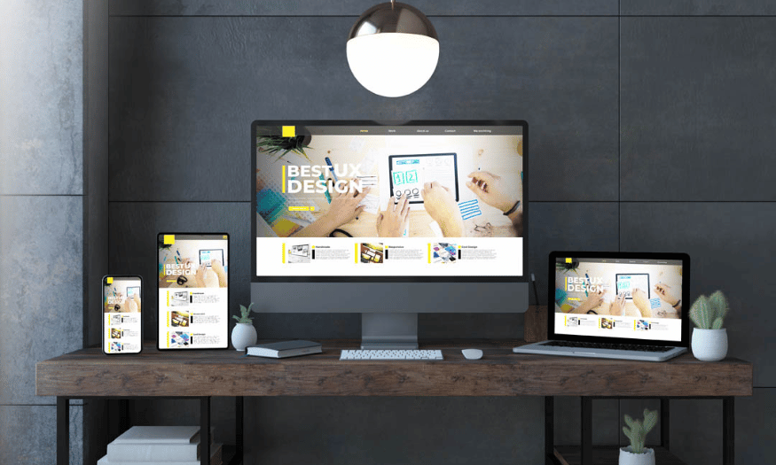
Tips for Designing Standard UI/UX Website Interface
Nội dung
- 1. Clean up the clutter on your website interface
- 2. Leave plenty of room for design
- 3. Direct user attention through visual layout
- 4. Choose colors for the interface according to a correct strategy
- 5. Don't underestimate the wallpaper
- 6. Pay attention to typography to enhance your brand
- 7. Standard UI/UX design software
- 7. Conclusion
In today's digital age, having a friendly and attractive website interface is not only a competitive advantage but also a decisive factor for the success of a business. User interface (UI) and user experience (UX) design is not just about aesthetics, but also about how users interact with the product. A well-designed interface will help users easily find information, reduce bounce rates and increase conversions. In this article, Sadesign will explore with you tips for designing a standard UI/UX website interface, from understanding user psychology to optimizing website performance, helping you create a great experience for users.
In today's digital age, having a friendly and attractive website interface is not only a competitive advantage but also a decisive factor for the success of a business. User interface (UI) and user experience (UX) design is not just about aesthetics, but also about how users interact with the product. A well-designed interface will help users easily find information, reduce bounce rates and increase conversions. In this article, Sadesign will explore with you tips for designing a standard UI/UX website interface, from understanding user psychology to optimizing website performance, helping you create a great experience for users.
1. Clean up the clutter on your website interface
One of the most common mistakes that any designer can make is clutter in their interface design. When starting to create a website, many designers often make a list of elements that they think are necessary. However, putting too much information on the homepage is not always a wise decision. Each element you add can reduce the user’s attention to the remaining elements. As a result, if the interface is overloaded with unnecessary details, users will have a hard time finding the information they really need, thereby reducing their browsing experience.
On the contrary, a well-designed interface, with necessary elements arranged scientifically, will create mutual support and enhance the user experience. This not only helps to prolong the access time but also reduces the bounce rate, increasing the conversion rate for your website.
For a web design to be effective, you need to guide users through a specific and clear sequence. There are many ways to guide users along the "path" you have outlined. However, the top priority is still to highlight the most important elements and eliminate unnecessary elements.
Should:
Eliminate Unimportant Elements : Immediately remove elements that do not contribute to the user experience. If necessary, move them to other pages, but never let them clutter up the home page.
Limit pull-out menus : While hover menus can help reduce clutter, they can also be distracting if used too often. It's best to keep your menu to 5 to 7 items.
Don't:
Use sidebars : New visitors often don’t click on sidebars. If they don’t fit on the screen, you’ll have to remove some of the navigation options, which is not good.
Use slides : Using slides that transition between images can be distracting. It is better to use static images so that users can focus on the main content without being distracted.
.png)
2. Leave plenty of room for design
Have you ever wondered if it is necessary to fill every empty space on your website with unnecessary information? Leaving some white space in your design not only makes your website look more spacious but also makes it more user-friendly.
White space (or “negative space”) is more than just empty areas of information. It draws attention to important elements, improves the reading experience, and helps images appear lighter. When used intentionally, white space can create balance and make information easier to digest.
"My motto when designing is: Simple is best. It directs the reader's attention right to what is most important." – Hitron
Consider this example from Streamflow, where the tagline and CTA button are placed centrally. Not because they are flashy or fancy, but because of the white space around them, they stand out. The details are pushed down, giving customers a general overview of the business without being too cluttered.
Should:
Surround important elements with white space : This helps focus user attention on the most essential elements.
Avoid using unnecessary graphics : Unnecessary patterns or fonts will only distract and detract from the viewer's experience.
Don't:
Emphasizing the wrong elements : Use white space to emphasize the right elements. If your goal is to direct users to your purchase page, don’t let white space focus on logos or unimportant information.
Overdoing the background : White space should really just be white space. If your background is too busy, it will take the viewer’s attention away from the most important elements.
.png)
3. Direct user attention through visual layout
When designing a website, it is extremely important to direct the user's attention. "Visual hierarchy" is a concept that helps you organize information from top to bottom in order of importance. The most important information, such as the headline and call-to-action (CTA) button, should be enlarged, bolded, and placed in a prominent position, while secondary information, such as the business address, can be minimized and placed below. This arrangement not only makes information easier for users to access, but also creates a smoother and more efficient experience.
However, interface design is more than just adding elements to a web page; it’s how you add them that matters. For example, adding a CTA button is an important step, but getting users to notice and click on it is more than that. The size, color, placement, and surrounding white space can all impact how long users spend on your page.
A great example is Shearline's website, where the three main elements—headline, product image, and CTA button—are given priority. Other elements like navigation and logo are placed in the background, creating a clear and easy-to-understand layout. This is the principle of "Visual Hierarchy" that every designer should follow to guide the user's attention to the most important elements.
Should:
Design to highlight important details : Most users don’t have time to read everything on a website. Therefore, you need to prioritize the most important elements and design them to attract the most attention.
Implement multiple alternatives : Visual Hierarchy systems can be complex, so experiment with different layouts. Use A/B testing or create different versions to find the one that works best.
Don't:
Arrange elements horizontally : The system needs to be laid out in a clear order. If you arrange elements horizontally without hierarchy, it will be difficult for users to pay attention to the most important elements.
Go beyond the norm : Avoid designs that are too large or have too many contrasting colors. Use attention-grabbing elements sparingly and within limits.
4. Choose colors for the interface according to a correct strategy
Once you’ve established the layout of your interface, the next step is choosing colors—a powerful tool in the hands of every designer. Each color conveys a different feeling to your audience. If you want to convey the energy and passion of your brand, red might be the ideal choice, while blue can convey calmness and trust. It’s not just the choice of colors that matters, but how they blend and work together to highlight key elements of your overall design.
“To use colors effectively in web design, you need to understand the anatomy of a color, and how they combine and work together. Harmony and balance are the keys to success.” – Desinly
Check out how Desinly uses orange in their design. Not only does the orange match the industrial equipment that Oil Sands Masterclass offers, it also stands out when paired with the black background. The consistency in the use of color for keywords and buttons also helps create a cohesive and appealing overall look.
Should:
Establish priority between colors : Each color should be chosen for primary, secondary, and background elements, in a clear order of priority.
Color Consistency : Once you have chosen the right color palette, use it consistently throughout your design, from the most important elements to the background.
Don't:
Choosing colors based on personal preference : Colors play an important role in marketing strategy. Choose colors to convey your brand message, not just based on personal feelings.
Choosing incompatible colors : Choosing colors alone is not enough; you need to consider how they work together. Colors that work well in one context may not look appealing when combined together.
.png)
5. Don't underestimate the wallpaper
When designing a website, the background image is not just an accessory but also an important element that can have a strong impact on the user experience. A beautiful and meaningful photo can effectively convey the message and values of the business. On the contrary, a poor quality photo can make your brand lose points in the eyes of customers.
Using backgrounds in web design requires you to follow some basic photography rules. A good photo can be impressive, but the subject matter and style of the photo should match the message you want to convey. For example, a photo of blueberries on a food service website should not only be beautiful, but also relevant to the product.
Should:
Use real photos : Instead of using actors or models, choose photos of your employees or customers. This creates a more genuine connection with the viewer.
Choose photos that match your message : If you want to convey a happy atmosphere, choose photos that show people smiling. This will help customers feel comfortable and closer to the brand.
Don't:
Using “fake” photos : It may be easy to randomly pick a photo from Google, but if customers find out that the photo isn’t yours, the connection to your brand will be lost.
Use low-resolution images : In the digital age, poor quality images will leave a bad impression on customers about your brand. Use modern image compression tools to ensure sharp images without slowing down your page load speed.
.png)
6. Pay attention to typography to enhance your brand
In addition to conveying messages through content, typography also plays an important role in creating an impression for a brand. If the content of a website is the beauty of the soul, then typography is the charm of the appearance. Typography is not simply the choice of fonts; it also includes the size, color, slant, boldness, and spacing between characters. All of these factors affect the customer experience.
“Typography is all about looks. But like a beautiful person, if you use fonts that are too busy, they can distract the reader from the message you want to convey. Combining the beauty of typography with minimalism is the key to success.” – Studio Ubique.
Like colors and images, typography comes in many different styles. Choose the style that best fits your brand. A great example is the design of Her Habesha, where the combination of fonts creates a luxurious and elegant look.
Should:
Use digital-friendly fonts : Choose fonts that are easy to read on devices, ensuring that customers can access information easily.
Learn typography schools : Understand the uses and benefits of each type of font to apply appropriately in design.
Don't:
Overuse of flashy fonts : A bold font can attract attention in a headline, but if used too much, it can distract the viewer.
Use one font for everything : Instead, use 2 to 3 different fonts for titles, subtitles, and body text. This will add variety and interest to your site, while maintaining balance and consistency.
7. Standard UI/UX design software
In the process of designing a standard UI/UX website interface, choosing the right software is very important. Design tools not only help you create beautiful interfaces but also support in optimizing the user experience. Below are some popular and quality software that you can use:
Adobe XD is one of the most powerful UI/UX design software available today. It allows you to create designs, prototypes and share them with your team members. With an intuitive interface and powerful integration features, Adobe XD makes it easy to create interactive interfaces quickly.
Sketch is a dedicated design tool for macOS, known for its vector features and ability to create beautiful interfaces. Sketch is popular in the design community thanks to its extensive plugin library and easy collaboration capabilities.
Figma is an online design software that allows multiple people to work on the same project in real time. This improves team workflow and reduces response time. Figma supports both UI design and prototyping, which is convenient for designers.
Canva is an online graphic design tool, suitable for creating graphic elements for websites such as banners, images and infographics. Although not UI/UX-specific, Canva is useful for those who need to create visual content quickly.
.png)
7. Conclusion
In short, designing a standard UI/UX website interface requires not only creativity but also a deep understanding of user needs and behaviors. By applying the design tips we have presented, you can significantly improve the user experience, thereby increasing brand value and revenue for your business. Remember, a good interface not only attracts users but also keeps them coming back. Investing in UI/UX design is one of the smartest decisions you can make for the sustainable development of your website and business.


VIP Products


Best Selling Products
Copyright Adobe Lightroom Account
59 USD
Genuine Cheap Canva Pro
39 USD
ChatGPT Plus Account (GPT-4)
16 USD
Capcut Pro 1 Year
39 USD
Genuine Adobe Illustrator account
99 USD
MidJourney Account
29 USD
Freepik Premium Account
59 USD
Plugin Retouch4me
69 USD
Windows 10 & 11 Pro Key
36 USD
Upgrade Genuine Office 365
49 USD
Adobe Photoshop Copyright - Full App
120 USD
Upgrade genuine Capture One account
120 USD
Upgrade Duolingo Super
29 USD
Autodesk All App Account Copyright
120 USD
Adobe Premiere Pro Account
99 USD