Best Selling Products
Typography in Design: How to Create Unique and Professional Highlights
Nội dung
Typography in design plays an important role, not only helping to convey the message clearly but also creating a strong visual impression.
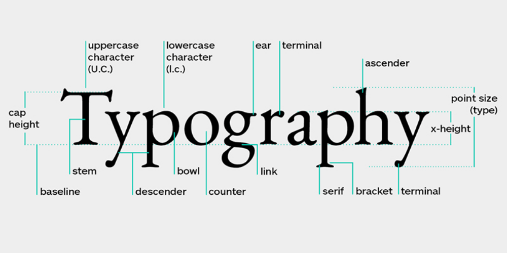
Typography in design plays an important role, not only helping to convey messages clearly but also creating a strong visual impression. From choosing fonts, sizes, colors to layout, Typography contributes to the success of every design product, from logos, posters to website interfaces. In this article, we will explore how to apply Typography to enhance the aesthetic value and communication effectiveness in design.
1. What is Typography? The role of Typography in design
Typography is the art and technique of arranging type in design, including the choice of font, size, spacing, color, and layout to communicate information effectively and aesthetically. In design, typography is not simply the use of written words, but also the use of them to create a visual and emotional experience for the viewer.
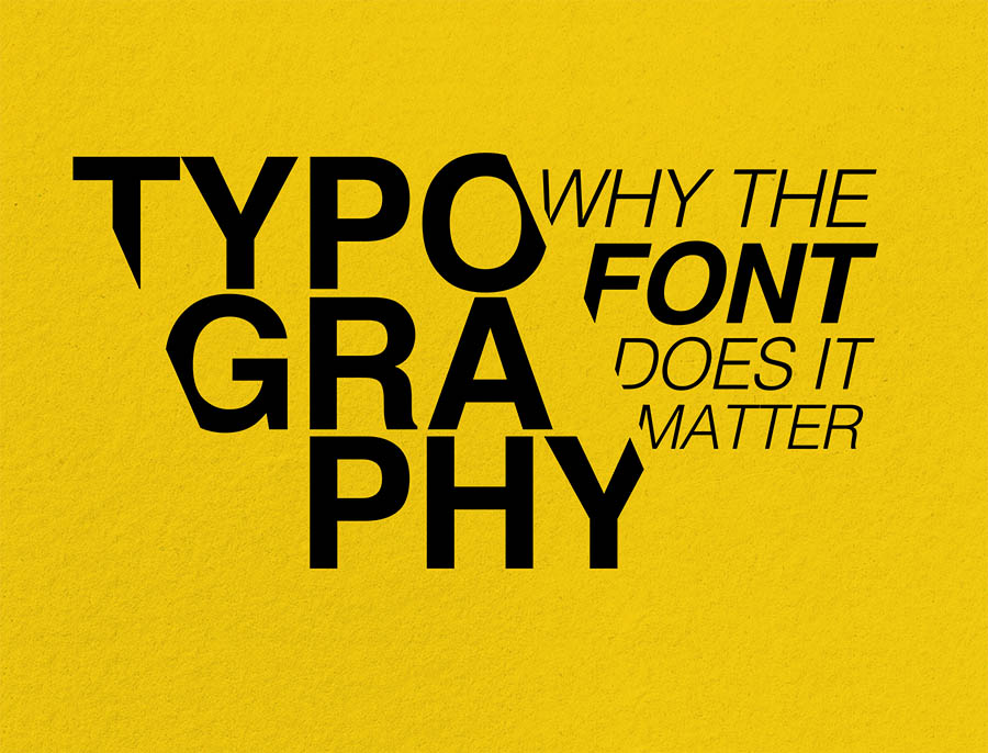
The Role of Typography in Design:
- Conveying a message: Typography helps text to be readable, understandable and attract the attention of the viewer. The right typeface can highlight the content and guide the reader's emotions.
- Expressing personality: Fonts, layouts, and colors can convey the style or personality of a brand or project.
- Increase aesthetics: Typography plays an important role in creating harmony and balance in the overall design, making the product look more professional.
- Action-Oriented: In advertising or website designs, typography can lead viewers to take a desired action, such as clicking a button, reading more, or making a purchase.
2. Typography Applications In Design
Typography has been and is one of the most important elements in the field of design. It is not only the art of arranging letters, but also a way to convey messages, create impressions and emotions for viewers. So how is typography applied in design, and why is it important?
2.1. Application of typography in graphic design
Typography in graphic design is an indispensable element to convey messages effectively and make a strong impression on viewers. Using fonts properly not only helps create aesthetic balance but also affects the emotions and experience of users. Here are some typography applications in graphic design:
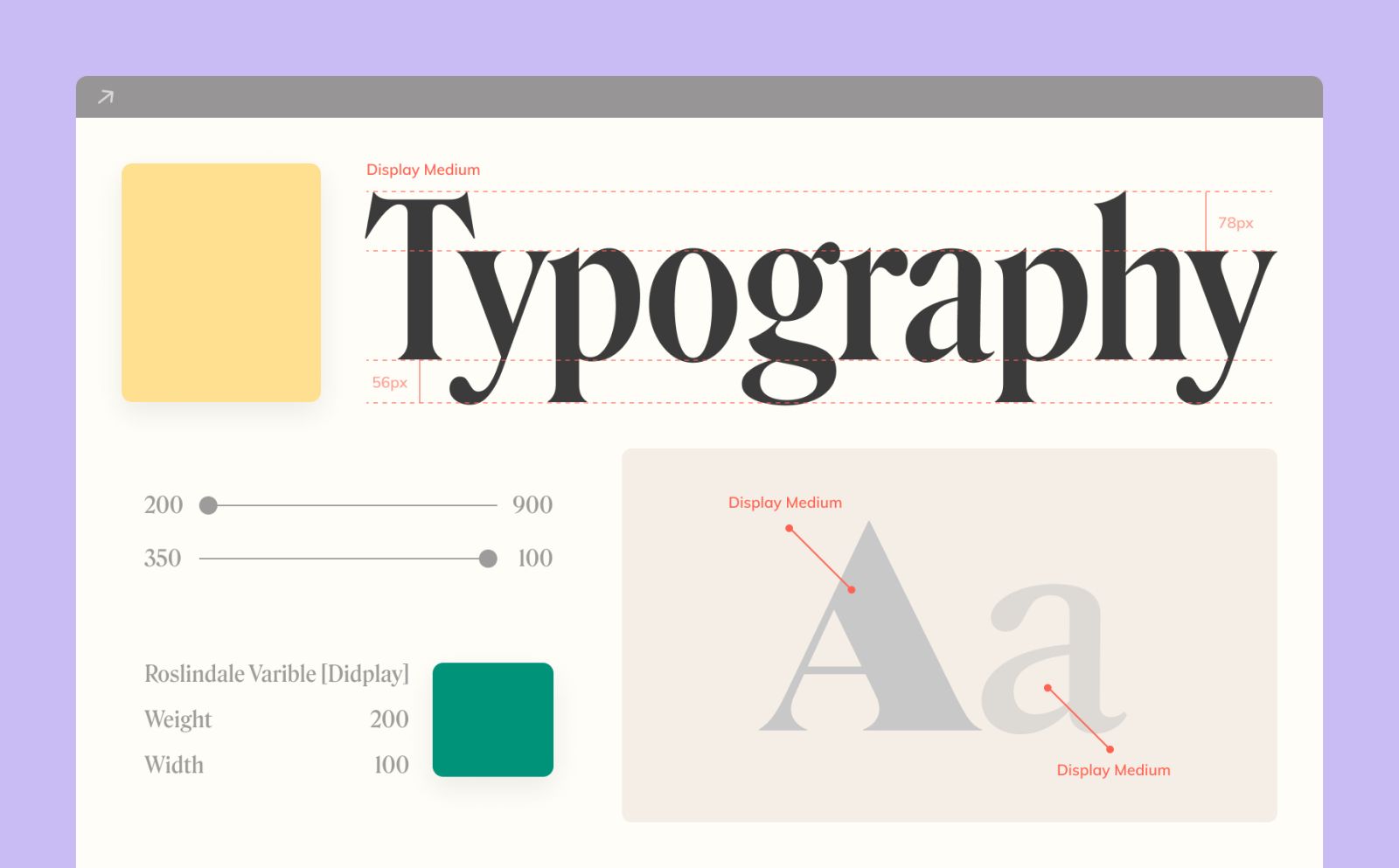
Create emphasis and hierarchy of information
- Visual Hierarchy: Typography helps divide information in graphic design by using fonts of different sizes and weights. For example, using a large, bold font for headlines and a small, light font for descriptions will help viewers easily identify important sections.
- Create contrast: Bold or italic fonts can highlight key messages while the rest of the text helps to complement the information without taking attention away from the main point.
Expressing emotions and brands
- Branding: Typography is an important part of building a brand identity. Each font has its own personality, from classic, elegant to modern, youthful. Choosing the right font helps connect the brand with the target audience.
- Serif Fonts like Garamond, Times New Roman give a traditional, prestigious feel.
- Sans-Serif Fonts like Helvetica, Futura create a modern, simple feel.
- Script Fonts like Brush Script, Pacifico evoke sophistication and creativity.
Using Typography to Create Creativity
- Artistic Typography: In graphic design, Typography is not just the arrangement of letters but can also become an artistic element. Unique fonts, modified with special effects such as drop shadows, color gradients or animations can create a distinct style.
- Get creative with layout: Typography can be a key element in a design layout, creating a unique look or a great balance between other design elements like images and colors.
Typography application in advertising projects
- Poster and banner design: Typography helps create an impression at first sight. Choosing a font that is easy to read and appropriate to the advertising message is very important. Bold, large fonts will attract attention, while light fonts help create balance.
- Outdoor Advertising: Typography in outdoor advertising needs to be clear and easy to read from a distance. Simple, clear fonts, along with appropriate spacing between characters are important design elements.
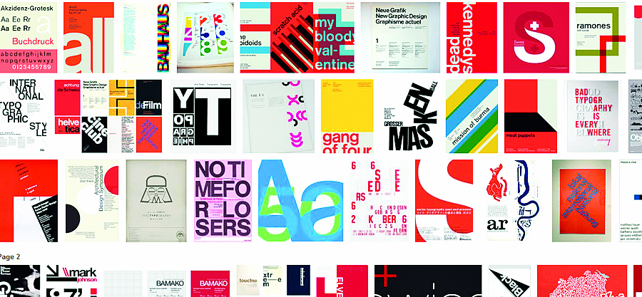
Typography in product packaging
Typography can help your product stand out on the shelf. Packaging with creative, easy-to-read fonts will attract customers and convey the value of your product. For example, food brands may choose an approachable, friendly font to create a sense of familiarity, while high-end products may use elegant fonts to convey luxury.
Optimizing Typography for Print
- Choose fonts that are suitable for the printing material: To ensure that typography in graphic design can be printed clearly, fonts must be suitable for the paper material and printing size. Choose fonts with reasonable thickness, avoid using fonts that are too thin, which will be difficult to read when printed at small sizes.
- Letter-spacing and line-height: Adjusting the letter-spacing and line-height helps ensure information is easy to read, even on printed publications.
Typography in digital design
Web and user interface (UI) design: Typography greatly affects the user experience on digital platforms. Fonts need to be easy to read on all devices and must be compatible between different operating systems and browsers. In addition, font selection also helps create consistency in web and app interface design.
2.2. Typography application in website design
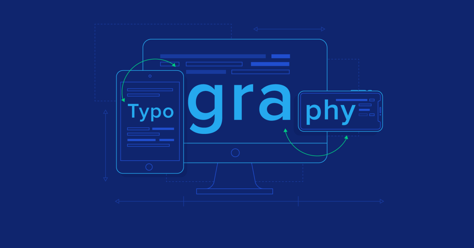
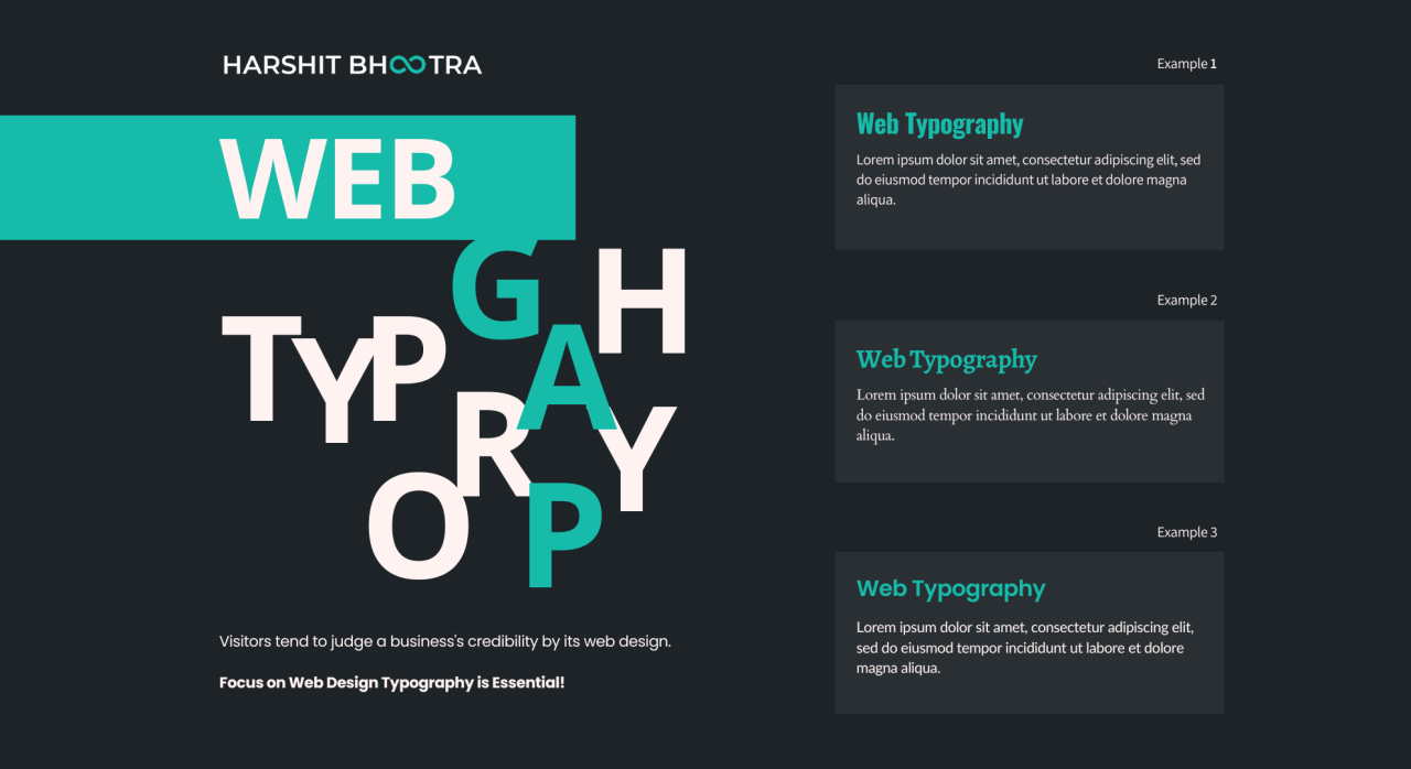
Typography is an indispensable design element when creating a website, not only helping to optimize user experience but also playing an important role in building a brand. Below are some Typography applications in website design to enhance the effectiveness of message transmission and improve the user interface.
Create information hierarchy
- Visual hierarchy: Typography helps to clearly divide the information on a website, making it easy for users to recognize the headings, main content, and sub-sections. Using large, bold fonts for headings and smaller fonts for content will help create balance and ease of reading.
- Font Combination: Combining serif and sans-serif creates a reasonable contrast, making it easy for readers to access information.
Improve Readability
- Choose a legible font: Sans-serif fonts like Arial, Helvetica, or Roboto are popular in web design because they are easy to read and user-friendly. Make sure the font is large enough and has a reasonable line-height to avoid eye strain when reading.
- Optimized for all devices: Typography should adapt to all screen sizes, from desktop to mobile, to provide users with an easy reading experience.
Branding through Typography
- Reflecting your brand personality: Typography is an important part of building your brand identity. The font you choose should reflect your brand’s style and values. For example, if your brand is modern, a clean sans-serif font would be appropriate. On the other hand, if you want to convey luxury, a serif font with delicate lines would make an impression.
- Consistent Typography: Maintain consistency in font usage across the entire website to create a unified and professional feel.
Grab Attention with Creative Typography
- Dynamic Typography: Using animations or hover effects can create emphasis and draw attention to important parts of a website, such as CTA (Call to Action) buttons.
- Custom Typography: Custom fonts or creative fonts help websites stand out, especially in creative industries like fashion, art, or entertainment.
Helps improve SEO
- Use Heading tags correctly: Typography supports SEO through the use of appropriate heading tags (H1, H2, H3,...) to classify content and help search engines understand the structure of the website.
- Web-friendly: Fonts should be optimized for performance so they don't slow down your website. Some web fonts, like Google Fonts, are designed to help your pages load faster.
Create an intuitive feel for users
Typography in user interfaces (UI): Typography can improve user interfaces by creating clarity and ease of use. Choose appropriate typefaces for different purposes, such as using clean fonts for notifications, and creative fonts for artistic purposes.
3. How to Choose Typography Fonts Suitable for Each Design Style
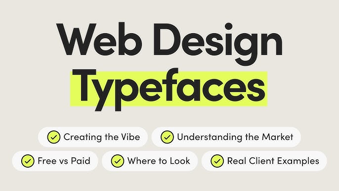
Choosing the right typography font will enhance the value of your design and enhance the message you convey. Here are some tips for choosing the right font for each design style:
- Classic style: Use Serif fonts like Times New Roman, Georgia to create a traditional and elegant feel.
- Modern style: Prioritize Sans-Serif fonts like Helvetica, Arial to bring minimalism and sophistication.
- Creative style: Use Display or Script fonts like Pacifico, Lobster to emphasize uniqueness and innovation.
- Minimalist design: Choose clean, simple fonts like Open Sans or Roboto for a clean, easy-to-read look.
- Youthful design: Use soft, fun fonts like Comic Sans or custom fonts.
Typography is not only a tool to convey information but also an art of expressing emotions and style. Using typography intelligently and creatively will help your design become more outstanding, professional and impressive in the eyes of the viewer.
SADESIGN is a reputable unit in providing unique and high-quality fonts, helping you easily express the right style in design.
Conclude
Typography in design is not just the art of arranging type, but also a powerful tool to convey messages, build brands and create aesthetic experiences. Choosing the right font and applying it effectively can enhance your entire design, from presentation slides, logos, to digital interfaces. Take advantage of Typography to highlight your ideas and better connect with your target audience. Don't hesitate to experiment, be creative and update the latest Typography trends to keep your designs impressive and professional.

