Best Selling Products

Upgrade genuine Capture One account
120 USD

Autodesk All App Account Copyright
120 USD

Genuine Adobe Illustrator account
99 USD

Genuine Cheap Canva Pro
39 USD

Copyright Adobe Lightroom Account
59 USD

MidJourney Account
29 USD

Upgrade Duolingo Super
29 USD

Plugin Retouch4me
69 USD

Upgrade Genuine Office 365
49 USD

Adobe Premiere Pro Account
99 USD

Adobe Photoshop Copyright - Full App
120 USD

Capcut Pro 1 Year
39 USD

Freepik Premium Account
59 USD

Windows 10 & 11 Pro Key
36 USD

ChatGPT Plus Account (GPT-4)
16 USD
Understanding the color composition of an image

It is extremely important for a photographer or editor to understand the color composition of an image. Color is what makes up the "look" and "feel" of an image. In order to get a good image, you need analysis to use the best colors.
The color composition of an imageIn the following article we will help you explain how you can create beautiful images. The reason you need to learn color theory, as well as how to evaluate the color composition of an image with Adobe Color CC and Selective layer color adjustment in Photoshop.
The color composition of an image
Anything that you see in an image can be achieved through final editing, especially the color grading.
 editing, especially the color grading
For each location, different spaces will have different colors. If it was indoors, what would the quality of the light, the source of the light, the position of the light, all play a role in in the final process. So whatever appears will have an impact on what's coming from Photoshop.
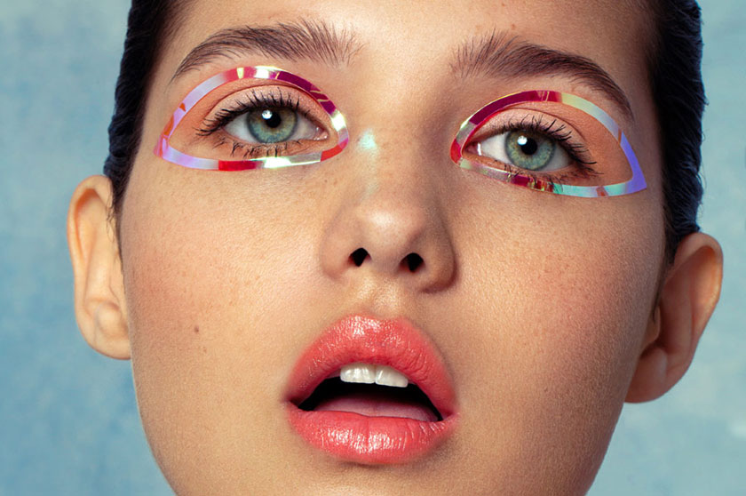
You cannot expect to reproduce an image with soft lighting and the color palette is turned off when your photo is taken with strong light and the subject is dressed in very casual clothing. From makeup to all the photo elements, you need to think about the colors of your final image when planning and styling your shoot.
But how do you create a visually appealing color layout? Color theory teaches us how color matching works by using the color wheel. The color wheel in Adobe Color CC serves as a tool for viewing color harmony.
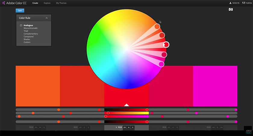 The color wheel
You see that two or more colors are displayed adjacent to a single primary color; it will be triple color if there are three colors evenly spaced on the wheel; Monochromatic color, if in which two or more shades of one primary color are displayed and complemented, one color is on the opposite side of the wheel completely. Each color harmony will bring about a different visual "feel".
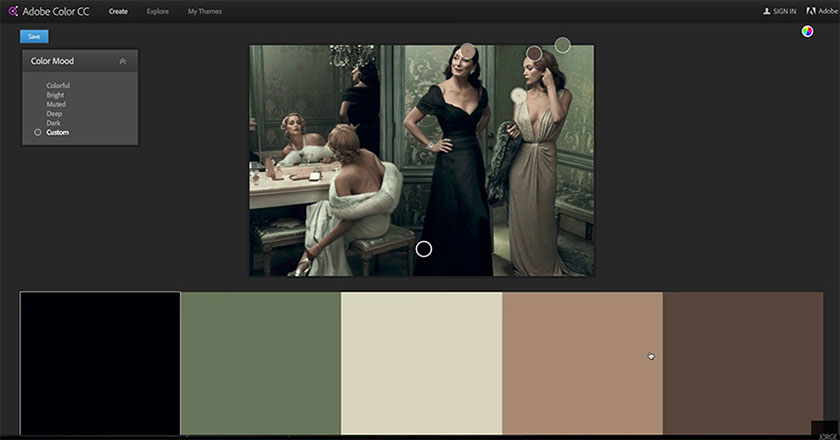
 cold colors
One thing you may not know, when you use warm colors as your primer guarantees the final ingredient, cold colors. As a photographer, you need to understand that using cool monochromatic tones such as grays and blues can make the viewer feel "lonely" or "isolated" as shown in the image above.
A very common combination that you see a lot in film poster design today is the use of blue and orange complementary colors to create eye-catching contrast.
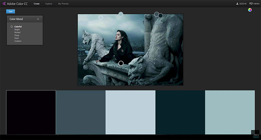
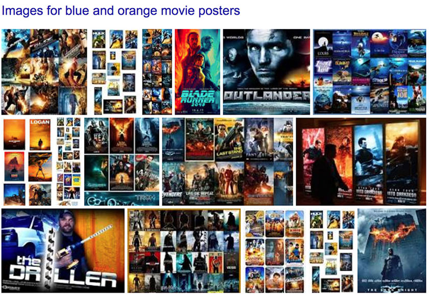 The color in film poster
To analyze colors in a reference image, you can use Adobe Color CC to view its color scheme. Import the reference image into Adobe Color CC or use the Selected Color Adjustment Layer in Photoshop to create the Saturation Map. This allows you to see the concentration of colors in that image.
Video specific instructions
You can watch our video below to better understand the color of the image:
Please use the timestamp below to jump straight to the Specific segments in the video are as follows:
0:25: Photography process explanation
2:53: Color Theory
5:24: Color Palette Evaluation Using Adobe Color
7:40: Evaluating Colors and saturation in Photoshop.
Keep these concepts in mind for the next shot when you create a mood board and search for reference images. SaDesign Retouching Academy hopes that the above sharing on image colors will help you better understand the visual elements of your inspiration so you can create more powerful works in the future.
See more How to use and create color lookup table in Photoshop


VIP Products


Best Selling Products
Upgrade genuine Capture One account
120 USD
Autodesk All App Account Copyright
120 USD
Genuine Adobe Illustrator account
99 USD
Genuine Cheap Canva Pro
39 USD
Copyright Adobe Lightroom Account
59 USD
MidJourney Account
29 USD
Upgrade Duolingo Super
29 USD
Plugin Retouch4me
69 USD
Upgrade Genuine Office 365
49 USD
Adobe Premiere Pro Account
99 USD
Adobe Photoshop Copyright - Full App
120 USD
Capcut Pro 1 Year
39 USD
Freepik Premium Account
59 USD
Windows 10 & 11 Pro Key
36 USD
ChatGPT Plus Account (GPT-4)
16 USD