Best Selling Products
What is Typography? Basic Terms in Typography
Nội dung
- 1. Overview of Typography
- 1.1. What is Typography?
- 1.2. History of Typography Development
- 1.3. Are Typeface and Font the same thing?
- 2. The role of Typography design in new-age Marketing
- 3. Refer to the main types of Typeface
- 3.1. Serif
- 3.2. Serif typefaces - Serif typefaces
- 3.3. Sans-serif
- 3.4. Display
- 4. Basic terms in Typography
- 4.1. Text structure
- 4.2. Typeface
- 4.3. Fonts and font families
- 4.4. Font size
- 4.5. Weight level
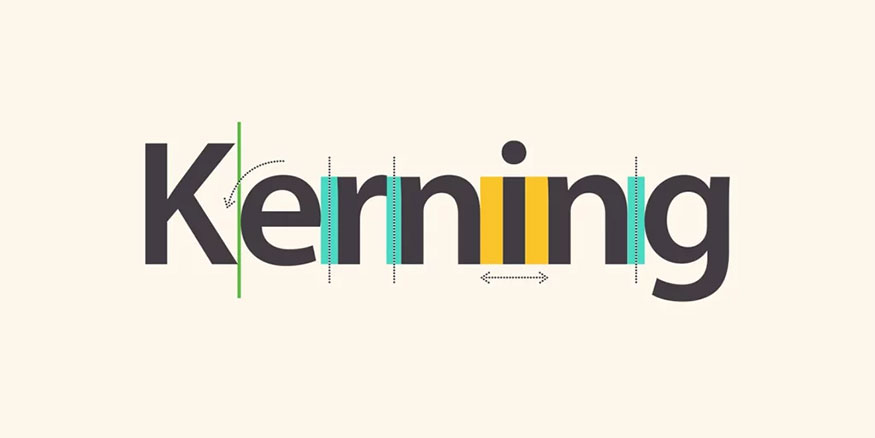
- 4.6. Letter Spacing - leading - word spacing
- 4.7. Text alignment
- 4.8. Line length
- 4.9. Font types
- 5. How does typography affect brand design?
- 5.1. Have personality (Contain mood)
- 5.2. Silent operation
- 5.3. Meaningful and creative
- 5.4. Changing perceptions
- 6. Impressive fonts in Typography
- 6.1. Acropolis
- 6.2. Cyclone
- 6.4. Gotham
- 6.5. Ziggurat
- 7. Frequently Asked Questions
- 7.1. What is the difference between Typography and Graphic Design?
- 7.2. How many types of Typeface are there?
Understanding Typography will help you understand how writing affects the reader's mind, contributing to creating a unique experience and leaving a strong impression on the customer's mind. Join SaDesign to learn more about Typography to see its importance in the field of Marketing.
1. Overview of Typography
1.1. What is Typography?
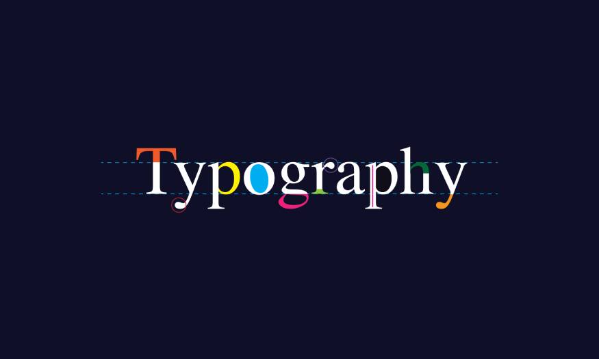
Typography is a term composed of two words "Typo" (form) and "Graphic" (writing) in Greek language.
Simply put, typography is the art of arranging letters, specifically the selection, arrangement and presentation of typefaces to create a layout that is both easy to read and attractive, while also effectively conveying a message. Simply put, Typography is the language of images, the way we use writing to communicate.
1.2. History of Typography Development
Typography dates back to the 11th century, originating in Asia. Typefaces are the result of typesetting and typesetting. Until the 1800s, letters were created and formed into metal blocks. The typefaces or overall designs were converted into fonts and sold to printing shops.
1.3. Are Typeface and Font the same thing?
Many people often confuse Typeface and Font, however these are two different concepts, specifically:
Typeface is a typeface design that includes a complete set of characters, numbers, symbols in a certain style. It is like a blueprint for a certain typeface, including all its variations and characteristics. For example: Times New Roman, Arial, Helvetica are Typefaces.
Font is a set of characters of the same size and style belonging to a Typeface. In other words, Fonts are specific versions of a Typeface, such as bold, italic, or different font sizes. For example: Times New Roman 12pt Bold, Arial 10pt Italic are Fonts.
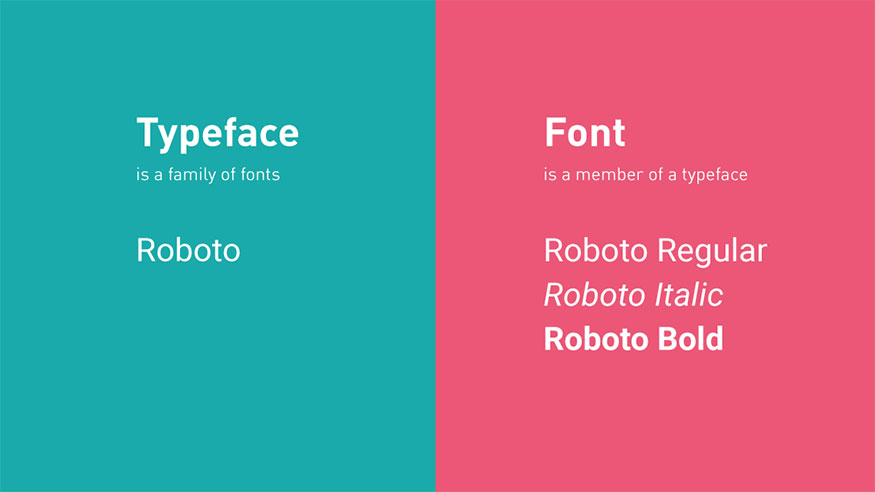
It is very important to distinguish between Typeface and Font in design. When choosing a font for a project, you need to understand Typeface and Font to choose the most suitable font for your purpose and design style.
2. The role of Typography design in new-age Marketing
In today’s information explosion era, businesses have to compete fiercely to attract customers’ attention. In that context, Typography plays a key role in Marketing strategy to help convey messages effectively, as well as contribute to creating a brand and enhancing business recognition:
Branding: Typography can clearly define a brand image, creating consistency and recognition. Choosing the right font for your business and brand personality helps to effectively convey your message and core values to your customers.
Attracting Attention: An eye-catching and creative typography design can attract the reader’s attention at first sight. By using contrasting colors, appropriate font sizes and layouts, designers can create attractive accents, making the content stand out and attract the attention of customers.
Improve readability: Typography plays an important role in facilitating the reader's absorption of information. Choosing the right font for the target audience, adjusting the contrast, and spacing between lines of text will create the most comfortable reading experience for the reader.
Effective Message Conveying: Typography design plays an important role in conveying messages clearly, concisely and attractively. The message of a marketing campaign is only truly effective when it is conveyed to customers in an easy-to-understand way.
3. Refer to the main types of Typeface
3.1. Serif
Serif fonts are “feet” typefaces that have an extra stroke at the beginning or end of the main stroke. Because of their classic style, they are considered a great choice for traditional projects. Serifs are also widely used in printed publications such as magazines and newspapers.
3.2. Serif typefaces - Serif typefaces
3.2.1. Old Style Serif
Old Style Serif has the following basic characteristics:
Has low contrast between thick and thin strokes
Cross axis
Serifs will italicize for lowercase letters.
3.2.2. Transitional serif - Transitional serif type
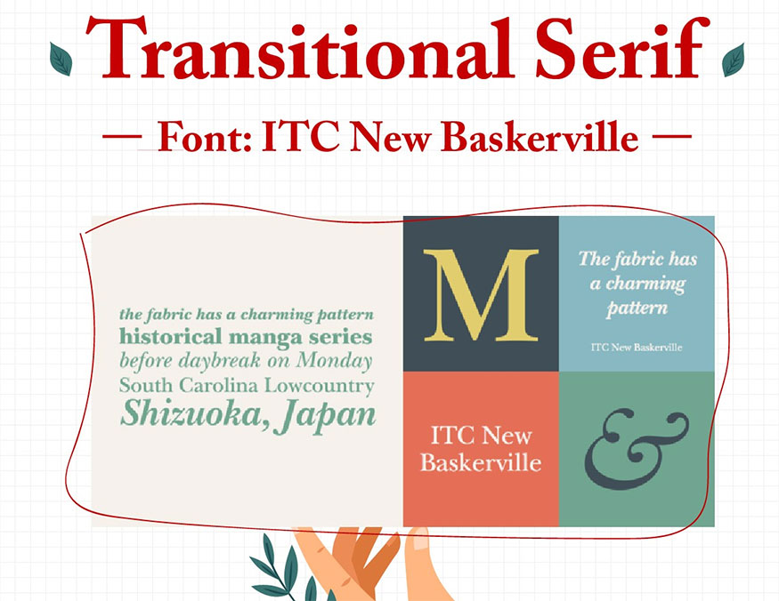
Transitional serif has the following characteristics:
High contrast between thick and thin lines
X-height (line indicating the height of lowercase letters): Medium
Vertical axis
Serifs with curved stems.
3.2.3. Modern Serif
Modern Serif has the following characteristics:
Serif long and thin
The axis is almost vertical.
Strong contrast.
3.2.4. Latin Serif
Latin Serif is characterized by a typeface with triangular or square feet.
3.2.5. Slab Serif
Slab Serif has the following characteristics:
Rectangular feet
The strokes are almost equal.
Large X-height.
Arched legs
Contrast, equal width.
3.3. Sans-serif
In French, sans means negative, so "sans-serif" means without feet, this typeface is the opposite of Serif font.
Sans-Serif fonts have a more modern, bright, and clear style than serif fonts. Thanks to this feature, they can display better on small screens such as computers and phones.
3.3.1. Grotesque
.jpg)
Grotesque possesses the following characteristics:
Lines with little contrast
Large or medium curve
Has a geometric design with large curvature.
3.3.2. Neo-Grotesque
Neo-Grotesque possesses the following characteristics:
Elegant and unobtrusive
Little contrast between strokes
Small aperture
Large x-height.
Ascender (the part of a letter that lies above the mean line, usually in a typeface like (h,l,k,…) that is higher than the height of the capital letters.
3.3.3. Geometric Sans - Geometric sans-serif typeface
Geometric Sans possesses the following basic characteristics:
Has simple geometric shapes such as circle, square, triangle
Large aperture curvature
There is no contrast between the strokes.
3.3.4. Humanist Sans - Humanist sans-serif typeface
Humanist Sans possesses the following basic characteristics:
The structure and proportions are characteristic of Old Style.
Large aperture curvature
There is contrast between the strokes.
The width of the stroke is uneven.
3.3.5. Glyphic
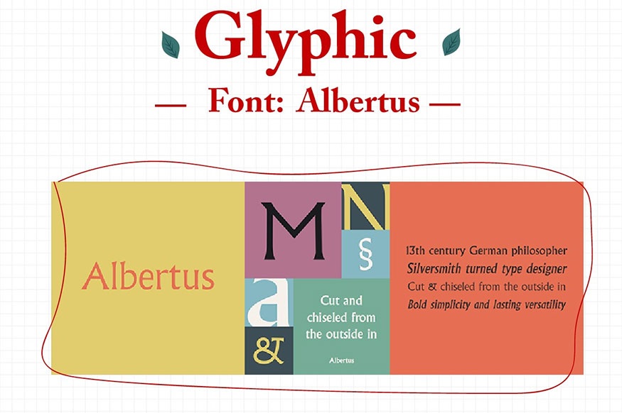
Glyphic has the following basic features:
Has a combination of characteristics of Sans and Serif.
The strokes end with a tapered foot.
3.4. Display
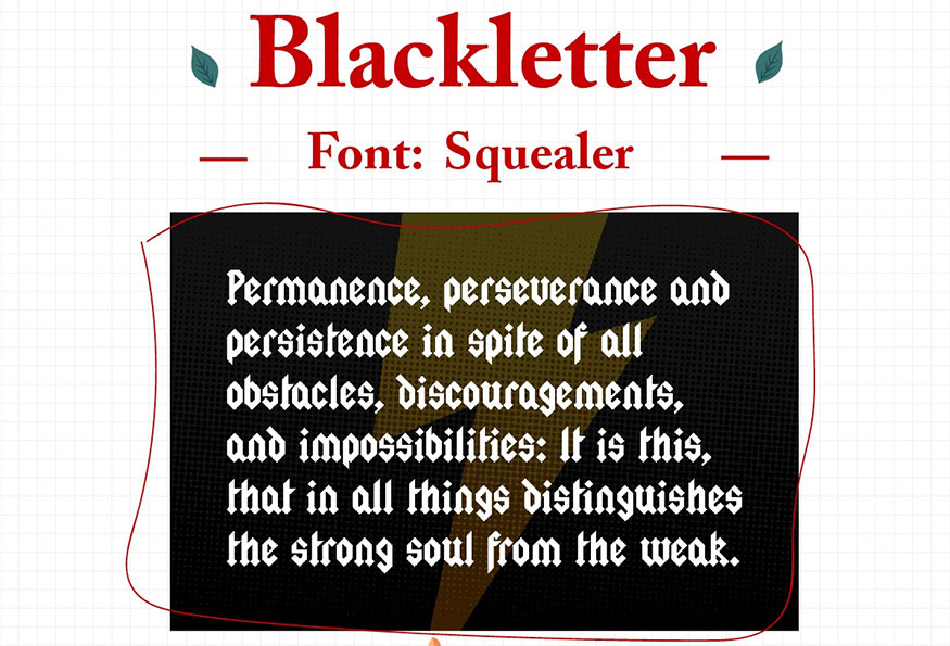
These fonts are often used to make posters, movie titles, book covers,...
Display has the following forms:
Black letter: High contrast, narrow, with straight lines and angular curves
Script: A copy of the calligraphy writing style, but more formal.
Handwriting: A copy of handwriting but less formal.
4. Basic terms in Typography
4.1. Text structure
An ideal start to learning how to master type on the page, demonstrating the ability to name the important parts of type, called letterforms.
4.2. Typeface
A typeface is a collection of letterforms, numbers, and symbols that are unified by a common visual design.
4.3. Fonts and font families
Each typeface can have several related type styles, which are variations of the original typeface. For example: Italic, bold, extended, condensed.
Type family: different versions of a typeface that extend the functionality of a typeface, while still retaining the visual characteristics of the original typeface. Some typefaces also include more elaborate versions such as shaded, outlined, decorated.
4.4. Font size
.jpg)
A letter measured in points, a term that dates back to when letters were cast individually and placed together in rows to form words or sentences. The term is still used today.
1 point = 0.353 mm, considered 1/12 pica.
4.5. Weight level
Letterform in typefaces is made up of many strokes, Weight is used to indicate the thickness or thinness of the strokes. Thicker strokes also mean that the letterform is bolder and stronger. Conversely, thin strokes will create an airy and light feeling.
4.6. Letter Spacing - leading - word spacing
- Letter Spacing is the space between characters and individual letters.
- Leading (line spacing) refers to the vertical space between letters.
- Word spacing: Indicates the distance between words. Word spacing that is too far apart or too close together reduces the clarity of the content.
4.7. Text alignment
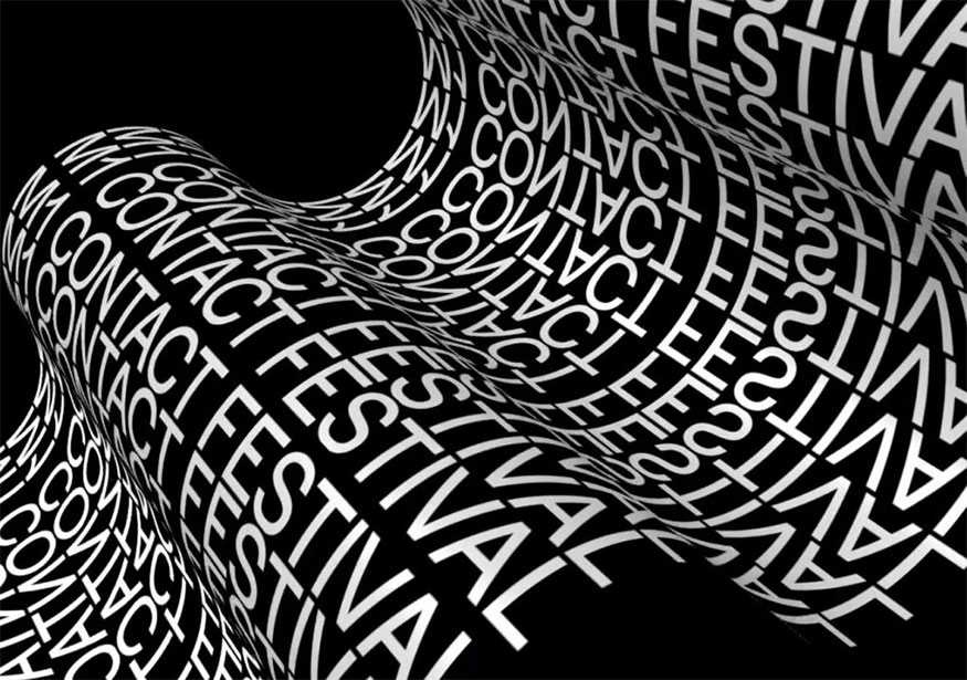
Text can be centered, left aligned, right aligned, justified, or wrapped around on the page.
4.8. Line length
Line length plays a role in designing readable text.
4.9. Font types
There are millions of typefaces out there and the number is growing, so it’s hard to keep them organized. To ensure clarity, we can divide them into 5 main types:
Serif
Sans serif (no stroke)
Square serif
Script (handwritten)
Decorative
5. How does typography affect brand design?
Each Typeface has its own distinct personality through its shape, structure, and style. Each Typeface is like an individual with its own distinct personality:
5.1. Have personality (Contain mood)
It can be seen that typography is an essential part of the presentation process. Every logo has a unique design with a font that matches the brand. Typography has the ability to completely change the look and feel of a website, clearly expressing what the brand wants to convey.
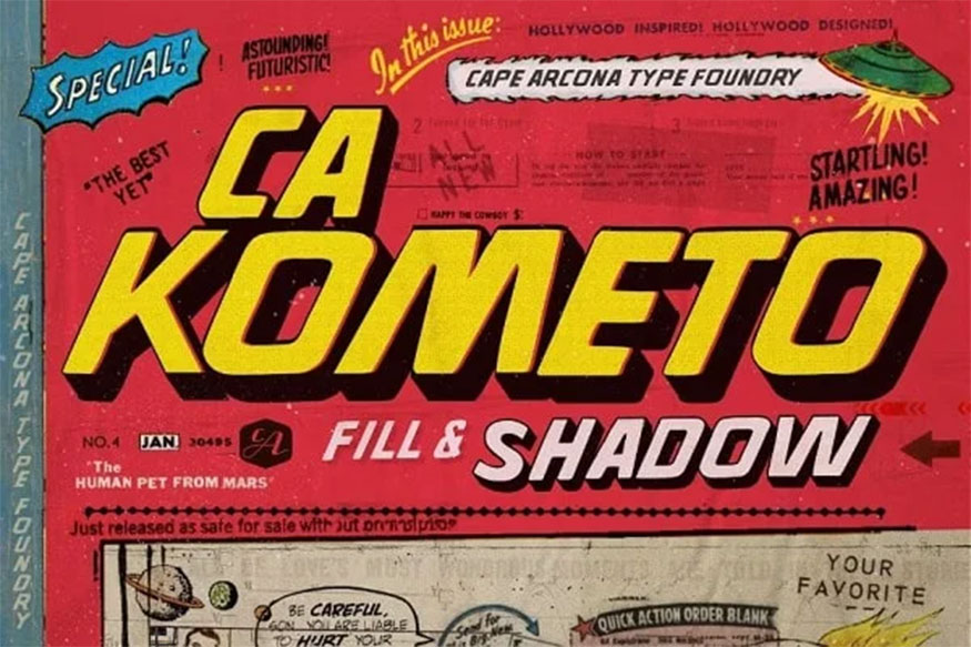
If applied correctly, Typography will effectively convey mood, helping the audience understand the message you want to convey. You should use clean, easy-to-read fonts to increase the persuasiveness of your presentation.
5.2. Silent operation
Nowadays, there are many brands that convey messages through simple stories, Typography supports brands to do this in the best way. Typography itself contains many meanings, they are clearly expressed through each line of the letter.
You need to choose the right Typography Font to maximize its effectiveness. Along with that, you should also research and be creative to choose relevant linking elements and put Typo in the right context to achieve optimal effectiveness.
5.3. Meaningful and creative
Typography is not just about choosing fonts, it is also an opportunity to express creativity and convey unique messages. Typography can be combined with images to create impressive designs that attract the attention of viewers.
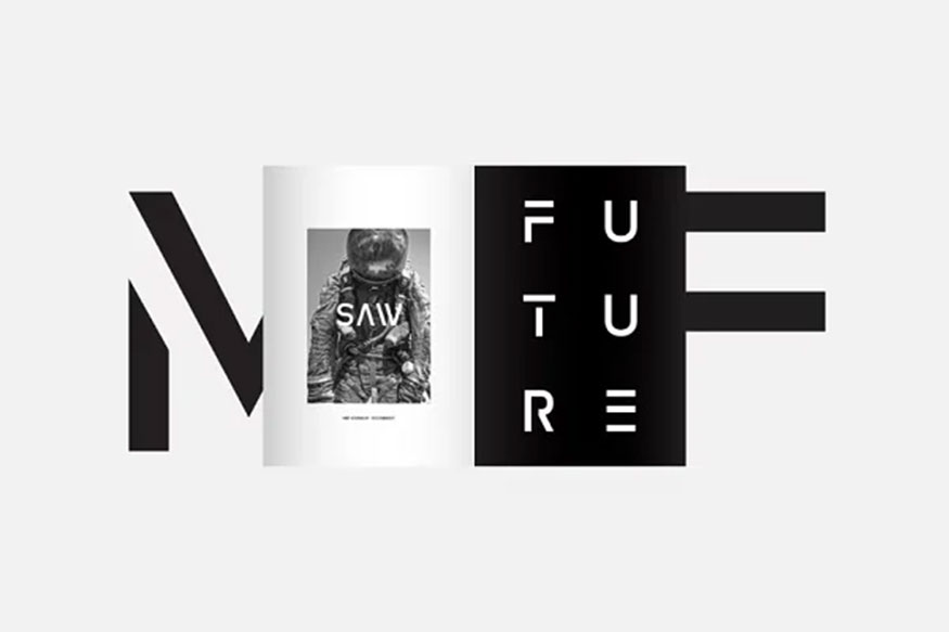
Typography can be used to create a unique image for a brand. For example, a brand's logo can be designed based on a unique font, expressing the brand's values and characteristics.
In addition, Typography can be used to convey creative messages that attract the attention of viewers. For example, a fashion brand can use a soft script font to express the femininity and charm of the product. Or a technology brand can use a Sans-serif font to express the modernity and dynamism of the product.
Creativity in Typography helps create unique, different highlights, attract customers' attention and help brands build their own image in the minds of consumers.
5.4. Changing perceptions
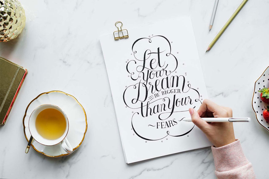
Typography has tremendous power in influencing how viewers perceive a brand.
Change the perspective through typography: Classic, formal fonts can create a sense of prestige and trust, ideal for financial, real estate, legal brands, etc.
Friendly and approachable: Youthful, dynamic font creates a sense of closeness and friendliness, suitable for fashion, beverage, entertainment brands,...
High-end and luxurious: Exquisite and unique fonts can create a high-end and luxurious feeling, suitable for high-end fashion brands, cosmetics, perfumes, etc.
Unique and outstanding: Innovative and individual fonts create a difference, creating a highlight to attract customers' attention.
Understanding your target audience helps you choose the right Typography, which helps build positive perceptions and the desired brand image.
6. Impressive fonts in Typography
6.1. Acropolis
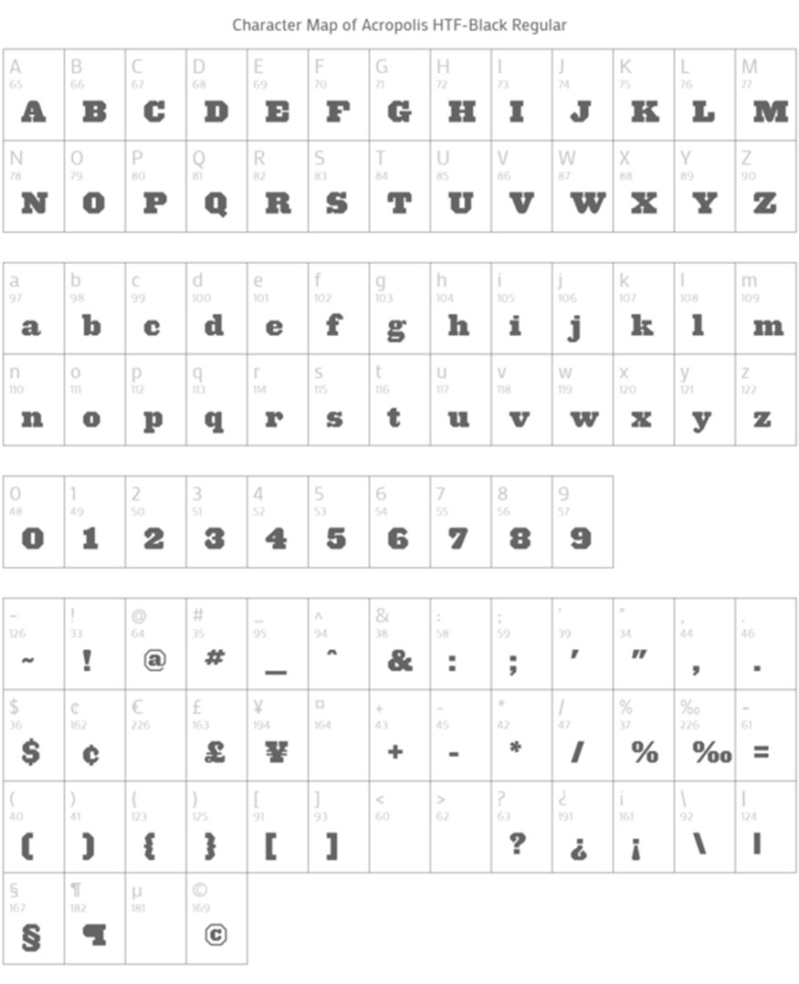
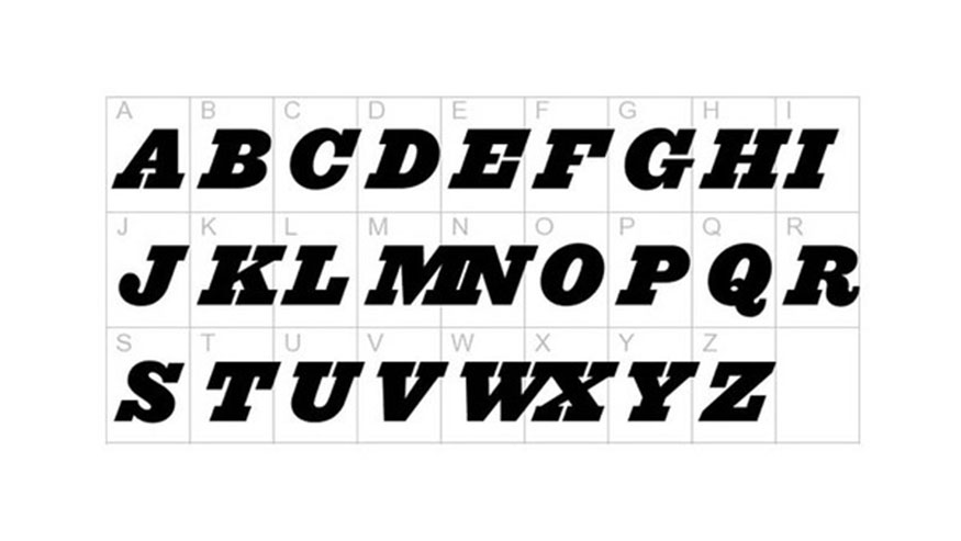
Acropolis is part of the Typography Slab Serif font family and comes in four different variations: Regular, Regular Italic, Bold Italic. Acropolis pretty much meets our need for strong characters with high readability. Combining Acropolis with a sans-serif body font makes for a great font for titles and subtitles.
6.2. Cyclone
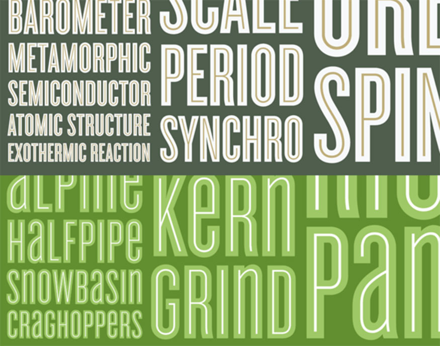
Cyclone is a unique and striking font that creates soft, non-traditional text with beautiful outlines. Cyclone has classic letterforms with high contrast, making it a top choice for Serif fonts.
6.3. Font zag free
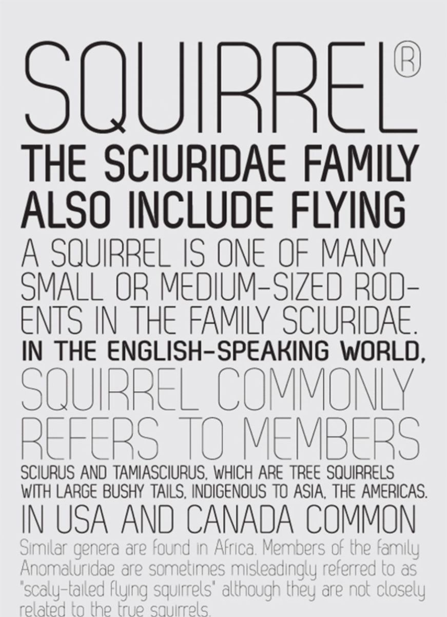
Font zag free has elegant, soft, gentle features, bringing a comfortable feeling to the reader. If using Font zag free for the whole text, it will not create a highlight and impress the reader. Font zag free is suitable for placing in subtitles and introductions.
6.4. Gotham
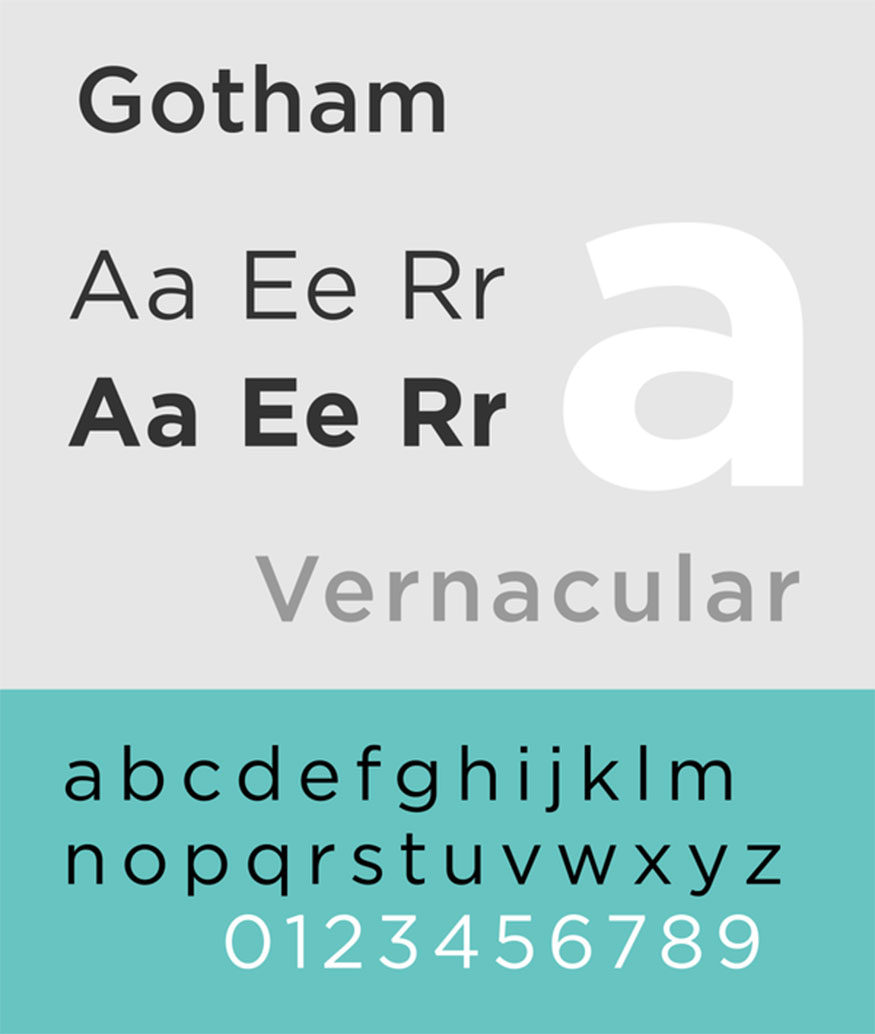
Gotham is one of the impressive Typography fonts, they are both strong and soft enough, not too sentimental, but not too serious. Gotham has enough shades from bold, italic, thin, ... suitable for many different situations.
6.5. Ziggurat
Ziggurat is a low, slightly rounded, soft font, suitable for use in texts and images with a funny, humorous nature.
7. Frequently Asked Questions
7.1. What is the difference between Typography and Graphic Design?
Graphic Design is the harmonious combination of both images and fonts to create a publication. Typography is a graphic application for the purpose of creating typefaces.
7.2. How many types of Typeface are there?
There are 4 main types of Typeface:
Serif fonts.
Sans serif fonts.
Script fonts.
Display fonts.
Typography is an important element in brand design. Choosing and using appropriate Typography not only helps create aesthetic beauty for the design product but also contributes to establishing the brand image, creating a difference and attracting customers. Hopefully this article has helped you better understand the role of Typography in brand design, from which you can apply it to create beautiful and effective design products.
Installation and support contact information:
🏡 SADESIGN Software Company Limited
📨 Email: phamvansa@gmail.com
🌍 Website: https://sadesign.ai







.png)

