Best Selling Products

Adobe Premiere Pro Account
99 USD

Freepik Premium Account
59 USD

Copyright Adobe Lightroom Account
59 USD

Upgrade Genuine Office 365
49 USD

Capcut Pro 1 Year
39 USD

Plugin Retouch4me
69 USD

ChatGPT Plus Account (GPT-4)
16 USD

Upgrade Duolingo Super
29 USD

Adobe Photoshop Copyright - Full App
120 USD

Genuine Cheap Canva Pro
39 USD

Upgrade genuine Capture One account
120 USD

MidJourney Account
29 USD

Genuine Adobe Illustrator account
99 USD

Autodesk All App Account Copyright
120 USD

Windows 10 & 11 Pro Key
36 USD
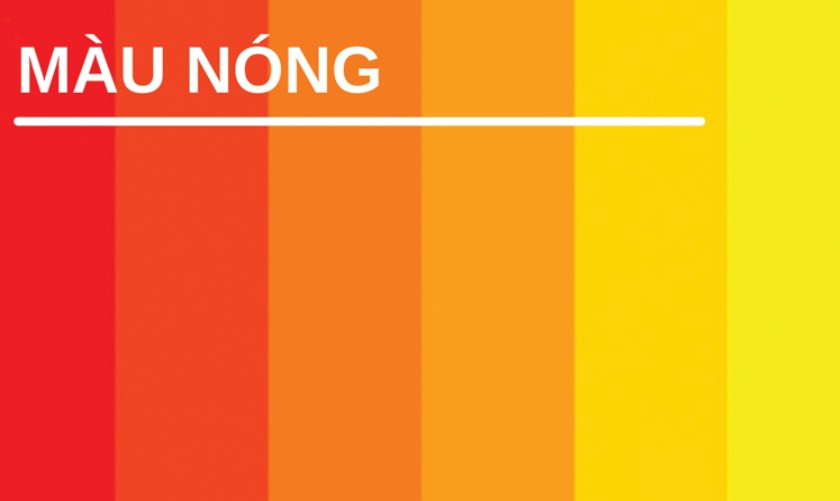
What is Warm Color? How to Use Warm Colors to Create Highlights in Design
Nội dung
- 1. Definition and Classification of Warm Color Gamut
- 2. Psychology of Warm Colors
- 3. The Role of Warm Colors in Design
- 3.1.Attractive and Make a Strong Impression
- 3.2. Creating Highlights and Balance in Design
- 3.3. Application of Warm Color in Design Fields
- 4. How to use warm colors in design
- 5. Notes When Using Warm Color
- 5.1. Avoid Overuse and Causing a “Glare” Feeling
- 5.2. Notes on Customer Target and Message
Want to make your designs stand out? Use these tips on how to use warm colors correctly to create a powerful and professional visual impact.
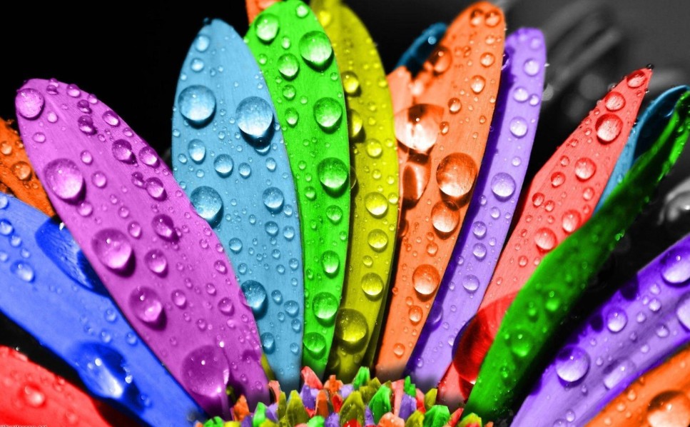
In the modern design world, color is not only a decorative tool but also a “non-verbal language” that conveys emotions, values and brand personality. An impressive design is often a combination of many factors, in which color plays a key role. Warm colors - colors such as red, orange, yellow have long captured the inspiration of designers because of their power to stimulate vision, inspire and even create passionate, assertive emotions. In this article, we will explore the basic knowledge about warm colors , their role and application in design as well as notes to help you turn them into effective tools in communication and marketing strategies.
1. Definition and Classification of Warm Color Gamut
When we think of “warm colors,” we often think of colors that are warm, energetic, and vibrant. Colors like red, orange, and yellow – and their variations – are often considered to represent energy, passion, and excitement. Not only are they vibrant on their own, when combined skillfully, they can create captivating visual effects that stand out in any design.
Warm colors are different from cool colors (like green, purple, blue) because they often evoke a feeling of closeness, friendliness and strongly stimulate the senses. While cool colors bring a feeling of peace and quiet, warm colors have the ability to "call" attention immediately. It is this contrast that creates the special appeal of warm colors, when they are used as a "stimulant" in design.
.png)
2. Psychology of Warm Colors
One of the reasons why warm colors are always in a popular position is because of their profound impact on human psychology. Research on color psychology has shown that warm colors have the ability to strongly stimulate human senses, thereby creating positive emotional responses such as excitement, dynamism and determination.
Emotional impact:
Red is often associated with passion, energy and determination. When used in design, you can stimulate the viewer's attention and convey a message of strength. Orange, with the combination of the warmth of red and the freshness of yellow, brings a feeling of joy, creativity and friendliness. Meanwhile, yellow carries the values of optimism, happiness and life, but also needs to be used carefully to avoid feeling "harsh" or easily causing glare if overused.
Biological effects:
Scientific studies have shown that seeing warm colors can stimulate the heart to beat faster, increase the body's energy levels and increase alertness. Therefore, in designs that need to create a sense of excitement and dynamism, warm colors become the ideal choice to convey urgent messages or encourage action.
.png)
Understanding the psychology behind warm colors will not only help you make the right color choices, but will also help you optimize your visual and design communication. The next step is to explore the role they play in creating impactful designs.
3. The Role of Warm Colors in Design
3.1.Attractive and Make a Strong Impression
One of the main advantages of warm colors is their ability to attract attention. People tend to react strongly to bright colors, so elements accented with warm colors often become the centerpiece of the design.
Get noticed immediately
In a competitive market, a design with a strong color accent will help customers easily recognize the brand. For example, a logo or symbol using red or orange can create a strong impression at first sight, making the brand quickly remembered.
Create a sense of urgency and drive for action
In addition to attracting attention, warm colors also have the ability to stimulate action. For example, in advertising campaigns, a call-to-action (CTA) button designed in red not only creates a sense of urgency but also encourages users to click, thereby increasing conversion efficiency.
.png)
Thus, with the power of hot colors, designers can effectively "elevate" their messages. Along with that, using them appropriately can create impressive visual effects, bringing outstanding brand value to SaDesign.
3.2. Creating Highlights and Balance in Design
Using warm colors is not only about attraction, but also helps create highlights in the entire design layout. This is especially important when you want to lead the viewer's eyes to the most important parts of the product.
Identify focal points:
Effective design always has “landmarks” to guide the viewer. Using warm colors to highlight key elements such as headlines, action buttons, or important images not only helps separate information but also creates a dynamic visual effect.
For example, when a website layout is designed with a neutral background but with red or orange buttons as accents, users will automatically focus and take the action you want.
.png)
Overall color balance:
By combining warm colors with neutrals, you can create harmony in your design. This helps avoid overusing colors that can feel “heavy” or too bright. Using white space in combination with warm colors can help create the necessary balance, bringing a pleasant and professional feeling.
A successful design is not simply about the outstanding elements but also lies in the subtle coordination between them. When you know how to "control" the hot color gamut, you can create special effects, thereby enhancing the overall aesthetic value of the design product.
3.3. Application of Warm Color in Design Fields
Warm colors can be applied in a variety of design fields, from logo design, product packaging to interior design and website interface. Here are some typical applications:
Branding and identity design:
In building brand identity, choosing the right color is a key factor in making a lasting impression on customers. Many famous brands have used red, orange or yellow in their logos and symbols to express passion, enthusiasm and commitment to quality.
.png)
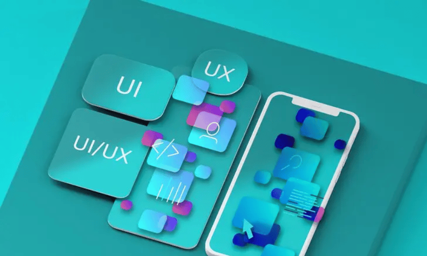
Website design and user interface (UI/UX):
In interface design, using warm colors can highlight action buttons, titles or important parts of the website. However, it is important to coordinate with the background color and other elements so as not to lose the professionalism and aesthetics of the website.
Packaging and advertising design:
A product packaging designed with warm colors can make an impression the moment customers see it on the shelf. This not only helps the product stand out but also conveys the message about the quality and value of the product through visual perception.
Interior design:
In interiors, warm colors can be used to create a cozy and dynamic space. However, it is necessary to know how to balance the light and surrounding space so as not to make the space "hot" or too visually stimulating.
4. How to use warm colors in design
.png)
Many people believe that design must have a harmonious combination of both hot and cold colors. However, if it were that easy to grasp, it would no longer be design. Design is always changing and transforming, requiring designers to know how to apply available knowledge to break those boring constraints. Accordingly, you do not need to cram both of the above tones into your design, but can completely use either one. And the use of hot colors in design can be a bit more difficult because each color has its own nuances but can easily create discomfort when combined together. To do this, when designing, you can follow the 80-20 rule, which is 80% neutral colors and 20% hot colors that stand out completely. Don't forget to adjust the saturation and contrast appropriately to make the design most impressive.
5. Notes When Using Warm Color
While warm colors bring many outstanding benefits, there are also some issues to keep in mind to avoid common mistakes when applying them:
5.1. Avoid Overuse and Causing a “Glare” Feeling
Although warm colors have a strong appeal, if used in excess or unbalanced, they can cause a “harsh” and uncomfortable feeling for the viewer.
.png)
Saturation control:
Adjusting the saturation level of warm colors is a necessary step to ensure that the design does not become too “hot”. Using lighter versions of red, orange or yellow, combined with neutral colors will help create harmony, avoiding “eye strain” for customers.
Combined with empty space:
Using enough white space will help the hot color blocks stand out without being too bright. White space creates a cool feeling, giving the user's eyes time to "rest" between strong color areas, thereby increasing the aesthetics of the overall design.
5.2. Notes on Customer Target and Message
Not every customer or brand message is suited to warm colors. Therefore, it is important to clearly define your target audience and the message you want to convey.
Cultural and industry fit:
In some cultures or in certain areas (e.g. traditional industries, or products for the elderly), too “warm” colors may not be appropriate. Consider carefully the level of application of warm colors to suit the characteristics of each subject.
In tune with the message:
If your message is about innovation, enthusiasm and vitality, then warm colors will be the optimal choice. On the contrary, if you want to convey a message of elegance, luxury or tranquility, you need to combine or choose other tones to ensure consistency.
Through this article, SaDesign hopes to convey valuable knowledge about how to use warm colors in design to ensure both aesthetics and convey a strong message. The combination of in-depth theory and practical application has shown that, whether in brand identity or in the working environment, warm colors always bring outstanding values to help improve the quality of each design product.


VIP Products


Best Selling Products
Adobe Premiere Pro Account
99 USD
Freepik Premium Account
59 USD
Copyright Adobe Lightroom Account
59 USD
Upgrade Genuine Office 365
49 USD
Capcut Pro 1 Year
39 USD
Plugin Retouch4me
69 USD
ChatGPT Plus Account (GPT-4)
16 USD
Upgrade Duolingo Super
29 USD
Adobe Photoshop Copyright - Full App
120 USD
Genuine Cheap Canva Pro
39 USD
Upgrade genuine Capture One account
120 USD
MidJourney Account
29 USD
Genuine Adobe Illustrator account
99 USD
Autodesk All App Account Copyright
120 USD
Windows 10 & 11 Pro Key
36 USD