
Best Selling Products

Freepik Premium Account
59 USD

Genuine Adobe Illustrator account
99 USD

Windows 10 & 11 Pro Key
36 USD

Plugin Retouch4me
69 USD

Adobe Photoshop Copyright - Full App
120 USD

Autodesk All App Account Copyright
120 USD

ChatGPT Plus Account (GPT-4)
16 USD

Capcut Pro 1 Year
39 USD

MidJourney Account
29 USD

Upgrade genuine Capture One account
120 USD

Copyright Adobe Lightroom Account
59 USD

Adobe Premiere Pro Account
99 USD

Upgrade Duolingo Super
29 USD

Upgrade Genuine Office 365
49 USD

Genuine Cheap Canva Pro
39 USD
Why does simplicity create such impressive photographs?
Nội dung
"Less is more" is a familiar saying in music, painting, design, and even sports. Many believe that doing more will lead to greater achievement, or faster results. In reality, the simplest methods are often the most effective. Photography is no exception. Beginners often include too many elements in a frame, then over-edit in post-production. The result is a visually cluttered image, and the most important element, the subject, is obscured. Experienced photographers do the opposite. They look at the scene and ask what can be removed, rather than what should be added. As a result, their photos are more striking, balanced, and aesthetically appealing.

1. The subject clearly begins with simplification.
In any photograph, the viewer should recognize the subject almost immediately. This could be a person, a mountain, or a building. When the frame contains too many competing elements, the viewer's eye doesn't know where to rest. Without a focal point, the photograph lacks focus, and no matter how good the technique, the visual impact remains weak.
In visual psychology, the ability to separate the subject from the background is called the image-background relationship. The brain constantly tries to categorize a scene into what to pay attention to and what to ignore. When the background is too cluttered, too bright, or too detailed, this categorization is disrupted, and the viewer has to figure it out themselves. Most viewers won't bother; they'll just scroll past and move on to another image.

Therefore, before pressing the shutter button, ask yourself what the photo is really about and what its subject is. Once you have the answer, arrange everything in the frame to serve that subject. You can apply classic composition principles such as the rule of thirds or leading lines, as they help guide the viewer's gaze to where it needs to go. If possible, remove distracting elements right in the scene. If not, change your position, lower or raise the shooting angle, or use a large aperture to blur the background. Some remaining issues can be handled in post-processing, and this will be discussed in more detail later in the article.
A prime example is the case of those transitioning from street photography to portrait photography with neon lighting. They often get so caught up in the dazzling neon signs that they forget the model is the main subject. When reviewing the photos, they feel something is missing but can't quite put their finger on it. That missing element is the focal point. The frame is too chaotic, the background does more work than the subject, and the result is portraits lacking substance. The lesson is clear: always remember what your subject is, and give it the priority it deserves instead of making it compete with everything around it.
2. Stable composition thanks to a clean frame.
Techniques like the rule of thirds or leading lines are effective because they naturally guide the viewer's eye to the subject. However, they are only fully effective when the frame is clean. If the leading line is interrupted by a series of unrelated objects, the viewer will lose focus midway and never reach their intended destination.
There are many ways to keep the frame clean. The first is to recognize that a clean frame generally leads to a more powerful image, and to consider this a primary principle when composing. The second is to utilize negative space, that is, empty areas such as a clear sky, a smooth wall, a flat water surface, or a dark area. Negative space is not a waste. It gives the eye a place to rest, while making the subject stand out more because there is nothing around to compete for attention. Negative space also creates a sense of spaciousness, tranquility, and sometimes symbolizes solitude or vastness.
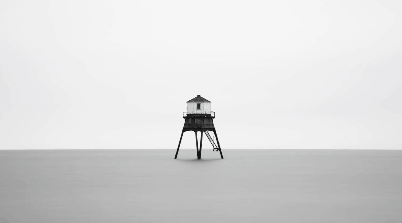
The third method is cropping the image. This is a simple but very effective tool. You can remove unnecessary details at the edges of the frame, or tighten the frame around the subject to increase focus. Many average photos become impressive after just one well-timed crop. Even during the shooting phase, you should check the four corners and four edges of the frame before pressing the shutter, as these are where unwanted objects often sneak in without us noticing.
Take a few seconds before each shot to review how you're framing your subject. Simplicity brings balance, and in most cases, a single subject with a clear light source will create a much more powerful image than a crowded and cluttered scene.
3. Emotions are stronger when there are fewer distractions.
An impressive photograph is not only about technique but also about emotion, and the emotion in a photograph almost always comes from the subject. If the subject is radiant and full of energy, the viewer feels that joy. If the subject is bowed, with a somber gaze, the viewer immediately understands that heavy mood without needing explanation. Emotion is transmitted directly, quickly, and without intermediaries.
However, when the frame contains too much visual noise, this flow of emotion becomes scattered. The viewer has to process a host of unnecessary information, and the main emotion of the photograph weakens or disappears entirely. That is why isolating the subject is so powerful.
Observe the work of top studio portrait photographers. These images may leave you speechless, but the behind-the-scenes work is often surprisingly simple, consisting of just a model, a backdrop, and carefully controlled lighting. They don't overcrowd the frame because they understand that any superfluous object risks stealing the viewer's attention. When they do add an element, it's always a deliberate decision, aimed at reinforcing the story and emotional depth of the photograph.
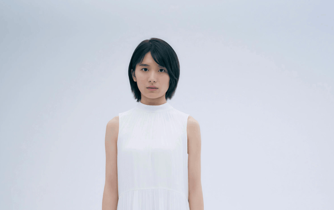
This principle applies to all genres. A landscape photograph with a solitary tree in the mist can evoke profound stillness. A street photograph with a single figure walking in the rain can speak volumes about loneliness or patience. Simplicity doesn't impoverish the image; it allows emotions to reach the viewer more fully.
4. Minimal post-production, high efficiency.
When a scene has fewer elements, you also have less to process during editing. A clean frame and solid composition will let the subject do most of the storytelling and conveying of emotion. Post-processing then only requires fine-tuning rather than editing.
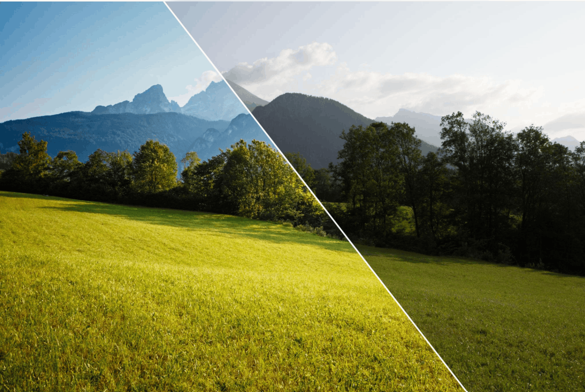
A very common mistake for beginners is over-editing. From the background to the subject, every slider is pulled too far, and the integrity of the photo is quickly ruined. Too many effects mean too much visual clutter, and viewers won't understand what you're really trying to show them.
Experienced photographers often take a different approach. They make many small, subtle adjustments, each contributing only a small part, but together creating a balanced and aesthetically pleasing image. You can apply this method by asking yourself each time you adjust a parameter whether this change actually improves the image or is just adding noise. This question is especially helpful with color grading and contrast, as that's where beginners are most easily tempted. Strong effects always look impressive at the time of adjustment, but are often less appealing in retrospect.
The Structure AI tool in Luminar Neo is a prime example. It enhances image clarity and detail almost instantly, making the image more vibrant. However, its effectiveness depends entirely on the dosage. If pushed too high, the image will become harsh, rough, and unnatural. If used sparingly, it makes a significant difference that viewers will hardly notice any editing. This is the spirit of the less is more principle in post-processing.
5. Common mistakes when editing photos
Below are some common pitfalls that beginners often fall into, resulting in cluttered and less impactful photos.
Fill every part of the frame. The temptation to add too much to the image is always present, but as analyzed, negative space is often far more effective than placing the subject in front of a dense background. The empty space helps separate the subject from the background, even creating a clear silhouette, and naturally draws attention to where it is. Try leaving more empty space than you feel comfortable with; the results might surprise you.
Oversaturating colors excessively is problematic. Vibrant colors are attention-grabbing, but vibrancy doesn't necessarily equate to beauty. Many novice photographers, especially those working with neon photography, tend to push colors too high, receiving harsh criticism from viewers. Some comment that the colors are so bright they strain the eyes, and this criticism is entirely justified. The solution is to learn a little about color theory to naturally harmonize the tones. Once the colors are balanced during shooting and white balance are achieved, you'll find you hardly need to touch the saturation slider at all.
Over-editing portraits. When you have a lot of professional retouching tools at your disposal, it's hard to spot the transition from subtle refinement to artificiality, or even faces that look creepy. Use these tools sparingly and remember that many small edits add up to one big one. A helpful tip is to leave the photo for about an hour and then come back to look at it. Once your eyes have rested, you'll immediately notice if the skin has been smoothed so much that the subject looks more like a character in a video game than a real person.
Using too many props. In product photography, props are a great way to tell a story and provide context for the product. But when there are too many props, the product starts to get lost, the focus becomes vague, and that's exactly what customers never want to see. Each prop should have a clear reason for being there and truly add value to the photo. A practical rule is that props should never be larger than the subject, nor should they be more dominant in color than the subject. This is where knowledge of color coordination becomes extremely useful.
6. Conclusion
Less is more, and keeping things simple are key principles to remember in photography. It's easy to get carried away cramming everything that looks appealing into a photo, but doing so makes it difficult for the viewer to grasp the image's intent, and they may turn away immediately.
Imagine a band finalizing a new song. If the sound engineer turns every instrument up to maximum volume, all the listener gets is a wall of noise, while the melody, harmony, and message of the song disappear. The same thing happens visually when there are too many elements vying for attention in an image.
Therefore, before pressing the shutter button or exporting the image, take a step back and ask yourself what can be removed, what is truly unnecessary, and which colors are too dominant. Once you've removed the superfluous elements, you'll almost always get a much cleaner and more powerful image.




















VIP Products








Best Selling Products
Freepik Premium Account
59 USD
Genuine Adobe Illustrator account
99 USD
Windows 10 & 11 Pro Key
36 USD
Plugin Retouch4me
69 USD
Adobe Photoshop Copyright - Full App
120 USD
Autodesk All App Account Copyright
120 USD
ChatGPT Plus Account (GPT-4)
16 USD
Capcut Pro 1 Year
39 USD
MidJourney Account
29 USD
Upgrade genuine Capture One account
120 USD
Copyright Adobe Lightroom Account
59 USD
Adobe Premiere Pro Account
99 USD
Upgrade Duolingo Super
29 USD
Upgrade Genuine Office 365
49 USD
Genuine Cheap Canva Pro
39 USD
Articles on the same topic