Best Selling Products

Capcut Pro 1 Year
39 USD

ChatGPT Plus Account (GPT-4)
16 USD

Genuine Cheap Canva Pro
39 USD

Autodesk All App Account Copyright
120 USD

Adobe Premiere Pro Account
99 USD

Upgrade genuine Capture One account
120 USD

Adobe Photoshop Copyright - Full App
120 USD

Upgrade Genuine Office 365
49 USD

MidJourney Account
29 USD

Plugin Retouch4me
69 USD

Windows 10 & 11 Pro Key
36 USD

Freepik Premium Account
59 USD

Copyright Adobe Lightroom Account
59 USD

Genuine Adobe Illustrator account
99 USD

Upgrade Duolingo Super
29 USD
Why Pastel Colors Are A 'Hot' Trend That Can't Be Missed In 2025?
Nội dung
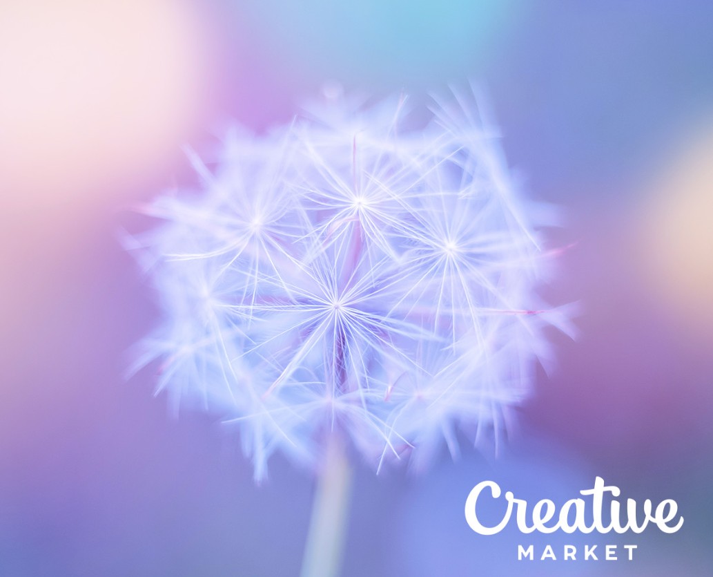
Pastel colors are becoming the preferred choice of modern designers. The soft, delicate characteristics and flexible color combinations of pastels bring a sense of relaxation and minimalist style to any design.
In today’s colorful and creative design world, each color is not simply an aesthetic choice but also a tool to convey emotions, lifestyles and brand messages. Perhaps you have realized that soft colors such as pink, mint green or pale yellow are becoming the “stars” in many design products – from website interfaces to brand identities and even interiors. So, what makes pastel colors so special and increasingly popular? Let’s explore with SaDesign through the article below!
1. What are pastel colors?
First, let's learn about the concept of pastel colors. By definition, pastel colors are light colors created by adding a large amount of white to the base color. The result is soft, delicate and close shades, creating a gentle, relaxing feeling for the viewer's eyes.
The pastel color system is widely used in life. You can see them in design publications, houses, furniture, and everyday items. This color group is basically divided into two parts:
Warm colors: Made up of colors such as red, orange, yellow, etc. but lighter than the original color. Warm pastel colors create a warm but gentle feeling and are not harsh.
Cool colors: Color groups such as mint green, lavender purple, etc. Cool pastel colors bring a cool, pleasant and very fresh feeling. Users will feel happy when looking at them.
.png)
2. Reasons why pastel colors are popular
According to Master Media's observation, pastel colors are increasingly used in daily life. There are many reasons for this, but mainly come from the following 4 reasons.
2.1. Feeling comfortable
When users feel very frustrated and tired when looking at traditional color tones, pastel colors were born to solve this problem. Users will feel lighter because this is a group of colors with low tones. If used to design houses, it will create a youthful, dynamic feeling.
However, if you want your publication or home to have a highlight, try adding some other colors to highlight it. Because using only pastel colors will lack clarity.
2.2. Create gentleness
Another reason why pa.png) stel colors are popular is because they evoke a sense of softness and gentleness. This is especially suitable for fashion works. They make the outfit look more airy, deep and attractive.
stel colors are popular is because they evoke a sense of softness and gentleness. This is especially suitable for fashion works. They make the outfit look more airy, deep and attractive.
Especially in today's fashion, gentleness and femininity are favored by many people. In Vietnamese culture and many Eastern countries, girls with feminine appearance are also favored. This is also a factor that strongly affects the popularity of pastel colors when applied to life.
2.3. Create harmony
Another advantage of pastel colors is that they can create harmony easily. They help users easily connect other colors together. Conflicts between color groups will be minimized.
2.4. High applicability
Using pastel colors is also highly appreciated because of its easy application. You can use them for media publications, interiors, fashion, household items, etc. Users also welcome the products very much, so pastel colors are on the rise.
.png)
3. Some beautiful and popular pastel color palettes
If you are a designer but are wondering which pastel color palette to choose, you can refer to the suggestions below. Master Media finds that these are highly applicable color sets, easy to use for many different purposes.
3.1. Red – orange and blue tones
If you want to balance between cool and warm tones, you can choose the red - orange - blue color scheme. It can be said that this color scheme is quite trendy, highlighting the subject well. This scheme is often used for publications related to food, stimulating appetite and urging customers.
.png)
3.2. Pink and blue tones
For a pastel color palette with good contrast, choose pink and blue. When used, you will easily highlight the desired product. The two tones of pink and blue also create a gentle and non-confusing look for the viewer. Therefore, this pastel color set is commonly used in many design publications.
.png)
3.3. Yellow-green tones
Another pastel color palette suggestion you can refer to is yellow - blue. Yellow often brings a warm feeling. When combined with a soft blue, it will have a better neutral feeling. This color set is often used in residential spaces with the main color being yellow, mixed with blue.
.png)
Pastel colors are not only a temporary trend but also a symbol of sophistication, gentleness and modernity in design. With the ability to bring a sense of relaxation, suitable for minimalist style and easy to coordinate with many other elements, pastel has affirmed its position in the hearts of designers and consumers. If you intend to create a design that is modern but still exudes elegance and friendliness, consider using pastel colors as a creative choice.


VIP Products


Best Selling Products
Capcut Pro 1 Year
39 USD
ChatGPT Plus Account (GPT-4)
16 USD
Genuine Cheap Canva Pro
39 USD
Autodesk All App Account Copyright
120 USD
Adobe Premiere Pro Account
99 USD
Upgrade genuine Capture One account
120 USD
Adobe Photoshop Copyright - Full App
120 USD
Upgrade Genuine Office 365
49 USD
MidJourney Account
29 USD
Plugin Retouch4me
69 USD
Windows 10 & 11 Pro Key
36 USD
Freepik Premium Account
59 USD
Copyright Adobe Lightroom Account
59 USD
Genuine Adobe Illustrator account
99 USD
Upgrade Duolingo Super
29 USD