Best Selling Products

Genuine Cheap Canva Pro
39 USD

Copyright Adobe Lightroom Account
59 USD

ChatGPT Plus Account (GPT-4)
16 USD

Upgrade Genuine Office 365
49 USD

Plugin Retouch4me
69 USD

Genuine Adobe Illustrator account
99 USD

Adobe Premiere Pro Account
99 USD

Adobe Photoshop Copyright - Full App
120 USD

Autodesk All App Account Copyright
120 USD

Upgrade genuine Capture One account
120 USD

Capcut Pro 1 Year
39 USD

MidJourney Account
29 USD

Upgrade Duolingo Super
29 USD

Windows 10 & 11 Pro Key
36 USD

Freepik Premium Account
59 USD
10 Typographic Nightmares That No Designer Wants to Encounter
Nội dung
- 1. Information about Typo
- 2. List of 10 Typographic Nightmares That No Designer Wants to Encounter
- 2.1. Simple Spelling Errors
- 2.2. Wrong Font Selection
- 2.3. Incorrect Kerning
- 2.4. Using Too Many Fonts
- 2.5. Not Using the Correct Font Size
- 2.6. Font Too Heavy for Content
- 2.7. Using Inappropriate Colors
- 2.8. Line Spacing Error
- 2.9. Too Much Bold Text
- 2.10. Lack of Pre-Completion Inspection
- 3. How to Identify and Handle Typo Errors in Design
- 3.1. Using the Spell Checker
- 3.2. Check Fonts Carefully
- 3.3. Maintain Consistency in Design
- 4. Tips to Prevent Typo Errors in Design
- 4.1. Periodic Work Checks
- 4.2. Pay Attention to Spelling Rules
- 4.3. Regularly Update Knowledge
- 5. Conclusion
Typos in graphic design can ruin an entire creative product. This article will list 10 dangerous typographical mistakes that any designer should avoid.
Typography is always a big nightmare for designers. A simple mistake in the text can completely ruin the impression of a design. In this article, Sadesign will explore common typographical errors that designers often encounter, as well as how to handle and prevent them. If you are a designer, this article will be a useful resource to help you improve the quality of your work.
1. Information about Typo
Typos are a problem that every designer has encountered at least once in their career. Typos may be small mistakes but they have a big impact on the brand image and professionalism of the design. In graphic design, the accuracy of font usage, kerning, or even choosing the wrong font can be a factor that ruins a product.
.jpg)
Typographical errors are not just a matter of spelling, but also of the interaction between text and the reader. A typographical error can make the viewer feel uncomfortable, distract from the main message of the design, or even create a bad impression of the brand. Therefore, it is extremely important for any graphic designer to recognize and avoid typographical errors.
2. List of 10 Typographic Nightmares That No Designer Wants to Encounter
Here we would like to update 10 Typo Nightmares That No Designer Wants to Encounter for your reference and sharing:
2.1. Simple Spelling Errors
While it may seem like a “harmless” mistake, a typo in a design can have serious consequences. A misspelled word can reduce brand credibility and attract unnecessary attention.
This mistake is easy to make, especially when you're working under time pressure. However, again, thorough testing is extremely important before completing any project.
2.2. Wrong Font Selection
Choosing the wrong font is one of the most common mistakes in design. A font that is too distracting or hard to read can cause your audience to immediately dismiss your message. Choosing the wrong font can affect the professionalism of your product and detract from the aesthetic appeal of your design.
.jpg)
To avoid this mistake, make sure that the font you choose is not only easy to read but also appropriate for the message you want to convey.
2.3. Incorrect Kerning
erning is the spacing between letters in a word. Without proper kerning, letters can be too close together or too far apart, causing imbalance and reducing the readability of the text. A professional designer must always pay attention to this spacing to ensure that the text is clear and easy to read.
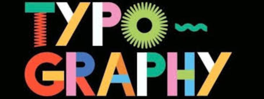
2.4. Using Too Many Fonts
Using too many fonts in a design can make the product look confusing and inconsistent. Try to use one or two main fonts throughout the entire design to create harmony and unity.
Some new designers may feel the need to experiment with different fonts, but this is a habit that can lead to confusion and unprofessionalism.
2.5. Not Using the Correct Font Size
Font size is an important factor in how readable your text is. If you choose a font that is too small or too large, it can be frustrating or difficult for your readers to follow. Using the right size for each piece of text will make your product easier to read and more appealing to your audience.
2.6. Font Too Heavy for Content
Some fonts can be too heavy and take up too much attention, detracting from the effectiveness of the content. Especially when you are designing for brands or products that require sophistication, choosing a font that is too “strong” can create a sense of instability in the overall design.
.jpg)
Always consider your communication goals before choosing a font to ensure you get a harmonious result.
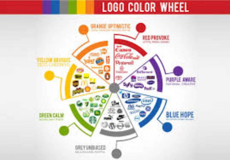
2.7. Using Inappropriate Colors
Colors and fonts should work together to create a pleasant reading experience. Using colors that do not match the font can reduce the clarity of the text and make the reader feel uncomfortable.
In particular, avoid combining colors with too high or too low contrast. A beautiful design requires sophistication and harmony in the use of colors.
2.8. Line Spacing Error
Line spacing is important in design. If the spacing is too tight, the text can become difficult to read and cause eye strain. Conversely, if the spacing is too wide, it can make the text disjointed and less aesthetically pleasing.
Designers must ensure line spacing matches the font and text size to create comfort for the reader's eyes.
2.9. Too Much Bold Text
While bold text can help make content stand out, using too much bold text can make a design look unbalanced and distract the reader. This can reduce the effectiveness of your message.
A good designer will know when to use bold text to create emphasis without disrupting the overall harmony of the design.
2.10. Lack of Pre-Completion Inspection
The final typo you can make is failing to thoroughly review your design before handing it off to your client. A small typo can easily be overlooked when you don’t take the time to review your work after it’s finished. This can sometimes be damaging to your reputation or the business you’re working with.
Always take the time to double check every little detail, from font, size, to spelling mistakes, to ensure the product is perfect.
3. How to Identify and Handle Typo Errors in Design
Although typo errors can appear at any time, with simple methods and supporting tools, you can completely identify and handle them effectively.
3.1. Using the Spell Checker
One of the easiest and most effective ways to detect typos is to use online spell checkers. These tools help you identify errors in your text quickly and accurately.
Tools like Grammarly, Hemingway Editor, or even the built-in spell checker in Microsoft Word can help you catch basic spelling errors. Even with an automated tool, you should still proofread your text to check for grammar and word meanings.
3.2. Check Fonts Carefully
To avoid font errors, you need to pay attention to the following factors:
Choose the right font for the intended use : Fonts can convey part of the message of a design. If used inappropriately, it can make the viewer feel disconnected from the content.
Check the legibility of the text when zooming in or out : Make sure the font is still legible and doesn't distort when you change the size.
3.3. Maintain Consistency in Design
One of the most important elements of design is consistency. This doesn’t just involve the use of color or images, but also includes maintaining consistency in fonts and text sizes.
Choose a primary font : You should choose a primary font and keep all text in the design consistent with this font.
Check the spacing between letters and lines : The spacing should be appropriate to ensure that the viewer does not feel confused when reading the text.
4. Tips to Prevent Typo Errors in Design
.jpg)
Don't just rely on tools to detect and fix errors, you should also apply some tips to prevent typos in the first place.
4.1. Periodic Work Checks
After each design stage, you should take the time to proofread all of your copy. This is an important step to ensure that there are no typos left behind. If possible, have someone else look over your work to make sure you haven’t missed any mistakes.
4.2. Pay Attention to Spelling Rules
Understanding spelling and grammar rules will help you avoid making mistakes in your writing. This is important, especially when working with complex or rule-heavy languages like Vietnamese.
4.3. Regularly Update Knowledge
Design is a constantly changing field, so it’s important to stay up to date on new trends, fonts, and design tools. By staying on top of changes in the industry, you’ll reduce the chances of making common mistakes.
Text Typography Sadesign - 01
5. Conclusion
Typography is a problem that cannot be ignored in graphic design. Although these errors may seem small at times, they can have major consequences for the quality of the design and the brand image. As a professional designer, you need to master the basic principles of fonts, spacing, colors, and always check your work carefully to avoid making regrettable typographical errors. Only when you have good control over these elements can your design products truly convey the message clearly, aesthetically and professionally.


VIP Products


Best Selling Products
Genuine Cheap Canva Pro
39 USD
Copyright Adobe Lightroom Account
59 USD
ChatGPT Plus Account (GPT-4)
16 USD
Upgrade Genuine Office 365
49 USD
Plugin Retouch4me
69 USD
Genuine Adobe Illustrator account
99 USD
Adobe Premiere Pro Account
99 USD
Adobe Photoshop Copyright - Full App
120 USD
Autodesk All App Account Copyright
120 USD
Upgrade genuine Capture One account
120 USD
Capcut Pro 1 Year
39 USD
MidJourney Account
29 USD
Upgrade Duolingo Super
29 USD
Windows 10 & 11 Pro Key
36 USD
Freepik Premium Account
59 USD