Best Selling Products

Adobe Premiere Pro Account
99 USD

Upgrade genuine Capture One account
120 USD

ChatGPT Plus Account (GPT-4)
16 USD

Windows 10 & 11 Pro Key
36 USD

Genuine Adobe Illustrator account
99 USD

Genuine Cheap Canva Pro
39 USD

Autodesk All App Account Copyright
120 USD

Plugin Retouch4me
69 USD

Copyright Adobe Lightroom Account
59 USD

Freepik Premium Account
59 USD

Upgrade Duolingo Super
29 USD

Upgrade Genuine Office 365
49 USD

Capcut Pro 1 Year
39 USD

Adobe Photoshop Copyright - Full App
120 USD

MidJourney Account
29 USD
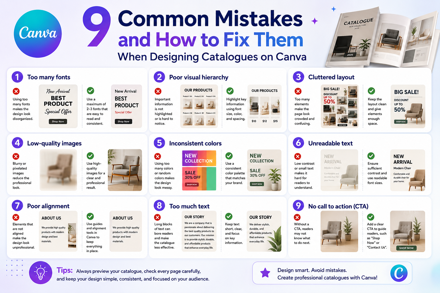
9 Common Mistakes and How to Fix Them When Designing Catalogues on Canva
Nội dung
- 1. Common mistakes and solutions when designing a catalog.
- 1.1. Designing a catalog without clearly defining its intended use.
- 1.2. Lack of clearly defined objectives
- 1.3. Ignoring the brand factor
- 1.4. Using too much text
- 1.5. Using too many fonts, lack of consistency.
- 1.6. Failure to adhere to color rules, causing visual clutter for the viewer.
- 1.7. Lack of white space makes the layout feel cramped.
- 1.8. Using low-quality images
- 1.9. Designing a catalog but forgetting to optimize it for printing.
- 2. Principles to remember when designing product catalogs on Canva
- 2.1. Focus on the reader's experience
- 2.2. Ensure consistency throughout the entire catalog.
- 2.3. Include a clear Call to Action (CTA) at the end of the catalog.
- 3. Conclusion
A catalog is not only the visual face of a product, but also a bridge that helps customers understand the brand's value.
1. Common mistakes and solutions when designing a catalog.
1.1. Designing a catalog without clearly defining its intended use.
Before you begin designing a catalog, the most important thing is to clearly understand the purpose of this document. A catalog is not just a place to list products or services; it's also a tool to convey a message, showcase the brand's style and values, and create a first impression on customers. Without a defined purpose, the design can easily become rambling, with disjointed information and an illogical layout.
Common mistake: Many Canva users rush to choose a template and start designing without first defining their goals. The result is a cluttered, inconsistent catalog that is difficult for viewers to grasp and reduces the effectiveness of the document's communication.
Solution: Before launching Canva, create a detailed brief, defining your goals, target audience, and the main message you want to convey. Canva offers many catalog templates suitable for various purposes, from sales and new product launches to brand promotion. Choosing a template and planning ahead will save you time, allow for a logical layout, and create a catalog that is both visually appealing and effective.

1.2. Lack of clearly defined objectives
A catalog is not just a collection of product images and information; it's also a visual marketing tool that helps customers understand the value of the product and brand. Without a clearly defined objective, the pages of a catalog may contain disorganized images, irrelevant information, or a weak main message, making it difficult for viewers to grasp the content.
Common mistake: Many designers start creating catalogs without a clear strategy. The result is disjointed information, illogical layout, and a catalog that fails to effectively convey the desired message.
Solution: Before designing, create a detailed plan and define specific goals: do you want to introduce a new product, enhance brand awareness, or attract potential customers? Ensure that every page and every detail in the catalog serves that goal. When the message, images, colors, and layout are consistent, the catalog will become professional, easy to understand, and make a strong impression on customers.
1.3. Ignoring the brand factor
One common mistake when designing a catalog is neglecting the branding element. A catalog is not just a product introduction document; it's also a visual representation of the company's image and style. Ignoring this element can lead to a lack of consistency, making it difficult for customers to recognize the brand and diminishing its professionalism in the eyes of the viewer.
Common mistakes: Many catalog designs are inconsistent with the brand identity, for example, using inconsistent logos, mismatched colors and fonts, or images that lack the brand's unique style. As a result, the catalog looks disjointed and fails to make a strong impression on customers.
Solution: Before designing, ensure you have a complete brand identity, including your logo, main colors, fonts, and visual style. Canva offers many easily editable catalog templates, allowing you to synchronize your brand's colors and fonts. When all brand elements are consistent throughout the catalog, the product will not only be visually appealing but also create a strong impression, enhancing brand recognition and the professionalism of your business.

1.4. Using too much text
Another common mistake is cramming too much text onto each catalog page. While complete information is essential, excessive verbosity can overwhelm the viewer, diminish their interest, and make it difficult to grasp important information.
Common mistake: Catalogue design often includes too many product descriptions and details, resulting in a cluttered and unappealing layout. Readers may overlook important information or lose patience when reading the entire catalogue.
Solution: Condense the information, highlighting only the key features and advantages of the product. Instead of using too much text, you can combine images, charts, and comparison tables to visually illustrate the information. Canva supports creating charts, tables, and attractive graphic elements, making the catalog both informative and easy to read and understand, while also creating an enjoyable experience for the viewer.
1.5. Using too many fonts, lack of consistency.
Designing a catalog on Canva gives you the ability to choose from hundreds of different fonts, but this is also a double-edged sword. Using too many fonts in the same design will make the catalog look cluttered, unprofessional, and make it difficult to highlight important content. A design lacking font consistency also reduces overall aesthetic value and is unpleasant for the reader.
Common mistake: Many people like to experiment with different fonts to create a unique look, leading to inconsistencies in titles, content, and supplementary details, making the catalog look unprofessional and difficult to follow.
Solution: Choose a maximum of 2–3 fonts for the entire catalog: one for the title, one for the main body, and, if needed, a third font for accents. Canva also allows you to save your brand font set; take advantage of this feature to ensure consistent font usage throughout the catalog, creating a professional and accessible feel for readers.

1.6. Failure to adhere to color rules, causing visual clutter for the viewer.
Color is a crucial element in determining the overall feel of a catalog. Inappropriate color combinations will make the catalog look garish, cluttered, and fail to highlight the products. Choosing colors haphazardly without adhering to brand identity will diminish aesthetic value and make it difficult for viewers to focus on important information.
Common mistake: Many novice designers often mix colors haphazardly, using too many dominant colors, resulting in catalogs that lack harmony and focal points. This makes it difficult for customers to grasp the content and reduces the effectiveness of the message.
Solution: Choose a color palette that aligns with your brand identity, prioritizing a maximum of 3–4 main colors. The colors for the title, background, and secondary details should be consistent and complementary to highlight the product. Canva provides tools for creating color palettes and color combinations automatically; you can utilize this to build a harmonious and professional catalog that makes it easy for viewers to understand the information.
1.7. Lack of white space makes the layout feel cramped.
Another common mistake when designing catalogs is having an overly cramped layout, leaving insufficient whitespace between elements. Whitespace not only makes the design look more spacious but also highlights important products and messages, while creating a readable and professional feel. A lack of whitespace will make the catalog look cluttered, overwhelming, and difficult to highlight key points.
Common mistake: Many designers try to maximize page space, cramming in images, text, and decorative details, resulting in a cluttered layout that makes it difficult for viewers to focus on the product or the main message.
Solution: Use grid layouts and element alignment tools in Canva to arrange whitespace appropriately. Actively leave some areas blank if it helps viewers easily absorb the information. Whitespace not only creates balance but also highlights important elements, making the catalog more professional and appealing.
1.8. Using low-quality images
Catalogues are visual documents, so image quality plays a crucial role in making a good impression on customers. Using blurry, pixelated, or inconsistently lit and toned images will make the catalogue look unprofessional, damage brand credibility, and fail to attract viewers.
Common mistake: Many people, when designing catalogs, simply upload photos they already have on their phones or the internet without checking their quality. This results in blurry images, inconsistent colors, reduces the overall value of the catalog, and makes it difficult to make a strong impression on customers.
Solution: Use high-quality images, at least 150 DPI, and maintain consistency in style, lighting, and color tone. If you don't have your own images, you can find free stock photos in Canva or from reputable sources like Pexels or Unsplash. When images are sharp and consistent, the catalog will look professional, easy to read, and create a sense of trust for customers.

1.9. Designing a catalog but forgetting to optimize it for printing.
A common mistake is focusing only on the beautiful catalog on the screen and forgetting that catalogs are usually printed. If not designed with standard print sizes (A4, A5), without safe margins, or if the file is exported at a low resolution, problems can easily occur during printing, resulting in cropped text, blurry images, or a misaligned layout.
Common mistake: Many designers only test catalogs on screen without checking paper size, safe margins, or standard print color settings. As a result, the printed catalog doesn't match the screen design, wasting time and money.
Solution: Before starting the design, choose the correct standard paper size for printing. When exporting the file, select "PDF Print" mode with high resolution and use CMYK color mode if available. This ensures that the printed catalog is sharp, correctly laid out, and maintains the quality of the design, helping you create a professional impression on your clients.
2. Principles to remember when designing product catalogs on Canva
2.1. Focus on the reader's experience
A beautiful catalog doesn't necessarily mean it's effective. The most important thing when designing is ensuring that readers can easily access and understand the information you want to convey. Information should be divided into small sections, with clear headings and arranged in a logical order, helping customers quickly grasp the products, services, or offers.
The images used in the catalog need to be carefully selected, appropriate to the content, and consistent in style, lighting, and color tone. Canva offers a wide range of tools and templates to help you create visually appealing layouts, from charts and comparison tables to prominent information blocks. By focusing on the reader's experience, the catalog not only attracts attention but also effectively conveys the message, making customers feel comfortable, remember it easily, and develop a positive impression of the brand.
2.2. Ensure consistency throughout the entire catalog.
Consistency is key to creating a professional impression in a catalog. Each page should adhere to the same style: font, colors, logo placement, image style, and layout must be consistent from beginning to end.
When these elements harmonize, customers will easily recognize the brand and perceive the business's professionalism. Canva allows you to save your brand identity and apply it consistently throughout the entire catalog, from titles and captions to decorative details. Maintaining consistency not only makes the catalog look appealing but also enhances brand value, making it easier for customers to remember and trust the product, thereby increasing interaction and conversion rates.

2.3. Include a clear Call to Action (CTA) at the end of the catalog.
No matter how beautifully designed a catalog is, the ultimate goal is to guide customers to take action. Call-to-action (CTAs) such as "Buy Now," "Visit Website," and "Sign Up for a Consultation" need to be placed strategically, easily visible, but without cluttering the layout.
A clear call to action (CTA) will help customers know exactly what to do next, while increasing conversion rates from catalogs to orders or contact. Canva offers many button and highlight block templates to help you easily design CTAs that harmonize with the overall design while still attracting attention. When combined correctly, CTAs transform a catalog from a mere reference document into a powerful marketing tool, prompting immediate customer action.
3. Conclusion
Designing a catalog on Canva may seem simple, but it requires attention to detail: from color and images to layout and fonts. Identifying and correcting common mistakes will help create a professional catalog that clearly conveys the message and enhances brand value. By mastering these principles, you will not only create a visually appealing product but also build a lasting impression on customers, transforming the catalog into an effective and reliable marketing tool.


VIP Products


Best Selling Products
Adobe Premiere Pro Account
99 USD
Upgrade genuine Capture One account
120 USD
ChatGPT Plus Account (GPT-4)
16 USD
Windows 10 & 11 Pro Key
36 USD
Genuine Adobe Illustrator account
99 USD
Genuine Cheap Canva Pro
39 USD
Autodesk All App Account Copyright
120 USD
Plugin Retouch4me
69 USD
Copyright Adobe Lightroom Account
59 USD
Freepik Premium Account
59 USD
Upgrade Duolingo Super
29 USD
Upgrade Genuine Office 365
49 USD
Capcut Pro 1 Year
39 USD
Adobe Photoshop Copyright - Full App
120 USD
MidJourney Account
29 USD