Best Selling Products

Plugin Retouch4me
69 USD

MidJourney Account
29 USD

Copyright Adobe Lightroom Account
59 USD

Autodesk All App Account Copyright
120 USD

Windows 10 & 11 Pro Key
36 USD

Genuine Cheap Canva Pro
39 USD

Upgrade Duolingo Super
29 USD

Genuine Adobe Illustrator account
99 USD

ChatGPT Plus Account (GPT-4)
16 USD

Capcut Pro 1 Year
39 USD

Adobe Photoshop Copyright - Full App
120 USD

Freepik Premium Account
59 USD

Upgrade genuine Capture One account
120 USD

Upgrade Genuine Office 365
49 USD

Adobe Premiere Pro Account
99 USD
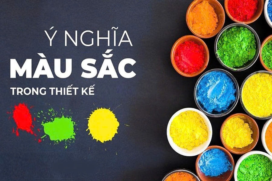
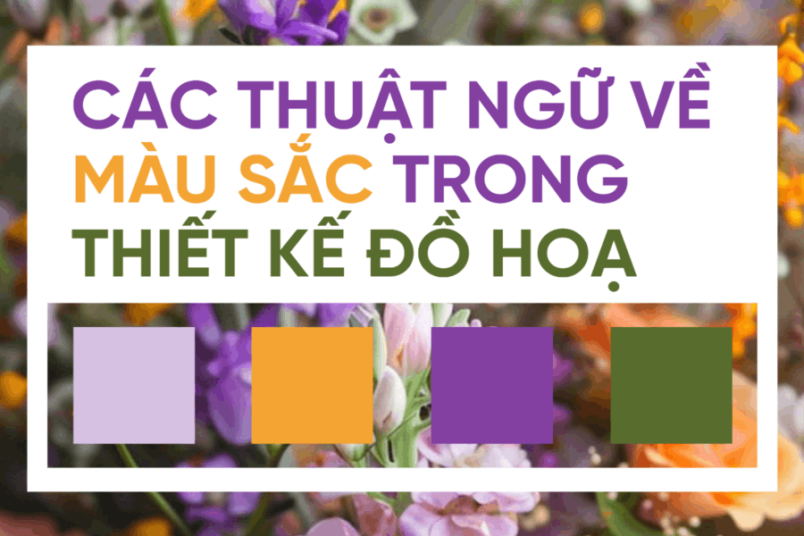
A Handbook of Color Terminology in Graphic Design
Nội dung
- 1. Color Terminology in Graphic Design
- 1.1. Primary Colors
- 1.2. Secondary Colors
- 1.3. Tertiary Colors
- 1.4. Warm and Cool Colors
- 1.5. Complementary Colors
- 1.6. Analogous Colors
- 1.7. Monochromatic Colors
- 1.8. Neutral Colors
- 1.9. Color Saturation
- 1.10. Brightness and Value
- 1.11. RGB and CMYK Color Systems
- 2. Notes on Using Color in Graphic Design
This comprehensive resource helps you master the language of color in design, suitable for learning, teaching, and direct application to real-world projects.
In reality, many designers, especially beginners, often use color intuitively. They choose colors because they "look good" or "please the eye," without truly understanding the nature of colors, the relationships between them, and their psychological impact on viewers. This is why many design products lack depth, consistency, and lasting impact.
To master color in graphic design, a thorough understanding of basic and advanced color terminology is essential. These terms not only help designers communicate more accurately with colleagues, clients, and production teams, but also form the foundation for developing a systematic, scientific, and strategic approach to color theory.
This article will help you understand color terminology in graphic design from A to Z , thoroughly explaining the meaning, application, and role of each concept in practice. Whether you are a design beginner or a seasoned professional, systematizing your color knowledge will always bring practical value to your creative process.
Buy Genuine Licensed Software at Affordable Prices
1. Color Terminology in Graphic Design
1.1. Primary Colors
Primary colors are the foundation of the entire color system in graphic design. These are colors that cannot be created by mixing other colors; on the contrary, they are the "raw materials" from which all other colors are made.
In graphic design, the concept of primary colors is often understood in terms of two main color systems. With the RGB (Rich Color) system, the three primary colors are red, green, and blue. Meanwhile, with the CMYK (Cyan, Magenta, and Yellow) printing system, the primary colors include cyan, magenta, and yellow. This difference stems from the working principles of light and ink.
Understanding basic colors helps designers better control the color mixing process and avoid errors when transferring designs from digital to print. This is fundamental knowledge, but it has a significant impact on the quality of the final product.
.jpg)
1.2. Secondary Colors
Secondary colors are created by mixing two primary colors in equal proportions. They act as a bridge between the primary colors, making the color palette richer and more versatile.
In traditional color systems, the combination of red and yellow creates orange, yellow and blue creates green, and red and blue create purple. These colors appear very frequently in design because they are both striking and easy to combine with other colors.
For designers, secondary colors are an important tool for creating emphasis without being as "harsh" as primary colors. They offer a more harmonious feel, especially when used in branding, posters, or digital interfaces.
1.3. Tertiary Colors
Tertiary colors are the result of mixing a primary color with a secondary color next to it on the color wheel. These are intermediate colors that facilitate a smooth transition between different color ranges.
Colors such as red-orange, yellow-orange, yellow-green, blue, blue-violet, or red-violet are often classified as tertiary colors. They bring a sense of sophistication and depth to designs, and are particularly suitable for products that require softness and emotional richness.
In practice, three-tiered color schemes are often used to create complex color palettes, avoiding monotony and giving the overall design a more professional feel.
1.4. Warm and Cool Colors
Warm and cool colors are a classification of colors based on the psychological feelings they evoke in viewers. This concept is extremely important in influencing user emotions and behavior.
.jpg)
Warm colors typically include shades of red, orange, and yellow. They evoke feelings of warmth, dynamism, and vibrancy, and are often used to attract attention. In marketing and advertising, warm colors often appear in calls to action or key messages.
Conversely, cool colors like blue, green, and purple convey a sense of calm, professionalism, and trustworthiness. These color palettes are very popular in brand design, especially in the technology, finance, and healthcare sectors.
Balancing warm and cool colors helps create a design that is both visually striking and pleasing to the viewer.
1.5. Complementary Colors
Contrasting colors are pairs of colors that are opposite each other on the color wheel. When placed next to each other, they create a strong visual impact and immediately attract attention.
Combinations of red and green, blue and orange, and yellow and purple are typical examples of contrasting colors. In graphic design, contrasting colors are often used to create emphasis, highlight important information, or separate elements in a layout.
However, using too many contrasting colors without proper control can make a design visually cluttered and unpleasant. Therefore, designers need to clearly understand the purpose of using contrasting colors to effectively harness their power.
.jpg)
1.6. Analogous Colors
Analogous colors are colors that are next to each other on the color wheel. They have a close relationship, creating a sense of harmony and unity.
Analogous color palettes often create a pleasant, natural feel and are well-suited to aesthetically pleasing designs such as fashion, cosmetics, or lifestyle. Using analogous colors makes designs look smoother and minimizes visual conflict.
In practice, many designers choose a similar color as a background, then combine it with a slightly contrasting color to create a focal point.
.jpg)
1.7. Monochromatic Colors
Monochromatic color is a method of using a single color but varying its brightness, darkness, or saturation to create many different variations. This is a minimalist yet highly effective color scheme.
Monochromatic designs often create a sophisticated, modern feel and offer visual control. In high-end branding or user interface design, monochromatic colors enhance consistency and reduce information clutter.
However, to prevent monochrome designs from becoming boring, designers need to understand how to adjust the hue and contrast within the same color palette.
.jpg)
1.8. Neutral Colors
Neutral colors include shades such as white, black, gray, beige, and brown. This group of colors serves as a background, balancing and supporting the primary colors in a design.
Neutral colors make designs more visually appealing, professional, and sophisticated. In many cases, they are the deciding factor in the elegance and refinement of a product design.
For designers, using neutral colors effectively requires subtlety, because even a slight change in shade can create a completely different feeling.
.jpg)
1.9. Color Saturation
Color saturation refers to the intensity or "vibrancy" of a color. Highly saturated colors are usually bright and striking, while less saturated colors are more subdued and softer.
In design, adjusting saturation helps control the emotional impact and appeal of colors. Oversaturated colors can cause eye strain, while colors that are too pale may lack impact.
Using appropriate saturation levels helps designs achieve a balance between aesthetics and effective message delivery.
.jpg)
1.10. Brightness and Value
Lightness and darkness reflect the degree of brightness or darkness of a color. This is an important factor in creating depth, visual hierarchy, and ensuring readability.
In graphic design, brightness and contrast directly affect the visibility of content, especially text and icons. A beautiful color palette that lacks contrast in brightness can make it difficult for viewers to absorb information.
1.11. RGB and CMYK Color Systems
RGB and CMYK are the two most important color systems in graphic design. RGB is based on light and is used for digital displays such as websites, applications, and videos. CMYK is based on ink and is used for printed products.
Understanding the differences between the two color systems helps designers avoid color discrepancies when transferring designs from digital to print. This is essential knowledge for anyone working seriously in the design industry.
2. Notes on Using Color in Graphic Design
Understanding color terminology is not enough if designers don't know how to apply it in practice. Colors need to be used strategically, in accordance with design goals, target audience, and context.
One common mistake is using too many colors in a single design, making the overall look cluttered and lacking focus. Additionally, neglecting readability, accessibility, and brand consistency is also a frequent issue.
Color doesn't exist in isolation; it's always intertwined with content, composition, and message. A good designer knows how to moderate their use, choose the right colors, and employ them as an effective storytelling tool.
.jpg)
In the digital age, designers have many tools to help them work with color more accurately and efficiently. Tools for creating color palettes, checking contrast, converting color systems, or simulating print colors help minimize risks and save time.
Combining color knowledge with the right tools will help designers improve the quality of their designs and work more professionally in a real-world environment.
Color is fundamental to graphic design, and understanding color terminology is the first step to mastering this visual language. From primary colors and contrasting colors to the RGB and CMYK color systems, each concept plays a crucial role in the creative process.
A professional designer not only knows how to "choose beautiful colors," but also understands why those colors are appropriate, how they impact the viewer, and what goals they serve in the design. When you master color from A to Z, design is no longer subjective, but becomes a strategic, in-depth process with lasting value.


VIP Products


Best Selling Products
Plugin Retouch4me
69 USD
MidJourney Account
29 USD
Copyright Adobe Lightroom Account
59 USD
Autodesk All App Account Copyright
120 USD
Windows 10 & 11 Pro Key
36 USD
Genuine Cheap Canva Pro
39 USD
Upgrade Duolingo Super
29 USD
Genuine Adobe Illustrator account
99 USD
ChatGPT Plus Account (GPT-4)
16 USD
Capcut Pro 1 Year
39 USD
Adobe Photoshop Copyright - Full App
120 USD
Freepik Premium Account
59 USD
Upgrade genuine Capture One account
120 USD
Upgrade Genuine Office 365
49 USD
Adobe Premiere Pro Account
99 USD