Best Selling Products

Windows 10 & 11 Pro Key
36 USD

MidJourney Account
29 USD

Capcut Pro 1 Year
39 USD

ChatGPT Plus Account (GPT-4)
16 USD

Upgrade Duolingo Super
29 USD

Adobe Premiere Pro Account
99 USD

Upgrade genuine Capture One account
120 USD

Genuine Cheap Canva Pro
39 USD

Adobe Photoshop Copyright - Full App
120 USD

Plugin Retouch4me
69 USD

Upgrade Genuine Office 365
49 USD

Freepik Premium Account
59 USD

Genuine Adobe Illustrator account
99 USD

Copyright Adobe Lightroom Account
59 USD

Autodesk All App Account Copyright
120 USD
Beautiful Web Design Is Not Difficult: Apply These Typography Tips Immediately
Nội dung
- 1. Basic Principles of Typography
- 1.1. Choose a font that suits your brand
- 1.2. Differences between font groups
- 1.3. Less is more
- 2. Typography tips in web design
- 2.1. Use fewer fonts
- 2.2. Use standard fonts
- 2.3. Length limit
- 2.4. Choose impressive Typography style
- 2.5. Avoid using fonts that can cause confusion
- 3. Useful tools and resources
Great web design is not just about images or colors, but also about how you arrange and present your content. The following typography tips will help you create a clear layout, keep your readers engaged, and make an impression at first sight.
Typography – the art of arranging words is not simply choosing a beautiful font. It is the “voice” of the brand, the emotional bridge between the content and the reader. When typography is invested in properly, the user experience does not stop at “reading and understanding” but also feels professional, trustworthy and comfortable. However, many designers often ignore or underestimate this factor, leading to unprofessional websites, difficult-to-access content and high bounce rates. The difference between a website with bad typography and a carefully crafted website is sometimes just a few seemingly small details: the spacing between letters, the font weight, or the size unit. In this article, SaDesign will explore with you a system of easy-to-apply typography tips that every designer, whether new or experienced, can “pocket” and implement immediately.
1. Basic Principles of Typography
Before diving into the technical details, we need to grasp three core principles: appropriate fonts, appropriate variety, and limitations to create emphasis.
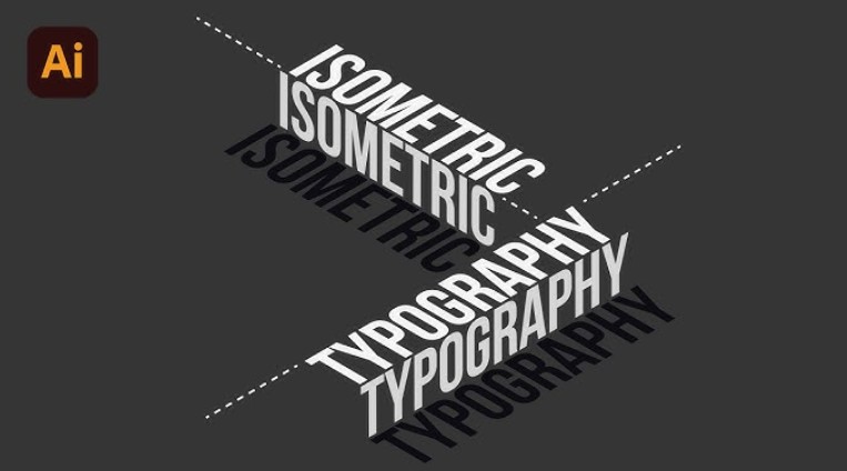
1.1. Choose a font that suits your brand
Each font type (serif, sans-serif, display, monospace) evokes a different feeling. Serif fonts tend to be classic and formal; sans-serif fonts are elegant and modern. Display fonts are good for bold headlines, while monospace is often used for code or technical content. When choosing a font, think about your brand’s personality: serious or youthful, avant-garde or traditional.
.png)
1.2. Differences between font groups
Serif: Times New Roman, Playfair Display – suitable for news blogs, magazines.
Sans-serif: Roboto, Open Sans, Helvetica – preferred for mobile apps and modern websites.
Display: Lobster, Pacifico – used to highlight special titles.
Monospace: Roboto Mono, Courier – for code snippets, technical quotes.
1.3. Less is more
No matter how many fonts you like, limit yourself to 2–3 per page. Too many fonts can make your design look cluttered and disjointed. Typically, one font for your headline, one font for your body copy, and (if needed) a secondary font for buttons or quotes is more than enough.
.png)
2. Typography tips in web design
2.1. Use fewer fonts
In Web design, simplicity and intelligence are always highly appreciated. And to achieve this, the use of Typography also plays an extremely important role. Accordingly, in Web design, you should only choose a maximum of 3 Typography styles. That is because 1 or 2 Fonts will create a monotonous feeling and make it difficult to impress viewers. However, if you use too many Fonts, it will unintentionally create complexity and make it difficult for viewers to distinguish important elements as well as key information that needs attention.
.png)
2.2. Use standard fonts
Nowadays, there are many fonts that are more attractive, eye-catching and impressive than standard fonts. However, using these fonts also has many potential risks such as font errors, font jumps, incorrect formats, etc. Therefore, the effective Typography tip in Web design that you cannot ignore is to use standard fonts. Currently, the safe standard fonts on websites are fonts that are pre-installed by many operating systems and are also updated so that you can freely choose.
.png)
2.3. Length limit
The purpose of design is to help simplify lengthy text. Website design is only truly effective when it does not require too much text but still helps viewers, customers or target audiences understand. To do this, the Designer team needs to coordinate smoothly with the Creative and Content teams to create concise but meaningful content, ideas, Slogans, etc. Therefore, be very selective and use text effectively and selectively to achieve both form and content factors. Accordingly, 30-40 characters per line of text is perfect for Web design.
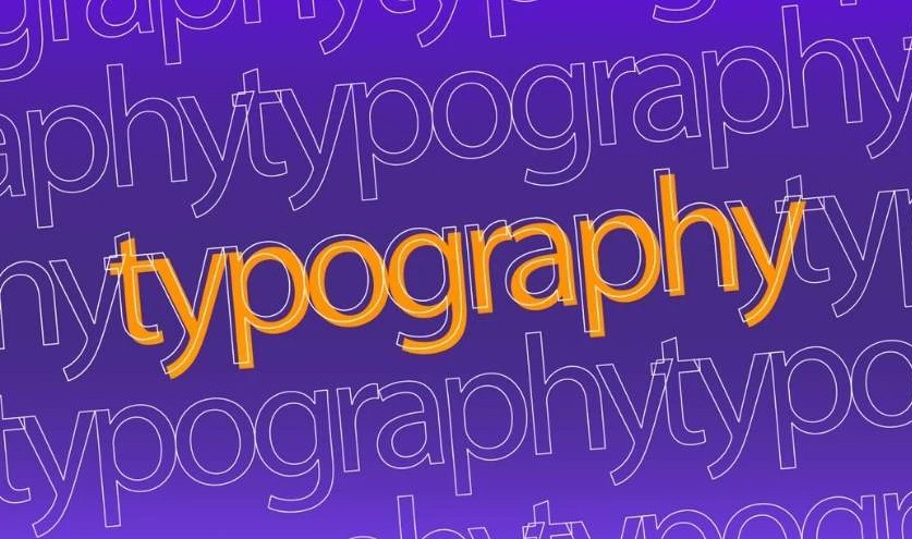
2.4. Choose impressive Typography style
Using 2-3 Typography styles makes the Website more attractive and creates highlights. However, that does not mean that using 1 Typography style is ineffective. However, using 1 Typography style is somewhat risky if you do not pay attention to changing the size, color, shade, etc. flexibly in the design. Not only that, once you decide to use 1 Typography style, pay attention to choosing an impressive Font and having different nuances when changing the lightness, size, etc.
.png)
2.5. Avoid using fonts that can cause confusion
There are many fonts in reality that have letters that can be confusing to viewers. Misunderstandings can be due to similarities in different formats, or creating different letters when placed next to each other, etc. It sounds difficult to imagine but in fact it is not too complicated. You can imagine that there are some fonts that have the uppercase letter "i" exactly like the lowercase letter "l" causing a big misunderstanding or a case that can cause misunderstanding like placing the letters "rn" next to each other to create the letter "m". Therefore, pay attention and test the formats before designing and putting them into actual application.
3. Useful tools and resources
Some websites, plugins and checklists to help you optimize the process:
Tool Name
Application
Google Fonts
Free font library, with Vietnamese subset and fast preload
Adobe Fonts
High quality font set, integrated variable fonts
FontPair
Suggestions for pairing two harmonious fonts
Typewolf
Typography trends on major sites
VSCode Live Server
Test responsiveness on save
Chrome DevTools
“Rendering → Emulate CSS Media” to test contrast, zoom in on lines
Above are all the typography tips from basic to advanced summarized by SaDesign. Typography not only helps your website look beautiful and professional but also improves user experience - the decisive factor in retaining customers and increasing conversion rates.


VIP Products


Best Selling Products
Windows 10 & 11 Pro Key
36 USD
MidJourney Account
29 USD
Capcut Pro 1 Year
39 USD
ChatGPT Plus Account (GPT-4)
16 USD
Upgrade Duolingo Super
29 USD
Adobe Premiere Pro Account
99 USD
Upgrade genuine Capture One account
120 USD
Genuine Cheap Canva Pro
39 USD
Adobe Photoshop Copyright - Full App
120 USD
Plugin Retouch4me
69 USD
Upgrade Genuine Office 365
49 USD
Freepik Premium Account
59 USD
Genuine Adobe Illustrator account
99 USD
Copyright Adobe Lightroom Account
59 USD
Autodesk All App Account Copyright
120 USD