Best Selling Products

ChatGPT Plus Account (GPT-4)
16 USD

Windows 10 & 11 Pro Key
36 USD

Capcut Pro 1 Year
39 USD

Upgrade genuine Capture One account
120 USD

Upgrade Genuine Office 365
49 USD

Adobe Premiere Pro Account
99 USD

Genuine Adobe Illustrator account
99 USD

Plugin Retouch4me
69 USD

MidJourney Account
29 USD

Upgrade Duolingo Super
29 USD

Autodesk All App Account Copyright
120 USD

Genuine Cheap Canva Pro
39 USD

Copyright Adobe Lightroom Account
59 USD

Adobe Photoshop Copyright - Full App
120 USD

Freepik Premium Account
59 USD
Transform 3D Lettering With Isometric Typography In Illustrator
Nội dung
- 1. Prepare tools and resources
- 2. What is Isometric?
- 3. Isometric imaging method
- 3.1. Draw manually with Pen Tool
- 3.2. Automation with Extrude & Bevel
- 3.3. Combining two methods
- 4. How to do Typography in Illustrator Isometric
- 5. Tips & Troubleshooting
- 5.1. Text is blurred and jagged when zoomed in.
- 5.2. Illustrator files are getting heavier and heavier, the computer lags.
- 5.3. Gradient or effect not displaying properly
Discover how to turn flat type into vibrant 3D artwork with Isometric Typography in Illustrator.
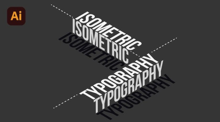
In the modern design world, Isometric or simulated 3D perspective is becoming a popular trend. Deep shapes and letters bring a sense of "floating", attracting the eye and conveying a stronger message than traditional flat Typography. Applying the Isometric style to Typography not only helps you create highlights for posters, banners or artwork but also opens up many creative opportunities: from game art, packaging design to web/app interfaces. So how to do Typography in Illustrator , this article will answer for you.
1. Prepare tools and resources
Before you get started, make sure you have the following tools and resources:
Adobe Illustrator: CC 2019 or later for full 3D features and GPU Preview mode.
Suitable fonts: Prioritize thick sans - serif or slab - serif fonts with clear stroke openings. For example: Montserrat, Bebas Neue, Roboto Slab…
Reference file/Moodboard: Collection of Isometric Typography images or mockups for color and layout inspiration.
Isometric support plugin/script (optional): For example Isometricax, Astute Graphics' VectorScribe, or automatic Shear script.
![]()
2. What is Isometric?
Isometric is a special 3D graphic design method based on actual size and simulated in the appropriate ratio. Because it is a 3D model, the drawing axis in Isometric is also special with 3 coordinate axes and a ruler for easy alignment and implementation. In particular, unlike the angles in the normal coordinate system, the coordinate system in Isometric has angles of 120 degrees. Therefore, although created on a Flat plane, Isometric graphics still create depth and emphasis for the design. However, Isometric is not like the perspective methods of designing and constructing detailed architecture in reality, Isometric focuses on simulating the outer surface of the scene.
3. Isometric imaging method
When it comes to 3D modeling, many people think that this step is complicated and only for those who are professionally trained. However, with Illustrator and some simple techniques, you can completely draw Isometric illustrations yourself – from basic blocks to complex details. Below are two main methods:
![]()
3.1. Draw manually with Pen Tool
3.1.1. Preparing the Isometric Grid
Enable Smart Guides and Snap to Grid (View > Smart Guides; View > Snap to Grid).
Grid settings: go to Preferences > Guides & Grid, set Gridline every = 10 px, Subdivisions = 2.
Rotate mesh 30°: draw a line 30° and use Object > Transform > Rotate to rotate the entire mesh.
3.1.2. Drawing basic edges
Select the Pen Tool (P) and hover over the starting point on the grid.
Hold Shift to Snap to 0°, 30°, 60° angles - ensuring each line segment is exactly aligned to the Isometric axis.
Draw the first edge (for example the top edge of the box).
Continue drawing the remaining two edges, each at a 30° angle to the horizontal edge, forming three faces of the block.
![]()
3.1.3. Surface finishing and assembly
Close the path (click back to the starting point) to complete the plane.
Copy the face you just drew, use Object > Transform > Rotate or Reflect to create symmetrical faces.
Use Pathfinder (Window > Pathfinder) to join the faces together into a complete 3D shape.
3.2. Automation with Extrude & Bevel
If you want to draw quickly and only need basic shapes like boxes, cylinders, or 3D letters, the Effect > 3D > Extrude & Bevel tool will be a great help:
Draw a flat shape (rectangle, ellipse, polygon or pre-made text outline).
Select the object, go to Effect > 3D > Extrude & Bevel.
In the dialog box:
Position: choose an Isometric style (Top, Left or Right).
Extrude Depth: adjusts the “thickness” of the block.
Bevel: choose edge type (Classic, Rounded…) and adjust Height to make the bevel stronger or weaker.
More Options: allows to fine-tune the lighting (Light Intensity, Ambient Light) to make the surface more realistic.
Click Preview to preview, then OK when satisfied.
![]()
3.3. Combining two methods
Basic Frame: Use Extrude & Bevel for quick modeling.
Finalize the details: Expand Appearance (Object > Expand Appearance), then edit each anchor point with the Pen Tool or Direct Selection Tool (A).
Create complex textures: Hand-paint small details (holes, mesh, patterns…) on each expanded surface to add depth and life.
4. How to do Typography in Illustrator Isometric
Similar to creating 3D Isometric illustrations, Typography can also be created in Isometric style in Illustrator. The method is similar but Typography has a noticeable difference in each step. Specifically as follows:
Choose the right font
Before you start designing Typography in Illustrator, you need to choose the right Font. After choosing the right Font, choose the right color, shade and font style. Pay attention to the nature of the design you want to aim for to have the most accurate choice.
![]()
Convert Typography Format
After having a satisfactory Font, you will proceed to the next step by converting Typography format. And the most basic element to start converting Isometric Typography is to convert them to Vector format. To do this step, you can select Object and proceed to expand in Expand.
Isometric Options
After converting the Typography to Vector format, you continue by choosing Isometric. In Illustrator, there are many Isometric Typography for you to choose from. To start, navigate to Effect, Click on 3D and then point to Extro & Bevel. Here, you can freely choose different Isometrics in Position.
Adjust accordingly
After choosing the Isometric style you like, you can perform some basic adjustments to achieve the desired effect. In this step, you can adjust the Typography angle in the corner icons on the right side. These 3 icons correspond to 3 faces in Isometric that you can align to achieve the purpose in the design. Along with that, you can also adjust the Typography depth at Extrude Depth. This is an important step to help the design be impressive and attractive. However, they are only really effective when used in balance and in accordance with the above angle. In the same Tab, you can also continue to adjust the Typography surface to highlight the text nuances.
Complete
After doing the basic steps above, you will finish your work by going to Object and expanding them in Expand Appearance. Don’t forget to colorize the Typography using Unity. Finally, give them the perfect perspective using Eyedropper.
![]()
5. Tips & Troubleshooting
When you “fight” with Isometric Typography in Illustrator, you will sometimes encounter some small “problems” that can affect the quality of your work or make you waste time debugging. Below are three common errors and specific solutions to help you design more smoothly.
5.1. Text is blurred and jagged when zoomed in.
Illustrator defaults to rendering images using Anti ‑ Aliasing and GPU Preview to smooth edges, but this sometimes prevents you from accurately inspecting vector paths.
How to fix:
Switch between display modes:
To turn Anti - Aliasing on/off, go to View > Pixel Preview. When it's off, you'll see the actual vector path, unobstructed by the smoothing effect.
Use the shortcut Ctrl/Cmd + Y to switch to Outline Preview. In this mode, Illustrator only draws the skeleton path, allowing you to check if there are any extra or missing anchor points, and if the line is at the correct 30° Isometric angle.
![]()
Adjust the zoom level appropriately:
When zooming too high (e.g. above 800%), the edges will jerk due to display limitations. Usually you only need to zoom up to 400–500% to check the details, otherwise zoom 100–200% to evaluate the actual shape of the letter.
5.2. Illustrator files are getting heavier and heavier, the computer lags.
Whenever you apply a lot of 3D effects, gradient meshes and textures, the file size increases rapidly, Illustrator has to calculate too many drawing points.
How to fix:
Flatten Transparency cho Gradient Mesh:
Select the object containing the gradient mesh, go to Object > Flatten Transparency.
In the dialog box, check Convert All Strokes to Outlines, Convert All Text to Outlines, and adjust the Raster/Vector Balance to about 80/20 to retain more vectors but reduce pixels.
Click OK to collapse the mesh points, reducing the number of nodes to process.
![]()
Image link instead of Embed:
When you use an image (like a texture), Illustrator will embed it into the file by default, making the file larger.
Open Window > Links, select the embedded files, click the small menu in the upper right corner of the panel, select Unembed or Relink the file from outside.
Using Symbols and Graphic Styles:
For repeating effects (e.g. bevel or shadow), save as a Graphic Style or Symbol.
When you need to reuse it, just drag and drop or click to apply the style, Illustrator doesn't have to duplicate the entire effect, saving memory.
5.3. Gradient or effect not displaying properly
Sometimes the order of layers or effects in the Appearance Panel gets mixed up, resulting in text or shadows not appearing as intended. Additionally, GPU Preview mode may have rendering issues with some complex gradients.
![]()
How to fix:
Check the effect order (Appearance Panel):
Open Window > Appearance.
In the list of fills, strokes and effects, make sure the Gradient, Gaussian Blur, Opacity, etc. are in the correct order: usually the main fill is at the bottom, the blend modes/blur are at the top.
Drag and drop to change the order, then press OK or exit the panel to see the results.
Switch Preview from GPU to CPU:
Go to View > Preview on CPU. This mode uses the CPU to render colors and effects, sometimes more accurately than GPU Preview for complex 3D or gradient meshes.
If you want to switch back to GPU, select View > Preview on GPU or simply reload the file.
Confirm lighting and shading in 3D Effect:
If you use Effect > 3D > Extrude & Bevel, click More Options in the dialog box and double-check the light position (Light Intensity, Ambient Light). Sometimes the light is too weak or the shadow is too strong, causing this face to almost “disappear.”
So you have joined SaDesign to explore the complete process of setting up an Isometric grid. Each step contains principles and tips to help your Isometric Typography work be both technically accurate and full of personal creativity.


VIP Products


Best Selling Products
ChatGPT Plus Account (GPT-4)
16 USD
Windows 10 & 11 Pro Key
36 USD
Capcut Pro 1 Year
39 USD
Upgrade genuine Capture One account
120 USD
Upgrade Genuine Office 365
49 USD
Adobe Premiere Pro Account
99 USD
Genuine Adobe Illustrator account
99 USD
Plugin Retouch4me
69 USD
MidJourney Account
29 USD
Upgrade Duolingo Super
29 USD
Autodesk All App Account Copyright
120 USD
Genuine Cheap Canva Pro
39 USD
Copyright Adobe Lightroom Account
59 USD
Adobe Photoshop Copyright - Full App
120 USD
Freepik Premium Account
59 USD