Best Selling Products

Freepik Premium Account
59 USD

Genuine Adobe Illustrator account
99 USD

Upgrade Genuine Office 365
49 USD

Windows 10 & 11 Pro Key
36 USD

Adobe Premiere Pro Account
99 USD

ChatGPT Plus Account (GPT-4)
16 USD

Capcut Pro 1 Year
39 USD

MidJourney Account
29 USD

Upgrade Duolingo Super
29 USD

Autodesk All App Account Copyright
120 USD

Adobe Photoshop Copyright - Full App
120 USD

Copyright Adobe Lightroom Account
59 USD

Plugin Retouch4me
69 USD

Genuine Cheap Canva Pro
39 USD

Upgrade genuine Capture One account
120 USD
Canva and the art of color coordination: Golden rules for designers and non-designers alike.
Nội dung
- 1. What are the basic color palettes in Canva?
- 2. What types of color palettes does Canva offer?
- 3. The role of color palettes in Canva design
- 3.1. Red: Represents passion, energy, and enthusiasm.
- 3.2. Blue: Conveys reliability, safety, and professionalism.
- 3.3. Yellow: Creates feelings of joy, positivity, and happiness.
- 4. Ensure brand consistency.
- 5. Tips for choosing a basic color palette in Canva
- 5.1. Using the Canva Color Wheel to define color relationships
- 5.2. Use existing images or draw inspiration from personal sources.
- 6. Mistakes to avoid when choosing color palettes in Canva
- 6.1. Choosing too many colors that don't go together.
- 6.2. Color combinations lacking contrast
- 6.3. Failure to update color palettes according to trends.
Combining theoretical knowledge of color and practical tools in Canva. Suitable for anyone who wants to improve their design aesthetics based on color palettes.

Color plays a role just as important as images, layout, or typography. Even a slight change in the color palette can make the overall design harmonious and appealing, or conversely, visually jarring and unprofessional. With the rapid development of visual design platforms like Canva, users of all skill levels can access a diverse and intelligent color palette library. However, not everyone fully understands how Canva's color palettes work, how to choose the right color groups, or how to utilize the built-in color matching tools. This is why this article was created.
We'll delve into all the useful information surrounding color palettes in Canva, how each type of palette works, and especially, the color selection techniques that professional designers use every day. Once you grasp this foundation, you can confidently create beautiful, consistent, and visually appealing designs without needing to be a seasoned design expert.
1. What are the basic color palettes in Canva?
To understand how Canva assists users in creating color palettes, we first need to revisit the concept of a "basic color palette." In the field of design in general, a color palette is a collection of colors arranged based on harmonious relationships, visual principles, and basic color rules. Choosing a color palette helps designs have a clear direction in terms of style, emotion, and the level of message they convey.
In Canva, color palettes are divided into groups based on frequency of use and design purpose. Primary colors are typically the strongest representative colors for a design, secondary colors complement the primary colors, while neutral colors balance the overall composition. Additionally, Canva offers trending color palettes to help users keep up with popular design styles worldwide.

Each basic color palette in Canva isn't just a random collection; it's built on visual principles such as contrast, saturation, hue, or color temperature. Understanding the nature of each color group will help you apply them more effectively in your design process.
2. What types of color palettes does Canva offer?
One of Canva's biggest advantages lies in its intelligently integrated and intuitive color toolset. Canva doesn't just provide color palettes; it also supports users in creating palettes from images, exploring trending color schemes, or customizing them using the color wheel. All of this is designed to be easy to use, suitable for both beginners and professional designers.
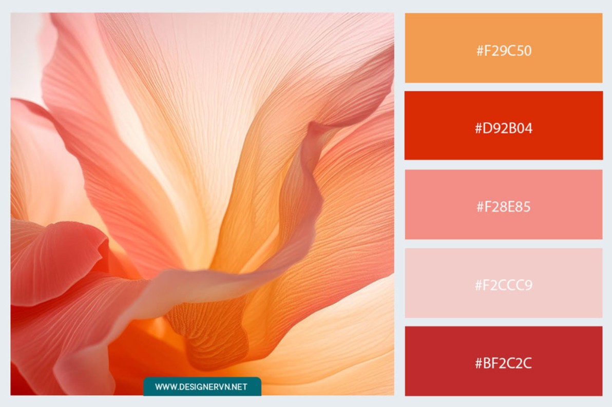
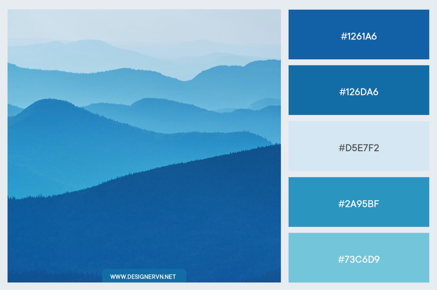
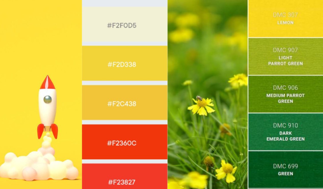
First, the Color Palette Generator is an outstanding feature. Simply upload a favorite photo or an image related to your project, and Canva will instantly analyze the primary, secondary, and neutral tones in the image to generate a corresponding color palette. This tool is very useful when you want to maintain consistency between the image and the design layout.
Next is the Canva Color Wheel: a tool that simulates the traditional color wheel used in design. It allows you to rotate and select colors using basic patterns such as complementary, analogous, or triangular. This helps you choose harmonious color combinations without needing in-depth knowledge.
Another type of color palette that users really like is the themed color palette. Canva compiles hundreds of color palettes in classic, modern, minimalist, elegant, nostalgic, or youthful styles… allowing you to quickly choose based on your mood or project theme.
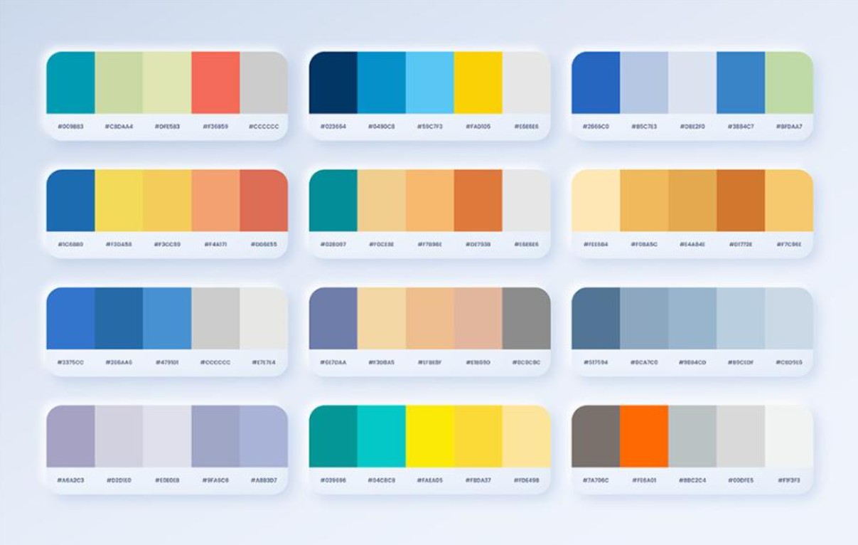
Finally, Canva regularly updates its color palette with trending colors each year, especially those popular in 2025, helping your designs keep up with global trends and go viral more easily on social media platforms.
3. The role of color palettes in Canva design
Color is a powerful element in visual communication. Whether a design is beautiful or professional largely depends on the creator's ability to coordinate the color palette. If layout and typography are the foundation, then color is the soul of the design. Canva makes it easy for users to choose the right color palette to evoke emotion, emphasize a message, or inspire action from the viewer.
Each color has its own personality. Warm colors like red, orange, and yellow express energy, passion, and vibrancy. Cool colors like blue, green, and purple convey calmness, reliability, or relaxation. By understanding color psychology and applying it to Canva designs, you can guide the viewer's emotions towards your desired goals.
A beautiful design isn't just a random combination of colors; it's based on visually related color groups, with balanced contrast and harmonious color proportions. For example, use a primary color to attract the first glance, a secondary color to support it, and a neutral color to balance it. Canva provides a visual environment that makes this process much easier than manual color matching.
3.1. Red: Represents passion, energy, and enthusiasm.
Red is a powerful, emotionally stimulating color often used to immediately attract attention. Industries that commonly use red include food, automotive, technology, and agriculture. However, some industries, such as finance, aviation, or high fashion, limit the use of red because it can convey a feeling of being too intense or lacking stability.
3.2. Blue: Conveys reliability, safety, and professionalism.
Blue is consistently one of the most popular colors, especially in designs related to finance, technology, energy, healthcare, or aviation. It evokes feelings of trust and stability. However, in the culinary field, blue is less frequently used because it can diminish the sense of appetite.
3.3. Yellow: Creates feelings of joy, positivity, and happiness.
Bright yellow evokes joy and positive energy. It's a color widely used in the food, energy, and household product industries. Conversely, yellow is quite rare in finance, high-end clothing, or automotive, as it can convey a sense of instability or be too youthful.

4. Ensure brand consistency.
A professional brand always possesses a clear, defined color palette that is applied across all communication and design materials. Canva allows users to save their brand color palette in a Brand Kit, making it quicker and more accurate to use the brand's signature colors. This tool is especially useful when working in teams or when a brand appears on multiple platforms.
Color consistency helps viewers instantly recognize a brand. Looking at orange, we think of Shopee; green, we associate it with Grab; blue, we remember Tiki. By maintaining a consistent color palette, a brand builds trust, familiarity, and memorability in the minds of users. Canva makes maintaining this consistency simple, even for those who aren't professional designers.
5. Tips for choosing a basic color palette in Canva
5.1. Using the Canva Color Wheel to define color relationships
The Canva Color Wheel is an incredibly powerful tool when you're unsure how to combine colors. Simply choose a base color and select a combination style like complementary, analogous, or triangular, and you'll instantly get a harmonious color palette. Complementary colors are two colors opposite each other on the color wheel, such as red and green; they create strong contrast and attract attention. Analogous colors consist of three adjacent colors like blue – green – yellow-green, creating softness and harmony. The triadic pattern offers balance thanks to three evenly spaced colors like red – yellow – blue.
Using a color wheel saves you time, eliminates the need to rely on intuition, and still ensures aesthetic appeal. This is a secret many designers use when they want to quickly create a suitable color palette while maintaining creativity and professionalism.
5.2. Use existing images or draw inspiration from personal sources.
Canva's Color Palette Generator lets you create color palettes directly from images. This ensures the palette perfectly matches the image's tone, guaranteeing a consistent and seamless design. If you're designing a summer lookbook, simply upload a beach photo, and Canva will immediately suggest shades of blue, white, sandy brown, or light yellow. If you're creating a music event poster, you can select a stage image to get an energetic neon color palette.
This method saves considerable time while ensuring the color palette accurately reflects the emotions you want to convey.
6. Mistakes to avoid when choosing color palettes in Canva
6.1. Choosing too many colors that don't go together.
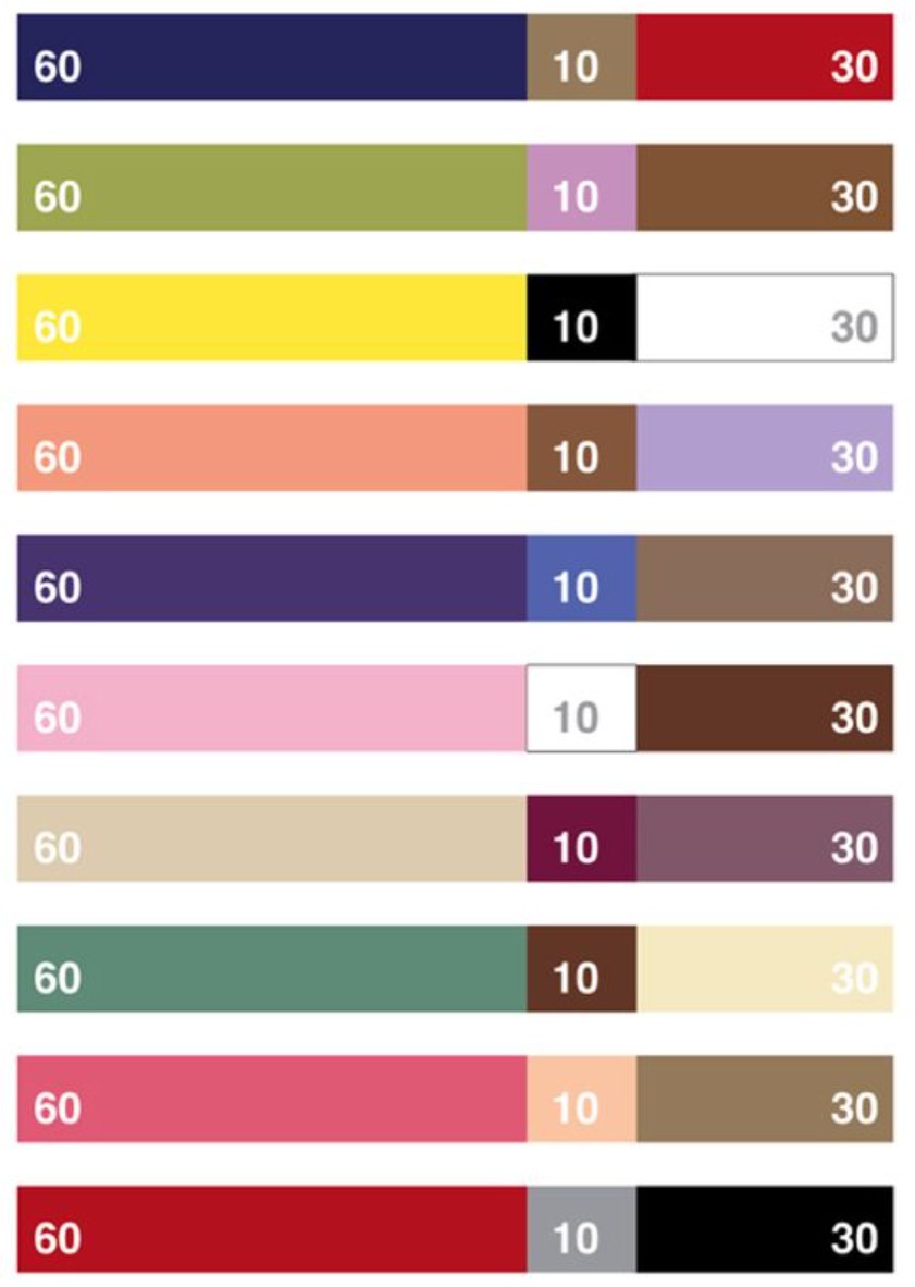
One of the most common mistakes is using too many colors in a single design. When the number of colors exceeds five primary colors, the design becomes inconsistent, cluttered, and difficult to follow. The 60-30-10 rule is a golden formula that helps you easily control color. 60% is for the main background color, 30% for supporting colors, and 10% for accent colors to create focus. Applying this formula in Canva will result in a more balanced and modern layout.
6.2. Color combinations lacking contrast
Color isn't just about creating visual effects; it's also crucial for readability. When text lacks contrast against the background, viewers will have difficulty following the content and may ignore the design. Canva has a built-in contrast checker to help you instantly assess the clarity between text and background color. This is especially important when designing posters, event banners, or social media content. Avoid hard-to-read color combinations like yellow against white or red against green to ensure effective communication.
6.3. Failure to update color palettes according to trends.
Color palettes also have their own trends each year. Pantone and many major design organizations often announce the color of the year, strongly influencing the fields of fashion, graphic design, and media. If you want your designs to be trendy and eye-catching, regularly update these color palettes and apply them to Canva. This is a way to create something fresh, unique, and in line with modern tastes.
Hopefully, the information shared in this article has helped you better understand the role of color palettes in Canva and how to apply them effectively. If used correctly, Canva will not only be a convenient design tool but also a place where you can expand your aesthetic thinking and creativity without limits through your own refined color choices. Wishing you many impressive designs and continued improvement in your color coordination skills!


VIP Products


Best Selling Products
Freepik Premium Account
59 USD
Genuine Adobe Illustrator account
99 USD
Upgrade Genuine Office 365
49 USD
Windows 10 & 11 Pro Key
36 USD
Adobe Premiere Pro Account
99 USD
ChatGPT Plus Account (GPT-4)
16 USD
Capcut Pro 1 Year
39 USD
MidJourney Account
29 USD
Upgrade Duolingo Super
29 USD
Autodesk All App Account Copyright
120 USD
Adobe Photoshop Copyright - Full App
120 USD
Copyright Adobe Lightroom Account
59 USD
Plugin Retouch4me
69 USD
Genuine Cheap Canva Pro
39 USD
Upgrade genuine Capture One account
120 USD