Best Selling Products

ChatGPT Plus Account (GPT-4)
16 USD

Adobe Photoshop Copyright - Full App
120 USD

Capcut Pro 1 Year
39 USD

Freepik Premium Account
59 USD

Upgrade Duolingo Super
29 USD

Upgrade genuine Capture One account
120 USD

Copyright Adobe Lightroom Account
59 USD

Genuine Cheap Canva Pro
39 USD

Autodesk All App Account Copyright
120 USD

Windows 10 & 11 Pro Key
36 USD

Upgrade Genuine Office 365
49 USD

Genuine Adobe Illustrator account
99 USD

MidJourney Account
29 USD

Plugin Retouch4me
69 USD

Adobe Premiere Pro Account
99 USD
Color Principles in Graphic Design: Color Combinations and Visual Psychology
Nội dung
Explore the principles of color in graphic design and how color combinations affect visual psychology in the first part of this series. Learn how to use color effectively!
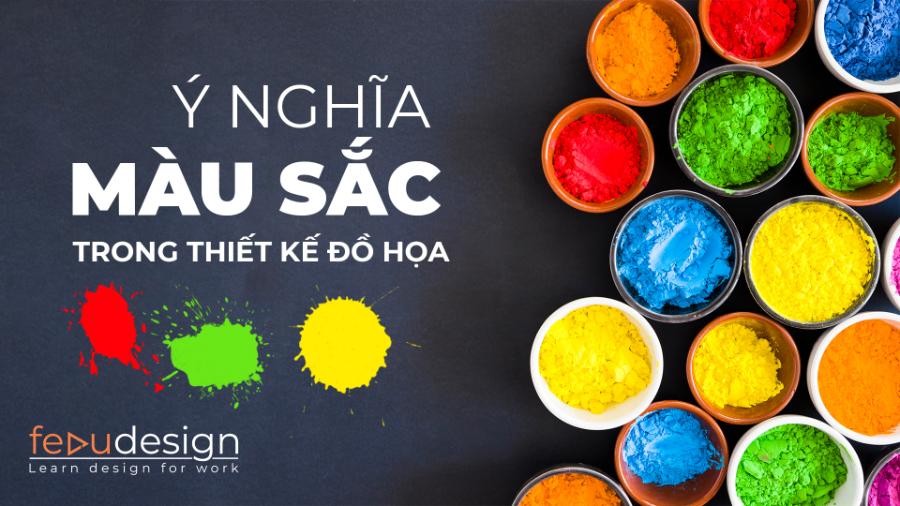
Color is not only an attractive element in graphic design, but also has a strong impact on the emotions and psychology of the viewer. Understanding the principles of color in design will help designers create products that are both aesthetic and effective. In this article, sadesign will explore with you the importance of color combinations and how they affect visual psychology.
1. Introduction to Color Principles in Graphic Design
In graphic design, color plays an extremely important role. Not only is it a beauty factor, color also helps convey messages, makes a strong impression and affects the viewer's emotions. The principle of color in graphic design is the application of scientific and artistic knowledge of color to create design products that are highly aesthetic and easily communicate with the viewer.
(1).jpg)
Color is not a simple element but a combination of many scientific factors. It directly affects human visual perception, causing different emotional and psychological reactions. Therefore, understanding the principles of color and their impact on the viewer's psychology is very important for designers.
2. Color Principles in Graphic Design
Colors in design are not just randomly selected but must follow certain principles to achieve the highest efficiency. Below are the basic color principles that any designer needs to master:
2.1 Color Wheel
The color wheel is a basic tool for determining color combinations. Colors are divided into three main groups: primary colors (red, yellow, blue), secondary colors (orange, green, purple), and intermediate colors (colors created by combining a primary color with a secondary color). Understanding and applying the color wheel helps designers choose harmonious color combinations.
Primary Colors : Red, yellow and blue are the three primary colors, which cannot be created by mixing other colors.
Secondary Colors : Orange, green and purple are created by mixing two primary colors.
Tertiary Colors : The result of mixing a primary color with a secondary color.
2.2 Color types
(1).jpg)
Color theory plays an important role in graphic design, helping to create harmony and appeal in design products. The main types of colors include primary colors (red, blue, yellow), secondary colors (green, orange, purple) created from mixing primary colors, and tertiary colors are the result of combining primary and secondary colors.
Warm and cool colors:
Colors can be divided into two main groups: warm colors (like red, orange, yellow) and cool colors (like blue, green, purple). Warm colors tend to create a feeling of energy and warmth, while cool colors create a feeling of relaxation and peace.
Complementary and Symmetrical Colors:
Complementary colors are colors that are opposite each other on the color wheel. When combined, the visual effect is very strong and prominent. Complementary colors are colors that are next to each other on the color wheel, when combined, create harmony and are pleasing to the eye.
Tone:
Using light, dark or neutral tones in design helps create depth and impact for the product. Tone also plays a big part in evoking emotions in the viewer.
In addition, concepts such as hue, saturation, and brightness also greatly influence how colors are perceived and used. Correctly applying color principles not only enhances aesthetics but also effectively conveys messages, creating a strong impression on viewers.
2.3. Color properties
The basic properties of color include hue, saturation, and brightness. Hue represents the nature of the color, such as red, blue, or yellow. Saturation represents the lightness or purity of the color, while brightness determines the lightness or darkness of the color. Understanding and flexibly applying these properties not only helps increase aesthetics but also effectively supports in orienting the emotions and attention of viewers, thereby enhancing the communication value of design products.
Hue : Is the name of the color (eg red, blue, yellow).
Saturation : Is the purity of a color. Highly saturated colors will be vibrant and vivid, while low saturated colors will be pale and dull.
Value : Is the lightness or darkness of a color. Colors with high values will be bright, while colors with low values will be dark.
2.4 Color matching principles
The principles of color coordination in design play an important role in creating harmony and visual appeal for a product. An effective design usually follows basic rules such as using the color wheel to choose a dominant color, complementary color or contrasting color.
(1).jpg)
Applying the correct color scheme not only enhances aesthetics but also conveys the message clearly and professionally. In addition, it is necessary to pay attention to the psychology of color to ensure that the selected color tones are appropriate to the project's goals and audience.
Monochromatic : Uses a single color, but can vary the saturation and value of that color.
Analogous : Use colors that are next to each other on the color wheel.
Complementary : Use colors opposite each other on the color wheel.
Triadic : Uses three colors that are evenly spaced on the color wheel.
Tetradic (Four) : Uses four colors that form a rectangle on the color wheel.
3. The Impact of Color on Visual Psychology
Color has a profound effect on human psychology, and the right use of color in design not only makes a product look beautiful but also creates special emotions. Each color has its own meaning and can evoke different emotional responses. Here are some common effects of colors on viewers' psychology:
.jpg)
Red:
Red is a color of energy, power, and urgency. It can stimulate strong emotions such as passion and love, but can also cause feelings of stress and frustration if used too much. Red is great for attracting attention and making a strong first impression.
Blue:
Blue is a symbol of peace, trust and intelligence. It helps create a relaxing and pleasant space. Blue is often used in designs related to fields such as finance, healthcare, education where trust is an important factor.
Green: Green
is associated with nature, freshness and growth. It has a soothing effect on the eyes and creates a feeling of relaxation and comfort. Green is widely used in the designs of brands related to health, the environment or ecological products.
Yellow:
Yellow is associated with energy, creativity, and optimism. It can increase feelings of joy and happiness, but it can also cause anxiety if used in excess. Yellow is often used to attract attention, but if overused, it can make the viewer feel stressed.
Purple:
Purple is the color of luxury, mystery and creativity. It can stimulate curiosity and imagination, while also bringing a sense of relaxation. Purple is often used in high-end designs, or in the fields of art and creativity.
Black and white:
Black represents power, luxury, mystery, while white represents purity, sophistication and simplicity. When combined, these two colors create a strong contrast and easily create sophisticated, impressive designs.
4. Why Color Combinations Are Important in Design
Color combinations are crucial in creating harmonious and engaging design products. Each color combination can bring different feelings, so designers need to consider carefully before choosing. An inappropriate combination can be annoying, messy and unprofessional, while a harmonious color combination will make the product more accessible and bring high communication efficiency.
Colors have the ability to effectively convey messages, build brands, and highlight content. A harmonious color scheme can create a pleasant, professional feel, while the wrong color choice can create an imbalance and detract from the value of the design. Therefore, studying and applying the principles of appropriate color coordination is essential to achieving success in any design project.
5. Conclusion
The principles of color in graphic design are not only about choosing beautiful colors, but also about using them to convey messages and create emotions in the viewer. Colors can affect the psychology and emotions of the viewer, so understanding color combinations is a key factor for designers to be successful in their work.


VIP Products


Best Selling Products
ChatGPT Plus Account (GPT-4)
16 USD
Adobe Photoshop Copyright - Full App
120 USD
Capcut Pro 1 Year
39 USD
Freepik Premium Account
59 USD
Upgrade Duolingo Super
29 USD
Upgrade genuine Capture One account
120 USD
Copyright Adobe Lightroom Account
59 USD
Genuine Cheap Canva Pro
39 USD
Autodesk All App Account Copyright
120 USD
Windows 10 & 11 Pro Key
36 USD
Upgrade Genuine Office 365
49 USD
Genuine Adobe Illustrator account
99 USD
MidJourney Account
29 USD
Plugin Retouch4me
69 USD
Adobe Premiere Pro Account
99 USD