Best Selling Products
Common mistakes and how to avoid them when combining colors in design
Nội dung
- I. The Importance of Color Combinations in Design
- II. Common mistakes in color coordination design
- 1. Using too many colors in one design
- 2. Not studying color psychology
- 3. No clear contrast
- 4. Overuse of bright or neon colors
- 5. Not testing color palettes before implementation
- III. Basic Color Matching Rules to Avoid Mistakes
- 1. Complementary Color Rules
- 2. Analogous Rule
- 3. Triadic Rule
- 4. Monochromatic Rule
- IV. Useful tools in color matching
- 1. Adobe Color
- 2. Coolors
- 3. Paletton
- V. Step-by-step guide to effective color matching
- VI. Conclusion
Discover common mistakes when mixing colors in design and how to fix them effectively. A comprehensive guide to help improve professional color mixing skills for every designer.
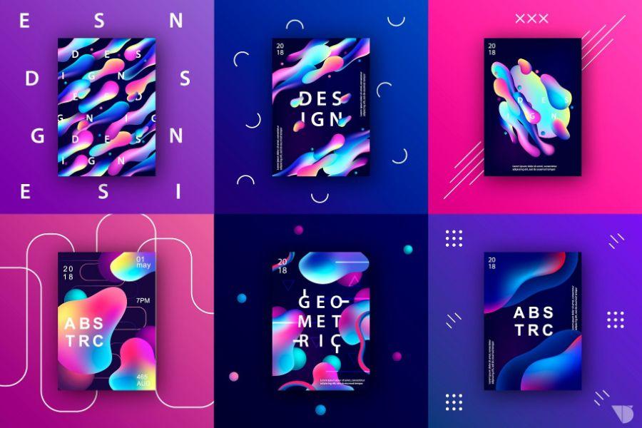
Color matching is one of the most important elements in graphic design, which can enhance or ruin an entire work. However, not all designers really understand color theory and know how to apply it correctly. Mistakes in color matching can make the product messy, unprofessional and difficult to convey the message. In this article, sadesign will point out the most common mistakes and guide how to avoid them, helping designers improve their skills and build more harmonious and aesthetic designs.
I. The Importance of Color Combinations in Design
In the world of design, color is more than just a decorative element that beautifies a product. It is a powerful language, a means of conveying emotions and messages in a direct and profound way. The influence of color is so great that it can shape the entire experience of the viewer, from the first impression to the ability to remember it later.

A well-chosen color palette has the power to create a powerful positive impression. When used in harmony, colors can make viewers feel comfortable and relaxed, or, conversely, energized and excited. This is especially important when it comes to attracting attention and retaining users. Furthermore, consistent and strategic use of color can help build a strong brand identity, making it easily recognizable and memorable. Think of big brands like Coca-Cola with its vibrant red, or Facebook with its signature blue – color has become an integral part of their identity.
On the other hand, color inconsistency in a design can have serious negative consequences. A messy, unconnected color palette is visually distracting, making it difficult for viewers to focus. This directly dilutes the message the design is trying to convey, making the content less effective and difficult to digest. Ultimately, it negatively impacts the user experience, reducing engagement and even causing them to abandon the product or service.
In many creative fields, the proper use of color is always considered a key factor in the success of a product.
-
In graphic design, color defines style, creates emphasis, and guides the viewer's eye along a certain flow of information.
-
With user interfaces (UI), color not only beautifies, but also functions to position interactive elements, distinguish states (e.g., pressed, unpressed buttons), and improve overall usability.
-
In advertising, color is a powerful tool to stimulate emotions, create interest, and drive purchasing behavior.
-
Even in fashion or interior design, color combinations determine style, sense of space and comfort for the user.
Each color carries its own meaning and can interact with human emotions in different ways. Red can represent energy and passion, while blue often evokes feelings of calmness and trust. Understanding the psychological and cultural meanings of each color is a prerequisite for creating impactful designs.
II. Common mistakes in color coordination design
In design, color schemes play an important role in creating harmony and visual appeal. However, many designers often make common mistakes such as using too many colors without consideration, leading to a confusing and unprofessional feeling. Another mistake is choosing colors that do not match the message or brand, causing the design to lose connection and meaning.
1. Using too many colors in one design
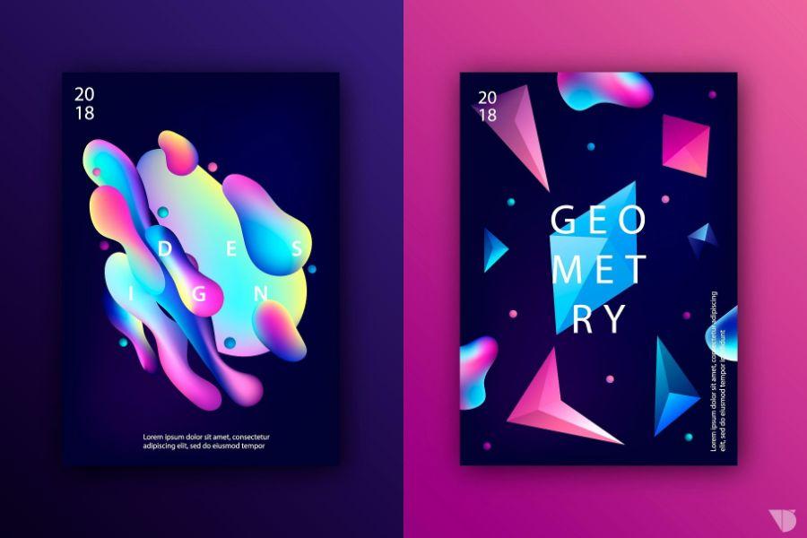
One of the most serious mistakes is to go overboard with colors, which can make a design look cluttered and unfocused. Many new designers tend to use a bunch of eye-catching colors in one piece in the hope of creating a striking effect. However, this can easily lead to visual chaos, which can make the design lose its coherence and professionalism.
How to avoid:
The 60-30-10 rule is a simple yet effective solution. It says 60% dominant color, 30% secondary color, and 10% accent color. This method helps create balance and visual appeal throughout the entire layout.
2. Not studying color psychology
Design is not only an art but also a science. Each color is associated with a specific set of emotions and meanings. For example, red often evokes a sense of urgency or passion, blue creates a sense of trust, yellow brings brightness and hope.
Common Mistake:
Many people use color based on personal preference, ignoring emotional and cultural factors. This can result in designs that are misunderstood, offensive, or inappropriate for the target market.
How to avoid:
Read up on color psychology before you make your choice. Whether it’s a luxury brand, an educational website, or an environmental campaign, the right color can make a big impact on your communication.
3. No clear contrast
Color contrast helps emphasize key elements, create depth, and direct the eye. When contrast is lacking, a design becomes “drowned” and difficult to read, especially in digital publications such as websites or presentation slides.
Common mistake:
Using background and text colors that are too similar, causing the viewer to strain their eyes to read the information. For example, light gray text on a white background, or yellow text on a green background.
How to avoid it:
Use a color contrast checker like Contrast Checker to ensure readability is up to par. Also, incorporate light-dark contrast instead of relying on pure color.
4. Overuse of bright or neon colors
Neon colors can create an eye-catching effect in youthful or edgy designs. However, overusing bright colors can make a design look unprofessional, especially in branding or product designs for a mature audience.
How to avoid:
Use neon colors as accents rather than as the dominant color. Limit them to no more than 5% of the total design area and consider a neutral background to create balance.
5. Not testing color palettes before implementation
Many designers choose colors based on their intuition and implement them without testing them on different platforms or devices. This can easily lead to display errors, loss of color accuracy, and impact on user experience.
How to avoid:
Always create a color palette preview and test it on a variety of layouts, including light and dark themes, print, web browsers, and mobile devices.
III. Basic Color Matching Rules to Avoid Mistakes
Understanding the basic rules of color is key to creating harmonious, attractive designs that effectively communicate your message. Applying these principles correctly will help you avoid common mistakes and ensure your work is professional and pleasing to the eye.

1. Complementary Color Rules
The rule of contrasting color schemes is to use two colors that are directly opposite each other on the color wheel. Typical examples are Red and Green, Blue and Orange, or Yellow and Purple.
-
Characteristics: This contrast creates a strong visual impact, giving a sense of prominence, dynamism and drama. When placed next to each other, contrasting colors make each other appear more vibrant, attracting immediate attention. This is a great choice when you want to create a strong focal point or highlight a specific element in the design.
-
Applications: Often used in bold designs, such as logos, advertising posters, or call-to-action (CTA) elements in user interfaces. The high contrast makes the message clear and easy to see.
-
Important Note: Although they create a powerful effect, the use of contrasting colors should be used in moderation. If applied carelessly or used too much, they can cause a feeling of "overwhelming", glare and discomfort for the viewer. Choose one main color and use the contrasting color as a small highlight, or adjust the brightness/darkness, saturation to reduce the direct contrast.
2. Analogous Rule
The analogous rule is to choose colors that are next to each other on the color wheel. Usually three colors, such as Blue, Turquoise and Green; or Red, Orange and Yellow.
-
Characteristics: Analogous colors are closely related to each other, creating a smooth and natural transition. Therefore, this color scheme style brings a feeling of softness, harmony, comfort and elegance. It evokes unity and peace, without causing a feeling of being too abrupt or conflicting.
-
Application: Great for designs that require a soft, sophisticated, and professional look, such as websites, mobile apps, presentations, or interior spaces. It’s also a safe bet for beginners because it’s hard to make a serious mistake with this rule.
-
Note: To avoid monotony in your design, choose one main color, one secondary color, and one accent color. This will add interest while maintaining overall harmony.
3. Triadic Rule
The rule of three is the use of three colors that are evenly spaced on the color wheel, forming an equilateral triangle. The most common examples are Red, Yellow, and Blue; or Orange, Purple, and Green.
-
Characteristics: This color scheme provides a great balance between boldness and consistency. While these three colors are not direct opposites, they still provide enough contrast to keep the design from being boring, while still maintaining harmony due to their equal spacing on the color wheel. It feels lively, playful, and balanced.
-
Application: Suitable for designs that need to be dynamic, creative and attractive while still maintaining professionalism. Often seen in logo design, children's graphics, or brands that want to express creativity and uniqueness.
-
Note: Similar to the contrast rule, you should choose one color as the dominant color and use the other two as secondary or accent colors. This helps control the color balance and avoids the feeling of too many colors competing for attention, leading to confusion.
4. Monochromatic Rule
Monochromaticism is the practice of building a color palette around a single color, but exploiting variations of it by changing its lightness/value – darkness/shade – or saturation. For example, if you choose blue, you would use lighter (tint), darker (shade) or more/less saturated/less saturated shades of blue.
-
Characteristics: Monochromatic color schemes offer a very high level of unity and sophistication. It creates a sense of elegance, tranquility and professionalism. Since there is only one base color, the design is very coherent and pleasing to the eye. This rule is often used to create depth and structure without adding new colors.
-
Applications: Ideal for minimalist, modern designs, or when you want to convey a clear, distraction-free message. Very popular in user interface (UI) design, websites, branding or photography, where the focus is on the content or visual details.
-
Note: While safe and elegant, monochromatic color schemes can become monotonous if not varied. To avoid this, make the most of color variation by using different shades/tints, combined with lighting effects, shadows, or textures to add depth and interest to the design.
IV. Useful tools in color matching
In the field of design and art, color matching plays an important role in creating aesthetically pleasing and professional products. To aid in this process, there are many useful tools that designers can use. Some of the prominent tools include:
1. Adobe Color
Powerful tool for creating and storing professional color palettes, exportable to other Adobe software such as Illustrator, Photoshop.
2. Coolors
Supports quick color palette creation, random or customized as desired. Color lock feature helps keep favorite tones and rotate the remaining colors.
3. Paletton
Focus on classic color matching rules such as Monochromatic, Analogous, Complementary, etc. to help users understand the color palette structure.
V. Step-by-step guide to effective color matching
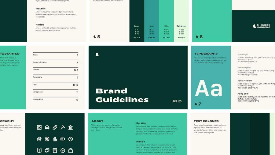
To effectively coordinate colors, you first need to understand the color wheel and the basic principles of color combination.
Step 1: Identify emotions, goals, and audience
Before choosing a color, it is important to clearly define the design message and the target audience. This helps filter out colors that are psychologically and culturally appropriate.
Step 2: Choose the main color and secondary color
Choose a central color and build your color scheme around it. Combine similar or contrasting colors to create a striking visual effect.
Step 3: Check contrast and usability
Use tools to ensure that text and important elements are easy to see. Make sure the design is friendly to people with visual impairments or use in different lighting conditions.
Step 4: Consider the black and white version
A design still needs to maintain coherence when converted to grayscale. If a design relies solely on color to differentiate elements, it will fail when printed in black and white.
Step 5: Test on multiple platforms
Test export your design on different devices to make sure the colors don't look off or cause discomfort to users.
VI. Conclusion
Color matching is an art that requires both aesthetic sensitivity and scientific understanding. Avoiding basic color matching mistakes is the first step to creating deep, professional, and inspiring designs. Always experiment, learn, and observe to improve your color matching skills. With a solid foundation of knowledge, each color palette will not only be a visual combination but also become a story told through the eyes, full of emotion and persuasion.


