Best Selling Products
Discover the Secrets Behind Iconic Logos
Nội dung
Logo analysis is an important area in understanding the message that brands want to convey to customers. Each element of the logo is carefully chosen to evoke a specific message.
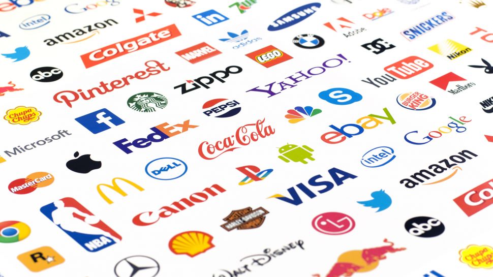
A logo is more than just a symbol that represents a brand; it also contains subtle and profound messages. Down to the smallest details, each design is created with the purpose of conveying the core values and unique personality of the brand. In this article, we will explore the interesting stories behind famous logos, from the simplicity of FedEx to the iconicity of Pepsi.
1. The importance of logo analysis
Logo analysis not only helps in brand recognition. It also provides insight into the core values, message and strategy of the business. A well-designed and well-suited logo in the graphic design arsenal can effectively convey the brand identity. At the same time, it creates a strong impression on customers and builds trust.
By studying color, shape, typography, and other design elements, we can gain a better understanding of how a brand wants to be perceived and where it wants to position itself in the market. This plays a vital role in building a marketing strategy and developing a long-term brand image.
![]()
Logo analysis plays an important role in building and developing a brand. Because a logo is not only a representative symbol but also conveys the values, mission and personality of the business. Logo analysis helps evaluate the effectiveness of the design, its recognition ability as well as its suitability to the target market.
A well-designed logo must ensure simplicity and memorability. At the same time, it must reflect the true nature of the brand. Through analysis, businesses can identify strengths to promote. Along with that are limitations that need to be improved, thereby optimizing the communication strategy.
In addition, analysis also helps ensure that the logo does not overlap with other brands, avoid legal risks and build a professional, trustworthy image in the eyes of customers.
2. FedEx: The Hidden Arrow Represents Speed
Decoding these hidden messages helps businesses build deeper connections with customers. Second, it strengthens their position in the market.
![]()
The FedEx logo is hailed as one of the best designs in history. FedEx, one of the world's leading shipping corporations. The corporation is notable for its logo symbol containing an arrow hidden between the letters "E" and "x". This is not a coincidence, but a deliberate creation, to show the agility and prestige of the shipping service.
Although the design was finalized in 1994 by Lindon Leader, the creative process was an interesting journey. Initially, the design team tried over 400 different designs before realizing that the natural space between the letters could create the image of a forward-moving arrow.
This elegant design is not only creative but also meaningful. It represents speed, precision and clear direction in every service the company provides. It is a clear demonstration of FedEx’s commitment to providing a fast and efficient shipping experience to customers around the world.
3. Pepsi: The Mystery of Reverse Numbers
Pepsi, one of the world's leading soft drink brands. It has created a special mark not only thanks to its unique flavor but also thanks to its creative and mysterious communication campaigns. One of the recent outstanding campaigns is "The Mystery of Reverse Numbers", which has attracted the attention of many consumers.
![]()
With a unique idea, Pepsi cleverly incorporated reverse numbers on its products. It stimulates curiosity and exploration from customers. The campaign not only brings a new experience but also inspires creativity. It contains a connection to the community through decoding hidden messages.
"The Mystery of Reverse Numbers" is not only a marketing strategy but also demonstrates Pepsi's deep understanding of consumer psychology. Especially young people - a group of customers who are always looking for difference and creativity. Through this campaign, Pepsi continues to affirm its position as a breakthrough and innovative brand. At the same time, it strengthens its strong relationship with consumers around the world.
Pepsi's logo once caused a stir with an interesting detail: When viewed through a mirror, the word "PEPSI" turns into the number sequence "12939." Legend has it that this is the date the brand was founded. However, in reality, this was part of a marketing campaign to attract public attention. This not only increased curiosity but also helped Pepsi affirm its creativity in all communication strategies.
4. Apple: The Bitten Apple and the Journey of Asserting Personality
![]()
Apple with its characteristic bitten apple logo. This brand has become one of the world's leading technology brands, affirming its class and unique personality. Apple was founded in 1976 by Steve Jobs, Steve Wozniak and Ronald Wayne.
This brand has constantly innovated and created to bring breakthrough products. From Macintosh personal computers, iPods, iPhones, iPads to services such as the App Store and iCloud. Apple's highlight lies not only in its sophisticated and luxurious design. It also lies in creating a seamless technology ecosystem, meeting the increasing needs of users.
With the philosophy of "Think Different", Apple is not afraid to challenge the limits, putting quality and user experience first. The brand's success comes not only from advanced technology but also from the ability to connect emotionally with users. It turns the product into a symbol of modern lifestyle.
Apple's journey is a clear testament to its persistence in asserting its own identity and values. It contributes to shaping the future of the global technology industry.
Thus, the image of the bitten apple in the Apple logo is a simple but meaningful symbol. It not only represents knowledge and creativity. It also honors Alan Turing - the father of computer science. The bitten apple reminds of his tragic death. At the same time, it shows the brand's desire to overcome all limits.
5. Amazon: Smiles From A to Z
![]()
Amazon, one of the world's leading e-commerce and technology corporations. It is known for its slogan "Smiles from A to Z", which represents its commitment to providing a comprehensive and satisfying customer experience.
Founded in 1994 by Jeff Bezos, Amazon started out as an online bookstore. The brand has since expanded rapidly and become one of the largest online shopping platforms in the world. With a diverse product portfolio ranging from books, electronics, fashion to food and digital services, Amazon always puts customers at the center of everything it does.
Not only stopping at e-commerce, Amazon is also leading in the technology field with outstanding products and services. Including: Amazon Web Services (AWS), Alexa, Kindle and Prime Video. Modern logistics system along with fast delivery service helps Amazon build trust and satisfaction from consumers.
In addition, the group is constantly innovating and investing in artificial intelligence, automation and sustainable energy. With a long-term vision and comprehensive development strategy, Amazon continues to affirm its pioneering position. It brings outstanding value to customers around the world.
At first glance, Amazon's logo looks pretty simple with the brand name and a curved arrow from "A" to "Z." But the truth is, this arrow represents the smile of customer satisfaction and the commitment to providing every product from "A" to "Z."
6. McDonald's: Symbol of Familiarity
McDonald's is one of the most famous fast food brands in the world, a symbol of familiarity and convenience. Founded in 1940 in the United States, McDonald's has grown strongly and is present in more than 100 countries. It has become a familiar name to millions of customers.
![]()
With its distinctive golden "M" logo, McDonald's is not only a place to provide fast food such as: Hamburger, French fries and fried chicken. In addition, it also brings a professional service experience and a friendly space. The brand's special feature lies in its ability to harmoniously combine global uniformity and adapt to local culture. It is through adjusting the menu to suit the taste of each country.
In addition to product quality, McDonald's also focuses on social responsibility with community support and environmental protection programs. This brand is not only a restaurant chain but also a symbol of modern lifestyle. It brings convenience and joy to all ages. McDonald's has truly left a deep impression on global consumers.
The golden “M” in the McDonald’s logo is more than just the first letter of the brand name. It is also designed to evoke a sense of warmth and familiarity. The designers chose a bright yellow color to stimulate appetite and create a memorable impression on people.
Conclude
Each logo is a work of art, carrying a profound message and the endless creativity of the designers. The small but meaningful details in each logo help the brand affirm its identity and conquer customers worldwide. According to analysis from Sadesign .
