Best Selling Products

ChatGPT Plus Account (GPT-4)
16 USD

Autodesk All App Account Copyright
120 USD

Plugin Retouch4me
69 USD

Genuine Cheap Canva Pro
39 USD

Adobe Photoshop Copyright - Full App
120 USD

MidJourney Account
29 USD

Capcut Pro 1 Year
39 USD

Adobe Premiere Pro Account
99 USD

Copyright Adobe Lightroom Account
59 USD

Windows 10 & 11 Pro Key
36 USD

Upgrade Genuine Office 365
49 USD

Upgrade Duolingo Super
29 USD

Upgrade genuine Capture One account
120 USD

Genuine Adobe Illustrator account
99 USD

Freepik Premium Account
59 USD
Easy Photoshop Color Correction Tutorial for Beginners
Nội dung
- 1. Why is Photo Color Correction Important?
- 2. Preparation Before Starting Color Correction in Photoshop
- 2.1. Install and Open Photoshop
- 2.2. Understanding Layers and Layer Masks
- 2.3. Necessary Control Panels
- 3. The Most Basic and Popular Photo Color Correction Tools in Photoshop
- 3.1. Brightness/Contrast
- 3.2. Levels
- 3.3. Curves
- 3.4. Hue/Saturation
- 3.5. Vibrance
- 3.6. Photo Filter
- 4. Simple Photo Color Correction Process for Beginners
- 4.1. Step 1: Analyze the Original Image and Identify the Problem
- 4.2. Step 2: Adjust Overall Brightness and Contrast (Levels or Curves)
- 4.3. Step 3: Adjust White Balance (Levels or Curves)
- 4.4. Step 4: Increase or Decrease Vibrance/Saturation
- 4.5. Step 5: Fine-tune Specific Colors (Hue/Saturation - Color Channel)
- 4.6. Step 6: Apply Overall Color Filter (Photo Filter - Optional)
- 4.7. Step 7: Use Layer Mask to Control the Area of Influence
- 5. Golden Tips to Help You Adjust Color More Beautifully and Professionally
- 5.1. Always Use Adjustment Layers
- 5.2. Edit Step by Step and Carefully
- 5.3. Using Blend Modes
- 5.4. Compare Photos Before and After Editing
- 5.5. View Histogram and Info Panel
- 5.6. Editing on Calibrated Monitor
- 5.7. Save and Export Images Properly
- 6. Conclusion
Detailed instructions on how to easily adjust photo color in Photoshop, suitable for beginners, helping you create professional and impressive photos.
In the world of photography and graphic design, color plays a crucial role. A beautiful photo is not only about the composition or lighting, but also about the way the colors are expressed. However, our photos do not always have the desired colors right from the start. That is where Adobe Photoshop comes into its own – a magical tool that helps you turn dull, lifeless photos into colorful, impressive works of art.
1. Why is Photo Color Correction Important?
Before we get into the technicalities, let's understand why color grading is so important.
-
Fixing flaws in the original photo: Inadequate lighting, incorrect white balance, or poor camera quality can cause colors to appear off, washed out, or have a color cast. Color grading helps correct these problems.
-
Increase aesthetics and appeal: Harmonious, vivid colors will make your photo stand out more, attracting viewers at first sight.
-
Convey Emotions and Stories: Colors have the power to evoke powerful emotions. A warm color tone can create a cozy, cheerful feeling, while a cool color tone can evoke a quiet, mysterious feeling. Color grading helps you tell your story more effectively.
-
Create a personal style (Preset/Filter): Applying a consistent color grading style helps you create your own mark, making your work recognizable.
-
Meet printing and display requirements: Ensure colors display accurately on devices and in print to avoid color distortion.
2. Preparation Before Starting Color Correction in Photoshop
To make the color grading process go smoothly, make sure you have the following ready:
2.1. Install and Open Photoshop
-
Make sure you have the correct version of Adobe Photoshop installed on your computer.
-
Open the photo to edit: Go to File > Open... or drag and drop the photo directly into the Photoshop interface.
2.2. Understanding Layers and Layer Masks
These are two extremely important concepts in Photoshop, especially when editing photos. Color correction on a separate Adjustment Layer combined with a Layer Mask will help you:
-
Non-destructive editing: Any changes you make will be on a separate layer, without affecting the original pixels of the image. This allows you to easily go back, edit, or remove the effect at any time without damaging the image.
-
Flexible control: Layer Masks let you apply color correction effects to a specific part of your photo, or remove it from unwanted areas.
-
White Layer Mask: All effects of the adjustment layer will be applied.
-
Black Layer Mask: All effects of the adjustment layer will be hidden.
-
Using the Brush Tool (B) with white/black: Use the black brush to "paint" on the mask, hiding the effect in that area. Use the white brush to "paint" on the mask, revealing the effect in that area.
-
2.3. Necessary Control Panels
Make sure the following panels are visible in your workspace (if not, go to Window and select the panel name):
-
Layers (F7): Shows all layers of the image.
-
Properties: Displays the settings for the adjustment layers you have selected.
-
Adjustments: Contains quick icons for creating adjustment layers.
3. The Most Basic and Popular Photo Color Correction Tools in Photoshop
Photoshop offers a lot of color correction tools, but for beginners, we'll focus on the easiest and most effective ones. These are called Adjustment Layers .
3.1. Brightness/Contrast
This is the most basic tool for adjusting the overall lighting and contrast of a photo.
-
How to use:
-
Open the image in Photoshop.
-
In the Adjustments panel , click the Brightness/Contrast icon (the sun icon that is half black and half white). A Brightness/Contrast layer will appear in the Layers panel .
-
On the Properties panel , you will see two sliders:
-
Brightness: Drag right to increase brightness, drag left to decrease brightness.
-
Contrast: Drag right to increase contrast (highlight and dark areas), drag left to decrease contrast (soften the photo).
-
-
-
Tip: Start by adjusting brightness first, then contrast to find the right balance.
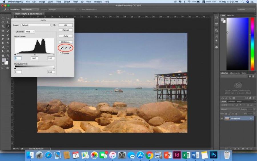
3.2. Levels
Levels is a more powerful tool than Brightness/Contrast, allowing you to adjust the tonal range (Highlights, Midtones, Shadows) in more detail via the Histogram.
-
How to use:
-
On the Adjustments panel , click the Levels icon (a trapezoid icon with three small triangles).
-
On the Properties panel , you'll see the Histogram graph and three small sliders below it:
-
Shadows slider: Drag to the right to make the shadows darker.
-
Gray slider (Midtones/Gamma): Drag right to make the midtones darker, drag left to make the midtones lighter.
-
White slider (Highlights): Drag to the left to make the highlights brighter.
-
-
Look at the Histogram: A graph that shows the distribution of pixels by tone. The goal is to make the histogram evenly distributed, avoiding "truncation" at either end (meaning the image loses detail in areas that are too dark or too bright).
-
Using Eyedroppers: Three eyedropper icons below the Histogram:
-
Black Eye Dropper (Set Black Point): Click on the darkest area in the image to set the actual black point.
-
Gray dropper (Set Gray Point): Click on the neutral area (neutral gray) to adjust the white balance.
-
White Dropper (Set White Point): Click on the brightest area in the image to set the actual white point.
-
-
-
Tip: Levels are great for fixing underexposed or slightly overexposed photos, adding depth and detail to your photo.
3.3. Curves
Curves is one of the most powerful and flexible color correction tools in Photoshop, giving you precise control over each tonal range (Shadows, Midtones, Highlights) and color channel (RGB, Red, Green, Blue).
-
How to use:
-
On the Adjustments panel , click the Curves icon.
-
On the Properties panel , you will see a curve graph.
-
Horizontal axis: Represents the original tonal values of the image (from darkest to lightest).
-
Vertical axis: Represents the tonal values after adjustment.
-
-
Adjust RGB curve (default):
-
Create anchor points: Click on the curve to create anchor points.
-
Pull up: Brighten that area.
-
Drag down: Darkens that area.
-
Drag the point at the bottom left: Controls the shadows.
-
Drag the point at the top right: Controls the highlights.
-
Drag the middle point: Controls the midtones.
-
-
Adjust each color channel (Red, Green, Blue):
-
In the drop-down menu (default is RGB), select Red , Green , or Blue .
-
Red Channel: Pull up to increase red, pull down to increase green (Cyan).
-
Green Channel: Pull up to increase green, pull down to increase magenta.
-
Blue Channel: Pull up to increase blue, pull down to increase yellow.
-
-
-
Tip: Use Curves to create an S-shaped contrast effect (pull down the shadows, raise the highlights) to make your photo pop. It's also a great tool for removing unwanted color cast.
3.4. Hue/Saturation
Hue/Saturation is the ideal tool for adjusting the hue, saturation, and brightness of an entire image or specific color channels.
-
How to use:
-
On the Adjustments panel , click the Hue/Saturation icon (the colored circle icon).
-
On the Properties panel , you will see three sliders:
-
Hue: Drag to change the color tone (e.g. turn red to orange, blue to purple).
-
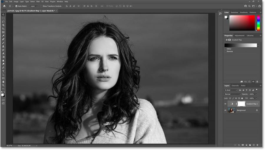
Saturation: Drag to the right to increase color intensity (darker colors), drag to the left to decrease color intensity (lighter colors, toward gray). Drag all the way to the left to turn the photo black and white.
-
Lightness: Drag right to lighten the color, drag left to darken the color.
-
-
Adjust specific color channels:
-
In the drop-down menu (default is Master ), you can select specific color channels such as Reds , Yellows , Greens , Cyans , Blues , Magentas .
-
When you select a color channel, you can simply adjust the Hue, Saturation, or Lightness of that color alone without affecting the other colors.
-
-
-
Tip: This tool is useful for highlighting a certain color in a photo (for example, making a red flower more vibrant) or for converting a photo to black and white.
3.5. Vibrance
Vibrance is a smarter tool similar to Saturation. It boosts the saturation of less saturated colors in your photo, while protecting skin tones and oversaturated colors, helping to avoid “blowing out” or unnatural-looking skin tones.
-
How to use:
-
On the Adjustments panel , click the Vibrance icon (the small triangle icon with two curved arrows).
-
On the Properties panel , you will see two sliders:
-
Vibrance: Drag right to increase the vibrancy of the colors.
-
Saturation: Similar to Hue/Saturation, but Vibrance should be used first.
-
-
-
Tip: Always start with Vibrance for a more natural result, then use Saturation if you need to even out the intensity of all colors.
3.6. Photo Filter
Photo Filter simulates the color filters that photographers often attach to camera lenses to adjust color temperature or create special color effects.
-
How to use:
-
On the Adjustments panel , click the Photo Filter icon (the colored square icon).
-
On the Properties panel , you will see:
-
Filter: Select available filters (e.g. Warming Filter (85) to warm the photo, Cooling Filter (82) to cool the photo).
-
Color: Select a custom color if you want to apply a specific color tone.
-
Density: Drag to adjust the intensity of the color filter.
-
Preserve Luminosity: Check this box to ensure that the overall brightness of the image is not affected too much when applying a color filter.
-
-
-
Tip: Photo Filters are a quick way to change the overall tone of your photo, creating a warm, cool, or vintage atmosphere.
4. Simple Photo Color Correction Process for Beginners
To avoid confusion, follow a simple yet effective process after opening an image in Photoshop:
4.1. Step 1: Analyze the Original Image and Identify the Problem
-
Overall look: Does the photo have a color cast? (yellow, blue, red, etc.).
-
Check the brightness: Is the photo too dark, too bright, or bright enough?
-
Contrast: Is the image flat (low contrast) or too harsh (high contrast)?
-
Overall color: Are the colors dull, lackluster, or too vibrant?
4.2. Step 2: Adjust Overall Brightness and Contrast (Levels or Curves)
-
Start with Levels: Use Levels to adjust the black point, white point, and midpoint. Drag the three sliders to make the Histogram more evenly distributed. This is an important step to rescue underexposed or overexposed photos, adding depth.
-
Or Curves (for more control): If you're more comfortable, use Curves to create an S-curve, adding subtle contrast. Drag the bottom left point down a bit, and the top right point up a bit.
4.3. Step 3: Adjust White Balance (Levels or Curves)
-
Using the Gray Eyedropper in Levels: If your photo has a color cast, try clicking the gray eyedropper in the Levels panel and then clicking an area in your photo that you know should be neutral gray (e.g., a white wall, gray concrete, gray clothing). Photoshop will automatically adjust the white balance.
-
Or Curves (color channels): If the color cast is still there or you want to make more subtle adjustments, switch to the Curves of each color channel (Red, Green, Blue). For example, if the image has a blue cast, you can switch to the Blue channel and pull the curve down a bit to reduce the blue (increase the yellow).
4.4. Step 4: Increase or Decrease Vibrance/Saturation
-
Prioritize Vibrance: Start with Vibrance to make colors more vibrant naturally.
-
Use Saturation (cautiously): If you need to increase the intensity of all colors evenly or reduce the saturation drastically, use Saturation . Always be careful to avoid "burning" or over-vivid colors.
4.5. Step 5: Fine-tune Specific Colors (Hue/Saturation - Color Channel)
-
If there's a specific color in your photo that you want to change or highlight, use Hue/Saturation and select that color channel (e.g. Reds for skin tones, Greens for vegetation).
-
Adjust Hue to change the color tone, Saturation to increase/decrease the intensity, Lightness to lighten/darken that color.
4.6. Step 6: Apply Overall Color Filter (Photo Filter - Optional)
-
If you want to change the overall tone of your photo to create a specific atmosphere (warm, cold, vintage...), add a Photo Filter layer .
-
Choose the appropriate filter and adjust the Density .
4.7. Step 7: Use Layer Mask to Control the Area of Influence
-
After each editing step, check the Layer Mask of the corresponding Adjustment layer.
-
If you want the effect to only apply to part of the image, select the mask, use the Brush Tool (B) with black color to paint over the areas you don't want the effect to appear. Use white color to repaint the effect if needed.
-
Adjust the Opacity of the Brush to control the level of impact.
5. Golden Tips to Help You Adjust Color More Beautifully and Professionally
To improve your color grading skills, keep these tips in mind:
5.1. Always Use Adjustment Layers
-
This is the golden rule of non-destructive photo editing. Always create Adjustment Layers instead of editing directly on the original image Layer.
5.2. Edit Step by Step and Carefully
-
Don't try to do everything at once. Each Adjustment Layer should address a specific problem (e.g. a Levels layer for brightness, a Hue/Saturation layer for color).
-
Make small, subtle adjustments. A little change can make a big difference.
5.3. Using Blend Modes
-
Adjustment Layers can also apply Blend Modes to create unique color effects. For example:
-
Soft Light or Overlay for Curves/Levels layers can gently increase contrast.
-
Color or Hue for Hue/Saturation layers to change the color without affecting the lightness/darkness.
-
-
Experiment with different blend modes to see the effect.
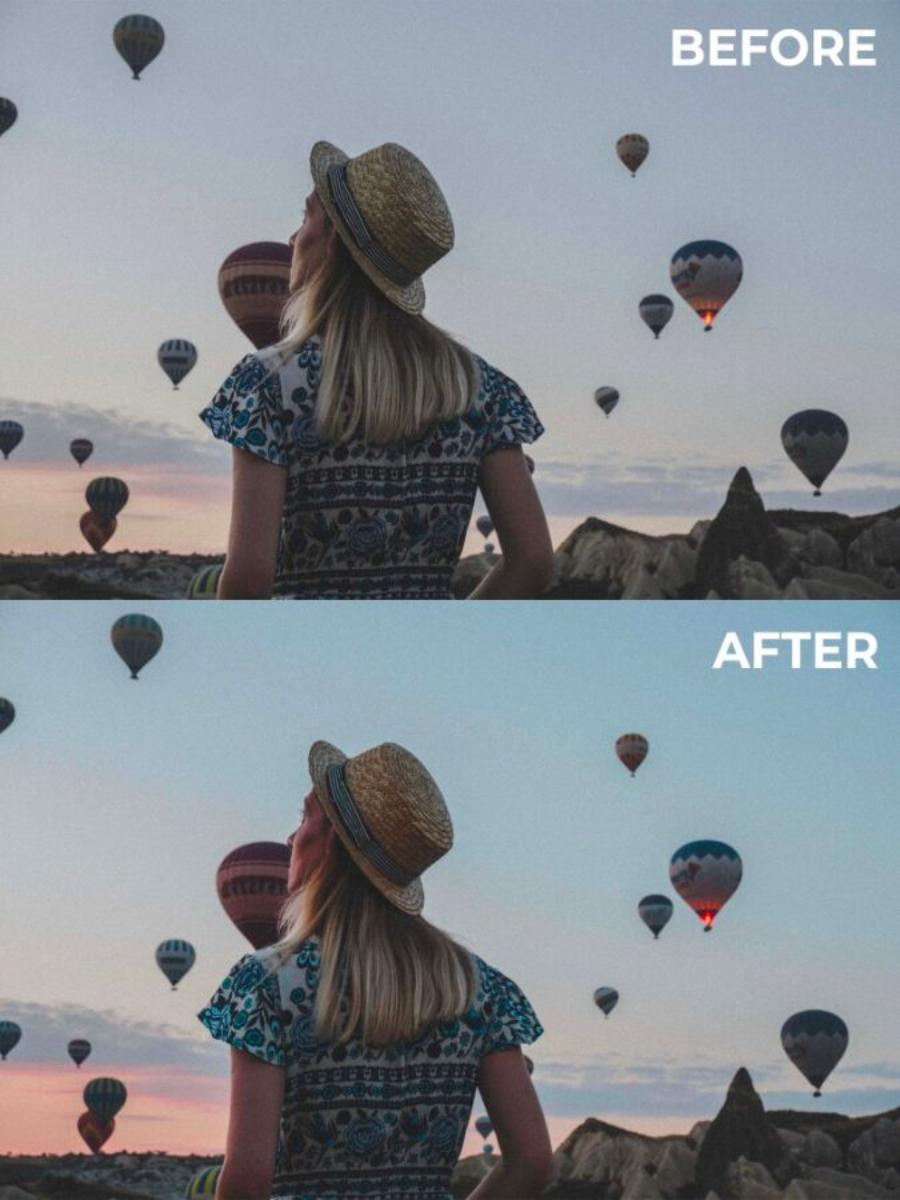
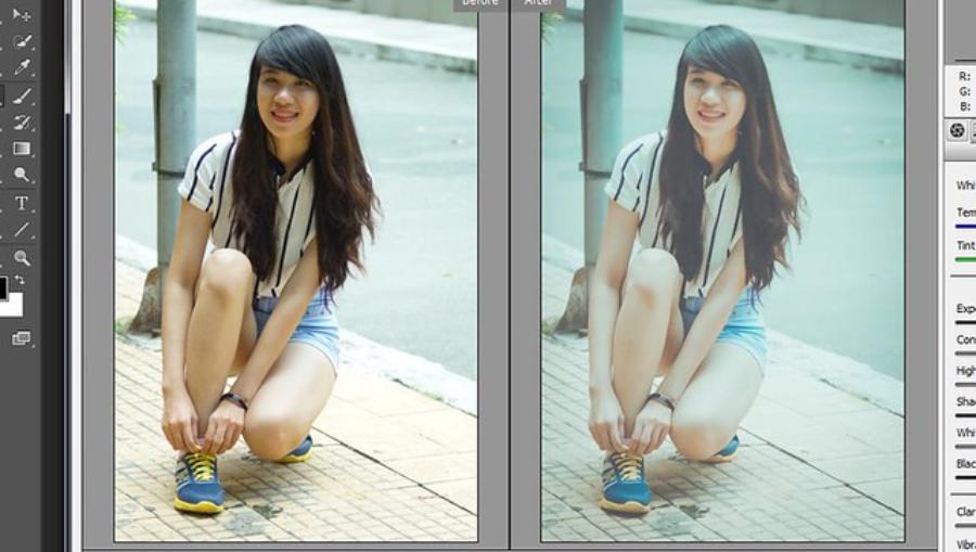
5.4. Compare Photos Before and After Editing
-
To evaluate the effectiveness of your edits, you can:
-
Click the eye icon (Visibility) on the Adjustment Layer to turn the effect on/off.
-
Hold down Alt (Windows) or Option (Mac) and click the background layer's eye icon to hide/show all adjustment layers.
-
Use the History Panel ( Window > History ) to go back to previous steps.
-
5.5. View Histogram and Info Panel
-
Histogram: Always keep an eye on the Histogram when adjusting Levels or Curves to ensure the image has enough detail in both highlights, shadows, and midtones.
-
Info Panel ( Window > Info ): When you hover over an image, the Info panel displays the RGB values of each pixel. This is useful for checking specific color areas or seeing if light/dark areas are being "clipped" (RGB values of 0,0,0 for pure black or 255,255,255 for pure white).
5.6. Editing on Calibrated Monitor
-
For the most accurate color display, you should ideally work on a color-calibrated monitor. This ensures that the colors you see on your monitor are the actual colors of the photo.
5.7. Save and Export Images Properly
-
Save PSD files: Always save your work as .psd or .psb files (if the file is too large) to retain all the layers and be able to edit them later.
-
Export image for use: When finished, export your image for use on the web or in print:
-
File > Export > Save for Web (Legacy)... (Ctrl/Cmd + Shift + Alt + S) to export web-optimized images (JPG, PNG).
-
File > Export > Export As... for more export options.
-
File > Save As... (Ctrl/Cmd + Shift + S) to save in other formats like JPG, TIFF, etc.
-
6. Conclusion
Color correction in Photoshop is not as complicated as you think. With basic tools. Including: Brightness/Contrast, Levels, Curves, Hue/Saturation, Vibrance, and Photo Filter, combined with a good understanding of Adjustment Layers and Layer Mask. Thus, you have enough luggage to turn ordinary photos into vivid and artistic ones.


VIP Products


Best Selling Products
ChatGPT Plus Account (GPT-4)
16 USD
Autodesk All App Account Copyright
120 USD
Plugin Retouch4me
69 USD
Genuine Cheap Canva Pro
39 USD
Adobe Photoshop Copyright - Full App
120 USD
MidJourney Account
29 USD
Capcut Pro 1 Year
39 USD
Adobe Premiere Pro Account
99 USD
Copyright Adobe Lightroom Account
59 USD
Windows 10 & 11 Pro Key
36 USD
Upgrade Genuine Office 365
49 USD
Upgrade Duolingo Super
29 USD
Upgrade genuine Capture One account
120 USD
Genuine Adobe Illustrator account
99 USD
Freepik Premium Account
59 USD