Best Selling Products

Genuine Cheap Canva Pro
39 USD

Plugin Retouch4me
69 USD

Adobe Premiere Pro Account
99 USD

MidJourney Account
29 USD

Copyright Adobe Lightroom Account
59 USD

Upgrade Duolingo Super
29 USD

ChatGPT Plus Account (GPT-4)
16 USD

Capcut Pro 1 Year
39 USD

Freepik Premium Account
59 USD

Adobe Photoshop Copyright - Full App
120 USD

Genuine Adobe Illustrator account
99 USD

Upgrade Genuine Office 365
49 USD

Upgrade genuine Capture One account
120 USD

Autodesk All App Account Copyright
120 USD

Windows 10 & 11 Pro Key
36 USD
Google Translate is preparing for a major overhaul with a new interface: A host of exciting changes to look forward to on Android.
Nội dung
- 1. Google Translate: The familiar translation tool for billions of people.
- 2. Why does Google Translate need a "makeover"?
- 3. A new interface appears in the beta version.
- 4. The language selector has been moved to a more accessible location.
- 5. A new, more modern function bar.
- 6. Two contextual shortcuts help you continue learning faster.
- 7. The input box is more intelligently optimized.
- 8. Managing saved translation history and translations is more convenient.
- 9. The new input interface is more user-friendly.
- 10. AI Gemini presents both opportunities and challenges.
The Google Translate update brings several improvements to the layout, function bar, translation history management, and the ability to resume language learning sessions.
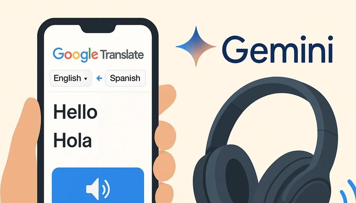
1. Google Translate: The familiar translation tool for billions of people.
Google Translate was launched by Google in 2006 and quickly became one of the most popular online translation platforms in the world. Currently, the application supports hundreds of languages and various translation methods such as text translation, voice translation, image translation via camera, live conversation translation, and document translation.
Beyond its educational value, Google Translate is incredibly useful for work, travel, international communication, and research. Thanks to its ability to work on both web and mobile platforms, users can easily access this tool anywhere.
For many years, Google has continuously improved its translation capabilities through the application of machine learning, neural network translation (NMT), and more recently, generative artificial intelligence (AI). However, the application's interface is almost "frozen," making many people feel that Google Translate is outdated compared to other applications in the Google ecosystem.
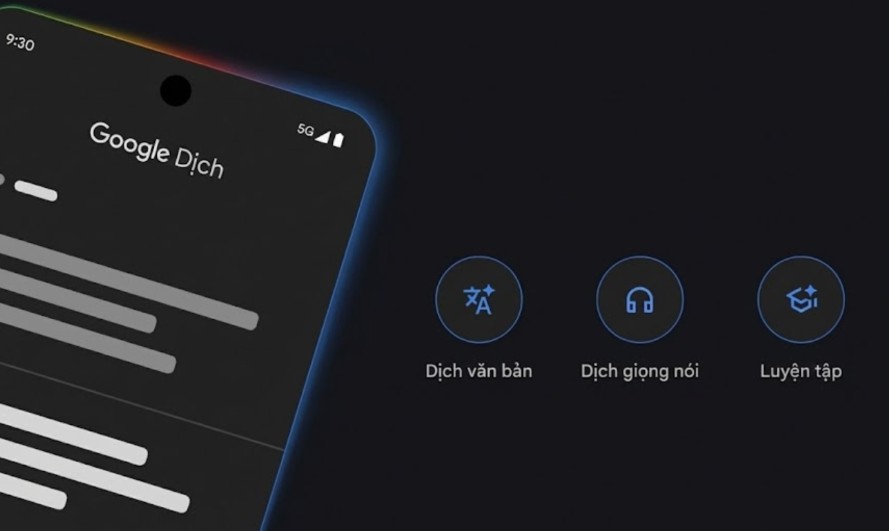
2. Why does Google Translate need a "makeover"?
If you frequently use apps like Google Photos, Gmail, Google Maps, or Google Keep, you'll easily notice that these apps have been updated to the Material You design language, featuring a softer, more modern, and optimized interface.
Meanwhile, Google Translate has maintained its familiar layout for many years:
-
The large text input box takes up most of the screen.
-
The language selector is located at the bottom.
-
The functions are arranged into four fixed tabs.
-
Some of the control buttons are not arranged very intuitively.
Although this design still fully meets user needs, it has started to become outdated in terms of user experience. Given that Google is standardizing the interface across the entire Android ecosystem, a refresh of Google Translate is almost inevitable.
The interface changes are not simply about creating a fresh feel, but also about helping users operate faster, reducing the number of taps, and making more efficient use of the display space on modern phone screens.
3. A new interface appears in the beta version.
According to information shared in Google Translate version 10.25 for Android, Google is testing a completely new interface.
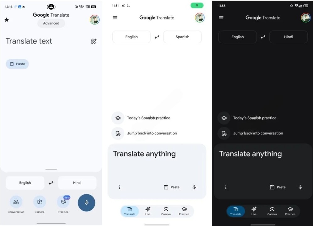
The most noticeable change is that the entire home screen layout has been rearranged to be more minimalist.
Instead of having the text input box occupy almost the entire screen as before, Google has reduced its size to create more space for other features. This makes the interface cleaner, less cluttered, and more convenient to use.
The interface elements are also designed in the characteristic rounded style of the new Material Design, creating consistency with other Google applications.
While these changes haven't altered how the app works, they significantly improve the visual experience and usability.
4. The language selector has been moved to a more accessible location.
One of the most significant changes is the location of the language selector box.
In the old interface, users had to look near the bottom of the screen to select the source and target languages. This location wasn't very convenient, especially when switching languages frequently.
In the new version, Google has moved the language selector to the top of the window.
This change brings many benefits:
Users can quickly identify the language being used.
Switching between languages is now more convenient.
The input space is expanded vertically.
The new layout is also consistent with the design of many other Google applications, making it quick for users to get used to.
This is a small change, but it has a big impact on the daily user experience.
5. A new, more modern function bar.
Another notable point is that the four traditional function tabs have been completely redesigned.
Instead of displaying them as separate buttons, Google moved them to a pill-shaped navigation bar, similar to the interface of the Now Playing app.
The four main features have also been renamed: Translate, Live, Camera, Practice
The new design offers a more modern, streamlined, and intuitive feel.
In particular, the use of a pill-shaped navigation bar aligns with Android's new design trend, helping to create a more consistent interface across the entire Google ecosystem.
6. Two contextual shortcuts help you continue learning faster.
One of the most valuable additions to the new interface is the inclusion of two contextual keyboard shortcuts.
Previously, users would essentially start from scratch every time they opened the app, but now Google Translate can display options to continue:
-
Previous language practice session.
-
Recent conversation.
This is especially useful for people who are learning a foreign language or who frequently use Google Translate to communicate.
Being able to continue directly from where you left off saves time and creates a seamless experience.
This design trend is also being adopted by many modern applications to personalize the user experience.
7. The input box is more intelligently optimized.
Google has also significantly improved the text input area.
Instead of just a simple input field, this area now includes three main components:
-
The three-dot menu button.
-
Text paste button.
-
Microphone icon.
The new design makes it easier for users to access more functions without making the interface complicated.
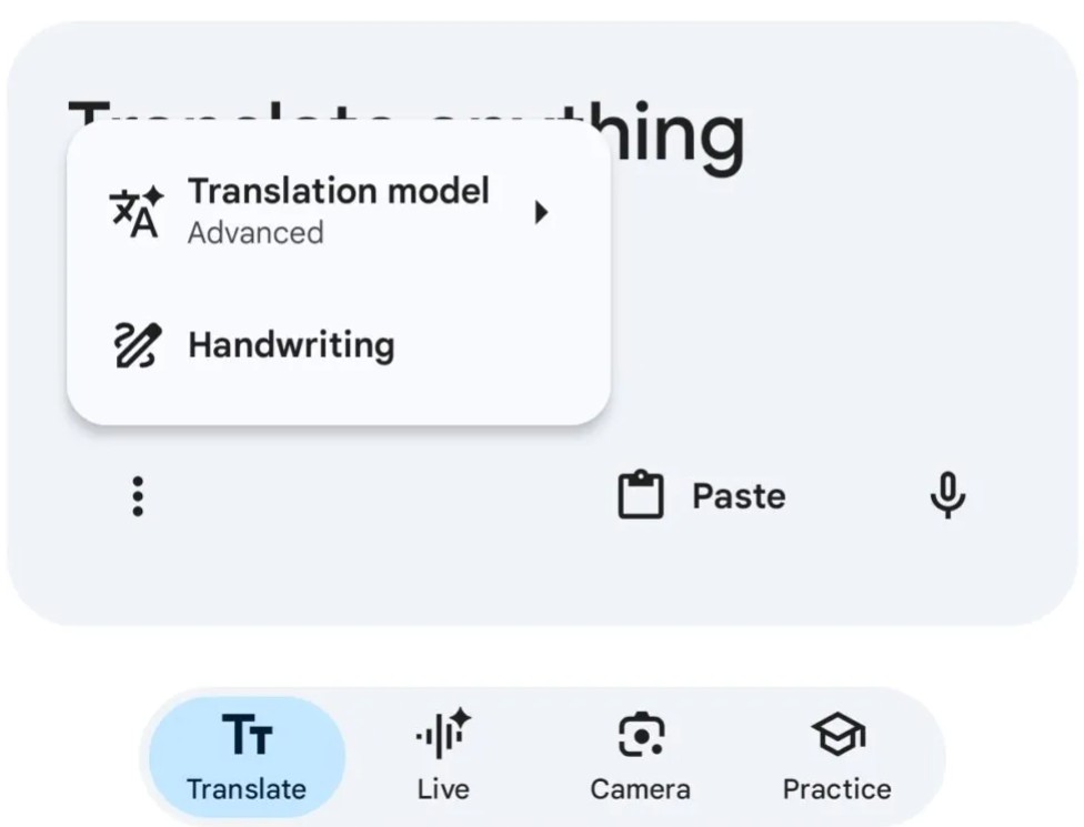
When clicking on the three-dot icon, users can open additional options such as:
-
Choose a translation model.
-
Handwritten.
-
Other extended features.
Grouping the secondary functions into a menu makes the main screen cleaner while still ensuring full functionality.
8. Managing saved translation history and translations is more convenient.
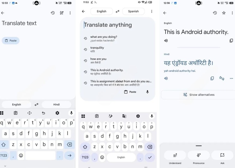
Previously, the star icon was used to access saved translations.
In the new interface, Google replaced this icon with a comprehensive navigation menu.
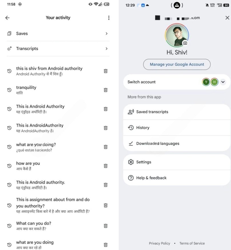
From here, users can access:
-
History of translation.
-
The translations have been saved.
-
Recent content.
Consolidating management functions into a single area allows users to find information faster while reducing the number of icons appearing on the home screen.
This is a small change, but it results in a more consistent and professional experience.
9. The new input interface is more user-friendly.
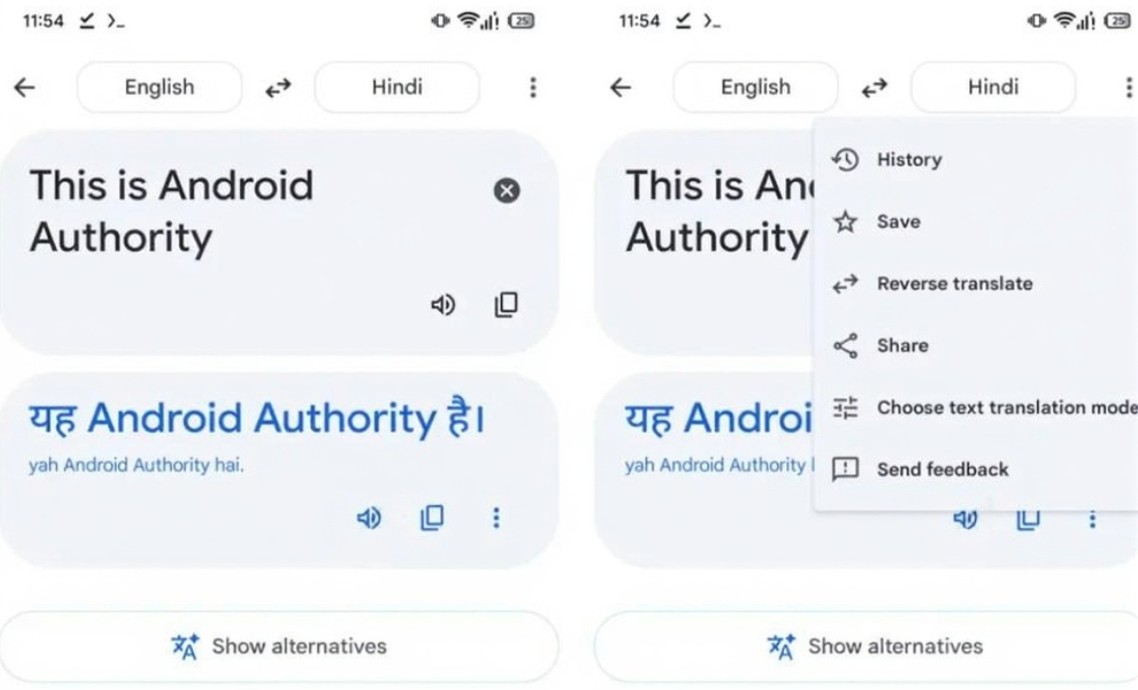
Another upgrade appears when the user begins typing text.
The language selection box is pinned at the top.
The following will display recent translations in a similar way to search history in the Chrome browser.
This design offers several advantages:
Users can easily find the content they have just translated.
Reduce the time spent retyping identical paragraphs.
Accelerate the continuous translation process.
This is an improvement focused on the user experience rather than just a change in appearance.
10. AI Gemini presents both opportunities and challenges.
One reason cited by many experts is the integration of the Gemini AI into Google Translate.
Gemini has the ability to:
Understand the context.
Express yourself naturally.
Rewrite the sentence smoothly.
Adjust your writing style.
As a result, translations become more like how humans communicate.
However, AI generation doesn't always prioritize translating each word exactly according to its original meaning.
In many cases, Gemini will "interpret" the content rather than accurately translating each component.
For language learners, this can sometimes be helpful.
However, for those who need a literal translation for research, academic purposes, or work, this is a significant limitation.
11. Conclusion
Google Translate is undergoing a significant transformation after years of maintaining a nearly unchanged design. The new Android interface offers a more modern style, optimized operation, and alignment with Google's Material Design ecosystem. Changes such as a smaller input field, the language selector being moved to the top, a redesigned function bar, the addition of contextual shortcuts, and improved history management all contribute to an enhanced daily user experience.
However, a beautiful interface is only part of the equation. What users expect most is stable, accurate, and flexible translation quality. The arrival of AI Gemini opens up many opportunities for Google Translate to become smarter, but at the same time, it requires a balance between natural expression and accuracy of the original content. If Google adds the option to switch between traditional and AI translation as desired by the community, Google Translate will not only undergo a visual transformation but also significantly upgrade its usability, continuing to be a leading translation tool in the AI era.





















VIP Products








Best Selling Products
Genuine Cheap Canva Pro
39 USD
Plugin Retouch4me
69 USD
Adobe Premiere Pro Account
99 USD
MidJourney Account
29 USD
Copyright Adobe Lightroom Account
59 USD
Upgrade Duolingo Super
29 USD
ChatGPT Plus Account (GPT-4)
16 USD
Capcut Pro 1 Year
39 USD
Freepik Premium Account
59 USD
Adobe Photoshop Copyright - Full App
120 USD
Genuine Adobe Illustrator account
99 USD
Upgrade Genuine Office 365
49 USD
Upgrade genuine Capture One account
120 USD
Autodesk All App Account Copyright
120 USD
Windows 10 & 11 Pro Key
36 USD