Best Selling Products

Adobe Photoshop Copyright - Full App
120 USD

Upgrade Genuine Office 365
49 USD

Upgrade genuine Capture One account
120 USD

Windows 10 & 11 Pro Key
36 USD

MidJourney Account
29 USD

Plugin Retouch4me
69 USD

Copyright Adobe Lightroom Account
59 USD

Capcut Pro 1 Year
39 USD

Genuine Adobe Illustrator account
99 USD

Freepik Premium Account
59 USD

ChatGPT Plus Account (GPT-4)
16 USD

Autodesk All App Account Copyright
120 USD

Upgrade Duolingo Super
29 USD

Adobe Premiere Pro Account
99 USD

Genuine Cheap Canva Pro
39 USD
Gutenberg Model: Effective Application in UX/UI Design
Nội dung
- 1. What is the concept of Gutenberg model?
- 2. The four main visual areas in the Gutenberg Diagram
- 2.1. Primary Optical Area (Top left)
- 2.2. Strong Fallow Area (Top Right)
- 2.3. Weak Fallow Area (Bottom left)
- 2.4. Terminal Area (Bottom Right)
- 2.5 How the human eye moves according to the Gutenberg model when reading text
- 2.6 Why is the Gutenberg model still relevant in digital design?
- 3. The Four "Golden" Zones of the Gutenberg Diagram and Their Meaning for UX/UI Design
- 4. The "Divine" Application of Gutenberg Diagram in UX/UI Design
- 5. Comparing the Gutenberg Model to Other Visual Navigation Models
- 6. Golden Rules When Applying Gutenberg Diagram In Design
- 7. Important Notes When Using the Gutenberg Model
- 8. Combine Gutenberg Diagram With Other UX/UI Design Principles
- 9. Tools to Support Visual Navigation Analysis and Gutenberg Implementation
- 10. Real-life examples of effective application of the Gutenberg model
- 11. Conclusion
Learn more about the Gutenberg model – a classic visual reading principle in design. Discover how to apply Gutenberg Diagram in UX/UI to create effective user experiences.
In the field of modern UX/UI design, understanding the visual behavior of users is a prerequisite for building effective interfaces. One of the classic visual principles that still retains its application value is the Gutenberg model . Although it has been around for a long time, this model is still a fundamental tool that helps designers control the flow of information, orient the gaze and enhance the user experience. In this article, sadesign will analyze the Gutenberg model in detail and how to apply it flexibly to modern UX/UI projects.
1. What is the concept of Gutenberg model?
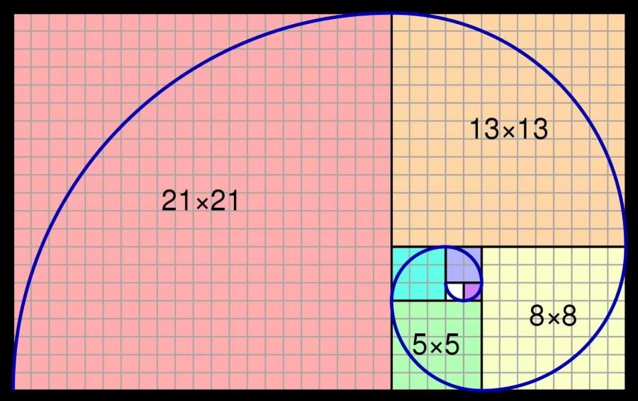
The Gutenberg Model – also known as the Gutenberg Diagram – is a visual diagram that simulates the way the human eye scans and takes in information on a two-dimensional surface, usually on paper or a screen. Developed by 20th-century typographer Edmund C. Arnold, the model assumes that the Western eye begins at the top left and moves diagonally to the bottom right, following the natural reading sequence of Latin languages.
.jpg)
Unlike advanced reading models such as Z-pattern or F-pattern , Gutenberg Diagram is commonly used in designs with simple, highly balanced layouts. It not only helps identify “hot” areas in the design but also provides a basis for designers to build layouts that can effectively guide the eye.
2. The four main visual areas in the Gutenberg Diagram
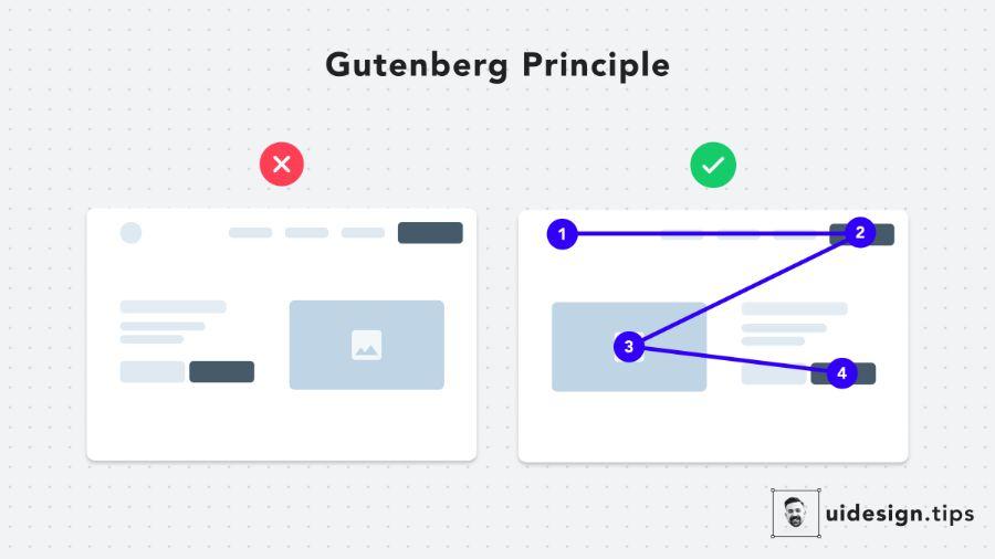
The Gutenberg model divides the design surface into four main areas :
2.1. Primary Optical Area (Top left)
This is where the user begins the reading process. All eyes are drawn to this area first. Therefore, this is the ideal place to place important content such as headlines, brand logos, or key messages.
2.2. Strong Fallow Area (Top Right)
This is where the eye will move next after the main area. While not as strong as the first area, this area still receives significant attention. Secondary CTAs, prominent images, or navigation cues are often placed here.
2.3. Weak Fallow Area (Bottom left)
This area receives the least attention in the entire diagram. Without any visual appeal, users will often skip over it. However, it can still be used for additional elements or supporting details.
2.4. Terminal Area (Bottom Right)
This is the stopping point of the eye – where the user will stop after completing the visual journey according to the model. Therefore, this is the ideal place to place a call-to-action (CTA), sign-up form, or closing information.
2.5 How the human eye moves according to the Gutenberg model when reading text
When approaching a page of text (or a similarly structured interface), the human eye typically starts in the upper left corner, moves horizontally to the right, then down the line and repeats the process, forming a “Z” shaped scan path or a slight diagonal. The priority area is the starting point, the final area is the natural ending point, the inertial blind area is often ignored, and the center area can attract attention if there is interesting content.
2.6 Why is the Gutenberg model still relevant in digital design?
Although reading environments have changed with the advent of screens and digital devices, basic human reading habits still hold strong. The Gutenberg Model provides a useful framework for understanding how users tend to consume information on digital interfaces, especially pages that are text-heavy or structured similarly to the printed page. By designing with this model in mind, designers can optimize reading flow and ensure that important information is placed in the most visible locations.
3. The Four "Golden" Zones of the Gutenberg Diagram and Their Meaning for UX/UI Design
.jpg)
Top-Left Priority Area:
First visual “anchor” position: This is where users typically look first when visiting a page.
Its importance: Therefore, this area is very important to place elements that immediately attract attention, such as the logo, main headline, or the most important information that you want the user to see first.
Bottom-Right Area:
End of visual journey: This is typically where the human eye stops after scanning the page.
Call-to-action role: This area is the ideal place to place important calls-to-action (CTAs), such as “Buy Now,” “Sign Up,” or “Contact” buttons. Placing CTAs at the end of the natural reading journey can increase the likelihood that users will take the desired action.
Diagonal Scan:
Less-noticed area: Due to the habit of reading diagonally, this area often receives less attention than the priority and ending areas.
How to optimize it: Avoid placing important information or main CTAs in this area. Instead, use it for supporting elements, secondary information, or decorative elements that are not too important.
Center:
The "main stage" of the content: This is the area where the human eye can focus after scanning the priority area.
How to draw attention: The center area is the ideal place to place your main content, a prominent image or video, or important messages you want users to remember. Use visual hierarchy (size, color, contrast) to highlight elements in this area.
4. The "Divine" Application of Gutenberg Diagram in UX/UI Design
Website and App Layouts: The Gutenberg model provides a solid foundation for building clean and intuitive website and app layouts. By dividing the page into regions according to the model, designers can strategically arrange interface elements to guide users' eyes naturally. For example, the main navigation menu is often placed in the upper left priority area, while the main content occupies the center area.
Place important content: To ensure that core information is immediately noticed by the user, place it in the top left priority area. Supporting or less important information can be placed in the inertial blind or center area with lower visual priority.
Design your Call to Action (CTA): The bottom right corner is the ideal place to place important CTAs. Once users have scanned through the content, placing the CTA at the natural end of their visual journey increases the likelihood that they will take the desired action (purchase, sign up, contact, etc.).
User Navigation: By following the Gutenberg model, designers can create a natural reading and interaction flow. Users tend to move their eyes diagonally, so arranging navigation elements (e.g. “next,” “more” buttons) in this direction can help them easily explore content.
Product Page Design: On product pages, the featured product image is often placed in the center or priority area to attract attention. Product details, descriptions, and prices can be arranged in a top-to-bottom and left-to-right reading flow. The “Add to Cart” or “Buy Now” button should be placed in the bottom right area to encourage purchase action.
News and blog design: In news or blog design, the article title is usually placed in the priority area. The article content will occupy the center area, and related elements such as a sidebar containing related articles or advertisements can be placed in the blind area or on the right.
Form Design: When designing forms, arranging fields according to the Gutenberg reading flow can help users complete them easily. Important fields should be placed in the upper left, and the “Submit” button is often placed in the lower right corner.
5. Comparing the Gutenberg Model to Other Visual Navigation Models
.jpg)
F-Pattern: The F-pattern is common on websites with a lot of text content. Users typically read along a horizontal line at the top of the page, then scan down and read a shorter horizontal line, forming an F shape. Important points should be placed along these two horizontal lines and the left column.
Z-Pattern: The Z-pattern is often seen on websites with little text and lots of visual elements. The human eye moves in a Z-pattern: from left to right at the top, down the diagonal, and then from left to right at the bottom. Important elements should be placed along this Z-pattern.
Differences and suitability of each model in different design situations:
Gutenberg: Suitable for pages that are structured similarly to printed text, where users tend to read from left to right and top to bottom sequentially.
F-Pattern: Suitable for pages with a lot of text, such as blog pages, articles, or search results pages, where users tend to scan quickly to find important information.
Z-Pattern: Effective for home pages or landing pages that have little text and focus on images or visual elements to grab initial attention.
When to use Gutenberg, F-Pattern, or Z-Pattern? The choice of pattern depends on the type of content, the goal of the page, and the expected user behavior. If the page has a sequential reading structure, Gutenberg is a good choice. If the page has a lot of text that needs to be scanned quickly, F-Pattern is more effective. If the page is focused on visual elements and calls for quick action, Z-Pattern may be more appropriate.
6. Golden Rules When Applying Gutenberg Diagram In Design
Prioritize important content in the top left area: This is the “golden position” to attract initial attention and convey the core message.
Place your call to action in the bottom right area: Take advantage of the natural end point of the visual journey to encourage users to take the desired action.
Use the center area to draw focus to the main content: This is the "main stage" to present important information, featured images or videos.
Consider placing supporting or less important elements in the blind spot: Avoid placing important elements in this area as it is often overlooked.
Test and adjust layouts based on real user behavior: Use eye tracking tools and heat maps to understand how users actually interact with the interface and adjust layouts accordingly.
7. Important Notes When Using the Gutenberg Model
Not an absolute rule: The Gutenberg model is a useful guide, but it's not a hard-and-fast rule. In some cases, creatively breaking the model can yield surprising results.
Influence of reading culture: The Gutenberg model is based on left-to-right reading habits. For languages and cultures that read from right to left (e.g. Arabic, Hebrew), this pattern is reversed.
Responsive design: When designing for different screen sizes, it's important to ensure that the principles of the Gutenberg model still apply flexibly and effectively across mobile and tablet devices.
Page Goal and Content: The specific purpose of the page and the type of content will influence how the Gutenberg model is applied. A conversion-focused landing page might have a different layout than a text-heavy blog page.
8. Combine Gutenberg Diagram With Other UX/UI Design Principles
.jpg)
Consistency: Applying the Gutenberg model consistently across your entire website or app will help users become familiar with the layout and navigate easily.
Visual Hierarchy: Use size, color, contrast, and position to create a clear hierarchy, guiding the user's eye through important elements according to the Gutenberg flow.
Whitespace: Use whitespace effectively around Gutenberg areas to create breathing space and help users focus on the main content.
Readability: Choose the right font, size, and line spacing to ensure users can read the content easily when moving their eyes according to the Gutenberg model.
9. Tools to Support Visual Navigation Analysis and Gutenberg Implementation
Eye-tracking tools: Provide accurate data on how users look and interact with the interface, helping determine whether a Gutenberg layout is effective.
Heatmaps and Clickmaps: Shows the areas that are most noticed and clicked by users, helping to evaluate the effectiveness of placing important elements according to the Gutenberg model.
A/B testing: Allows testing different layouts based on the Gutenberg model and comparing their performance to optimize user experience.
Grid-based design plugins and frameworks: Help create flexible and easily adjustable page structures that follow the principles of the Gutenberg model.
10. Real-life examples of effective application of the Gutenberg model
News Pages: News pages typically place the headline and main content in the top left and center areas, while related news or advertisements may be located in the sidebar (inertial blind area or right side).
Blog pages: Similar to news pages, the title and article content are prioritized in the top left and center areas. Sharing buttons or author information can be located in the bottom right area or below the content.
Product Page: Featured product image in the center or top left area, product description and price in the center reading area, and "Add to Cart" button usually placed in the bottom right area.
Home Page: Effective homepages typically use the top left area for logos and primary messaging, the center area for featured content or primary calls to action, and the bottom right area for secondary CTAs or contact information.
11. Conclusion
Although the Gutenberg model was born in the traditional printing era, it has proven its power in modern UX/UI design. Understanding and applying this diagram not only helps increase the effectiveness of visual communication but also enhances interaction, user retention and conversion.


VIP Products


Best Selling Products
Adobe Photoshop Copyright - Full App
120 USD
Upgrade Genuine Office 365
49 USD
Upgrade genuine Capture One account
120 USD
Windows 10 & 11 Pro Key
36 USD
MidJourney Account
29 USD
Plugin Retouch4me
69 USD
Copyright Adobe Lightroom Account
59 USD
Capcut Pro 1 Year
39 USD
Genuine Adobe Illustrator account
99 USD
Freepik Premium Account
59 USD
ChatGPT Plus Account (GPT-4)
16 USD
Autodesk All App Account Copyright
120 USD
Upgrade Duolingo Super
29 USD
Adobe Premiere Pro Account
99 USD
Genuine Cheap Canva Pro
39 USD