Best Selling Products

Upgrade Duolingo Super
29 USD

Adobe Premiere Pro Account
99 USD

Upgrade genuine Capture One account
120 USD

Adobe Photoshop Copyright - Full App
120 USD

Genuine Cheap Canva Pro
39 USD

Plugin Retouch4me
69 USD

MidJourney Account
29 USD

Autodesk All App Account Copyright
120 USD

Copyright Adobe Lightroom Account
59 USD

Freepik Premium Account
59 USD

Capcut Pro 1 Year
39 USD

Genuine Adobe Illustrator account
99 USD

Upgrade Genuine Office 365
49 USD

ChatGPT Plus Account (GPT-4)
16 USD

Windows 10 & 11 Pro Key
36 USD
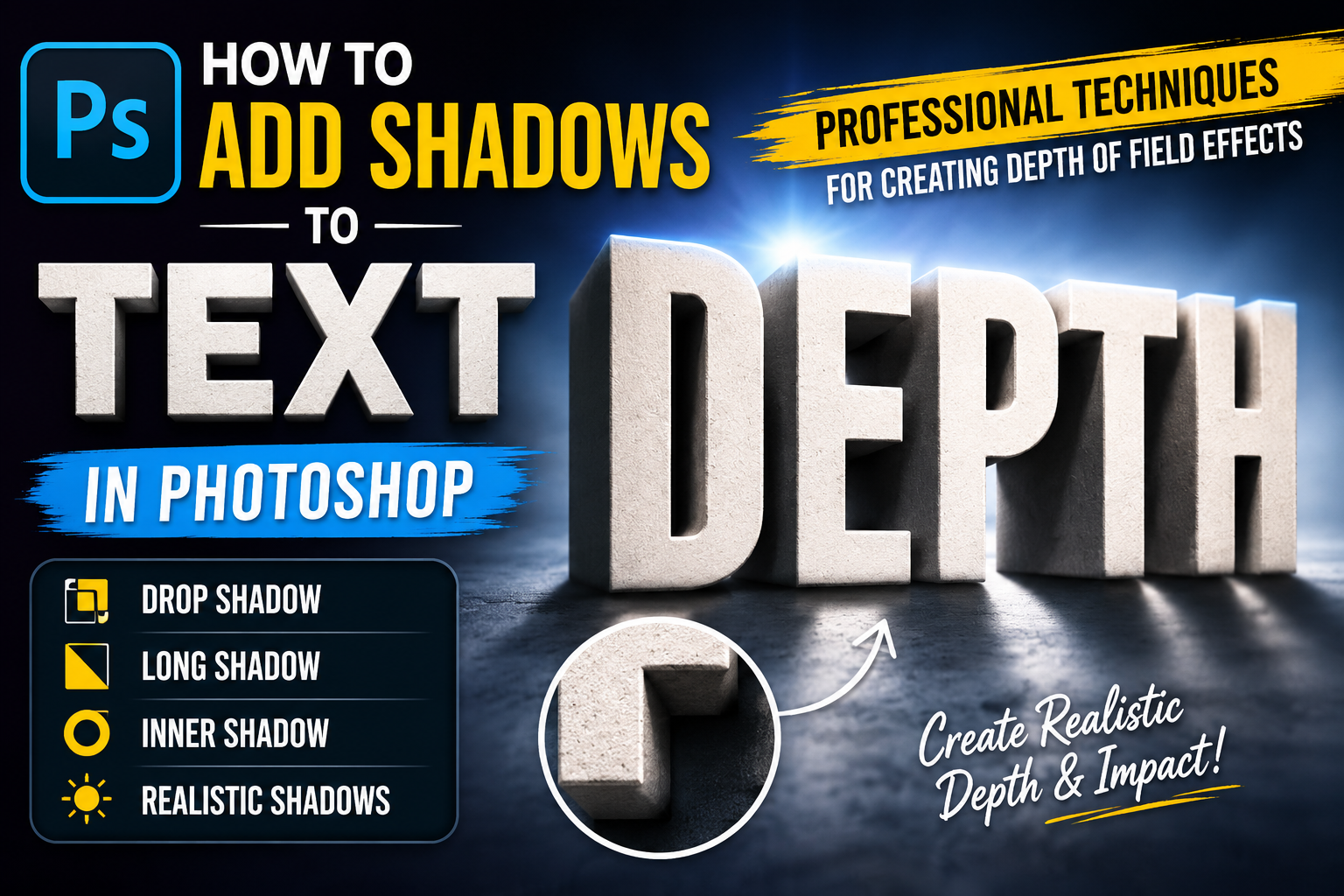
How to Add Shadows to Text in Photoshop: Professional Techniques for Creating Depth of Field Effects
Nội dung
- 1. The nature and role of shadow effects in graphic design
- 2. Detailed instructions on how to add text shadows using Layer Styles
- 2.1. Accessing the Layer Style panel
- 2.2. Understanding the parameters in the Drop Shadow option
- 2.3. Using Global Light to synchronize lighting
- 3. Create long, distorted shadows that change perspective (Long Shadow & Perspective)
- 4. Utilize the support resources available at appvip.ai
- 5. Important tips for achieving the most natural-looking text shadows.
- 5.1. The color of the shadow does not necessarily have to be black.
- 5.2. Pay attention to the blur effect.
- 5.3. Actual distance and ratio
- 6. Get creative with stylized letter shadows.
- 7. Common mistakes and solutions when adding shadows to text.
- 8. Conclusion
This detailed guide shows you how to professionally add text shadows in Photoshop, creating a 3D depth effect for your designs. Discover Layer Style tips and supporting tools at appvip.ai.
1. The nature and role of shadow effects in graphic design
Drop shadows are a simulation of the physical phenomenon where light is obscured by an object, creating a dark area behind it. In the digital world, especially with Photoshop, drop shadows are not just a dark band of color but a tool to trick the eye, creating a sense of distance between text and the background.
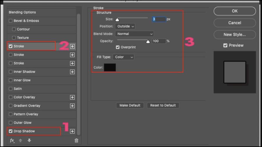
When a designer applies text shadows in Photoshop, the primary goal is to create visual separation. If the text and background are similar in color, adding a subtle shadow will help make the lines of the text clearer and sharper. Additionally, shadows play a crucial role in establishing information hierarchy. Important headings often have deeper, bolder shadows to immediately grab attention, while secondary content can use lighter shadows to maintain overall harmony.
2. Detailed instructions on how to add text shadows using Layer Styles
This is the most common and easiest method to implement, suitable for both beginners and experts due to its flexibility and non-destructive editing capabilities.
2.1. Accessing the Layer Style panel
The first step is to select the Type Layer you want to apply the effect to in the Layers panel. Then, double-click on the empty space of that layer or click the "fx" icon at the bottom of the Layers panel. A list of effects will appear, and you simply need to select "Drop Shadow" to begin the customization process.
2.2. Understanding the parameters in the Drop Shadow option
The Drop Shadow control panel offers a wide range of technical parameters that designers need to fine-tune to achieve the most natural results. Each parameter directly impacts the appearance of the drop shadow.
-
Blend Mode: Typically, the "Multiply" mode is used by default to ensure the shadow blends well with the background color.
-
Opacity: The intensity of the shadow. This setting should not be too high as it will make the shadow look harsh and unnatural.
-
Angle: The direction of the light source. Adjusting the angle circle will determine which side the shadow falls on relative to the text.
-
Distance: The distance between the text and the shadow. The larger the value, the more the text appears to float above the background.
-
Spread: The extent to which shadows spread, determining the intensity at the edges.
-
Size: The degree of blur of the shadow. A larger Size setting will create a soft shadow that gradually blends into the background.
2.3. Using Global Light to synchronize lighting
The "Use Global Light" feature is an extremely useful tool when you have many objects in the same design file. When this box is checked, any changes to the light direction (Angle) of the text will be applied synchronously to all other objects that are also using shadows. This ensures the logical flow of the artwork, avoiding the situation where each letter has a different shadow direction, causing visual confusion for the viewer.
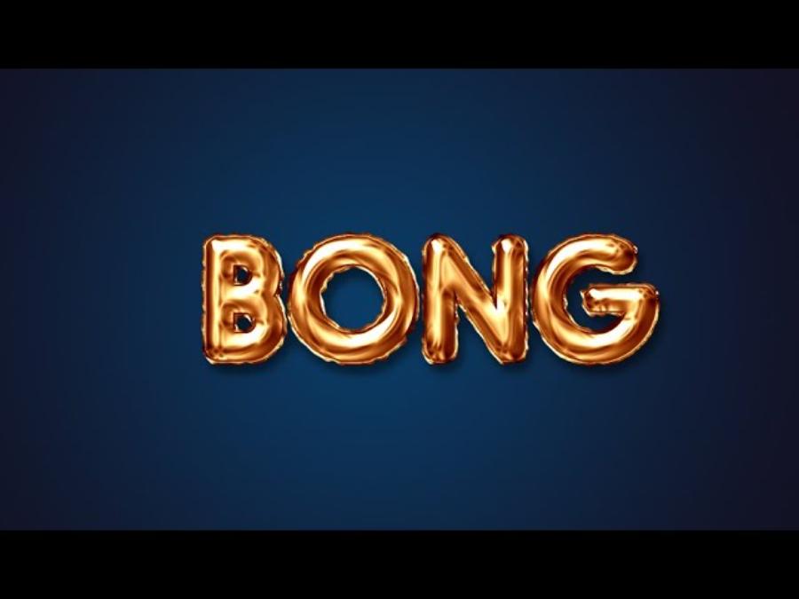
3. Create long, distorted shadows that change perspective (Long Shadow & Perspective)
Sometimes, the default Drop Shadow effect isn't enough to create a strong impression or isn't suitable for designs requiring a high level of artistry. In this case, techniques like creating long shadows or shadows that follow the perspective of the floor will be the optimal choice.
-
Using the Transform command: Users can duplicate the text layer, change it to black or gray, and then use the Ctrl + T key combination to distort and stretch the text layer so that it lies flat on the floor.
-
Gradient technique for shadows: To make long shadows look more realistic, the shadow near the base of the text should be bold and sharp, while the shadow further away should fade and become lighter. Applying a Layer Mask in combination with the Gradient Tool will help create this smooth transition effect.
-
Manually create 3D shadows: By holding down the Alt key and repeatedly pressing the arrow keys, you can create a series of overlapping layers of text, forming a solid shadow with depth, like letters made of metal or stone.
4. Utilize the support resources available at appvip.ai
The appvip.ai platform offers a diverse ecosystem of graphic and artificial intelligence solutions, simplifying the creation of text effects. Here, users can find applications that support automatic 3D typography creation, and pre-set Photoshop Action sets for one-click shading.
Combining traditional Photoshop skills with resources from appvip.ai allows designers to focus more on ideas instead of spending too much time on repetitive technical tasks. Referring to design trends and new tools at appvip.ai also helps you stay up-to-date with the latest shadow styles, from the currently popular Neumorphism to Glassmorphism.
5. Important tips for achieving the most natural-looking text shadows.
A common mistake beginners make is creating shadows that are too bold or too sharp, making the design look heavy and unprofessional. To avoid this, there are a few "golden" rules to follow.
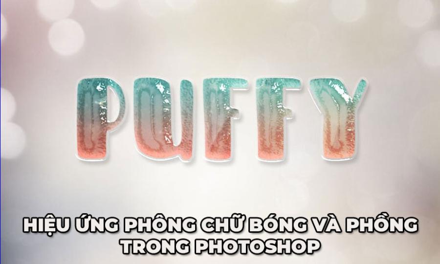
5.1. The color of the shadow does not necessarily have to be black.
Although black is the default color, in reality, the shadow of an object often carries a hint of its surroundings. For example, if text is on a dark blue background, the shadow should have a dark blue-black tone to create harmony. Choosing a shadow color that correlates with the background color will make the artwork look much more elegant and realistic.
5.2. Pay attention to the blur effect.
In reality, shadows rarely have sharp edges unless the light source is extremely strong and close. Therefore, always increase the Size parameter in the Drop Shadow panel appropriately. Moderate blur will prevent the shadow from looking "cut and pasted" and help the text blend seamlessly into the design space.
5.3. Actual distance and ratio
The distance of the shadow should be proportional to the size of the text and the design intent. If the text is too small but the shadow is too far away, the viewer will feel a sense of imbalance and discomfort. Experiment with different levels to find a balance between prominence and the stability of the layout.
6. Get creative with stylized letter shadows.
In addition to background shadows, Photoshop offers many other options to transform text into something unique and distinctive.
-
Inner Shadow: Instead of creating the illusion of raised letters, this effect makes the letters appear to be etched into the background surface. This is a great technique for minimalist designs or those that mimic leather or wood textures.
-
Outer Glow combined with Shadow: Sometimes, incorporating a subtle glow around the edges of the text before adding a shadow can make the text appear more vibrant, especially useful for neon or futuristic designs.
-
Multi-layered Drop Shadows: You can apply multiple Drop Shadow layers at once by clicking the "+" sign next to the effect name in the Layer Style panel. A bold, close-up shadow layer for definition, and a lighter, more distant shadow layer to create space will give the text a professional-looking depth.
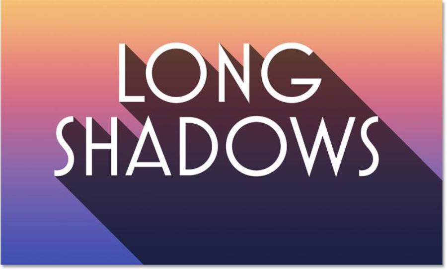
7. Common mistakes and solutions when adding shadows to text.
Post-production often involves errors that prevent the desired effect from being achieved. Identifying and correcting these errors promptly is an essential skill for an experienced copywriter or designer.
-
Broken shadow: This error usually occurs when the text layer is confined within a bounding box that is too narrow. Make sure the text layer has enough empty space around it for the shadow to be fully visible.
-
Shadows that are too dark obscure the text: When the shadow color and the text color are too close together, they cancel each other out. The solution is to increase the brightness of the text or reduce the shadow opacity to a minimum (around 20-40%).
-
Using too many drop shadows in a layout: Having a bold drop shadow on every line of text creates visual chaos. This effect should only be focused on the main title or key keywords to create focal points in the design.
-
Inconsistent shadow direction error: As mentioned in the Global Light section, if you accidentally turn off this option, the shadows will go in different directions, disrupting the lighting logic of the photo.
8. Conclusion
The technique of shading text in Photoshop is not just a simple software operation, but a combination of aesthetic thinking and an understanding of the laws of light. Applying the correct methods, from basic to advanced, will transform your text from dry lines of text into artistic elements with depth and powerful appeal. With the support of technology platforms like appvip.ai and consistent practice, anyone can create professional-looking graphic products.





















VIP Products








Best Selling Products
Upgrade Duolingo Super
29 USD
Adobe Premiere Pro Account
99 USD
Upgrade genuine Capture One account
120 USD
Adobe Photoshop Copyright - Full App
120 USD
Genuine Cheap Canva Pro
39 USD
Plugin Retouch4me
69 USD
MidJourney Account
29 USD
Autodesk All App Account Copyright
120 USD
Copyright Adobe Lightroom Account
59 USD
Freepik Premium Account
59 USD
Capcut Pro 1 Year
39 USD
Genuine Adobe Illustrator account
99 USD
Upgrade Genuine Office 365
49 USD
ChatGPT Plus Account (GPT-4)
16 USD
Windows 10 & 11 Pro Key
36 USD