Best Selling Products

Upgrade genuine Capture One account
120 USD

Genuine Cheap Canva Pro
39 USD

Windows 10 & 11 Pro Key
36 USD

Copyright Adobe Lightroom Account
59 USD

Capcut Pro 1 Year
39 USD

Upgrade Genuine Office 365
49 USD

Freepik Premium Account
59 USD

Adobe Photoshop Copyright - Full App
120 USD

ChatGPT Plus Account (GPT-4)
16 USD

Adobe Premiere Pro Account
99 USD

Plugin Retouch4me
69 USD

Genuine Adobe Illustrator account
99 USD

MidJourney Account
29 USD

Upgrade Duolingo Super
29 USD

Autodesk All App Account Copyright
120 USD
How to Change Colors in Photoshop for a Beautiful and Accurate Look for Designers
Nội dung
- 1. The technical nature of color conversion on digital platforms
- 1.1 The relationship between the three elements: Hue, Saturation, and Lightness
- 1.2 The role of RGB and CMYK color systems in the processing
- 1.3 The importance of identifying the target for processing
- 2. Methods for changing colors in Photoshop, from basic to advanced.
- 2.1 Using the intuitive Hue/Saturation command panel
- 2.2 Harnessing the power of the Replace Color feature
- 2.3 Techniques for using Color Blend Mode
- 3. Advanced color transformation process using Adjustment Layers
- 3.1 Advantages of Non-Destructive Image Processing Methods
- 3.2 Steps for combining Color Balance and Layer Mask
- 4. Core principles that help achieve high color accuracy after color conversion.
- 4.1 Adhering to the logical laws of natural light
- 4.2 Control saturation to avoid color banding.
- 4.3 Synchronizing the color spectrum according to a unified concept
- 5. Discover superior automatic color processing solutions at appvip.ai
- 6. Common mistakes to avoid when handling graphic color
- 6.1 Color bleeding errors at the edges of joints
- 6.2 Loss of detail in areas of extreme darkness and brightness.
- 7. Conclusion
A comprehensive guide to color changing methods in Photoshop, from basic to advanced. Discover the secrets to mastering the Hue/Saturation, Color Replace, and Brush tools.
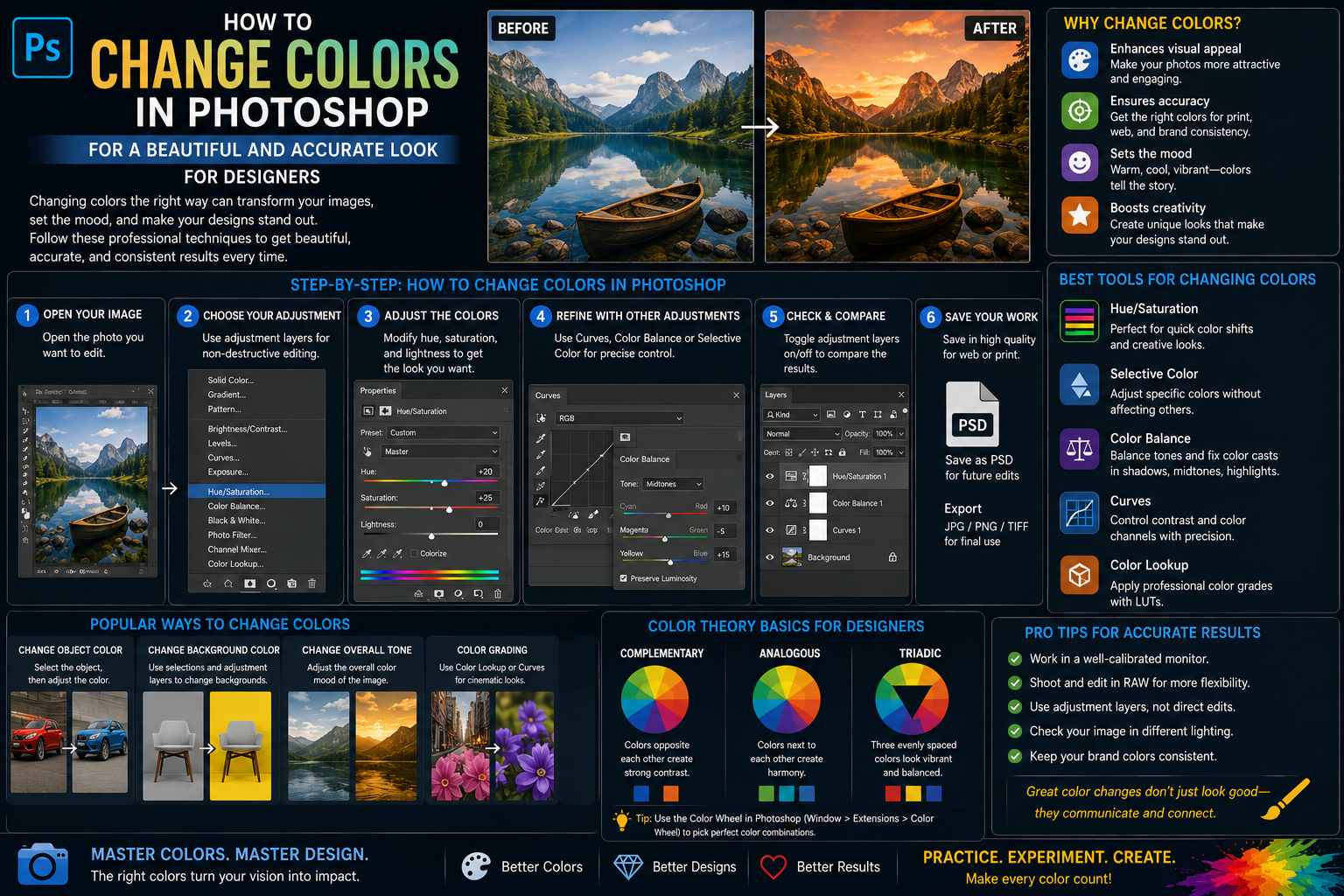
1. The technical nature of color conversion on digital platforms
1.1 The relationship between the three elements: Hue, Saturation, and Lightness
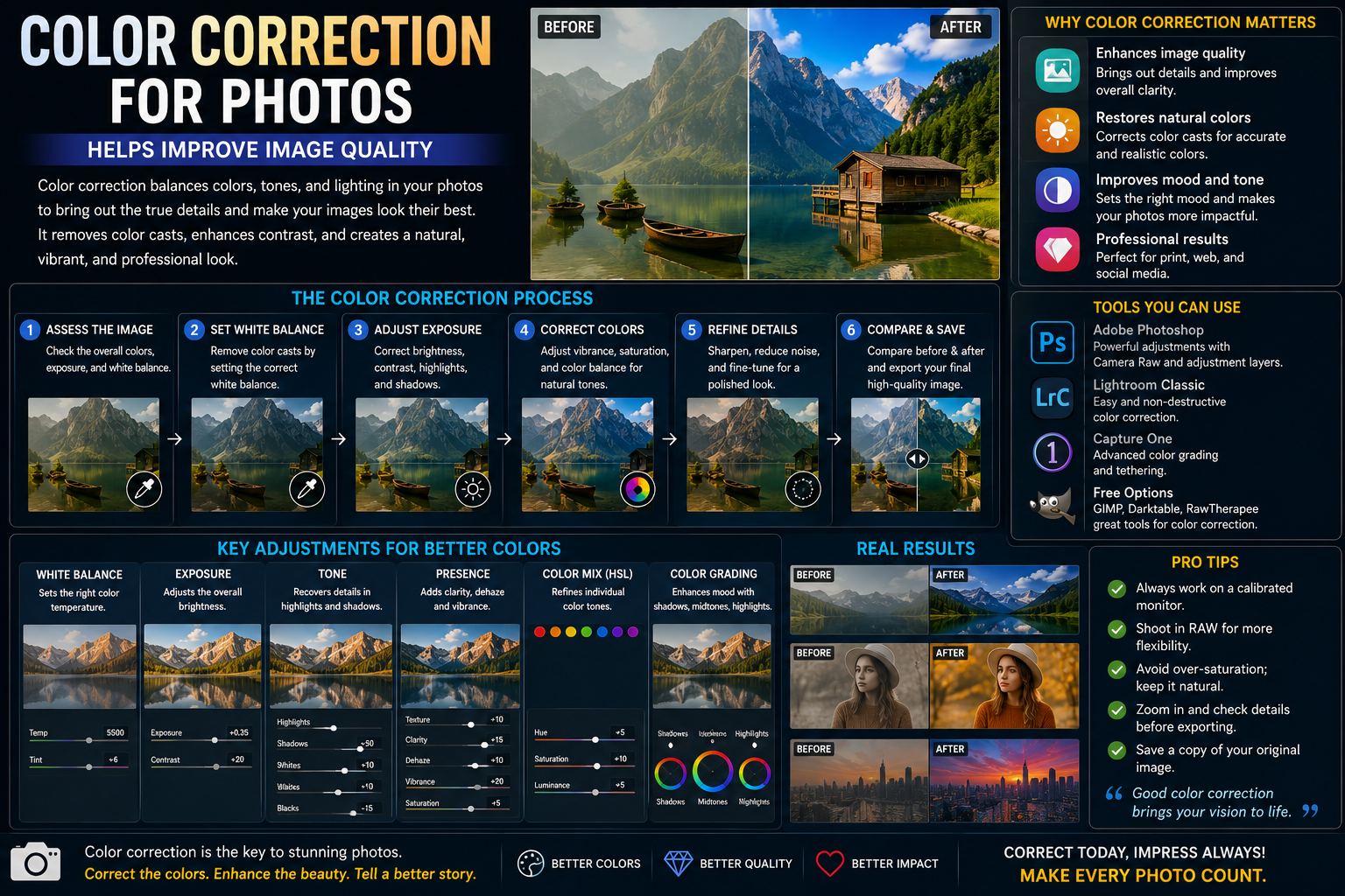
Each pixel displayed on a computer screen is composed of three fundamental attributes: hue, saturation, and lightness. Color manipulation is essentially the process of adjusting and shifting these parameters on the international standard color wheel. Understanding the principles of interaction between these three values helps designers proactively control the naturalness of the color, avoiding situations where the color becomes washed out or the rough details of the object's surface are lost after the change.
1.2 The role of RGB and CMYK color systems in the processing
Establishing the correct color space right from the start of the workflow is a crucial factor determining the success or failure of a project. The sRGB color system is always the optimal choice for digital media products, displayed on phone or computer screens, to ensure the smoothest color transitions. Conversely, for designs intended for physical printing, controlling the color range according to the CMYK standard helps prevent color discrepancies between the display screen and the final product after printing.
1.3 The importance of identifying the target for processing
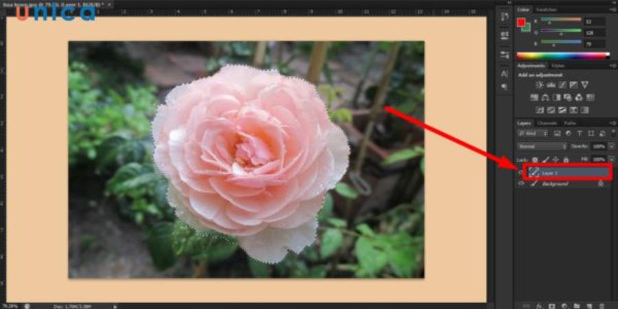
The accuracy of the color shift process depends entirely on the designer's skill in creating selections around the object. Software provides numerous tools, from automatic to manual, to separate the object from its surroundings. A sharp selection, free from cuts or omissions, ensures that the new color layer is applied perfectly, without leaving smudged streaks at the edges.
2. Methods for changing colors in Photoshop, from basic to advanced.
2.1 Using the intuitive Hue/Saturation command panel
This is the most popular and accessible solution for beginners entering the world of graphic design, thanks to its intuitive interface and flexible customization options.
-
Step 1: Use the Quick Selection Tool or Pen Tool to create a selection around the object you want to change the color tone of.
-
Step 2: Move your mouse to the system menu bar at the top, select Image , find Adjustments , and click the Hue/Saturation command (or quickly use the keyboard shortcut Ctrl + U ).
-
Step 3: In the control panel, drag the Hue slider to the left or right to change the color, adjust Saturation to increase or decrease vibrancy, and Lightness to change brightness, then press OK .
2.2 Harnessing the power of the Replace Color feature
This method is extremely effective when you want to replace a specific color tone in a photo without spending time creating complex selections for objects with many small details such as flowers or patterned clothing.
-
Step 1: Go to the Image menu , access the Adjustments section, and select the Replace Color command from the displayed list.
-
Step 2: Use the eyedropper icon to click directly on the color area you want to remove from the image so the software can identify the color range.
-
Step 3: Adjust the Fuzziness slider to expand or narrow the color selection area, then move the sliders in the Replacement section below to change to the desired new color.
2.3 Techniques for using Color Blend Mode
This solution provides maximum realism to the photograph by applying a new layer of color while preserving the original object's shadows, folds, and light structure.
-
Step 1: Create a completely new layer above the original image layer by pressing the Ctrl + Shift + N key combination .
-
Step 2: Change the blending mode of this new layer from Normal to Color in the Layers panel.
-
Step 3: Select the Brush Tool (shortcut key B ), choose your desired color from the color palette, and paint directly onto the areas you want to transform in the image.
3. Advanced color transformation process using Adjustment Layers
3.1 Advantages of Non-Destructive Image Processing Methods
Using adjustment layers is a standard workflow for design professionals worldwide. This method doesn't directly alter the pixels of the original image but creates an independent effect filter layer on top. This allows you to easily go back and edit, change parameters, or completely remove the new color layer at any stage of the design process without damaging the original file.
3.2 Steps for combining Color Balance and Layer Mask
This combination allows for detailed intervention in each individual lighting area, including the shadows, midtones, and highlights of the image.
-
Step 1: Click on the half-black, half-white circle icon at the bottom of the Layers panel and select the Color Balance command .
-
Step 2: Adjust the color sliders such as Cyan-Red, Magenta-Green, Yellow-Blue in the light areas to achieve the most desirable color tone.
-
Step 3: Select the included white layer mask and use the black brush to remove the color effect from areas you don't want to change, preserving the original colors of the surrounding background.
4. Core principles that help achieve high color accuracy after color conversion.
4.1 Adhering to the logical laws of natural light
A classic mistake amateur designers often make is only changing the surface color while neglecting the impact of ambient light. When you change the color of a shirt from blue to bright red, the areas of light reflecting off the shirt onto the skin or surrounding environment also need to be tinted with a subtle red hue. This helps the image maintain its physical logic and perfectly deceives the viewer's eye.
4.2 Control saturation to avoid color banding.
Pushing the saturation slider too high will destroy all the detail and form of the object, turning that area of the image into a flat, rough, and lifeless patch of color. Always maintain the parameters at a moderate level, combined with adjusting the contrast to preserve the natural textures and folds on the surface of the processed object.
4.3 Synchronizing the color spectrum according to a unified concept
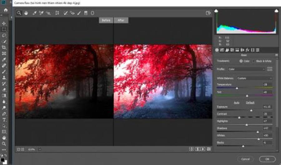
When changing the colors of multiple elements within a single image, you need to apply classic color theory principles such as analogous color schemes, direct complementary color schemes, or triangular color schemes. This scientific approach helps create a harmonious overall image with a clear aesthetic sense, avoiding chaos and gaudy tonal variations.
5. Discover superior automatic color processing solutions at appvip.ai
The website appvip.ai is a pioneering platform offering a fully automated image color optimization and transformation solution based on intelligent algorithms. No need to spend hours meticulously drawing selections or memorizing complex command tables; the system automatically separates the subject, analyzes the light source, and suggests the most perfect color transformation options with just one click. This next-generation technology frees content creators from excessive workload, saves time, and still produces highly accurate and aesthetically pleasing professional-grade works.
6. Common mistakes to avoid when handling graphic color
6.1 Color bleeding errors at the edges of joints
The phenomenon of new colors spilling over the background or encroaching on surrounding objects often occurs when the designer sets the bias (feather) of the selection area inappropriately. To fix this, you should zoom in on the image to its maximum size when creating the selection and use the Refine Edge or Select and Mask tool to smooth the edges before applying the new color layer.
6.2 Loss of detail in areas of extreme darkness and brightness.
When making color changes to objects that are pure white or pure black, conventional tools often cause the loss of natural shadow details or highlights. For these specific cases, combining the Curves or Levels command panels to reshape the histogram is essential to preserve the object's depth and texture.
7. Conclusion
Mastering editing skills and tonal control in specialized software is the universal key to unlocking limitless creativity for any designer. The seamless combination of keen artistic thinking and scientific layering techniques will help you easily create top-notch graphic publications that attract public attention. Continuously practice, experiment with blending modes, and utilize next-generation automated technology solutions today to elevate the value of all your creative products on your long-term career path.





















VIP Products








Best Selling Products
Upgrade genuine Capture One account
120 USD
Genuine Cheap Canva Pro
39 USD
Windows 10 & 11 Pro Key
36 USD
Copyright Adobe Lightroom Account
59 USD
Capcut Pro 1 Year
39 USD
Upgrade Genuine Office 365
49 USD
Freepik Premium Account
59 USD
Adobe Photoshop Copyright - Full App
120 USD
ChatGPT Plus Account (GPT-4)
16 USD
Adobe Premiere Pro Account
99 USD
Plugin Retouch4me
69 USD
Genuine Adobe Illustrator account
99 USD
MidJourney Account
29 USD
Upgrade Duolingo Super
29 USD
Autodesk All App Account Copyright
120 USD