Best Selling Products

Adobe Photoshop Copyright - Full App
120 USD

Upgrade Genuine Office 365
49 USD

Capcut Pro 1 Year
39 USD

Autodesk All App Account Copyright
120 USD

Genuine Adobe Illustrator account
99 USD

MidJourney Account
29 USD

ChatGPT Plus Account (GPT-4)
16 USD

Windows 10 & 11 Pro Key
36 USD

Copyright Adobe Lightroom Account
59 USD

Upgrade genuine Capture One account
120 USD

Genuine Cheap Canva Pro
39 USD

Upgrade Duolingo Super
29 USD

Adobe Premiere Pro Account
99 USD

Plugin Retouch4me
69 USD

Freepik Premium Account
59 USD
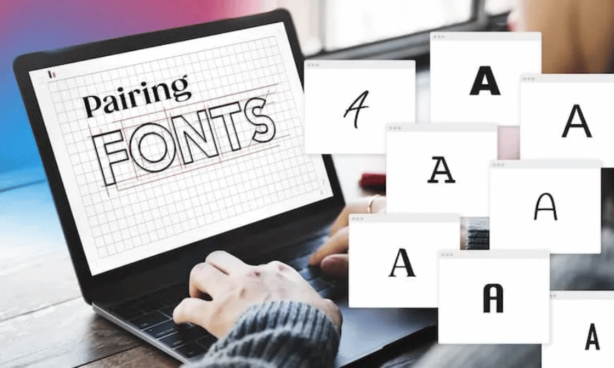
How to Combine Fonts to Design Professional Logos
Nội dung
- 1. Pair two fonts from the same font family
- 2. Thick fonts pair well with thin fonts
- 3. Try Tight Kerning vs. Wide Kerning
- 4. Two fonts with complementary shapes
- 5. Using Serif and Sans Serif Together
- 6. Try traditional headings with decorative body
- 7. Use decorative headings with traditional bodies
- 8. Don't use fonts that are too similar
- 9. Avoid combining fonts that are too different
- 10. Three is enough
- 11. Make sure they are easy to read
- 12. Conclusion
In the world of logo design, font selection and combination is one of the important factors that determine the success of a brand. A logo not only needs to be beautiful but also needs to convey the message of the business effectively. Combining fonts properly not only helps create uniqueness but also highlights the brand identity. In this article, Sadesign will explore with you the basic steps and useful tips to combine fonts professionally, making your logo more prominent and memorable.
In the world of logo design, font selection and combination is one of the important factors that determine the success of a brand. A logo not only needs to be beautiful but also needs to convey the message of the business effectively. Combining fonts properly not only helps create uniqueness but also highlights the brand identity. In this article, Sadesign will explore with you the basic steps and useful tips to combine fonts professionally, making your logo more prominent and memorable.
1. Pair two fonts from the same font family
When you start your logo design journey, choosing the right font is one of the most important decisions. Using fonts from the same family not only helps you create harmony but also brings a sense of consistency to the entire design. Font families are divided into groups such as serif, sans serif, herbal, and monospace, each with its own characteristics, making it easy to find fonts that complement each other.
A great advantage of using fonts from the same family is that you can take advantage of the variety of styles they offer. For example, a font family can include weights (thick or thin), sizes, and capitalizations. This allows you to be more flexible in your design while still maintaining consistency. The NIGHTOWL logo is a great example, with the perfect combination of typefaces from the same family, creating a cohesive and memorable look.
Additionally, choosing fonts from the same family saves you time searching and testing. You won’t have to worry about fonts clashing, as they’re designed to work together. This contributes to a better user experience, as viewers can easily identify your brand and the message you want to convey.
.png)
2. Thick fonts pair well with thin fonts
One of the most effective techniques in logo design is to create contrast between fonts. The combination of a thick font and a thin font not only enhances the aesthetics but also makes the message you are trying to convey clearer. Thick fonts tend to convey a sense of strength, while thin fonts create a sense of sophistication and lightness.
When combining these two font types, the key is to make sure that they contrast enough for viewers to easily distinguish between them. For example, in the logo design for the Bla Bla Bla Podcast, you can see the combination of a thick font for the “Bla Bla Bla” part and a thin font for the word “Podcast”. This division not only creates a visual hierarchy, but also draws attention to the main name of the show.
Furthermore, using different weights between fonts also helps create a harmonious and balanced design. This can highlight important messages, while clearly showing the role of each part in the overall design. This contrast will help your logo stand out more to the viewer and make it easier to remember.
3. Try Tight Kerning vs. Wide Kerning
Kerning is an important design element that adjusts the spacing between characters in a font. Experimenting with tight and loose kerning can create interesting effects and help enhance the distinction between sections of a logo. Proper spacing between characters not only makes the text easier to read, but also creates a certain aesthetic feel.
However, when working with kerning, you need to be subtle and careful. If the spacing between characters is too close, it can feel cramped and difficult to read. Conversely, if the spacing is too far, the reader may feel distracted or lose interest. A balance between the two is essential to ensure that your logo is not only beautiful but also recognizable.
Remember, adjusting the size and kerning can also help you find the perfect combination for your logo. By experimenting with different font pairs and kerning, you can create a harmonious and striking whole. This not only creates a striking design, but also helps viewers easily recognize and remember your brand.
.png)
4. Two fonts with complementary shapes
When it comes to font pairing, the look and feel of the font are key. Each typeface carries a message, from professional to playful to even silly. For example, a round, playful font with a bubble-like shape would be great for a children’s birthday invitation, while a more serious font would be more appropriate for a business brand.
It is important to choose fonts that complement each other, creating a harmonious whole. The Heavy Routine Fitness Center logo is a great example of combining fonts that are similar in form but still stand out on their own. This complementarity not only creates a beautiful design but also helps viewers easily understand the message the brand is trying to convey.
Choosing fonts with complementary shapes also helps create a sense of consistency in the design. When viewers see two fonts that complement each other, they will easily recognize the brand and feel more comfortable with it. Experiment with fonts that contrast shapes but still maintain an emotional connection to create a unique and memorable logo.
5. Using Serif and Sans Serif Together
Combining Serif and Sans Serif fonts is one of the most popular and effective methods in logo design. Serif fonts, like Times New Roman, have decorative strokes at the ends of the letters, creating a formal and classic feel. In contrast, Sans Serif fonts, like Arial, are simple and modern, without complicated decorations.
This combination not only brings balance to the design, but also creates a clear contrast between the different parts of the logo. By using a Serif font for the headline and a Sans Serif font for the subhead, you can easily draw attention to the main message without losing clarity. The Book Club logo is a great example, where the serif font adds sophistication to the word “book,” while the sans serif font feels approachable and inviting.
However, when combining these two fonts, you need to be mindful of their overall weight and style. Both fonts should be distinctly different to avoid feeling boring or lacking in creativity. With attention to detail and thoughtfulness in your choices, you can create a memorable and memorable logo design.
.png)
6. Try traditional headings with decorative body
When designing a logo, it’s important to determine the role of each font within the hierarchy. Headlines are often the most attention-grabbing element, so they need to be larger and heavier to make a strong impression. Additionally, headlines also set the tone for the brand, making them the first thing viewers encounter.
In the case of Mystic Theory Beauty, using a traditional font for the title not only conveys modernity but also creates a sense of trust for the brand. By combining it with a decorative font for the body, the logo creates an attractive contrast and a strong visual impact. The audience will feel professional yet artistic, attracting them to the brand.
Pairing a traditional font for the title and a decorative font for the body text creates a clear hierarchy. This not only highlights the key messages, but also creates a memorable design. When you consider how each part interacts with the other, you’ll see the powerful impact this combination has on the overall logo.
7. Use decorative headings with traditional bodies
In logo design, choosing a font is not just a decision about form, but also about how it conveys emotion. If you want your logo to evoke fun and lightheartedness, combining a decorative heading with a traditional body type is a perfect choice. Decorative fonts are often creative and unique, while traditional fonts convey a sense of professionalism and trust.
Interestingly, changing the font between the title and the body copy can create a strong contrast that makes the logo stand out. Using decorative headings to draw the viewer’s eye, combined with a traditional body, creates a relaxed yet professional feel. TailorBrands’ Fitness logo is a great example of this combination, where fun and professionalism come together.
However, if you don’t find the right combination of fonts that you have chosen, don’t worry. There are actually many ways to experiment and find the perfect combination for your logo. Be open to different types of fonts and create a truly unique and impressive design.
.png)
8. Don't use fonts that are too similar
When pairing fonts, the golden rule to remember is: Contrast, contrast, and contrast again! This is the core element that helps you create an effective logo design. The combination of serif and sans serif fonts is a good example of this, as they create just enough contrast to highlight different parts of the logo.
When choosing a font pair, consider factors like size, weight, color, spacing, and style. These factors will help you judge whether the two fonts truly complement each other. If you find yourself unable to determine which part of your logo is important, you may have chosen fonts that are too similar in style, weight, and size.
A logo design will be less effective if the fonts are indistinguishable from each other. Viewers will have a hard time understanding the message you are trying to convey, and this can lead to confusion. Make sure that each font has its own role and contributes to the overall logo in a clear and understandable way.
9. Avoid combining fonts that are too different
While it’s important to create contrast, too much difference between fonts can make your message confusing. Fonts should have a certain similarity, like planets in the same solar system. If you combine fonts that are too different, your audience will easily get confused and not grasp the meaning you’re trying to convey.
To determine if fonts match, you can either look at them visually or use some basic rules. A simple rule of thumb is to check the proportions and x-height (the height of the “x” character in each font). If the x-height is similar but the shape and style are different, it’s probably a good match.
Also, try choosing two fonts with thin strokes but different sizes, or choosing a font with different weights but similar styles. These choices will help create a logo design that is not only unique but also easily recognizable and memorable.
.png)
10. Three is enough
In logo design, the recommended rule of thumb is three fonts. The main reason is because using more than three fonts can make the design look unbalanced and confusing to the viewer. Some designers may feel that breaking this rule is necessary to be creative, but in this case, sticking to the rule will yield better results.
If you feel the need to add a fourth font, try tweaking the ones you already have. You can make them bold, italic, or underline to create a difference without having to add a new typeface. This not only cleans up the design, but also keeps it from looking too complicated, making it easier for your audience to absorb the message.
Before deciding on a new font, ask yourself why you’re choosing it. Each font you choose should have a specific reason and benefit the overall design of your logo. If you can’t convince yourself that a font is necessary, chances are your audience won’t either.
11. Make sure they are easy to read
One of the main goals of using fonts in logo design is to enhance the image and create an emotional connection with the audience. However, if the viewer cannot read the text, all your efforts will be for nothing. Therefore, it is important to ensure that the fonts you choose are easy to read.
Fonts need to be clear and easy to recognize, not only on screen but also in print. This is especially important today, when more and more people access information via mobile devices. A beautiful logo that is difficult to read will be quickly ignored by users, which can affect their first impression of the brand.
Consider the size, weight, and style of the fonts you use. Make sure they not only fit the style of your design but are also easy for people to read. An effective logo should not only look good but also easily convey the message you want to convey. Pay attention to these factors to create memorable and memorable designs.
12. Conclusion
In short, font pairing in logo design is not simply choosing a few fonts but also the art of combining and building brand identity. By mastering the basic principles and applying useful tips, you can create impressive logos that truly reflect the values and vision of the business. Contact Sadesign now to upgrade your design software to create the perfect font.


VIP Products


Best Selling Products
Adobe Photoshop Copyright - Full App
120 USD
Upgrade Genuine Office 365
49 USD
Capcut Pro 1 Year
39 USD
Autodesk All App Account Copyright
120 USD
Genuine Adobe Illustrator account
99 USD
MidJourney Account
29 USD
ChatGPT Plus Account (GPT-4)
16 USD
Windows 10 & 11 Pro Key
36 USD
Copyright Adobe Lightroom Account
59 USD
Upgrade genuine Capture One account
120 USD
Genuine Cheap Canva Pro
39 USD
Upgrade Duolingo Super
29 USD
Adobe Premiere Pro Account
99 USD
Plugin Retouch4me
69 USD
Freepik Premium Account
59 USD