Best Selling Products

Copyright Adobe Lightroom Account
59 USD

Upgrade Genuine Office 365
49 USD

Upgrade genuine Capture One account
120 USD

Adobe Premiere Pro Account
99 USD

Genuine Cheap Canva Pro
39 USD

Autodesk All App Account Copyright
120 USD

MidJourney Account
29 USD

Plugin Retouch4me
69 USD

Windows 10 & 11 Pro Key
36 USD

ChatGPT Plus Account (GPT-4)
16 USD

Genuine Adobe Illustrator account
99 USD

Freepik Premium Account
59 USD

Adobe Photoshop Copyright - Full App
120 USD

Upgrade Duolingo Super
29 USD

Capcut Pro 1 Year
39 USD
Important Notes In Print Design To Make The Product Perfect
Nội dung
- 1. Basic principles in print design
- 1.1. Distinguishing between offset printing and digital printing
- 1.2. File formats and their importance
- 2. Technical notes when designing for printing
- 2.1. Resolution
- 2.2. Color Mode
- 2.3. Size and proportions
- 2.4. Bleed and Trim
- 3. Image and graphic elements
- 3.1. Image quality
- 3.2. Sharpness and detail
- 3.3. Color and consistency
Learn how to optimize your print design process with in-depth tips on formatting, resolution, and final proofing. This article will help you build an efficient workflow that ensures your products not only look great, but are of the highest quality.
In today’s competitive design world, the transition from digital drawing to actual printed product requires careful preparation in every aspect. A beautiful design on screen does not guarantee the same effect when printed if specific technical standards are not followed. Therefore, this article will help you better understand the factors that need to be controlled in the print design process.
SaDesign will guide you step by step to set up and check the design file, how to convert colors, set the right size and ratio as well as how to use the right images to ensure the quality of the final product. Whether you are a professional designer or a newbie in this field, the following notes will be valuable tools to help you create impressive and professional printed products.
1. Basic principles in print design
Before we get into the technical details, it is important to understand the fundamentals of print design. A great design is not only a combination of visual elements and content, but also meets technical standards when delivered to the printer.
1.1. Distinguishing between offset printing and digital printing
In the printing industry, offset printing and digital printing methods are commonly used, each with its own advantages and disadvantages.
In Offset:
This method is suitable for products that need to be produced in large quantities. Offset printing provides high print quality, accurate colors, and good detail reproduction. However, this process requires expensive initial setup and longer preparation time. If your project requires high color accuracy and detail, offset printing is the obvious choice.
.png)
Digital Printing:
Digital printing is suitable for printing projects with small quantities or needing quick turnaround times. With digital technology, switching between design versions is easier and the initial cost is lower. Although the print quality may not be as superior as offset printing, digital printing is improving and becoming an attractive option for many small businesses.
.png)
1.2. File formats and their importance
One of the first important steps in the print design process is choosing the right file format. File format not only affects editing capabilities, but also determines the final print quality.
PDF, EPS, TIFF formats are popular formats used in the printing industry.
PDF is popular because of its high compatibility and easy transfer between systems.
EPS is commonly used for vector designs, which helps maintain sharpness at any size.
TIFF is suitable for raster images where high resolution and sharp detail are required.
Choosing the correct file format will help avoid unnecessary errors when transferring to the printer, ensuring the quality of the printed product meets standards.
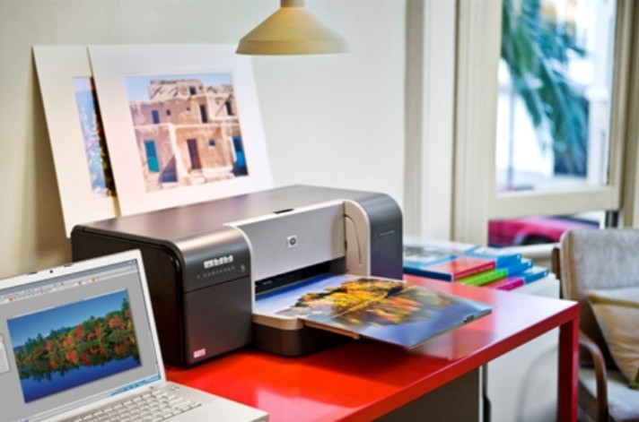
2. Technical notes when designing for printing
Every printing project requires detailed technical preparation to ensure the quality of the final product. Below are some technical notes that you should pay special attention to.
.png)
2.1. Resolution
Nothing is more important than ensuring the resolution of your design. A low resolution image will look blurry when printed, losing points with your customers.
DPI (dots per inch) is the number of pixels that appear in one inch. To ensure good print quality, you should design at least 300 DPI. This helps prevent images from becoming blurry or pixelated when printed at large sizes.
.png)
If you use images or graphic elements with substandard resolution, the printed product will lose detail and become unsightly, directly affecting the customer's impression.
A sincere advice from SaDesign is to always check the resolution of the document before sending it to the printer. Don't let a small error affect your entire project.
2.2. Color Mode
Converting between two basic color modes is an indispensable step: RGB and CMYK
RGB vs. CMYK:
RGB: RGB color mode is used for display devices such as computer screens, phones. Colors in RGB are often bright and vivid but not suitable for printing.
CMYK: The CMYK color mode consists of four primary colors (Cyan, Magenta, Yellow, Key/Black) and is the standard for printing. Converting files from RGB to CMYK is a mandatory step to ensure that the printed colors are close to the colors on the screen.
.png)
If not converted properly, the design may print with colors that are different from the intended ones, reducing product quality as well as affecting brand recognition.
Always check the color chart and perform the conversion correctly to avoid unnecessary errors during printing.
2.3. Size and proportions
Exact size and proper proportions are the deciding factors for the success of a printed product.
Set design dimensions according to production requirements:
Each printed product has its own size and proportion. Setting the wrong size will lead to imbalance in the layout, reducing the aesthetics of the design.
Note on margin and safety zone:
To ensure that important information doesn't get cut off when printed, set up safety margins around your entire design. This helps protect elements like logos, headlines, and key text from unwanted errors.
Therefore, controlling size and proportion not only helps create a balanced design but also shows professionalism in your work process.
2.4. Bleed and Trim
Trim margins and crop lines are two factors that are often overlooked but play an important role in ensuring that the printed product does not lose necessary details.
Bleed is an area of the design that extends beyond the actual dimensions of the product to ensure that, even if there is a small error during cutting, no part of the design is lost. Typically, the bleed area is placed approximately 3-5mm from the edge of the design.
.png)
The cutting edge defines the final boundaries of the product. The placement of the cutting edge needs to be carefully calculated to ensure that the printed product is exactly the desired size.
If you do not pay attention to the cutting margins and cutting lines, you will have to face the problem of printed products with missing details, causing loss of aesthetics and increasing repair and reprinting costs.
3. Image and graphic elements
A print design is not just about meeting technical requirements, it must also contain aesthetic elements that help convey a message in a powerful and impressive way. Visual and graphic elements can make a big difference between an average product and a great one.
3.1. Image quality
Select high quality images:
When choosing images for your design, make sure they are high resolution and not pixelated. A blurry or grainy image can ruin the entire professional feel of your printed product.
Use vector images when possible:
Vector images are scalable without losing quality, making them ideal for graphic elements, logos, and icons. This not only ensures sharpness, but also creates a modern, sophisticated feel.
Also, check the image elements through test prints to make sure every detail appears faithfully and beautifully.
.png)
3.2. Sharpness and detail
Clear lines:
Lines in a design should be clear and not blurred, especially when the design is enlarged to a large size. Blurry details can disappear when printed, causing an imbalance in the overall design.
Check the small details:
Before sending your file to the printer, review the entire design at a magnified level to detect and promptly handle the smallest errors. Small details can make a significant difference in aesthetics.
These principles not only help your products become more professional, but also contribute to enhancing the brand recognition experience in the eyes of customers.
3.3. Color and consistency
Professional color palette:
Using a consistent color palette across your entire design helps create strong brand recognition and cohesion. Choose a color palette that fits your message and apply it consistently from headlines to body copy.
.png)
Avoid using too many colors:
While using bright colors can be impressive, using too many colors can be confusing and detract from the professionalism of the design. Picking a few dominant colors and finding ways to combine them harmoniously will yield better results.
Check printing color:
Before printing your product, it is a good idea to review and print a proof to ensure that the printed colors match the design on screen. Lighting and paper quality can significantly affect color, so check these proofs carefully.
Through the presented sections, it can be seen that print design not only requires creative skills but also requires meticulousness in every technical detail. Always remember that an excellent design is not only the result of creative talent but also the result of carefulness and meticulousness in every stage from drawing to printed product.


VIP Products


Best Selling Products
Copyright Adobe Lightroom Account
59 USD
Upgrade Genuine Office 365
49 USD
Upgrade genuine Capture One account
120 USD
Adobe Premiere Pro Account
99 USD
Genuine Cheap Canva Pro
39 USD
Autodesk All App Account Copyright
120 USD
MidJourney Account
29 USD
Plugin Retouch4me
69 USD
Windows 10 & 11 Pro Key
36 USD
ChatGPT Plus Account (GPT-4)
16 USD
Genuine Adobe Illustrator account
99 USD
Freepik Premium Account
59 USD
Adobe Photoshop Copyright - Full App
120 USD
Upgrade Duolingo Super
29 USD
Capcut Pro 1 Year
39 USD