Best Selling Products
Important notes when designing professional standees on Canva
Nội dung
- 1. What is a standee and its role in visual communication?
- 2. Determine Standee Design Goals: "Guidelines" For Every Decision
- 3. Choosing the Right Standee Size: "Golden Coordinates" for Display Space
- 4. Standee Layout Design: Professional "Stage" For Message
- 5. Important notes when designing standees on Canva
- 5.1. Choose the right size from the start
- 5.2. Do not use low resolution images
- 5.3. Clear layout, reasonable division of areas
- 5.4. Prioritize easy-to-read fonts
- 5.5. Choose colors according to brand identity
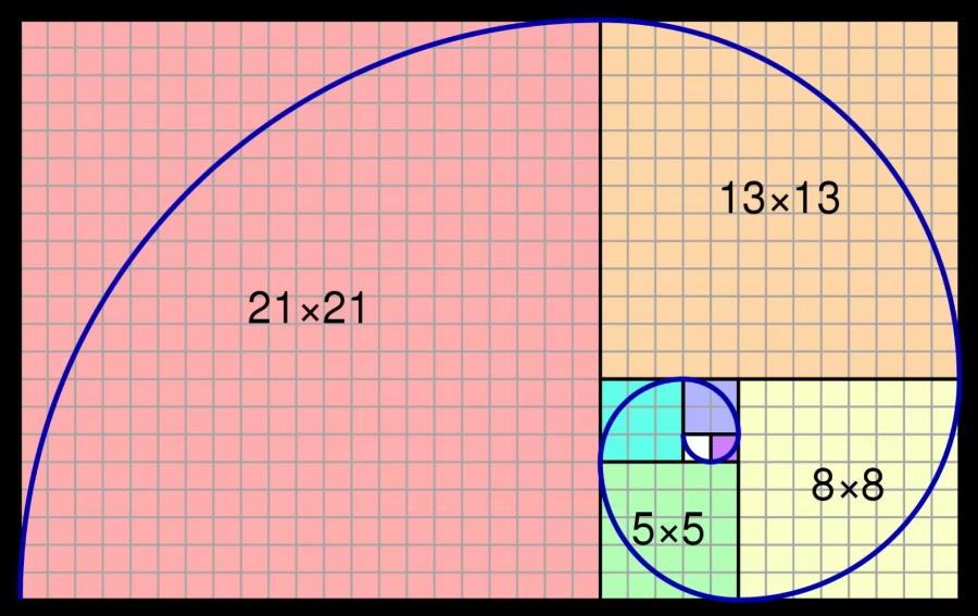
- 5.6. Make use of grid systems and alignment
- 6. Short and Concise Message: "Golden Words" That Remain in the Mind
- 7. High Quality Images and Graphics: "Weapon" Attracts All Eyes
- 8. Conclusion
Learn in detail the important notes when designing standees on Canva: from choosing size, font, color to exporting print files. The article is for both beginners and professional designers.
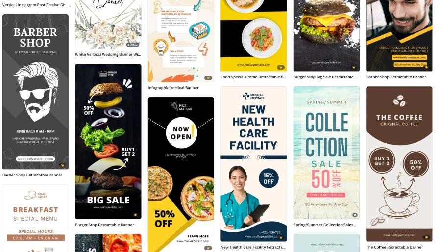
Canva offers a simple, fast and beautiful design solution for everyone, especially suitable for those who want to create an eye-catching standee. However, the convenience of this tool does not mean that you can ignore the basic principles of layout, color and visual experience. To have a complete standee design that is suitable for communication purposes, users need to pay attention to important factors that the article of sadesign below will discuss in detail.
1. What is a standee and its role in visual communication?
Standee is a large format printed advertising publication, often placed in places with a lot of people passing by. Specifically, such as shopping malls, fairs, events, showrooms or in front of stores. Unlike online designs, standees need to make an impression at first sight. It acts as a "silent salesperson", conveying information quickly, clearly and purposefully.
.jpg)
Therefore, when starting to design on Canva, users need to clearly understand the nature of standee: a printed, static product, serving the purpose of fast and strong visual communication . Every element from images, text to colors must be carefully selected and optimized for a stationary space in a real environment.
2. Determine Standee Design Goals: "Guidelines" For Every Decision
Before starting any design in Canva, clearly defining the purpose of the standee is the most important step. This purpose will act as a "compass", guiding all your design decisions, from choosing the size, layout, message, image to the call to action.
What is the purpose of the standee? Clearly defining the purpose will help you focus on the appropriate message and design elements.
Events: Event standees can be used to welcome guests, provide information about the schedule, speakers, a map of the venue, or create a check-in and photo area. The design should be attractive, easy to read, and can include a QR code that leads to detailed information.
Product/service advertising: The goal is to introduce a new product/service, highlight features, benefits, or solve a customer problem. The design requires attractive product images, a compelling message, and a clear call to action.
Promotion: Promotional standees should highlight the discount, free gifts, validity period and conditions (if any). Bright colors and direct messages will be effective.
Instructional/Informative: Standees provide instructions (e.g. directions, location), contact information, business introduction or basic services. The design should be clear, easy to read and may include simple icons or diagrams.
Brand communication: The goal is to increase brand awareness, reinforce image and core values. The design needs to be consistent with the brand identity, focusing on the logo, signature colors and slogan.
Who is the target audience of the standee? Understanding the audience you want to reach will help you adjust the language, images and design style accordingly.
Age, gender, interests, habits: This information helps you choose images, colors, and fonts that match their aesthetic taste. For example, standees for children will have bright colors and funny images, while standees for business people can be more formal and professional.
What do they care about in your product/service? Focus on the benefits and solutions your product/service brings to them. Your message should address a “pain” or meet a need of your target audience.
What communication style will appeal to them? Use informal, friendly language or professional, formal language depending on the audience you are trying to reach.
What is the main message you want to convey? Effective standees focus on a single core message. Trying to convey too much information will confuse the viewer and make it difficult to remember. Pick the most important message and highlight it.
What specific goals do you want to achieve? Setting measurable goals will help you evaluate the effectiveness of your standee later.
How much percentage increase in brand awareness? (Difficult to measure directly from standees, but possible through post-event surveys).
How many website/fanpage visits are promoted? (Through QR code placed on standee).
How many orders/registrations increased? (If the standee advertises a specific promotion).
How much engagement did the event get? (For example, how many people checked in via standee).
3. Choosing the Right Standee Size: "Golden Coordinates" for Display Space
Standee size not only affects the ability to display information but also relates to aesthetics and suitability for the display space. Canva provides many templates with suggested sizes, but you need to consider the following factors to make the best choice!
.jpg)
Popular standee sizes: Understanding the types of standees and their standard sizes will help you visualize and make the right choice.
X-shaped standee: With an X-shaped frame structure supporting the printed plate, the common sizes are 60x160cm and 80x180cm . This type is compact, easy to install, move and has affordable printing costs, suitable for many purposes indoors and outdoors with little wind.
A-frame standee (A-frame): Usually made of wood or metal, with two printed sides. More diverse in size, often more compact than X-frame standee, for example 50x70cm or 60x80cm . Suitable for placing in front of stores, cafes to display menus, short promotions.
Roll-up standee (roll-up banner): Has a mechanism to automatically roll the printed sheet into the base box, very convenient for moving and storing. Common sizes are 60x160cm , 80x200cm , or even larger. Often used in events, fairs, showrooms to create professionalism and attraction.
Consider the display space: The size of the standee needs to be in harmony with the space where it is placed.
Indoors: If the space is spacious, you can choose a large standee to increase visibility. However, make sure it does not obstruct the walkway or view.
Outdoors: Wind is a factor that needs special attention. Standees that are too large can easily fall over. Choose a standee with a sturdy frame or reinforcement (e.g. a stand that can hold water/sand). Moderate size is safer.
Narrow space: In limited space, a compact A-frame standee or a moderately sized roll-up standee will be the optimal choice.
Make sure your design is proportional: Once you’ve chosen your physical standee size, design in Canva with the corresponding proportions. For example, if you’re printing a 60x160cm standee, create your design with a width of 60 units and a height of 160 units (this can be pixels, cm, mm depending on your setup, but the important thing is the ratio). This will help avoid distorted images or unbalanced layouts when printed.
Note on design file size: Although Canva allows for multiple sizes of designs, make sure that when you export the file for printing, the size you choose on Canva corresponds to the actual standee size. This helps the printer have the correct file and ensures the best print quality, avoiding the problem of broken lines due to over-enlarging the file.
4. Standee Layout Design: Professional "Stage" For Message
The layout of your standee is like the “stage” where your message is presented. A well-designed layout guides the viewer’s eye, highlights important information, and creates a professional impression.
.jpg)
The "Less is More" principle: Especially for standees, where viewers often only glance at them for a short time, it is important to keep the layout simple and focused. Avoid cramming too many elements, keep only what is really necessary to convey the main message.
Create a clear visual hierarchy: Viewers need to know what's most important on your standee within the first few seconds. Use elements like:
Size: The title and main message should be larger than the secondary information.
Color: Use bold colors for important elements like headlines or calls to action.
Placement: Place important elements in a visible location (usually the top of the standee).
Contrast: Create a clear contrast between text and background to ensure readability.
Use white space wisely: White space (empty areas around design elements) not only makes your standee look cleaner and more professional, but it also helps the viewer’s eye focus on the main content. Don’t be afraid to leave white space around your headlines, images, and calls to action.
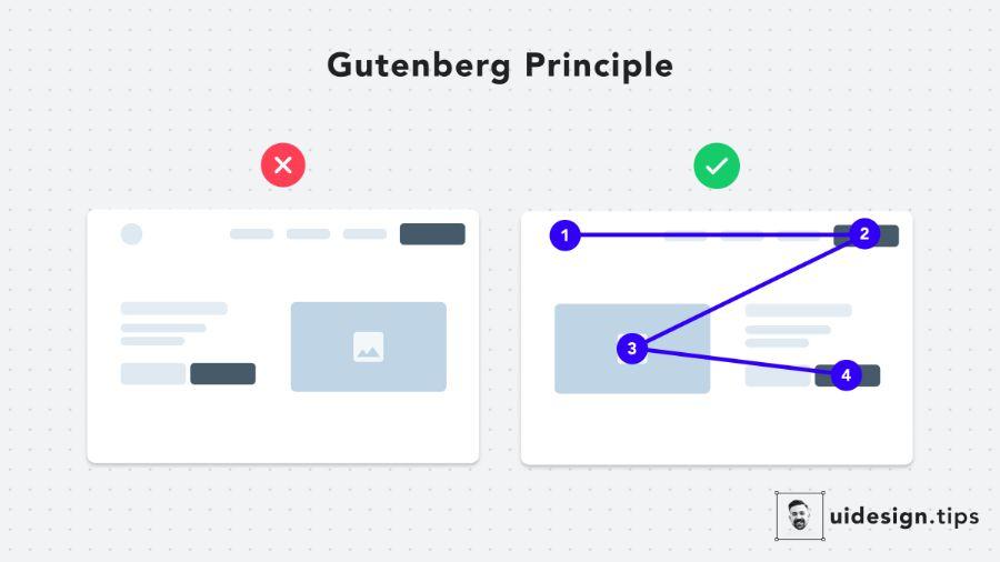
Ensure a natural reading flow: Most people read from top to bottom and from left to right. Arrange the elements on your standee according to this reading flow so that viewers can absorb information easily and quickly. The headline is usually at the top, followed by the main image or content, and finally the call to action and contact information.
5. Important notes when designing standees on Canva
5.1. Choose the right size from the start
Canva allows you to customize the size before designing. To avoid the image being broken or out of proportion when printed, it is necessary to determine the correct standee size from the beginning. Some common sizes:
60 x 160 cm (traditional standing rectangular standee)
80 x 180 cm (commonly used at conferences and large events)
120 x 200 cm (mini backdrop)
It is recommended to create design files in 1:1 ratio (in cm or equivalent pixels), for example: 600mm x 1600mm or 2362px x 6299px (at 100 dpi).
5.2. Do not use low resolution images
Because standees are large-format publications, the images inserted need to be high resolution (minimum 150 dpi). Avoid using images downloaded from the internet that are small in size and can easily break when printed. Canva has a high-quality photo library available, but you should prioritize using original, self-taken or copyrighted images to ensure sharpness.
5.3. Clear layout, reasonable division of areas
A logical layout will help the viewer's eyes scan information easily. Suggestions for effective standee layout:
Top : Brand logo + message title.
Middle : Illustration + main content (offer, product…).
Below : Contact information + QR code, website, hotline.
Avoid stuffing too much text, which can make the layout confusing and difficult to digest. A concise yet striking message is still the top priority.
5.4. Prioritize easy-to-read fonts
Don’t use too many fonts in the same design. 2–3 fonts are enough: one main font for the title, one secondary font for the detailed content. Prioritize modern sans-serif fonts like Montserrat, Open Sans, Raleway, etc. and limit overly decorative fonts.
Fonts should be large enough to be read from a distance (at least 70–100 pt for headlines), and avoid low-contrast colors that are difficult to read.
5.5. Choose colors according to brand identity
Colors have a powerful effect on emotions and whether people stop or pass by. Make sure the colors are consistent with your brand identity, easily recognizable, and contrast well enough to highlight key content.
Avoid using too many colors in the same standee. Choose 2-3 main colors and clearly prioritize them.
5.6. Make use of grid systems and alignment
Although Canva is not as powerful as Adobe in terms of grid capabilities, it still supports basic alignment very well. Users should enable grids and use center guides to ensure that elements are on axis, avoiding misaligned layouts that are unsightly.
6. Short and Concise Message: "Golden Words" That Remain in the Mind
In a competitive advertising environment, standees often have only a few seconds to attract attention and convey a message. Therefore, keeping your message short, concise and easy to understand is extremely important so that your "golden words" can linger in the viewer's mind.
.jpg)
Focus on the main message: Identify the most important message you want viewers to take away after seeing the standee. Focus only on this message and remove any unnecessary information.
Use simple, easy-to-understand, audience-appropriate language: Avoid using technical jargon, complex words, or long sentences. Use language that your target audience can easily understand and connect with.
Prioritize important and impactful keywords: Use strong, direct, and memorable words. Keywords related to the benefits, solutions, or uniqueness of your product/service will attract attention.
Double check for spelling and grammar errors: A small spelling or grammar error can make your standee look unprofessional and reduce its effectiveness. Read through your entire document, or ask someone else to check it for you.
7. High Quality Images and Graphics: "Weapon" Attracts All Eyes
Images and graphics play a key role in attracting attention and visually conveying a message. Using high-quality images and graphics creates a professional and trustworthy impression.
Use high-resolution images (at least 300 DPI): Low-resolution images will be blurry and broken when printed at large standee sizes, causing loss of aesthetics and affecting the message. Always use good quality original images or search on reputable photo libraries.
Choose images that are relevant, attractive and convey the message: The images you choose must be directly related to the product/service, event or message you want to convey. The images need to be aesthetically pleasing, eye-catching and evoke positive emotions.
Consider using vector graphics: For logos, icons, or illustrations, vector graphics (formats like SVG, EPS) are ideal because they can scale to any size without losing quality. Canva offers a variety of vector graphic elements that you can use.
Avoid using blurry, pixelated or unclear copyright images: Using poor quality images will reduce the value of the standee. Always make sure you have the right to use the image (free, paid or self-taken).
8. Conclusion
Designing a standee on Canva can be extremely effective in terms of communication if done correctly and with attention to detail. From choosing the size, layout, font to the file export technique, each step plays a decisive role in the quality of the final printed product. With the notes shared in this article, Canva users can confidently create professional, attractive standee designs that are suitable for each specific purpose.
