Best Selling Products
What is Material Design? What are the characteristics of Material Design?
Nội dung
- 1. What is Material Design?
- 2. What are the benefits of Material Design?
- 3. The basic goal of Material Design in UI
- 4. What are the characteristics of Material Design?
- 5. What are the 3 indispensable pieces of Material Design?
- 5.1. Space
- 5.2. Light
- 5.3. Material
- 6. Principles of Material Design
- 6.1. Bold, Vivid and Intentional
- 6.2. Metaphor
- 6.3. Natural effects
- 6.4. Animation
- 7. What elements make Material Design impressive?
- 8. Popular applications of Material Design
What is Material Design? What are its characteristics? Let's explore the details with Sadesign through the following shares.
1. What is Material Design?
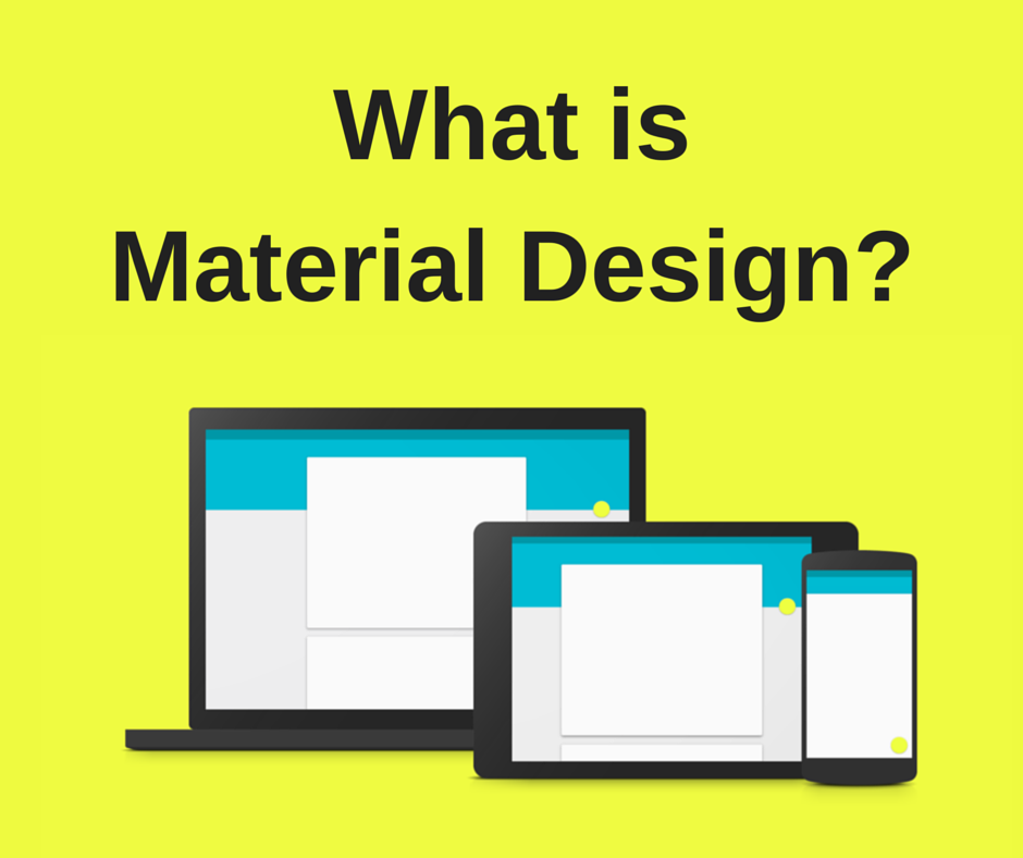
Material design is a new design style launched by Google in 2014.
You can simply understand that Material Design is a more developed form of the Flat Design trend. However, Material Design does not bring a "flat" feeling to the entire interface like Flat Design, but it is many layers of Flat stacked on top of each other. From there, it creates depth and highlights for the usual flat design.
.jpg)
Material Design focuses on simple lines and bold, prominent colors. At the same time, designers optimize user experience with 3D effects, realistic lighting,...
In addition, this design trend also includes natural movements, such as when buttons and menus appear on the screen. All are aimed at bringing users new, more interesting experiences, closer to real life.
2. What are the benefits of Material Design?
.jpg)
The use of Material Design is becoming more and more popular due to the many benefits it brings.
- Material Design is an entire design ecosystem, not just a style guide. If there's a specific design situation, Material Design can have a comprehensive set of rules for how to handle it.
- Google maintains Material Design and maintains extensive documentation on how to use and implement Material Design. Many modern design systems may lack this type of support and documentation.
- Material Design is a fairly flexible design library. In the guidelines, much of the specifics of how the design is implemented are left up to the designer.
- Material Design is packed with unique features that set it apart from flat design like user feedback in the form of haptic feedback, subtle animations, etc. It also has a very simple physical sense, making interactions more intuitive.
- Material Design promotes animation in design, both to give users feedback and to hint at how different features work.
- Dark theme options have been added, giving designers even more visual flexibility. Material Design was originally very light and bright, which didn’t fit the aesthetic of some brands. Adding dark theme guidelines should fix that.
- With Material Design, users experience everything with a feeling that is both strange and familiar, easy to manipulate and can be used on many different devices.
3. The basic goal of Material Design in UI
Material UI is a React Component library integrated with Google's Material Design. Material UI gives you and your website a completely new interface, with buttons, textfields, toggles,... designed in a new style, instead of everyone using Bootstrap like today.
.jpg)
The fundamental goal of Material Design in UI is to build an interface that allows interaction with the user. It must be both beautiful and interesting, but also logical and effective for the user.
In addition, the software's visual simulation also includes the principle of Animation in velocity with mass and acceleration. Material will slow down its speed when Material Design appears. And vice versa, the speed will gradually increase when Material Design disappears.
4. What are the characteristics of Material Design?
You can simply understand that Material Design layers are many layers of paper stacked on top of each other, but each sheet - each Material layer has a completely different color and effect. A complete interface is when you finish stacking many layers of effects on top of each other.
To be able to identify Material Design, you can rely on some of the following characteristics:
- The colors used are often prominent but still based on a main color block.
- Flat interface, with little or no shadow or gradient effects.
- Flat icons, following the minimalist trend, easy to understand and visualize.
- Maximizing white space helps the design space look softer and more airy.
- Motion effects are used smoothly and naturally, making it easy for viewers to visualize.
- Bright colors mixed with attractive motion effects for a lively, non-boring design.
5. What are the 3 indispensable pieces of Material Design?
To make your Material Design perfect, it cannot lack the following 3 basic elements:
5.1. Space
Space in Material Design is the part below the screen layer of the device. It is simulated in 3D space with the Oxy axis and the depth is Oz axis. This element is clearly shown when there is a light source shining on it.
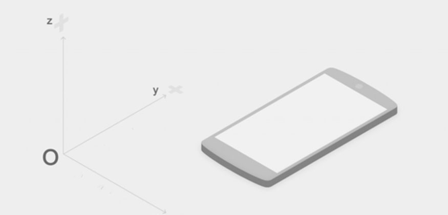
Designers will create depth for their designs in this space. To see the depth effect, adjusting the light appropriately is the most important. A good Material Design is when you can detect and experience the space.
5.2. Light
Lighting in Material Design is intended to express the three-dimensionality of space. It helps effects become clear, with specific distinctions with material layers according to each position of the Oz axis.
In Material Design, designers often combine two light sources to create a synthetic shadow effect, simulating real-life space. This helps the design have depth thanks to the light that creates a 3D spatial effect, while being user-friendly.
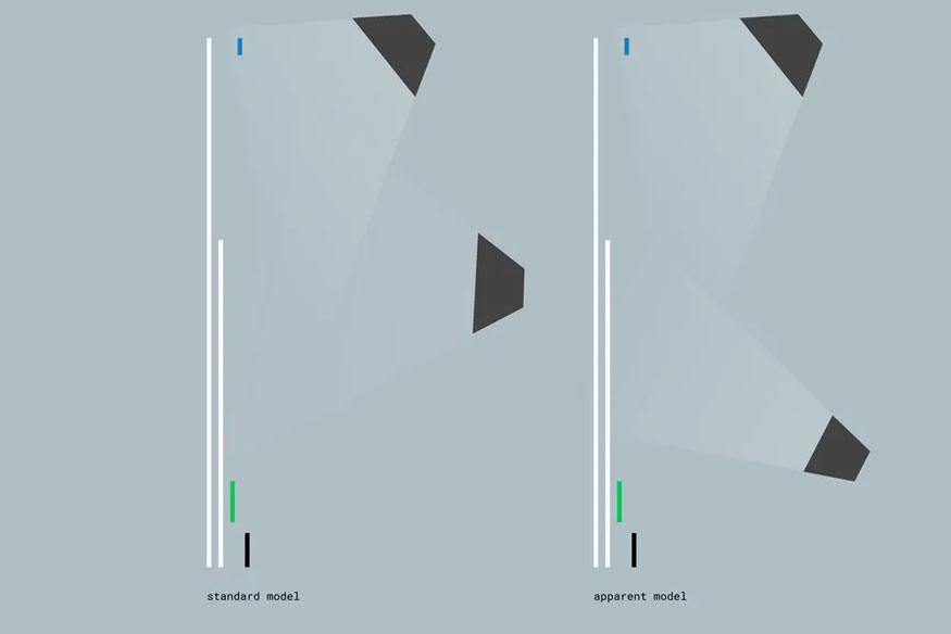
The 2 types of light sources in Material Design include:
- Direct lighting: the type plays an important role #1, deciding whether your design has shadow and sharpness effects or not. Designers must analyze the design, adjust the appropriate light intensity to get the best shadow effect.
- Ambient light: characterized by soft colors, unclear light source, creating a soft shadow effect around. When combined with a direct light source, it will create great light for your Material Design.
5.3. Material
Materials are stacked in plane layers with a relative thickness of 1dp. This element is placed parallel to the Oxy plane in the Oxy coordinate axis in the space section. Therefore, interactions with Materials will move up and down along the Oz axis.
The relative position of each Material layer to the others can be easily described by changing the size of the shadow.
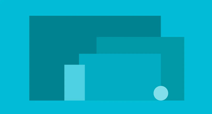
Note that the content inside each Material will be created based on new styles and trends, but it must ensure that it complies with the principles of Flat Design. Furthermore, Material is also an amorphous substance due to its flexibility in changing size, shape, or being able to be separated into many parts or combined into one. In space, Material can appear or disappear from any position.
6. Principles of Material Design
Material Design provides specific design principles that help make the process of use as optimal as possible.
6.1. Bold, Vivid and Intentional
Drawing inspiration from the real world of physics, Material Design follows the principles of print design. It focuses on typography, grids, space, proportion, color, and uses imagery to guide visual processing. These elements are pleasing to the eye and create a hierarchy that helps draw the user’s attention.
Choosing the right colors, sharp imagery, large typography, and white space is a must. This helps create a bold, dynamic interface that highlights the design intent.
6.2. Metaphor
- Material is a metaphor that unites rationalized space with a system of motion. You can think of Material Design surfaces as being designed like paper and ink.
- In Material Design, Material surfaces and aspects provide visual cues based on reality. Using familiar tactile properties helps users quickly understand interaction affordances.
- Material Design uses the elements mentioned above in its designs. The basic principles include reflections, shadows, and textures.
6.3. Natural effects
Effects in Material Design are user-driven. For example, with the wave effect, when you tap an element, the effect radiates out from your finger, not from a fixed direction.
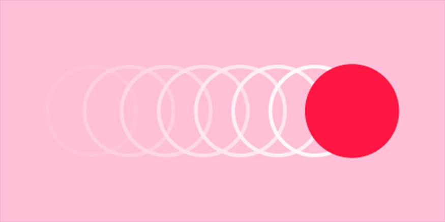
Or the page transition effect is natural, continuous and does not disappear without needing to load a new page,...
The effects are aimed at being as natural as possible.
6.4. Animation
The goal of Material Design is to build user interfaces that are beautiful, interesting, but also intuitive and logical.
Therefore, animations in Material Design must follow basic principles of physics such as velocity, acceleration, mass, etc. These factors will help make the dynamic effects as realistic as possible.
7. What elements make Material Design impressive?
Some of the following elements can help make your Material Design more impressive, don't miss it.
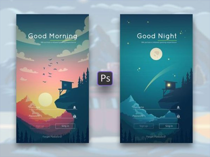
- Natural effects: you want to create effects that look as natural as possible. This is partly based on principles of physics as well as practical experience. In essence, the effects in Material Design depend on the person using them.
- Fun: Fun is essential to make your Material Design more impressive. You can choose a small detail that few people pay attention to to design unique movements and interactions to create highlights. Instead of focusing on highlighting the whole.
- Surface effects: the transition effect should be natural, the elements move continuously, not disappear and then load a new page. This helps users understand where the new page comes from, what elements are there and where to focus.
- Ordered: Material Design should be ordered, with later elements coming first, important elements coming first, and larger elements coming first. Ordered arrangement helps users to identify and focus on the necessary and important parts.
- Consistency: Materials should move in the same direction to create uniformity throughout the design.
8. Popular applications of Material Design
Material Design has the following specific applications:
- Commonly used in Google applications such as Gmail, Google maps...
- Application for recording information and data: Evernote.
- Social Networking Applications: eBay
- Application for phone keyboard app: Laban key.
- Application in conversion and measurement: S Converter.
- …
Above is a summary of information about Material Design. Hopefully the above sharing can be useful for you, partly to understand more about this new design trend.
------------------------
Installation and support contact information
🏡 SADESIGN Software Company Limited
✅ Fanpage : https://www.facebook.com/SadesignRetouchingPanel
💬 Gmail : phamvansa@gmail.com
