Best Selling Products
What is layout in design?
Nội dung
- 1. What is layout?
- 2. How important is layout in design?
- 2.1. Enhance aesthetic value
- 2.2. Linking components in design
- 2.3. Increase reader engagement
- 3. Common rules in layout design
- 3.1. Rule of thirds
- 3.2. Odd number rule
- 3.4. Emphasis rule
- 3.5. The Grid System Rules
- 4. The power of good layout and design
Layout plays an important role in every design. Inconsistent layout, lack of clarity,... will make your work disjointed, the message cannot be conveyed to the viewer,... So, what is Layout and why is it so important? Let's go deeper into this issue with SaDesign through the following shares.

1. What is layout?
Layout is an English word that means layout, presentation. This is a specialized term in graphic design. Here, it is simply understood as the arrangement of content and graphic elements in the design to aim for consistency and rationality for the product.
.jpg)
Layout includes a set of tasks such as arranging the layout, presenting the proportional alignment of details, dividing the distance, determining the position of the components appearing in the design,...
2. How important is layout in design?
Layout is an indispensable part of design, a work with a reasonable layout will bring the following benefits:
2.1. Enhance aesthetic value
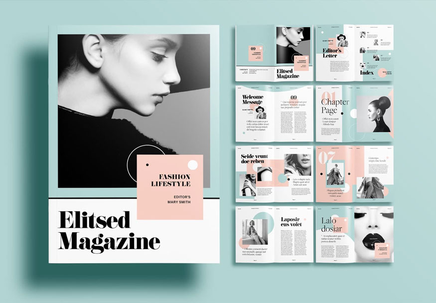
Layout plays an important role in enhancing the aesthetic value of a work of design.
A reasonable and clear layout system will help each element in your design stand out and become more attractive.
Just like you decorate your house, objects arranged neatly, in the right position and function, will help make your house more beautiful instead of just leaving things "randomly" in the house.
2.2. Linking components in design
With a clear layout, the components are in reasonable positions with different main and secondary parts, which will fully convey the purpose and communication message of the product.
The properly linked components help viewers easily grasp the overall content of the product. Therefore, viewers can find the key points to pay attention to in the product, thereby obtaining the necessary information guided by those point.
2.3. Increase reader engagement
Products with clear, beautiful layouts and reasonable presentation content will attract viewers at first sight, enhancing the effectiveness of the design.
The content in the design is linked to help viewers easily grasp information, attracting more people to view your products.
With new layout styles, you can easily create an impression and highlight in the eyes of viewers, helping them to be impressed with your product longer and more often.
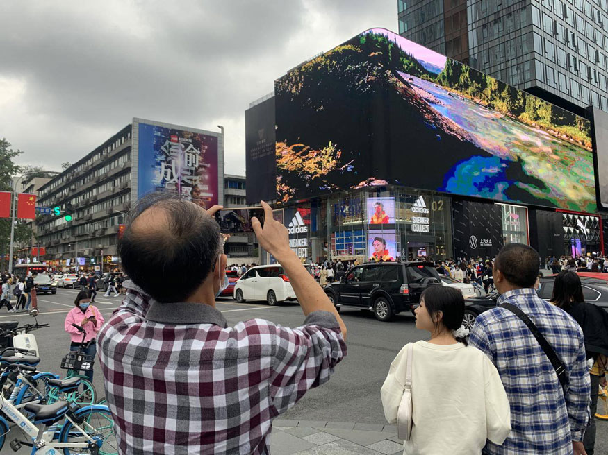
You can imagine when designing a website for a business, if the web interface has a friendly and clear layout, it will easily attract customers, inspire them to search and view more products or content on the web.
3. Common rules in layout design
This arrangement is not done “randomly” or “conveniently”, but has principles established by experienced predecessors. Designers must understand these principles to apply them to their designs to create a connection for the entire publication.
Here are some of the most common rules of layout design you need to know.
3.1. Rule of thirds
The rule of thirds is the most basic rule in layout design as well as photography. It is a useful technique for creating effective compositions in design. This rule is very simple but extremely effective in creating balance in a composition.
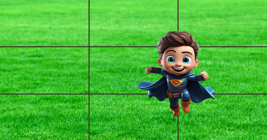
To apply this, imagine your design layout is divided into thirds both horizontally and vertically. Now we have 9 equal sections with intersection points between the closed lines. These points will be where we should place the main subject, next to other supporting elements. By positioning elements at these intersections, we can attract the viewer’s attention and make your design attractive, the viewer can take in the whole work.
3.2. Odd number rule
As the name suggests, this rule is about including odd numbers of elements (~3 to 5 elements) in your layout to get an easier design effect.
With this type of layout, the center point will be complemented by 2 objects on the outside. Therefore, your layout will be balanced most simply and naturally. This rule is often applied by designers in logo design to create impressive products for customers.

3.3. The rule of balance
Everything in life is about balance, and design is no different. Designers are constantly balancing different elements to find harmony in their designs. Imagine an invisible scale in every design and make sure you don’t throw it off balance. Don’t put all the elements in one corner, and leave one corner empty. For example, if one side of your design has some large text, balance it out with smaller, equally sized text on the other side.

Remember that in terms of composition, white space (or negative space) is also an element that helps create balance. White space gives our eyes a path to follow in the design. Give each element on the page some room to breathe and the balance between positive and negative space will naturally emerge.
You can see how moving the elements in the web design above closer together (thus narrowing the negative space and breaking the balance of the composition) makes the design feel claustrophobic and ultimately unsuccessful.
3.4. Emphasis rule
The eye often needs a place to rest or something interesting to keep it looking longer, otherwise people will look at your design and quickly move on to something else. Let's say you are taking a photo of your idol at a fan meeting. Your goal is to draw attention to the moment and the joy of the meeting by making your idol the subject and focal point of the composition.
To convey to the viewer that your idol is the focal point, you need to use proportion and emphasis. You can place your subject in a prominent position in the photo and make sure they are the largest object in the photo. You can emphasize your idol by blurring the background to make her stand out or by focusing on her bright dress.

Finding the focal point of your design will give your eye the guidance it needs to structure your layout, as well as build hierarchy in the best way.
3.5. The Grid System Rules
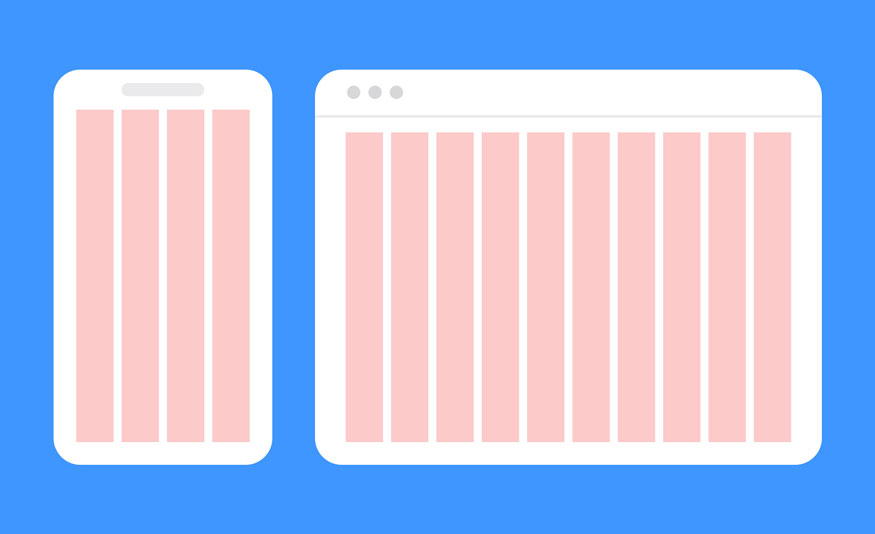
Grids provide order to graphic design. They speed up the design process by helping designers decide where content should be placed instead of where it could be placed.
Designers love to use layout systems based on this rule because the design will be neat, beautiful, and more applicable than designs based on the remaining rules.
With the 5 principles above, you will create extremely reasonable layout systems for your design. Apply appropriately to get the most reasonable layout.
4. The power of good layout and design
When you build a good layout system with an eye-pleasing layout, it will help improve the view of specific objects, in order to create the best effect on the viewer's eyes.
To create a successful layout design, you need to understand the basic principles of arrangement and know how to apply them to your design.
A beautiful design is not enough to create an impression on customers, to encourage them to go deeper into your product, you also need a design with a good layout.
Above is the summary information about the layout. It is really necessary for your designs, please study carefully to apply it appropriately to your products.
------------------------
Installation and support contact information
🏡 SADESIGN Software Company Limited
✅ Fanpage : https://www.facebook.com/SadesignRetouchingPanel
💬 Gmail : phamvansa@gmail.com


