Best Selling Products
Plugin Retouch4me
69 USD
Upgrade Duolingo Super
29 USD
Genuine Adobe Illustrator account
99 USD

Freepik Premium Account
59 USD
Autodesk All App Account Copyright
120 USD

Genuine Cheap Canva Pro
39 USD
Upgrade genuine Capture One account
120 USD

Capcut Pro 1 Year
39 USD

MidJourney Account
29 USD

Windows 10 & 11 Pro Key
36 USD

Copyright Adobe Lightroom Account
59 USD

Adobe Photoshop Copyright - Full App
120 USD

Upgrade Genuine Office 365
49 USD

ChatGPT Plus Account (GPT-4)
16 USD

Adobe Premiere Pro Account
99 USD
Pocket Basic Knowledge About Color To Help Your Design "Level Up" Immediately
Nội dung
- 1. Basic color theory
- 1.1. Color concept
- 1.2. Color scheme model
- 1.3. Color classification
- 2. Color Wheel
- 2.1. Color ring structure
- 2.2. Color Harmony Principle
- 2.3. Color harmony application
- 3. Color Psychology
- 3.1. General meaning of some main colors
- 3.2. Application in branding and UI
- 4. Application in practical design
- 4.1. Branding
- 4.2. User Interface Design (UI/UX)
- 4.3. Print design (Poster, brochure)
- 4.4. Motion Graphics & Animation
- 5. Tools and references
- 5.1. Color palette generator tool
- 5.2. Color sample library
- 5.3. Plugin support in the software
- 6. Related questions
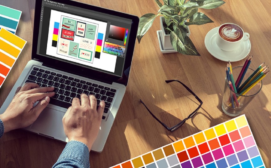
Your designs can be made much better with the right color choices and combinations. In this article, you’ll find easy-to-implement color tips and real-world examples that will help you elevate your designs in just a few simple steps.
In the world of design, color is not just a “decoration” but also a medium that connects emotions, conveys messages and builds brand identity. A harmoniously coordinated and psychologically correct color palette will help your design product stand out, attract attention and leave a deep impression on the audience. On the contrary, an ill-considered color choice can be annoying, unprofessional or even cause misunderstandings about the meaning. This article will provide you with the entire basic theoretical framework of color , the color wheel, color psychology as well as the secret to applying color in practice. Let's find out!
1. Basic color theory
Before getting into the application, understanding the nature and mechanism of color matching will help you feel more confident when designing. Below are the most basic concepts.
1.1. Color concept
Color comes from visible light wavelengths (380-740 nm) that hit the retina and are recorded by the brain. In design, we often distinguish between two types of color:
True color (Pigment): Applied to printing materials, paint, ink... When light hits the surface, part of the wavelength is absorbed and the rest is reflected to create the color you see.
Display Color (Light): Applies to digital screens (TV, computer, phone). Color is created by mixing red (R), green (G) and blue (B) light.
.png)
Understanding this concept correctly helps you choose the right color system for each purpose: if you design for print, you need to pay attention to CMYK; but when designing for web/app, RGB is the optimal choice.
1.2. Color scheme model
RGB (Red – Green – Blue): Additive color model, produces white when all three channels reach high values. Common on all types of screens.
CMYK (Cyan – Magenta – Yellow – Key/Black): Subtractive color model, used for printing; supports printing accurate color tones and saves black ink when needed.
HSB/HSV (Hue – Saturation – Brightness/Value): Not a model for exporting files, but very useful for visualizing and fine-tuning colors in software like Photoshop, Illustrator.
Converting from RGB to CMYK and vice versa can sometimes result in saturation or brightness errors, as the color spaces of the two models are not fully compatible. Therefore, professional designers always check the print preview to avoid “on-screen color” being too different from the actual product.
1.3. Color classification
Primary colors: In RGB are R, G, B; in CMYK are C, M, Y. They are the base for mixing other color tones.
Secondary colors: Mixed from two primary colors (eg: R + G = yellow; G + B = cyan; R + B = magenta).
Tertiary colors: Mixing a primary color and an adjacent secondary color (eg red-orange, green-green-orange...).
.png)
Clear categorization makes it easy to grasp and plan color schemes, and to communicate ideas clearly when working in teams or communicating with clients.
2. Color Wheel
Once you understand color models and classifications, the color wheel is a powerful tool to help you coordinate colors intuitively and scientifically.
2.1. Color ring structure
The traditional color wheel consists of 12 tones: 3 primary colors, 3 secondary colors and 6 tertiary colors. The wheel is divided into:
Warm colors: Red, orange, yellow. Evokes feelings of energy and warmth.
Cool colors: Blue, green, purple. Evokes a feeling of relaxation and professionalism.
Neutral Colors: Black, white, gray – although not in the circle, they are extremely important for balancing the design.
2.2. Color Harmony Principle
The following rules will help you choose a balanced color scheme that feels pleasing:
Complementary (Direct contrast)
Take colors that are opposite each other on the wheel (eg: blue – orange).
Creates high contrast, which is attractive but can be jarring if overused.
.png)
Analogous (Analogous Adjacent)
Choose 3 consecutive colors (eg: orange – yellow-orange – yellow).
Create a sense of harmony and lightness.
Triadic (Triad)
Choose 3 colors evenly spaced on the wheel (eg red – blue – yellow).
Balance between contrast and harmony.
Split-Complementary
Choose a dominant color and two colors that are adjacent to the opposite color (eg blue with red-orange and red-purple).
Less glare than pure complementary but still maintains contrast.
Tetradic & Square
Tetradic: two complementary pairs (eg blue – orange and red – green).
Square: 4 colors are 90° apart on the wheel.
More complicated, need to skillfully balance the proportion of each color used.
.png)
2.3. Color harmony application
With branding, when determining the main color palette, complementary or analogous are often used for easy recognition and to create an impression.
In UI/UX, it is necessary to ensure enough contrast (insert neutral colors like white/gray to create “breathing” space), often favoring analogous or soft triadic.
For advertising posters, sometimes a strong complementary will attract attention immediately, suitable for products that need to stand out.
3. Color Psychology
Color is not just a form, but also has the power to influence the emotions and behavior of the viewer.
3.1. General meaning of some main colors
Color
Meaning
Application examples
Red
Energy, passion, warning
Sale, promotion, call to action
Cam
Creative, warm, friendly
Youthful content, creative startup
Yellow
cheerful, optimistic, outstanding
Children's products, summer
Blue
Reliable, professional, stable
Financial and technology brands
Green
Natural, balanced, fresh
Organic products, health
By this
Luxurious, mysterious, creative
High-end cosmetics, art
Black – White – Gray
Neutral, elegant, minimalist
Fashion, minimalism style
3.2. Application in branding and UI
.png)
Brand: Apple often uses white - gray - black to create a luxurious, minimalist look; Coca-Cola chooses red to express enthusiasm and attraction.
UI/UX: For a banking website, blue and white make customers feel secure; for a sports app, red and orange stimulate energy.
Note that the use of color depends on the culture and habits of the target audience. A color tone that is “positive” in one market may have a different meaning in another.
4. Application in practical design
Once you have a good understanding of color theory and psychology, the next step is to flexibly apply it to each specific design category.
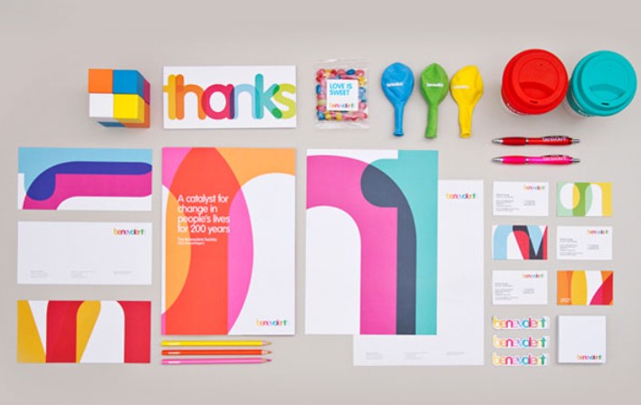
4.1. Branding
Logo and identity: Choose 1–2 main colors, 1–2 secondary colors. Keep consistency across business cards, envelopes, banners, and website.
Guideline: Defines how to use color on light/dark backgrounds, border color, text color...
4.2. User Interface Design (UI/UX)
Contrast: Ensure text and background have enough contrast for easy reading (minimum 4.5:1 ratio according to WCAG).
State color: Hover, active, disabled colors should be clear and consistent. For example, the main button is blue, hover turns dark blue, disabled turns gray.
Warning color: Usually red or orange for important errors/notifications.
.png)
4.3. Print design (Poster, brochure)
Color Transitions: Always check the CMYK preview and adjust the saturation and brightness so that the print does not appear dark or washed out.
Ink Coverage: Avoid applying too much dark ink to a large area to reduce the risk of ink bleeding and paper warping.
4.4. Motion Graphics & Animation
Gradient: Leads the eye from point A to point B, creating depth.
Color transition effect : Enhances experience, evokes movement, often used in intro videos or loading screens.
5. Tools and references
To optimize your workflow, you can take advantage of the following tools:
5.1. Color palette generator tool
Adobe Color (color.adobe.com): Allows you to create, share, and export standard color palettes for Adobe CC.
Coolors.co: Generate color palettes quickly, export swatch files, support grids and press space to randomize.
Paletton: Supports simulation on sample websites, suitable for web interface design.
.png)
5.2. Color sample library
Material Design Palette (material.io/design/color): Standard color palette for Material-oriented UI.
Flat UI Colors: Flat, bright color scheme, popular with modern design styles.
5.3. Plugin support in the software
Color Picker and Swatch Libraries in Illustrator/Photoshop: Helps to quickly save color palettes, convert between RGB–CMYK easily.
Eye Dropper (Chrome Extension): Get colors directly from web images.
6. Related questions
What is the difference between RGB and CMYK and when should you use them?
RGB (Red–Green–Blue) is a light model used for display devices such as computer screens and phones. When the three channels are combined at their highest values, white is obtained.
CMYK (Cyan–Magenta–Yellow–Key/Black) is an ink model used for paper publications, posters, brochures. When four channels are mixed at maximum value, black is obtained.
Digital design always uses RGB; when exporting to print, convert to CMYK and check the preview to avoid color deviation.
.png)
How to choose the right color palette for a new project?
Start with your brand goals and target audience: Youthful brands might favor orange and yellow; financial brands often choose blue.
Use tools like Adobe Color or Coolors.co to generate color sets based on analogous, complementary… principles.
Limit to 3–5 primary colors, adding neutral colors (white, gray, black) to balance and create a “rest” for the eyes.
How to check contrast to ensure accessibility?
Use the Contrast Checker tool (web.dev/contrast-checker) to measure the ratio between the text and the background.
According to WCAG standards, the minimum ratio for normal text is 4.5:1, and for large text (≥18pt) is 3:1.
If not, adjust the brightness or saturation of the text/background color to improve readability.
.png)
When should you use gradients in design?
Gradients help guide the eye and create depth—perfect for backgrounds, call-to-action buttons, or banners.
Choose a gradient of 2-3 tones that have an analogous or triadic relationship to maintain harmony.
Avoid using too many complementary color gradients if you don't want the design to be "dazzling".
Should we adhere to color psychology principles rigidly?
Color psychology is just a suggestion, not a hard and fast rule. Viewers in different cultures may perceive colors differently.
Always combine real-world testing: ask for customer feedback, test on multiple devices and lighting environments.
The most important thing is that the color should match the message and create a good user experience.
Color is an invisible language but has great power in shaping emotions and visual impact on viewers. Entering the world of color, you should start by mastering basic theory, then persistently practice color matching, test on many platforms and listen to feedback from customers and colleagues. Immediately apply the principles, tools and tips in this article to create impressive design products, optimizing both aesthetics and user experience. Wish you happy and creative design!


VIP Products


Best Selling Products
Plugin Retouch4me
69 USD
Upgrade Duolingo Super
29 USD
Genuine Adobe Illustrator account
99 USD
Freepik Premium Account
59 USD
Autodesk All App Account Copyright
120 USD
Genuine Cheap Canva Pro
39 USD
Upgrade genuine Capture One account
120 USD
Capcut Pro 1 Year
39 USD
MidJourney Account
29 USD
Windows 10 & 11 Pro Key
36 USD
Copyright Adobe Lightroom Account
59 USD
Adobe Photoshop Copyright - Full App
120 USD
Upgrade Genuine Office 365
49 USD
ChatGPT Plus Account (GPT-4)
16 USD
Adobe Premiere Pro Account
99 USD