Best Selling Products
Retro Poster Design Tutorial: Detailed Tips
Nội dung
- 1. Characteristics of Retro Style Poster Design
- 1.1. Nostalgic Colors
- 1.2. Characteristic Fonts
- 1.3. Vintage Patterns and Graphics
- 1.4. Classic Effect Techniques
- 1.5. Simple but Harmonious Layout
- 1.6. Cultural Symbolism
- 1.7. Flexible Application
- 2. Understand Retro Style
- 2.1 What is Retro Style?
- 2.2 Origin and Development
- 2.3 Outstanding Features of Retro Style
- 3. How to Design Retro Style Posters
- 3.1. Choose Classic Color Tones
- 3.2 Choosing a Distinctive Font
- 3.3. Harmonious Layout Design
- 3.4. Use Appropriate Images and Graphics
- 3.5. Combining Retro Effects
- 3.6. Editing and Finalization
- 4. Conclusion
Learn how to design a stunning retro poster, from choosing colors, typography, to layout. Discover the secrets to creating a unique piece with a nostalgic feel.
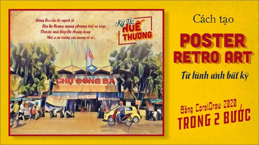
Retro style always brings a sense of nostalgia and attraction. With the combination of classic colors, characteristic fonts and unique layouts, retro style posters not only convey messages but also show a unique artistic mark. Join sadesign to explore how to design retro posters through the article below.
1. Characteristics of Retro Style Poster Design
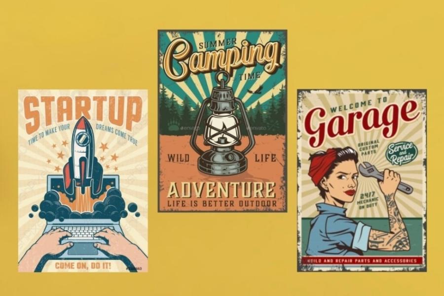
Retro design is an art and design trend that is nostalgic and reminiscent of past decades. In the field of poster design, retro style is not only an aesthetic choice but also an effective tool to convey emotions, cultural values and create a connection with the audience. Below are the outstanding features of retro poster design.
Cheap Canva Pro Upgrade
1.1. Nostalgic Colors
One of the defining elements of retro style is the color palette used. Designs often use warm, muted tones such as brown, earthy yellow, burnt orange, olive green, and brick red. These colors not only create a classic feel but also bring a sense of closeness and warmth to the viewer.
1.2. Characteristic Fonts
Typography is an important element in retro poster design. Fonts often have a vintage look, ranging from elegant serifs to bold sans-serifs or handwritten fonts. They are often designed with a worn, faded or peeling effect to add to the vintage feel.
1.3. Vintage Patterns and Graphics
Retro style often uses motifs and graphics that are iconic to the period it represents. For example, images such as cassette players, vinyl records, classic cars, or simple geometric patterns often appear in designs. These details help evoke memories and create strong associations with the past.
1.4. Classic Effect Techniques
Visual effects also play a big part in creating a retro look. Designers often use techniques like simulated grain, blur, or distress to create the illusion that the poster has been weathered over time. This adds authenticity and highlights the nostalgic quality of the design.
1.5. Simple but Harmonious Layout
The layout in retro poster design is often not too complicated but still ensures harmony between elements. Components such as images, text and graphics are arranged in a balanced way, creating an overall look that is easy to see and attracts the attention of the audience.
1.6. Cultural Symbolism
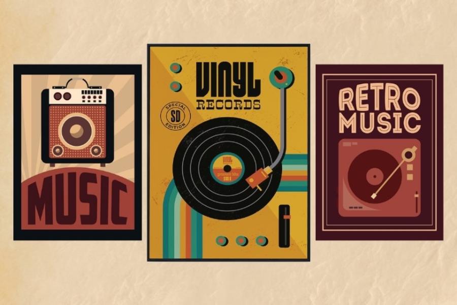
Another notable aspect of retro style is its ability to reflect culture and the times. Each decade has its own characteristics in terms of fashion, music, technology, and lifestyle. Retro poster designs often exploit these elements to create a strong emotional connection with the viewer.
1.7. Flexible Application
Retro style is not limited to a specific field but can be widely applied from product advertising, music events to social media campaigns. This versatility makes retro a popular choice in the modern design industry.
2. Understand Retro Style
Retro is a style inspired by previous decades, often focusing on nostalgia and elements typical of each period. When designing a retro poster, the most important thing is to capture the spirit of this style, from the colors, typography to images.
2.1 What is Retro Style?
Retro is a term derived from the Latin word "retrospectus," which means "looking back." In the context of design and art, retro style is understood as a re-enactment or inspiration from aesthetic, cultural, and design trends of previous decades, usually from the 1920s to the 1980s. This style not only evokes a bygone era but also brings a warm, intimate yet artistic feeling.
2.2 Origin and Development
Retro style began to emerge strongly in the mid-20th century when people began to feel nostalgic for old cultural values. It is not simply the reuse of old elements but also the creative combination of the past and the present. In fields such as fashion, interior, music and art, Retro brings a fresh breeze while still retaining the classic features.
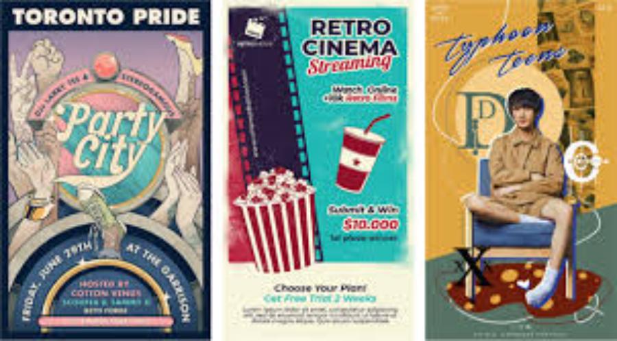
For example, in fashion, 50s flared dresses and 70s flared pants are redesigned with modern materials. In interior design, items such as patterned armchairs or vintage table lamps are often used to recreate living spaces from previous decades.
2.3 Outstanding Features of Retro Style
Retro style has recognizable characteristics, including:
1. Bold and Contrasting Colors
The color palette in Retro style is often very diverse, from soft pastel tones to bold colors such as orange, yellow, green and red. The color combinations are often highly contrasting but still harmonious.
2. Unique Patterns and Designs
Geometric motifs, soft curves, or intricate patterns are characteristic of this style. They often appear on wallpaper, upholstery, or even clothing.
3. Classic Material and Shape
Natural wood, vinyl, and chrome are popular materials in the retro style. Furniture shapes often feature rounded or angular lines typical of each decade.
4. The Combination of Old and New
The special feature of Retro style is the ability to combine classic elements with modern technology or materials, creating a unique blend.
3. How to Design Retro Style Posters
Apply the characteristic motifs and color palettes of the Retro style to create unique, specific designs:
3.1. Choose Classic Color Tones
Color is the deciding factor for the success of a retro poster. Use nostalgic tones, combining them harmoniously to create a warm and cozy feeling.
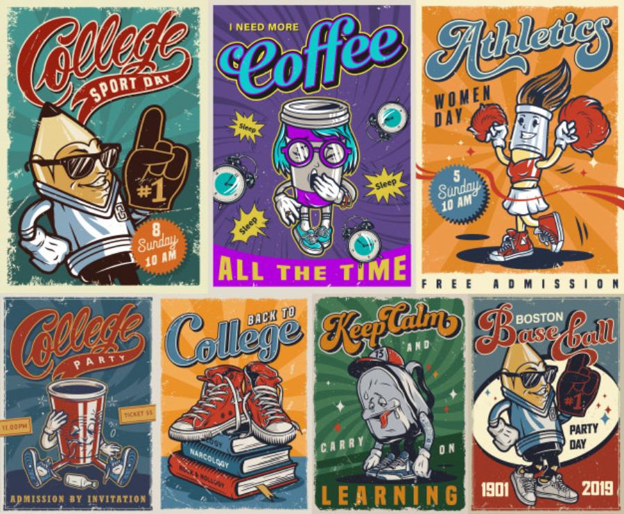
Popular color schemes:
Contrasting color scheme: Combine light and dark colors to highlight key details.
Monochromatic color scheme: Use one main color, complemented with different shades.
Complementary color scheme: Use two opposite colors on the color wheel to create accents.
Also, consider using a faded effect or a grainy texture to add a vintage feel to your poster.
3.2 Choosing a Distinctive Font
Typography plays an important role in conveying a retro style. When designing a poster, choose fonts that are iconic to the decade, such as:
Vintage Script: Gives an elegant feel, often seen in old advertising posters.
Classic Serif: Creates a solid feel, often used in headlines.
Sans serif vintage: Clean, suitable for modern and classic designs.
Combine typefaces together harmoniously, for example, use serif for headings and script for sub-content to create prominence.
3.3. Harmonious Layout Design
Layout is the deciding factor in the appeal of a poster. With retro style, the layout is often designed simply but creatively, focusing on the main details.
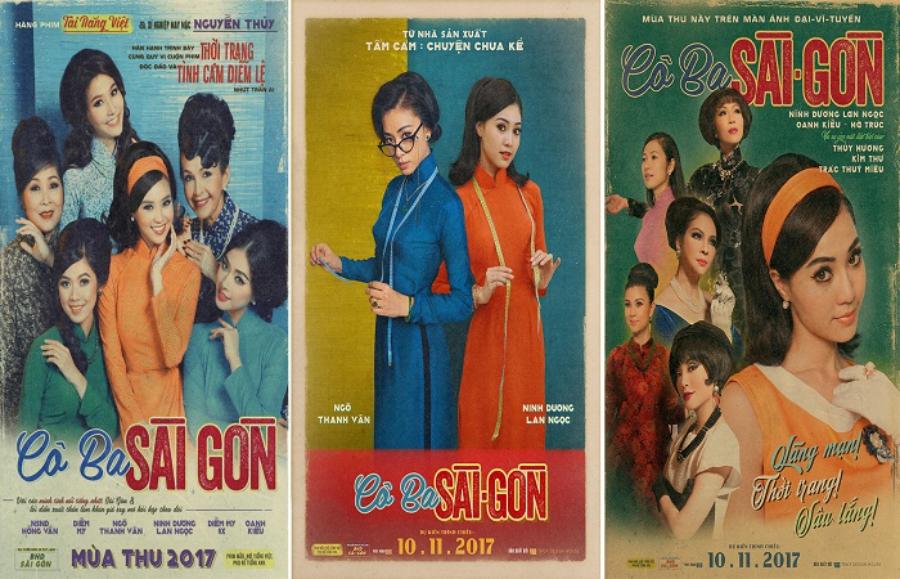
Some notes:
Focus on the focal point: Make sure key elements like headlines, images, or slogans stand out from the rest.
Use borders: Simple borders or patterns help create a clean and attractive feel.
Ensure balance: Divide the poster into clear areas to easily attract the eye.
3.4. Use Appropriate Images and Graphics
Images and motifs are the soul of retro posters. Choose illustrations or photographs with a vintage feel, and add motifs such as:
Symmetrical lines: Show neatness and comfort.
Floral Patterns: Reminiscent of traditional designs.
Simple shapes: Highly symbolic, easy to impress.
Additionally, vintage effects such as color noise or light scratches can be used to increase realism.
3.5. Combining Retro Effects
Effects are an essential element to highlight the retro style. Some commonly used effects include:
Grain: Creates an old photo feel, adding depth to the poster.
Noise: Makes the poster look like it was printed on old paper.
Gradient: Use a blurred gradient to soften transition areas.
These effects not only enhance the aesthetics but also make the poster stand out.
3.6. Editing and Finalization
Once you have completed your design, the final step is to edit and finalize. Make sure that all the elements in your poster are arranged harmoniously, without any unnecessary or distracting details.
Check the following factors:
Clarity: Are important details prominent?
Color: Are the tones consistent and appropriate?
Layout: Do the positions of elements need to be changed to create balance?
Finally, save your poster in a high quality format to ensure it looks its best when printed or used digitally.
4. Conclusion
Designing a retro poster is not only a way to recreate the nostalgic beauty but also an opportunity for you to express your personal mark. With a clever combination of colors, fonts and layouts, you can completely create unique and impressive works. Get started today and let your designs become a source of inspiration for everyone!

