Best Selling Products

Copyright Adobe Lightroom Account
59 USD

Plugin Retouch4me
69 USD

Adobe Photoshop Copyright - Full App
120 USD

Genuine Adobe Illustrator account
99 USD

MidJourney Account
29 USD

Capcut Pro 1 Year
39 USD

ChatGPT Plus Account (GPT-4)
16 USD

Upgrade Duolingo Super
29 USD

Freepik Premium Account
59 USD

Upgrade genuine Capture One account
120 USD

Windows 10 & 11 Pro Key
36 USD

Autodesk All App Account Copyright
120 USD

Adobe Premiere Pro Account
99 USD

Genuine Cheap Canva Pro
39 USD

Upgrade Genuine Office 365
49 USD
Revealing the Art of Color Combination in Movies That Not Every Designer Knows
Nội dung
- 1. Why is color coordination important in film?
- 1.1. Create emotion and atmosphere
- 1.2. Visual orientation and attention focus
- 1.3. Recall and build visual brand
- 1.4. Support storytelling and character development
- 2. Principles of color matching in movies
- 2.1. Principle of color contrast
- 2.2. Principle of similar color coordination
- 2.3. Principles of monochrome color scheme
- 2.4. Principles of color coordination
- 2.5. Principles of balanced color coordination
- 2.6. Principles of color matching according to mood and scenario
- 2.7. Traditional and modern color matching principles
- 3. Conclusion
Discover the art of color matching in movies – an important factor that contributes to creating attraction and strong emotions for each film. The article analyzes in detail the principles of color matching in movies and why it has become the secret weapon of filmmakers.
Color matching in movies is not just a random combination of colors, but a subtle art that plays an important role in shaping the emotions and messages of the movie. Although not all designers know all the principles of color matching in movies, this technique largely determines the visual and emotional success. In this article, Sadesign will take you deep into the world of color matching in movies - from why color matching is important, to the principles of color matching that any filmmaker should know.
1. Why is color coordination important in film?
Color coordination in movies acts as a non-verbal language, conveying messages and emotions to the audience in the most intuitive way. Each color, when skillfully coordinated, will create different visual effects, helping the audience feel more deeply about the space, time and mood of the character.
.jpg)
1.1. Create emotion and atmosphere
Color is a powerful tool for filmmakers to create an atmosphere that fits the content of the story. Cool colors like blue and purple often bring feelings of sadness, loneliness or mystery. Meanwhile, warm colors like red, orange and yellow express warmth, excitement or tension. Color coordination in movies helps to adjust the emotions of the audience, leading them into the world that the director wants to create.
1.2. Visual orientation and attention focus
Color coordination in movies also has the effect of directing the viewer's attention to important details. Contrasting or prominent colors will help clearly distinguish characters and objects in the scene, create highlights and avoid boredom in the image composition.
1.3. Recall and build visual brand
Many famous films are associated with a distinctive color scheme. This is a way to create a unique identity and help the audience easily recognize the work from the first images. For example, action films often use bright, bold color schemes to create an intense feeling, while psychological films often use calm, minimalist color schemes to add depth.
1.4. Support storytelling and character development
More than just an aesthetic, color schemes in movies also help filmmakers convey deeper messages about characters and plots. Color changes can signal psychological shifts or turning points in the story, thereby adding dimension and appeal to the film.
2. Principles of color matching in movies
Understanding the principles of color matching in film helps filmmakers, even those who are not specialized in design, to effectively apply them to improve the quality of their products. Below are the most basic and important principles.
2.1. Principle of color contrast
The concept of color contrast principles in movies
The principle of color contrast in film is based on combining opposite colors on the color wheel, creating a prominent and vivid image. When mixing colors according to the principle of color contrast, the colors will highlight each other, helping to attract the audience's attention and create a strong visual effect.
The role of color contrast in film
In the process of editing, applying the principle of color coordination in film in the direction of contrast helps to create highlights for each scene. Contrasting colors also help to express character, space, or strong emotions such as the opposition between good and evil, tension or conflict. This is a powerful tool for filmmakers to convey profound ideas through images.
How to use the principle of color contrast
The principle of color matching in movies when applying color contrast often uses pairs of colors that are symmetrical on the color wheel such as red and green, blue and orange, yellow and purple. Choosing the right ratio and color will create a sense of balance, avoiding confusion for the viewer. For example, action scenes or climaxes often prioritize contrasting colors to increase drama and appeal.
Notes when applying the principle of color contrast
Do not overuse the color matching principle in movies according to excessive color contrast because it can make the scene too colorful and lose its authenticity. The choice of color needs to be suitable for the content and context of the film, while ensuring overall harmony in each frame.
2.2. Principle of similar color coordination
.jpg)
Definition of analogous color scheme in movies
Analogous color schemes in film are based on using colors that are close to each other on the color wheel. This method creates a pleasing, harmonious, and seamless feel in the composition of the image.
Applications of analogous color schemes in film
Analogous color schemes are often chosen in gentle, romantic scenes or quiet, tranquil scenes. This principle of color schemes in movies helps create a pleasant and consistent feeling, helping viewers immerse themselves in the story without being distracted by overly bright colors.
How to match similar colors correctly
Colors that are next to each other on the color wheel, such as green and blue, yellow and orange, and red and orange, are good examples of analogous color schemes. Combining different shades of these colors will add richness to the scene while still maintaining a soft, natural look.
Advantages and disadvantages of analogous color schemes
The biggest advantage of this color scheme in film is that it helps create visual unity and harmony, contributing to highlighting content and emotions in a subtle way. However, if too many similar colors are used, the scene can become monotonous and lack emphasis.
2.3. Principles of monochrome color scheme
The concept of monochrome color scheme in movies
Monochromatic color scheme is a color scheme in cinema that uses a dominant color with different shades and brightnesses to create a unique and deep image. This is a symbolic color scheme and can create a strong psychological effect.
Applications of monochrome color scheme in film
Monochromatic color schemes are often used in highly expressive scenes to emphasize the emotion or theme of the film. Choosing a dominant color helps focus the viewer's attention on the important elements the filmmaker wants to convey.
How to effectively combine monochrome colors
The principle of color matching in movies when using monochromatic color scheme requires sophistication in choosing the hue, saturation and brightness of the color to create variety without losing unity. For example, a sad scene can use blue tones with many different shades to express a somber mood.
Benefits and limitations of monochrome color schemes
Applying the principle of color coordination in film in a monochromatic direction helps to enhance the artistry and concentration of the image. However, without proper adjustment, the image can become boring or lifeless.
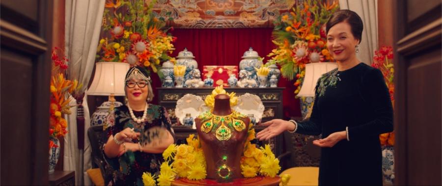
2.4. Principles of color coordination
.jpg)
The concept of color accentuation in film
The first principle of color matching in film that you need to understand is accent color matching. This is the method of using color to highlight an important detail or subject in the frame. The purpose of this principle of color matching in film is to draw the viewer's attention to a certain point, helping to convey the story more clearly.
In accent color schemes, colors are often chosen to contrast highly with the background or surrounding elements. For example, a character wearing a red shirt standing out against a dark background will immediately become the focus of the scene. Therefore, choosing colors that match the content and context is extremely important in the principles of color scheme in film.
Emphasis color scheme application in film genres
The principle of color coordination in movies emphasizes that it is widely applied in many different genres of movies. In action movies, red or yellow are often used to create a sense of urgency and danger, while psychological movies prioritize soft colors to highlight the characters' emotions.
In addition, the principle of color coordination in movies also helps to locate space and time, for example, bright colors bring the feeling of summer days, while dark, dim colors remind us of sad rainy nights.
Benefits of the Emphasis Color Principle
Applying the principle of color coordination in movies in an emphatic way helps viewers easily identify and remember important details. Not only that, it also enhances the aesthetics of the film, creates impressive visual effects, and supports the director in conveying messages and emotions.
2.5. Principles of balanced color coordination
The concept of balanced color scheme in film
The second principle of color matching in film that needs attention is balanced color matching. This is a color matching method that aims to create harmony and stability throughout the entire frame. The colors are chosen so that they are not too bright or out of tone, bringing a pleasant feeling to the viewer.
Balanced color scheme does not focus too much on a single color, but distributes the colors evenly and harmoniously. This is a principle of color scheme in movies that helps reduce confusion and maintains the connection between scenes in the movie.
Application of balanced color matching in filmmaking techniques
In actual film production, the principle of balanced color coordination in film is demonstrated through the selection of appropriate settings, lighting and costume colors. The subtle coordination between the colors of the scene and the characters helps the entire frame look harmonious, creating a beautiful and natural whole.
This also helps reduce visual pressure when the audience watches the film, while maintaining aesthetic consistency throughout the film's duration.
The importance of balanced color schemes
The principle of balanced color in movies not only makes the image attractive but also helps to convey gentle, subtle emotions. Color balance makes the movie more accessible, creating a sense of authenticity and closeness to the viewer.
2.6. Principles of color matching according to mood and scenario
.jpg)
The Relationship Between Color and Mood in Film
The principles of color matching in film cannot be separated from the elements of mood and script. Each color is associated with a certain emotion or state, so color matching according to mood helps to increase the expressiveness and depth of the film.
For example, blue often represents peace or sadness, red represents passion or danger, and yellow evokes feelings of warmth and happiness.
Color matching for each scenario
In each type of script, the principles of color coordination in movies need to be applied flexibly. With horror scripts, cold and dark colors are often used to create a tense, suspenseful atmosphere. On the contrary, comedies or romantic movies prioritize bright colors to create a happy, light feeling.
Choosing the right color scheme according to the script not only improves the image quality but also helps the audience easily feel and sympathize with the story.
Mood Color Technique
Some of the commonly used mood color techniques in film include changing the lighting, applying color filters, and color correction in post-production. These operations help shape the style and main color of the film, helping the principles of color in film to maximize their effectiveness.
2.7. Traditional and modern color matching principles
Traditional color matching principles
Traditional color schemes in film are based on a basic color palette, using contrasting or similar color pairs to create a harmonious and attractive visual effect. According to this principle, color gamuts are often divided into:
Hot colors: red, orange, yellow - show excitement, enthusiasm, stress.
Cool colors: blue, green, purple – create a feeling of peace, coldness or sadness.
Traditional color schemes often use complementary pairs of colors on the color wheel (for example, red and green, blue and orange) to increase contrast, making images stand out and more attractive. This is a familiar color scheme in classic works, contributing to highlighting the highlights of the scene or expressing the contrast in the character's mood.
In addition, traditional color matching principles are also based on the principle of “monochromatic color” or “analogous” color matching to create harmony and uniformity in the scene. For example, shades of blue can be combined to create a cool, deep space, which is very suitable for sad or thoughtful scenes.
Modern color matching principles
With the development of filming techniques and image editing technology, the principles of color matching in today's movies have been expanded and become much more creative. Modern color matching is not only limited to using basic colors but also combines unique lighting and color effects to create new and impressive experiences.
The use of bright, neon or soft pastel colors can all be utilized to suit each film genre and artistic style. Modern color schemes are even more flexible in mixing colors to create complex, multi-dimensional emotions, helping to convey the story in a profound and engaging way.
An important point in the principle of modern color coordination is the combination of color and lighting techniques, shadows to create depth and space for the picture. This helps the film scenes not only beautiful but also have psychological dimensions, bringing the viewer into a separate emotional state.
3. Conclusion
The art of color matching in film is not easy, especially when it requires deep understanding and sophisticated techniques to convey the right ideas and emotions. However, mastering the principles of color matching in film will help filmmakers tell their stories more realistically and vividly. Color not only beautifies the film but is also a powerful language that brings the audience closer to the message and soul of each character. That is why color matching in film is important and needs to be seriously invested in every film project.


VIP Products


Best Selling Products
Copyright Adobe Lightroom Account
59 USD
Plugin Retouch4me
69 USD
Adobe Photoshop Copyright - Full App
120 USD
Genuine Adobe Illustrator account
99 USD
MidJourney Account
29 USD
Capcut Pro 1 Year
39 USD
ChatGPT Plus Account (GPT-4)
16 USD
Upgrade Duolingo Super
29 USD
Freepik Premium Account
59 USD
Upgrade genuine Capture One account
120 USD
Windows 10 & 11 Pro Key
36 USD
Autodesk All App Account Copyright
120 USD
Adobe Premiere Pro Account
99 USD
Genuine Cheap Canva Pro
39 USD
Upgrade Genuine Office 365
49 USD