Best Selling Products

Upgrade Genuine Office 365
49 USD

Upgrade genuine Capture One account
120 USD

Copyright Adobe Lightroom Account
59 USD

ChatGPT Plus Account (GPT-4)
16 USD

Adobe Premiere Pro Account
99 USD

Capcut Pro 1 Year
39 USD

Autodesk All App Account Copyright
120 USD

Adobe Photoshop Copyright - Full App
120 USD

Upgrade Duolingo Super
29 USD

Plugin Retouch4me
69 USD

Windows 10 & 11 Pro Key
36 USD

MidJourney Account
29 USD

Freepik Premium Account
59 USD

Genuine Adobe Illustrator account
99 USD

Genuine Cheap Canva Pro
39 USD
Selection of the hottest color schemes of 2025 for graphics & websites
Nội dung
- 1. Why is color scheme important in design?
- 2. 14+ color schemes in graphic design, website, beautiful design
- 2.1. Metallic color scheme
- 2.2. Classic color scheme
- 2.3. Cool color scheme
- 2.4. Earth color palette
- 2.5. Mechanical color scheme
- 2.6. Shadow color scheme
- 2.7. Aesthetic color scheme
- 2.8. Vibrant color palette
- 2.9. Vibrant color palette
- 2.10. Simple color scheme
- 2.11. Vibrant color palette
- 2.12. Creative color scheme
- 2.13. Elegant color scheme
- 2.14. Futuristic color palette
- 2.15. Bold color scheme
- 3. Principles for selecting and applying color schemes
A design can be perfect in terms of layout, typography and imagery, but if the colors don’t match, the entire message can easily be lost. Studies show that over 90% of a user’s first impression of a brand comes from color.

Color is one of the most powerful visual languages. In just a few seconds, color can evoke an emotion, trigger a memory, or create an entirely different atmosphere. Think of the vibrant orange of a summer afternoon, the gloom of a gray sky after a rainstorm, or the calming feeling of standing in front of the cool blue of the ocean. All of these are testament to the powerful impact color has on how we perceive the world.
In the field of graphic and web design, color is not only an aesthetic element but also a strategic tool. It can guide the user’s eye to an important point, reinforce the brand identity, or even decide whether the customer stays to explore longer or leaves after just a few seconds.
For experienced designers, choosing colors often comes with careful research on color psychology, market trends, and practical applications. But for beginners, finding the right color scheme is sometimes like getting lost in an endless maze. Therefore, in this article, we have compiled 14+ beautiful, sophisticated, and modern color schemes , suitable for use in graphic design, websites, as well as digital and printed products.
1. Why is color scheme important in design?
A design can be perfect in terms of layout, typography and imagery, but if the colors don’t match, the entire message can easily be lost. Studies show that over 90% of a user’s first impression of a brand comes from color.

The color palette is a tool that helps designers:
Create visual consistency : Helps the design to be consistent and not disjointed.
Evokes emotions : For example, blue evokes trust, red evokes urgency, yellow evokes joy.
Brand support : Every major brand is associated with a signature color palette: Coca-Cola with red, Facebook with blue, Starbucks with green.
Driving behavior : Colors can direct user actions, from clicking a CTA button to remembering a logo.
A successful color scheme is one that is both aesthetically pleasing and conveys the right emotion and message of the brand or product.
2. 14+ color schemes in graphic design, website, beautiful design
2.1. Metallic color scheme
Metallic color schemes are often inspired by shiny, reflective colors like gold, silver, platinum, or copper. When combined with cool blues or turquoise, they bring a luxurious, sophisticated, and modern feel.
Not only stopping at the aesthetic factor, this color scheme also evokes the association of advanced technology, luxury and standards. That is why many big brands in the field of technology and high-end fashion choose metallic colors as the main color to build their image.

For example, Apple has always used silver, space gray, and champagne gold in its products to create a sense of class. In website design, this color palette is often used to highlight high-end products, AI technology interfaces, or brands that want to convey sophistication and trust in quality.
2.2. Classic color scheme
When it comes to classic, warm, timeless colors like terracotta, dark navy blue, and glossy black come to mind. This combination evokes a nostalgic, luxurious feeling but never out of date.
Classic color schemes are often found in classic cars, wines, luxury furniture, or art brands that want to honor traditional beauty. For example, many European wine brands use this color scheme to design their bottle labels, conveying trust and a sense of quality that has been passed down through generations.
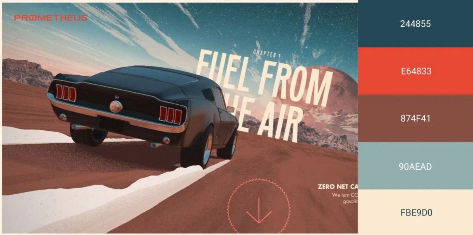
If applied to a website, this is an ideal choice for art galleries, luxury restaurants or lifestyle brands that want to create a luxurious yet intimate feel.
2.3. Cool color scheme
Dark turquoise combined with metallic light creates a fresh, youthful look, associated with technology and creativity. This color palette is often used in animation videos, technology startups or mobile apps to evoke dynamism and vitality.
Turquoise is inherently associated with creativity and innovation. When paired with metallic sheen, it becomes more futuristic and digital. This is why many AI, fintech or SaaS technology websites choose this color scheme to convey professionalism and trend-setting.

2.4. Earth color palette
Earth tones such as brown, beige, moss green, slate gray often create a sense of stability, sustainability and connection to nature. This color scheme is popular in the context of the trend of green living and sustainable design.
For example, brands like Patagonia and Everlane often use earthy color palettes to emphasize messages about the environment, nature, and responsible production. In interior design and architecture, this color palette evokes peace, intimacy, and trust.
If applied in a website, it is especially suitable for eco-tourism, farmstay, organic products or sustainable fashion brands.

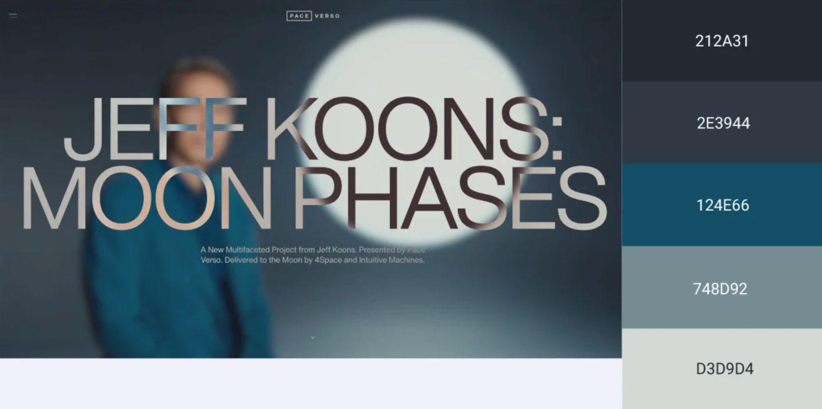
2.5. Mechanical color scheme
Neutral black and grey when paired with bright blue create a feeling that is both modern and solid. This color palette is highly technical, often used in the fields of robotics, artificial intelligence, mechanical industry or technology platforms.
Gray suggests balance and stability, while blue conveys a sense of trust and transparency. Together, they create a technological visual space that is both powerful and approachable. This is a very popular color palette in UI/UX interfaces for industrial software, technology websites or electronic products.

2.6. Shadow color scheme
This color scheme is built on gradients from blue to pink-orange, bright orange, creating a vibrant and attractive effect. When adding neon details like green or yellow, it becomes even more eye-catching.
The shadow color scheme is often used in marketing campaigns, event posters, advertising banners or entertainment apps. It brings a sense of movement, excitement and attracts attention immediately. For example, many music apps, EDM events or festivals use this color scheme to evoke excitement.

2.7. Aesthetic color scheme
Inspired by sculpture, this palette includes gray-white, space blue, and slate gray. It has a minimalist yet sophisticated feel, suggesting mystery and artistry.
This color scheme is often used for art studios, exhibition websites or personal portfolios in the fine arts field. The combination of neutral colors helps the content and artistic images stand out more, without being overwhelmed by color.
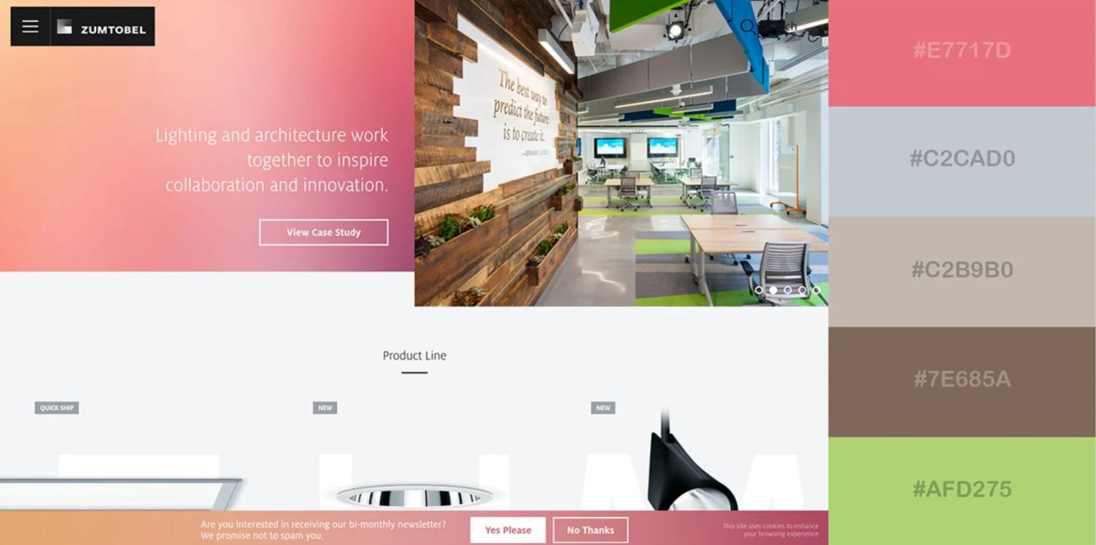
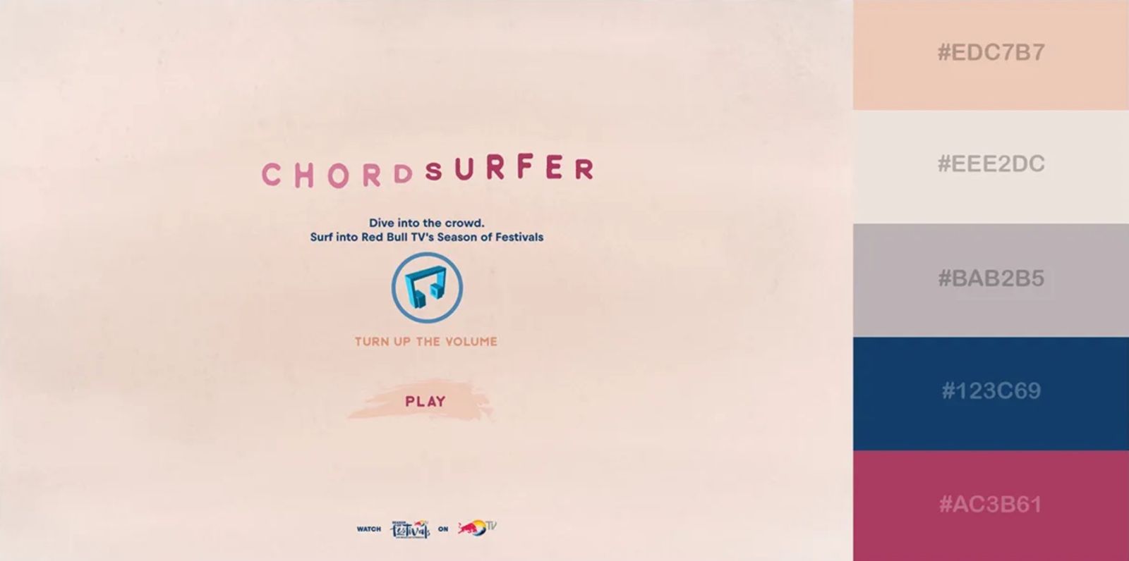
2.8. Vibrant color palette
In this color scheme, light red is used as the main color, combined with a cream gray background and pink details to create an interesting contrast. This is an uncommon combination, even a bit bold, but it makes a strong impression.
It often appears in fashion magazines, advertisements or media campaigns that want to make a difference. With the red color that is difficult to use for letters, when combined subtly, it creates a prominent and unforgettable strong feeling.

2.9. Vibrant color palette
This color palette is playful and youthful thanks to the combination of pink, green, yellow and light brown. It evokes joy, closeness and positive energy.
This palette is ideal for children's design, entertainment, community, education or campaigns that want to convey a sense of togetherness and fun. Many gaming and learning apps have used this palette to create a friendly feel for users.
2.10. Simple color scheme
The combination of a dark black background and electric blue creates a very striking effect. It is a simple color palette but extremely effective, especially when applied to digital interfaces.
Gaming, fintech, crypto and tech startup brands often favor this color palette because it evokes a modern, powerful and somewhat “cool” feel. The strong contrast helps important elements like buttons, logos or messages stand out immediately.

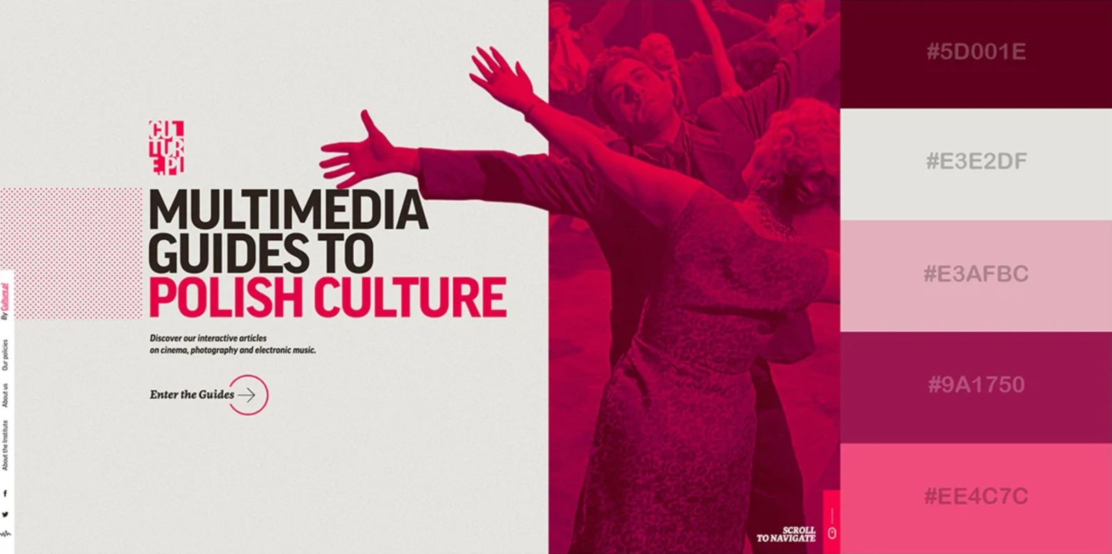
2.11. Vibrant color palette
Inspired by the Polish flag, this color palette uses crimson, hot pink, and a light gray base to create a minimalist yet creative style.
It is suitable for innovative brands, creative startups or personal projects that want to convey revolutionary spirit, determination and difference. This is also a color palette that evokes the spirit of youth, daring to change and explore new things.
2.12. Creative color scheme
When we combine gold, vermillion, navy and white, we have a color palette that is energetic, artistic and free-spirited.
This palette is ideal for creative services, music, art festivals or media agencies. For example, many campaigns promoting music albums, street festivals or youth brands often use this palette to emphasize freedom and emotional explosion.

2.13. Elegant color scheme
Royal blue, ruby and skin tone are a combination that brings a sophisticated, luxurious but still close beauty. It is very suitable for brands for women, especially cosmetics, fashion, spa, lifestyle.
These colors when combined together evoke a sense of nobility but not too distant, just enough to make customers feel elevated but still approachable. This is a color palette that many high-end beauty brands apply to impress customers.
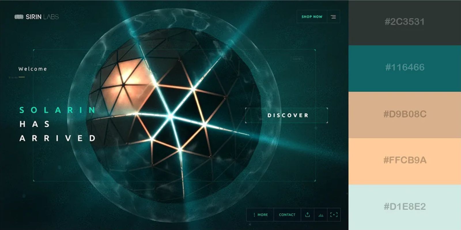
2.14. Futuristic color palette
Sapphire blue, smoky gray, platinum combined with peach orange and tan create a harmony between technology and humanity. It is modern, luxurious, and still retains a warm feeling.
This color palette is often used by AI, robotics companies or high-end technology brands. It helps the brand evoke a futuristic image, leading the trend but not distant from people.
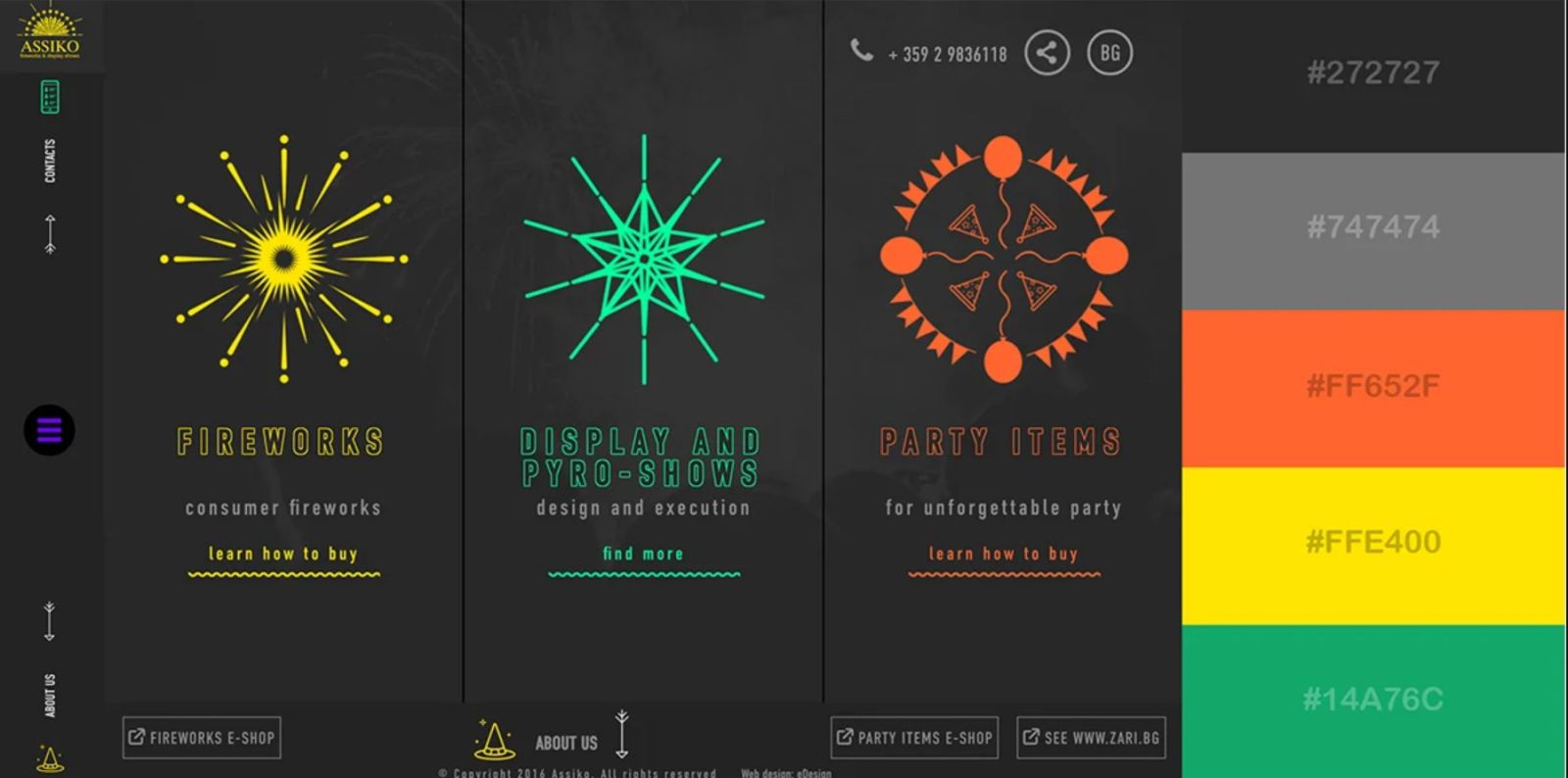
2.15. Bold color scheme
Dutch orange, bright yellow and turquoise when placed on a black and grey background create a strong, energetic color palette. This is not a color palette for safety, but for brands that want to break out, stand out and attract attention immediately.
Perfect for sports, gaming, e-sports brands or unconventional marketing campaigns. The vibrant and strong contrast between the colors makes this palette ideal for conveying energy and a challenging spirit.
3. Principles for selecting and applying color schemes
Not every color scheme is suitable for every type of design. Some important principles to keep in mind:
Understand your target audience : If your customers are young people, choose vibrant colors; if it's a financial business, prioritize blue to create trust.
Use the 60-30-10 rule : 60% dominant color, 30% complementary color, 10% accent color.
Consider contrast : Make sure the text is easy to read against the background.
Test multiple versions : Sometimes unexpected combinations produce unexpected results.
Color is the “soul” of design. A beautiful color scheme can make a website, logo or poster many times more memorable. From luxurious metallics, warm earth tones, to bold futuristic palettes, each combination opens up a new creative possibility. Choosing a color scheme should not only be based on personal aesthetic taste, but also on brand goals and user experience. If used properly, color will not only beautify but also tell stories, connect emotions and lead to action.


VIP Products


Best Selling Products
Upgrade Genuine Office 365
49 USD
Upgrade genuine Capture One account
120 USD
Copyright Adobe Lightroom Account
59 USD
ChatGPT Plus Account (GPT-4)
16 USD
Adobe Premiere Pro Account
99 USD
Capcut Pro 1 Year
39 USD
Autodesk All App Account Copyright
120 USD
Adobe Photoshop Copyright - Full App
120 USD
Upgrade Duolingo Super
29 USD
Plugin Retouch4me
69 USD
Windows 10 & 11 Pro Key
36 USD
MidJourney Account
29 USD
Freepik Premium Account
59 USD
Genuine Adobe Illustrator account
99 USD
Genuine Cheap Canva Pro
39 USD