Best Selling Products
Serif vs. Sans-serif: Understanding the Two Most Popular Font Types
Nội dung
- 1. Introduction What are Serif and Sans-serif?
- 1.1 What is Serif?
- 1.2 What is Sans-serif?
- 2. Misconceptions about Serif and Sans-serif
- 2.1 Myth 1: Serif is easier to read, while Sans-serif is harder to read
- 2.2 Myth 2: Serif fonts are only used in classic designs
- 2.3 Myth 3: All Sans-serif fonts are the same
- 2.4 Myth 4: Serif and Sans-serif cannot be combined together
- 3. When to use Serif and Sans-serif?
- 3.1 Use Serif fonts
- 3.2 Use Sans-serif fonts
- 3.3. Combining Serif and Sans-serif
- 4. Application of Serif and Sans-serif in design
- 4.1 Applications of Serif fonts
- 4.2 Applications of Sans-serif fonts
- 5.Conclusion
Serif and Sans-serif are two popular font families, but there are still many misconceptions. Let's learn the differences and their applications in graphic design and typography.
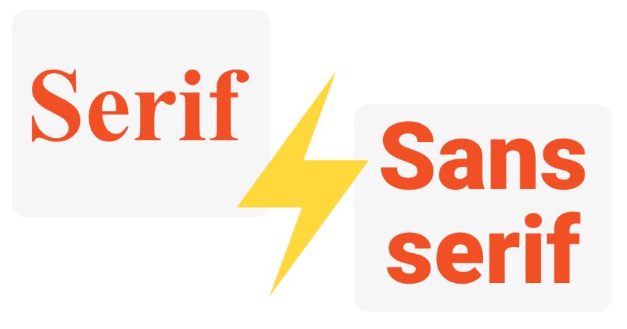
Fonts are one of the most important elements in graphic design and online communication. Among the popular font types, Serif and Sans-serif are the two main font groups that every designer must know. Although they are frequently used, there are still many misconceptions about the differences and how to choose between them. This article will help you decode the misconceptions about Serif and Sans-serif , and provide a clear view of their applications in design projects.
1. Introduction What are Serif and Sans-serif?
Serif and Sans-serif are the two most popular and widely used groups. However, to effectively use these two font types, it is necessary to clearly understand their characteristics, applications, and differences.
1.1 What is Serif?
Serifs are the small, raised “feet” at the top and bottom of letters in a font. They help to distinguish between letters and give a formal, classic feel. Serifs are often found in traditional fonts, and are a popular choice for printed publications such as books, newspapers, and magazines, because they increase legibility, especially when printed at small sizes.
.jpg)
Some notable serif fonts include: Times New Roman, Garamond, Georgia, and Baskerville. These fonts are commonly used in designs that need to be serious and professional, such as academic documents, newspapers, and in-depth texts.
Advantages of Serif fonts :
- Increased readability: Small strokes make it easier for the eye to move across lines of text, especially when reading long documents.
- Create a traditional feel: Serif fonts give a sense of trust and formality, suitable for academic or official content.
- Classic aesthetics: With their refined design, Serif fonts are often used in high-end brands or fields such as art and culture.
Disadvantages:
- May be difficult to read on small screens or when displayed at small sizes due to intricate details.
- Not suitable for modern or minimalist designs.
1.2 What is Sans-serif?
In contrast to Serif, Sans-serif fonts do not have strokes at the beginning or end of letters. “Sans” means “without” in French, so Sans-serif fonts are simple, clean fonts without decorative details. These fonts have a modern, clean feel and are easy to read on screens, especially in digital environments.
.jpg)
Prominent sans-serif fonts include: Arial, Helvetica, Open Sans, and Roboto. These fonts are often chosen for web design, mobile apps, and online media products because of their readability and minimalism.'
Advantages of Sans-serif fonts:
- Easy to read on screen: With a simple design, without small details, Sans-serif fonts display very well on digital devices.
- Modern aesthetics: This font is suitable for minimalist, creative or technological designs.
- Versatile: Sans-serif fonts can be used in a variety of contexts, from websites to mobile apps.
Disadvantages:
- May lack the formality and tradition of Serif fonts.
- Not ideal for long documents that require high legibility in print.
2. Misconceptions about Serif and Sans-serif
Despite being the two most popular font families, there are many misconceptions surrounding the choice between Serif and Sans-serif . Let’s look at some common mistakes to help you make the right choice in your designs.
.jpg)
2.1 Myth 1: Serif is easier to read, while Sans-serif is harder to read
Many people think that Serif fonts are easier to read, especially when reading long texts, because the strokes help the eye move easily from one letter to another. However, with the rise of digital design and the trend of minimalism, many studies have shown that Sans-serif fonts are not only easier to read but also provide a smoother reading experience on the screen. This is why websites and mobile applications today mainly use Sans-serif .
However, when it comes to Serif , these fonts are still very useful in printed publications, where the support of high-quality paper and ink helps improve the readability of long passages of text. Therefore, choosing Serif or Sans-serif depends on the context and the medium in which the text is presented.
2.2 Myth 2: Serif fonts are only used in classic designs
Although Serif fonts are often associated with classic and seriousness, not all classic designs use Serifs . Modern Serif fonts like Georgia and Miller break the old mold, offering a mix of traditional and modern, and are still widely used in online and print designs.
2.3 Myth 3: All Sans-serif fonts are the same
In fact, each sans-serif font has its own distinct characteristics. Although they all lack decorative strokes, fonts like Helvetica have a clean, legible design, while Arial has a simpler letter structure and some even feel it lacks sophistication. Furthermore, sans-serif fonts have clear distinctions between x-heights, widths, and styles. Choosing a sans-serif font also takes into account the aesthetics and functionality of the design project.
2.4 Myth 4: Serif and Sans-serif cannot be combined together
Many people believe that Serif and Sans-serif cannot be used together in the same design. However, if used correctly, this combination can create a very unique effect. Some designers combine Serif for headlines and Sans-serif for body copy to create contrast and highlight important content. The key is to understand the structure and style of each font type and make sure that they are harmonious and do not detract from the aesthetic of the design.
3. When to use Serif and Sans-serif?
.jpg)
Choosing between Serif and Sans-serif depends on your intended use and your target audience. Here are some suggestions to consider:
3.1 Use Serif fonts
- Print: Serif fonts are often used in books, magazines, newspapers or official documents. The small strokes help the eye move easily across the lines of text, increasing readability in long documents.
- Premium Branding: If you want to project a traditional, classy or professional brand image (e.g. bank, law firm, university), Serif is the ideal choice.
- Serious content: For formal documents such as theses, research reports or contracts, Serif fonts help emphasize trustworthiness and credibility.
3.2 Use Sans-serif fonts
- Digital design: Sans-serif is the optimal choice for on-screen content such as websites, mobile applications or presentation slides. The simplicity and clarity of Sans-serif increases readability on electronic devices.
- Dynamic branding: If you want to build a creative, youthful or high-tech brand image (e.g. startup, modern fashion brand), Sans-serif will be the right choice.
- Concise content: For headlines, tables or short paragraphs, Sans-serif helps keep the message clear and accessible.
3.3. Combining Serif and Sans-serif
In many cases, combining both types of fonts in the same design can be very effective. For example:
- Sans-serif headline, Serif body copy: This combination helps the headline stand out and attract attention, while the main content remains readable and formal.
- Separating information: Use two different font types to differentiate sections of content in a design (e.g. Serif for descriptions, Sans-serif for contact information).
4. Application of Serif and Sans-serif in design
.jpg)
4.1 Applications of Serif fonts
Traditional Printing : Serif fonts are well suited to traditional printed publications such as books, magazines, and newspapers, because of their ability to help the reader's eyes follow each line of text easily.
Create a formal, classic feel : Serif fonts like Times New Roman or Garamond are often used in documents that need to create a formal, official feel, such as contracts, letters, or academic documents.
Logo and branding design : Some high-end brands, especially in the fashion or finance industry, choose Serif to create a strong impression of elegance and sophistication.
4.2 Applications of Sans-serif fonts
Web design and user interfaces : Sans-serif fonts are easy to read on screens, especially when used in user interfaces such as websites, mobile apps, and online platforms. Roboto , Arial , or Helvetica are popular choices because of their simplicity and ease of use.
Modern Logos and Branding : Tech brands, startups, and companies that want to make a modern and innovative statement often choose Sans-serif for their logos. Fonts like Futura , Gotham , or Avenir are popular with young and dynamic brands.
Advertising and communication design : With its readability and minimalism, Sans-serif is well suited for online advertising or communication design, especially on platforms with small text sizes such as banners or mobile ads.
5.Conclusion
Choosing between Serif and Sans-serif fonts is not a simple decision, as each font type has its own advantages and applications. Serif fonts are often preferred in print and create a formal feel, while Sans-serif fonts are suitable for digital environments and modern designs. It is important to understand the intended use, audience, and design context to make the right decision.


