Best Selling Products

Freepik Premium Account
59 USD

Upgrade Genuine Office 365
49 USD

Adobe Premiere Pro Account
99 USD

Windows 10 & 11 Pro Key
36 USD

Genuine Adobe Illustrator account
99 USD

Genuine Cheap Canva Pro
39 USD

Upgrade Duolingo Super
29 USD

MidJourney Account
29 USD

Capcut Pro 1 Year
39 USD

ChatGPT Plus Account (GPT-4)
16 USD

Plugin Retouch4me
69 USD

Autodesk All App Account Copyright
120 USD

Adobe Photoshop Copyright - Full App
120 USD

Copyright Adobe Lightroom Account
59 USD

Upgrade genuine Capture One account
120 USD
Tet 2026 Color Palette: The Leading Shades Shaping New Year Calendar Design Trends
Nội dung
- 1. Color Trends Used in Tet Calendar Design for 2026
- 1.1. Red: The Energy of Luck and Reunion
- 1.2. Yellow: The Light of Prosperity and Success
- 1.3. White: Purity and New Beginnings
- 1.4. Green: The Breath of Nature and Hope
- 1.5. Neutral Colors: The Sophistication of Modernity
- 1.6. Pastel Colors: Gentle and Emotional
- 1.7. Metallic Effects: Luxurious Accents
Color not only creates aesthetic appeal but also conveys the spirit of the new year. This article explores the dominant color palettes shaping Tet calendar design trends for 2026, from traditional to contemporary styles. It also analyzes color combinations that help products stand out while carrying meaningful feng shui symbolism.
1. Color Trends Used in Tet Calendar Design for 2026
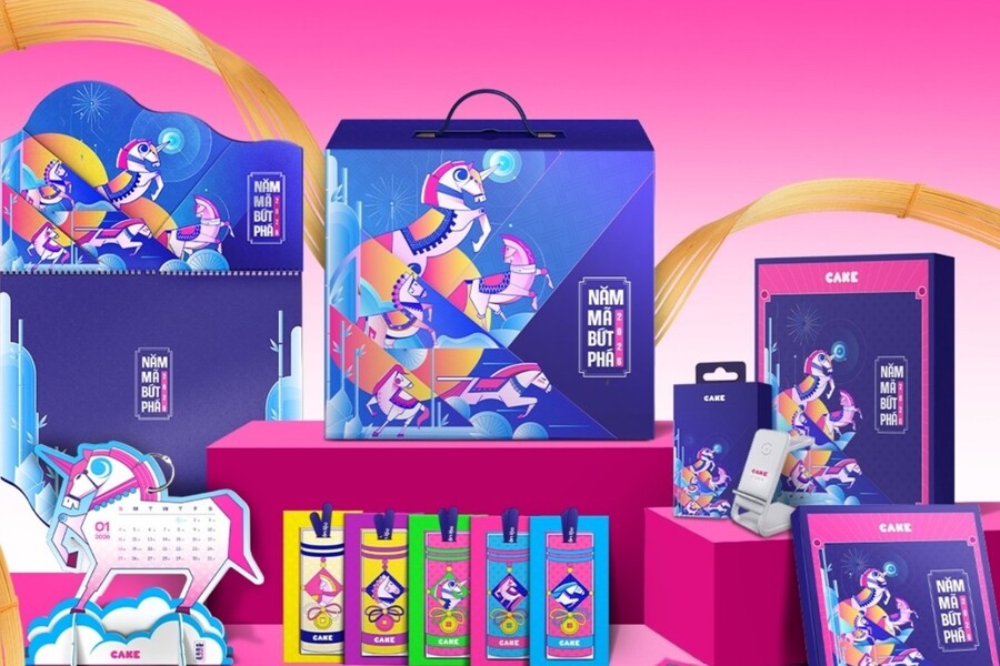
The year 2026 marks a clear evolution in Tet calendar design as traditional colors are reinterpreted in a more sophisticated and contemporary way. No longer confined to the familiar shades of red and yellow, this year’s color palette is diverse, emotionally rich, and highly personalized.
.jpg)
1.1. Red: The Energy of Luck and Reunion
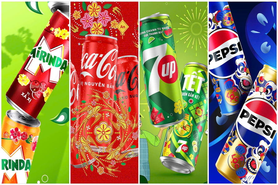
Red has long been the soul of Vietnamese Tet celebrations. In Tet calendar design for 2026, red not only symbolizes luck but also represents warmth, togetherness, and energetic new beginnings. However, the red tones of 2026 are no longer the traditional bright reds. Instead, deeper shades such as brick red, burgundy, and garnet are taking center stage. These tones create a sense of maturity, luxury, and greater visual depth.
.jpg)
When used in calendar layouts, red creates a powerful focal point that immediately attracts attention. It is often used for titles, traditional motifs such as apricot blossoms and peach blossoms, or as the dominant background color in calendars with classic themes. Red also has the ability to stimulate positive emotions, creating feelings of warmth and happiness.
The combination of red and metallic accents has become a prominent trend in 2026. When gold or copper metallic finishes are subtly applied to red graphic details, the overall design becomes more luxurious and sophisticated. As a result, red serves not only as a cultural symbol but also as a powerful aesthetic tool in modern Tet calendar design.
1.2. Yellow: The Light of Prosperity and Success
If red is the color of luck, yellow is the color of prosperity. In Tet calendar design for 2026, metallic gold and champagne gold are widely used, especially in premium calendar collections. These shades create a feeling of warmth, elegance, and luxury.
Yellow has the ability to reflect light, allowing designs to stand out without relying on excessive visual details. When used appropriately, yellow conveys sophistication while maintaining refinement. In many corporate calendars, gold is often applied to logos, border patterns, or decorative elements, enhancing the perceived value of the product.
.jpg)
When paired with red, yellow creates a strong traditional palette carrying deep feng shui significance. This color combination remains one of the most popular choices for Tet calendars because it feels both familiar and positive, representing abundance and success.
1.3. White: Purity and New Beginnings
White is appearing increasingly often in modern Tet calendar designs. This color brings a sense of purity, lightness, and the beginning of a new journey. Within layouts, white acts as breathing space, making designs feel more open and visually comfortable.
White allows graphic elements and calendar information to stand out clearly while creating a minimalist and refined appearance. When paired with metallic gold, it produces a luxurious and elegant style. Combined with pastel or neutral tones, white creates a gentle and contemporary atmosphere.
In Tet calendar design for 2026, white is frequently chosen for minimalist and premium calendar collections, particularly by brands aiming to express sophistication and professionalism.
1.4. Green: The Breath of Nature and Hope
The growing influence of nature-inspired design has significantly impacted the 2026 color palette, making green one of the most popular shades. Green symbolizes life, hope, and renewal. Tones such as olive green, mint green, and moss green create feelings of peace and familiarity.
Green helps designs appear calm, relaxing, and balanced. When combined with earth tones or neutral colors, it creates harmonious and natural compositions. In many calendar designs, green is used to communicate messages of sustainability and fresh beginnings.
.jpg)
1.5. Neutral Colors: The Sophistication of Modernity
Neutral shades such as beige, cream, light gray, and soft brown have emerged as a major trend. These colors provide a minimalist, elegant, and modern feel. Although they are not highly attention-grabbing, they create a stable foundation for layouts, helping designs appear balanced and easy to view.
When paired with metallic accents or traditional colors, neutral tones create a seamless fusion between classic and contemporary aesthetics. This palette is often selected by brands seeking to convey sophistication and professionalism.
1.6. Pastel Colors: Gentle and Emotional
Pastel tones create feelings of relaxation, softness, and youthful charm. Shades such as dusty pink, powder blue, pale yellow, and lavender make designs appear gentler and more approachable.
In Tet calendars for 2026, pastel colors are commonly found in collections featuring modern, creative, and friendly design styles. While they do not create strong visual impact, they offer comfort and refinement, helping calendars stand out in a distinctive way.
.jpg)
1.7. Metallic Effects: Luxurious Accents
Metallic effects are an important trend in Tet calendar design for 2026. Metallic highlights, gold foil finishes, and textured metallic surfaces help calendars appear more premium and refined. When combined with red, white, or pastel tones, metallic effects create a balance between tradition and modernity.
These effects often appear in high-end calendar collections, expressing appreciation and brand value. Beyond their visual appeal, metallic finishes enhance the premium feel of the product and make the calendar a memorable gift.
The color trends in Tet calendar design for 2026 clearly demonstrate the intersection between tradition and modernity. Familiar shades such as red and yellow continue to play central roles but have been refined to appear more sophisticated. Neutral tones, pastels, nature-inspired colors, and metallic effects add diversity and aesthetic depth.
Color does more than beautify; it conveys emotions and tells stories. A successful calendar is one that can connect with recipients emotionally and inspire positive energy throughout the year. When used effectively, color becomes a bridge between brands and users, allowing messages to be communicated naturally and meaningfully.


VIP Products


Best Selling Products
Freepik Premium Account
59 USD
Upgrade Genuine Office 365
49 USD
Adobe Premiere Pro Account
99 USD
Windows 10 & 11 Pro Key
36 USD
Genuine Adobe Illustrator account
99 USD
Genuine Cheap Canva Pro
39 USD
Upgrade Duolingo Super
29 USD
MidJourney Account
29 USD
Capcut Pro 1 Year
39 USD
ChatGPT Plus Account (GPT-4)
16 USD
Plugin Retouch4me
69 USD
Autodesk All App Account Copyright
120 USD
Adobe Photoshop Copyright - Full App
120 USD
Copyright Adobe Lightroom Account
59 USD
Upgrade genuine Capture One account
120 USD