Best Selling Products
Genuine Cheap Canva Pro
39 USD

MidJourney Account
29 USD
Upgrade Genuine Office 365
49 USD

Freepik Premium Account
59 USD
Adobe Photoshop Copyright - Full App
120 USD

ChatGPT Plus Account (GPT-4)
16 USD

Capcut Pro 1 Year
39 USD
Windows 10 & 11 Pro Key
36 USD
Autodesk All App Account Copyright
120 USD
Adobe Premiere Pro Account
99 USD

Upgrade Duolingo Super
29 USD

Copyright Adobe Lightroom Account
59 USD
Plugin Retouch4me
69 USD
Upgrade genuine Capture One account
120 USD
Genuine Adobe Illustrator account
99 USD
Visual hierarchy in graphic design
Nội dung
- 1. What is visual hierarchy?
- 2. Why is visual hierarchy important?
- 3. Understand how viewers read the layout.
- 3.1. The F-shape model
- 3.2. Z-shape model
- 4. Three levels in visual hierarchy
- 5. Size determines priority.
- 6. Color directs the gaze.
- 7. Contrast highlights information.
- 8. White space creates room for the focal point.
- 9. Alignment and Proximity
- 10. Texture and Repetition
- 11. Visual Hierarchy in UI/UX
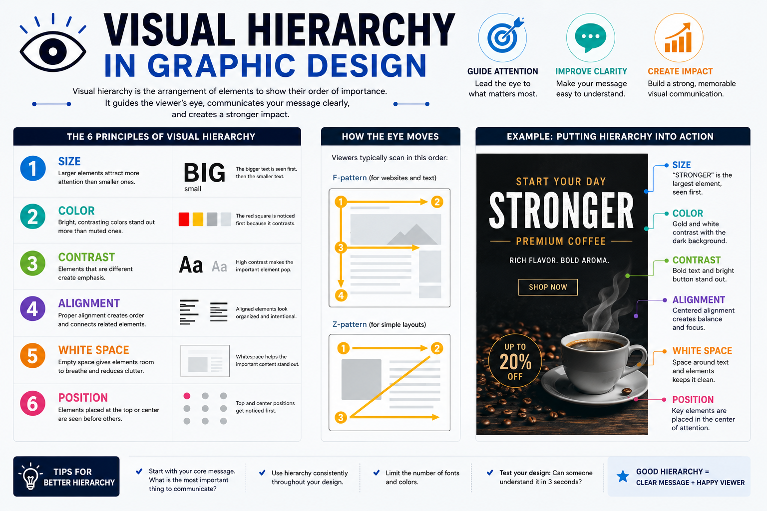
Visual hierarchy is a crucial principle that helps designers organize information and guide the viewer''s gaze in the desired order.
1. What is visual hierarchy?
Visual hierarchy is a way of organizing and arranging elements in a layout based on their level of importance. Instead of having all elements the same size, color, or prominence, designers create different levels so viewers know where to look first, what information is next, and what is simply supplementary content.
A well-structured layout typically creates a visual "path." Viewers can quickly grasp the main message, understand the context, and continue exploring details without feeling overwhelmed by the layout.
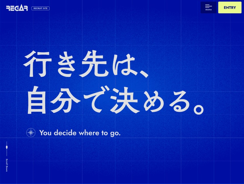
This principle relates to how humans tend to seek order and group elements into an understandable whole. Therefore, visual hierarchy is not simply about making one element larger than another, but rather the process of building relationships between multiple elements within the same composition.
In graphic design, visual hierarchy can be applied to posters, brochures, advertisements, websites, social media posts, application interfaces, and even brand identity systems.
2. Why is visual hierarchy important?
The primary goal of visual hierarchy is to draw attention to the right place . Since viewers only have a short time to process content, designers need to ensure the most important information appears in a prominent location and format.
In marketing design, this principle helps products convey their message faster and can guide viewers towards specific actions. A sales banner, for example, needs to make users aware of the main product or offer before reading the terms and conditions below.
In UI/UX, visual hierarchy also plays a role in navigation. Buttons, headings, menus, input fields, and content organized in a logical order help users understand the interface more quickly. Visual hierarchy simplifies navigation and directs users to important actions.
In print design, this principle also helps prevent readers from being overwhelmed by a large amount of information. A magazine page, brochure, or poster can contain a lot of content, but it can still be easily absorbed if the levels of information are clearly divided.
3. Understand how viewers read the layout.
To create an effective visual hierarchy, designers need to consider how the human eye typically scans content. Two common models are the F-shape and the Z-shape .
3.1. The F-shape model
The F-shape is commonly found in layouts with a lot of text, such as articles, news pages, blogs, or certain content interfaces. Viewers tend to start from the top, scan horizontally, and then continue moving downwards. The left side often serves as a crucial anchor point.
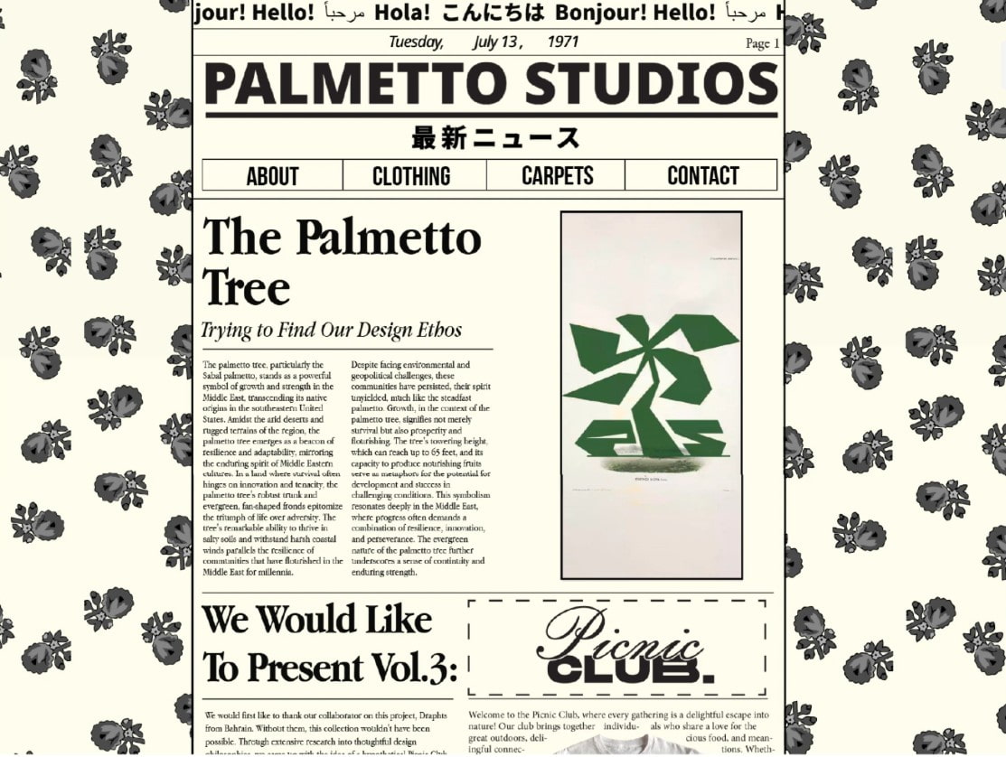
Therefore, with a content-heavy design, the main title and key information can be placed at the top or near the left axis. Subheadings, introductory paragraphs, and key keywords should also be presented clearly enough for users to quickly scan through.
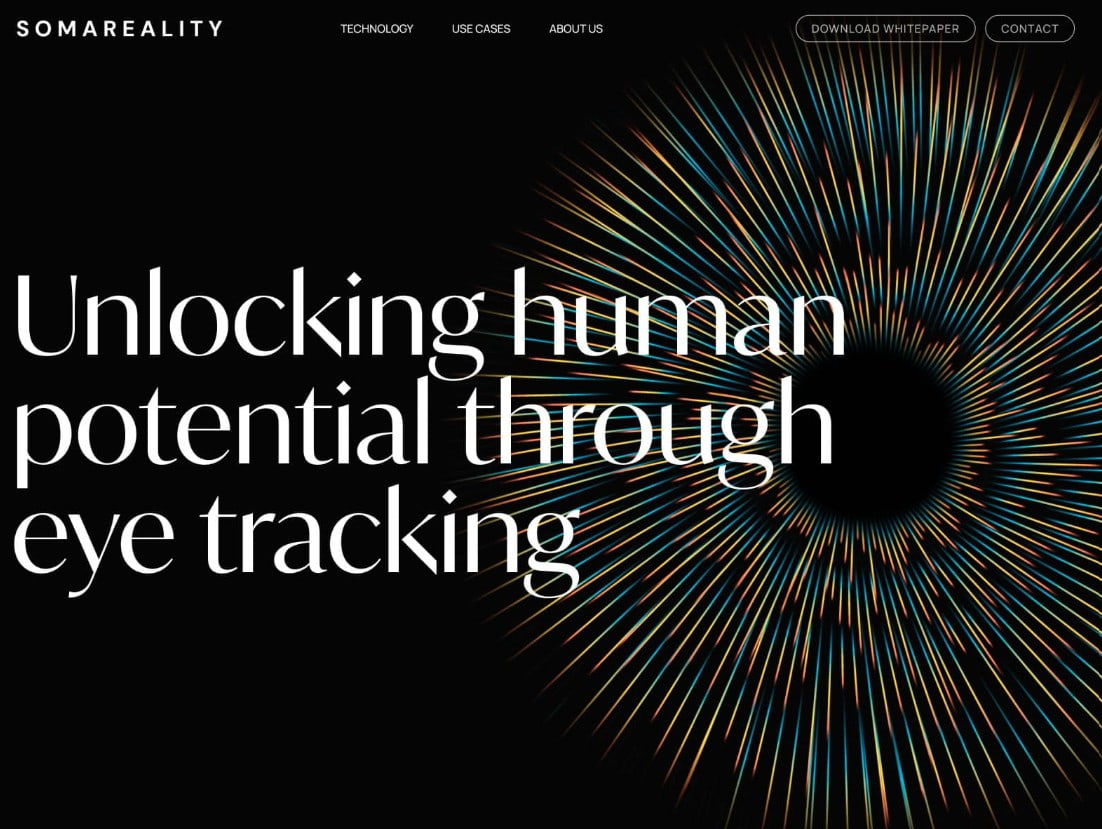
The F-shape doesn't mean every design has to adhere to a rigid template. It's simply a basis for designers to understand how users might perceive content and, consequently, build a suitable layout.
3.2. Z-shape model
The Z-shape is more suitable for layouts with minimal text, such as landing pages, banners, advertisements, or minimalist posters. The eye typically starts from the upper left corner, moves to the right, then follows a diagonal downward path and ends in the right-hand area.

With this layout, the top area can be used for the logo, headline, or main message. The center can contain an image or eye-catching visual element. At the end of the scrolling path, the CTA can be placed prominently to encourage viewers to take action.

It's important not to apply the Z-shape mechanically. Designers need to combine placement, imagery, color, and whitespace to create a natural visual flow.
4. Three levels in visual hierarchy
An effective layout can typically be divided into three levels: the main element, supporting elements, and details.
The key element is the first visual attraction. This could be a large headline, a striking image, a significant number, or a high-contrast component. Its purpose is to create a "visual hook," allowing the viewer to immediately identify the most important content.
Secondary elements provide context and further explanation for the main message. These could be subheadings, short descriptions, or supplementary images. Secondary elements need to be prominent enough to continue drawing attention but should not compete with the main focus.
Third-level elements include details such as contact information, dates, notes, links, or supplementary content. These elements should remain easily readable but not be visually dominant. This three-level organization creates a clear flow of information from primary to secondary.
5. Size determines priority.
Size is one of the most direct ways to create hierarchy. A larger component often attracts attention before a smaller one.

In typography, the main title can use a large font size, subheadings smaller, and the content often even smaller. This distinction helps viewers quickly differentiate between the title, the explanatory content, and supplementary information.
However, size needs to be used in moderation. If every element is too large, no element truly stands out. Conversely, if everything is small and of similar size, the layout easily becomes flat and it's difficult to determine the focal point.
Therefore, designers should identify the most important elements beforehand and then allocate space accordingly, prioritizing them.
6. Color directs the gaze.
Color not only evokes emotions but also helps determine the importance of elements. A striking accent color can make a call to action, headline, or key information stand out immediately.

The color distribution follows a 60–30–10 ratio, where the dominant color occupies the majority of the composition, the secondary color provides balance, and the accent color is used in smaller proportions to create emphasis.
In particular, designers need to pay attention to the visual weight of colors. Darker colors tend to feel heavier than lighter colors, so the coordination of background, text, and accent colors needs careful consideration.
A good design doesn't need to use too many colors to create hierarchy. On the contrary, a well-controlled color palette often makes information clearer.
7. Contrast highlights information.
Contrast helps an element stand out from the rest of the layout. This difference can come from color, size, font boldness, shape, or background.
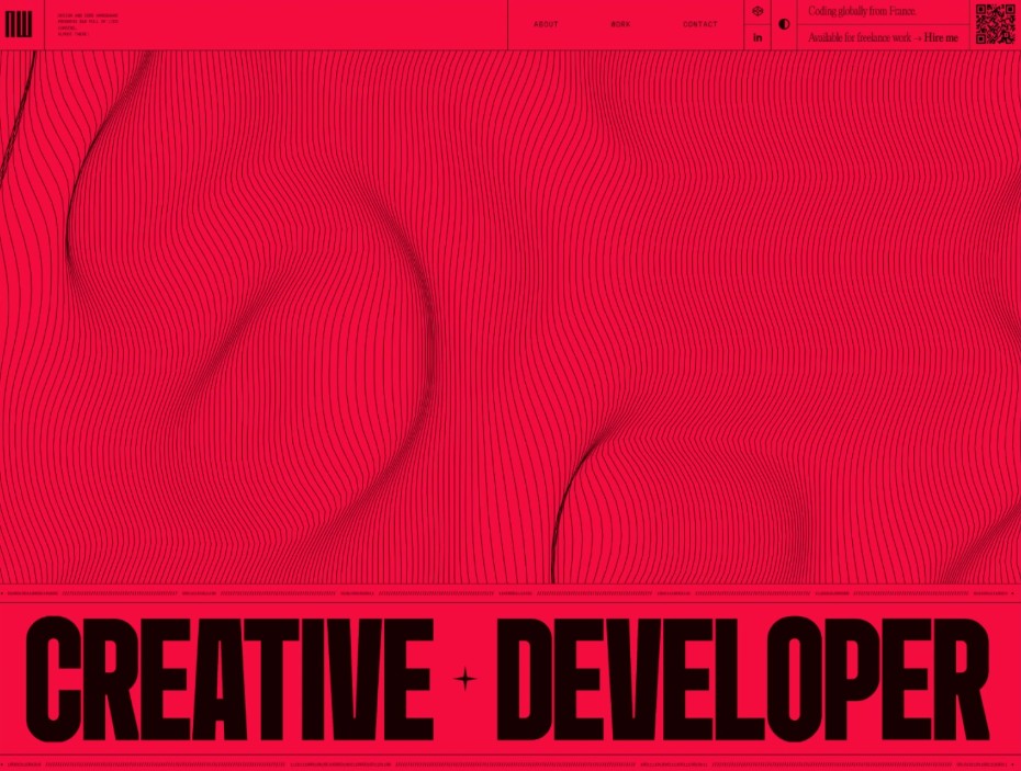
For example, bright text on a dark background creates a striking contrast. A brightly colored CTA button in a neutral layout can also become a focal point.
However, contrast doesn't mean every element has to be drastically different. Using too much contrast can cause the design to lose focus because too many elements are competing for attention.
In digital designs, contrast also needs to be checked to ensure readability and accessibility. This is especially important when designing interfaces or content for a large user base.
8. White space creates room for the focal point.
Whitespace, or negative space, is the area of space that doesn't directly contain content. However, it's not "empty" in the sense of being useless. Whitespace allows elements to breathe and highlights important features.
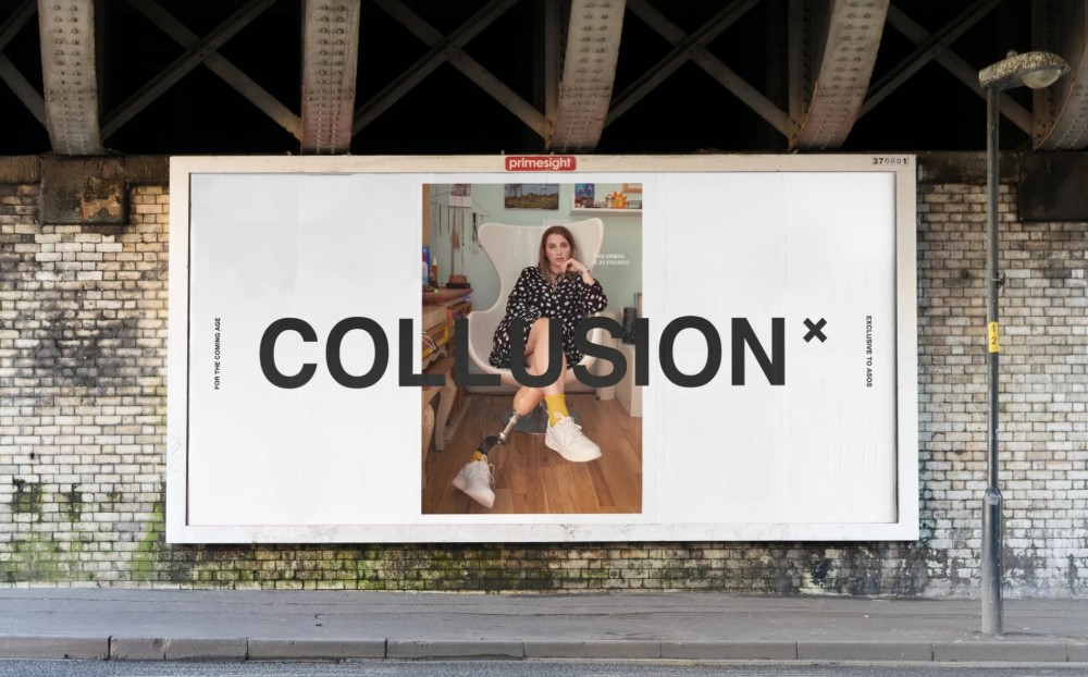
If a headline is surrounded by plenty of white space, the viewer's eye is more likely to focus on the headline. Conversely, when all elements are placed too close together, the layout can become cramped and it can be difficult to distinguish between different groups of information.
Whitespace also helps in grouping related elements. Designers can use spacing to differentiate each part of a layout without adding lines or borders.
Especially in minimalist posters and billboards, whitespace can become a strategic element to help the main message stand out.
9. Alignment and Proximity
Alignment helps create order in a layout. When elements are aligned along the same axis, viewers can more easily recognize the relationship between them.

With F-shaped layouts, left alignment often aids in content scanning. In some Z-shaped layouts, designers can flexibly use left, right, or center alignment to create balance and guide the viewer's gaze.
Meanwhile, proximity, or the principle of being close together, helps viewers understand which elements belong to the same group. For example, captions should be placed near their corresponding images; titles and descriptions should be appropriately spaced but close enough for viewers to recognize their connection.
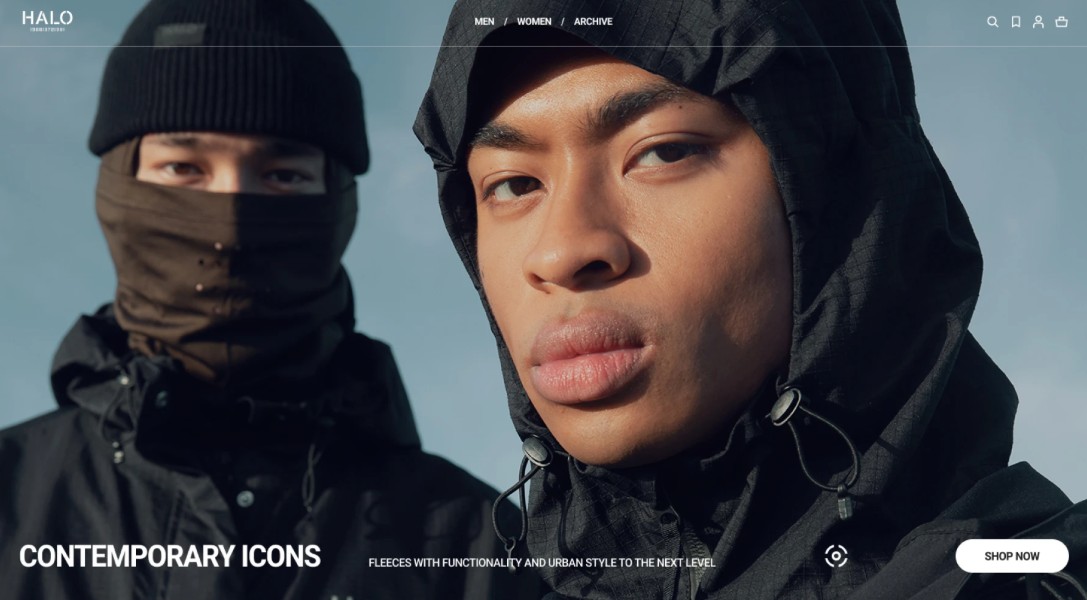
By combining alignment and proximity, the layout can become clearer without the need for excessive borders or decorative effects.
10. Texture and Repetition
Texture can make a difference in visual feel and help an element stand out in a layout. If the majority of the design has clean, flat surfaces, an area with a distinct texture will easily attract attention.

However, textures need to be used purposefully. If applied excessively, they can make the design cluttered and reduce readability.
Repetition, or repetition, helps create consistency. Repeating fonts, icons, colors, or visual styles makes elements with similar presentation feel as having equal importance.
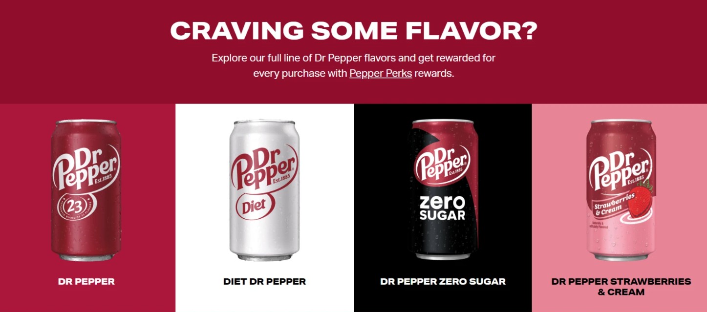
To highlight a key element, designers can intentionally break the rules of repetition, such as changing the size, color, or shape of that element. This creates a focal point while maintaining overall unity.
11. Visual Hierarchy in UI/UX
In UI/UX, visual hierarchy is particularly important because users need to understand the interface quickly and know what action to take next. An interface doesn't necessarily have to be innovative by completely changing familiar structures.
Familiar locations such as the shopping cart on an e-commerce website or the account area on a social media platform provide users with a point of reference. Designers can maintain this familiar structure but use size, color, whitespace, and contrast to define priorities.
Typography also plays a crucial role. A user interface typically needs to clearly distinguish between headings, subheadings, and main content. Differences in font size, boldness, and color help users quickly locate and understand the content on the screen.
With SaDesign, when developing UI designs, landing pages, or digital publications, building the hierarchy right from the wireframe stage will make the visual refinement process more efficient later on. Designers not only need to arrange elements aesthetically but also need to clearly define what the user should see first and which actions should be prioritized.















VIP Products



Best Selling Products
Genuine Cheap Canva Pro
39 USD
MidJourney Account
29 USD
Upgrade Genuine Office 365
49 USD
Freepik Premium Account
59 USD
Adobe Photoshop Copyright - Full App
120 USD
ChatGPT Plus Account (GPT-4)
16 USD
Capcut Pro 1 Year
39 USD
Windows 10 & 11 Pro Key
36 USD
Autodesk All App Account Copyright
120 USD
Adobe Premiere Pro Account
99 USD
Upgrade Duolingo Super
29 USD
Copyright Adobe Lightroom Account
59 USD
Plugin Retouch4me
69 USD
Upgrade genuine Capture One account
120 USD
Genuine Adobe Illustrator account
99 USD