Best Selling Products
Genuine Cheap Canva Pro
39 USD

Windows 10 & 11 Pro Key
36 USD
Upgrade Duolingo Super
29 USD

Copyright Adobe Lightroom Account
59 USD

Plugin Retouch4me
69 USD

MidJourney Account
29 USD

Upgrade Genuine Office 365
49 USD

Adobe Premiere Pro Account
99 USD

Genuine Adobe Illustrator account
99 USD

Freepik Premium Account
59 USD
Adobe Photoshop Copyright - Full App
120 USD

Upgrade genuine Capture One account
120 USD

Autodesk All App Account Copyright
120 USD

Capcut Pro 1 Year
39 USD

ChatGPT Plus Account (GPT-4)
16 USD
What Does Color Say About Your Brand?
Nội dung
Think back to the last product you bought. Did you really think carefully about its color, or were you simply drawn to something you yourself could hardly name? Many purchasing decisions happen that way: fast, instinctive and largely driven by color. This article will help you understand why color has such a big influence and how to apply it systematically for your own brand.
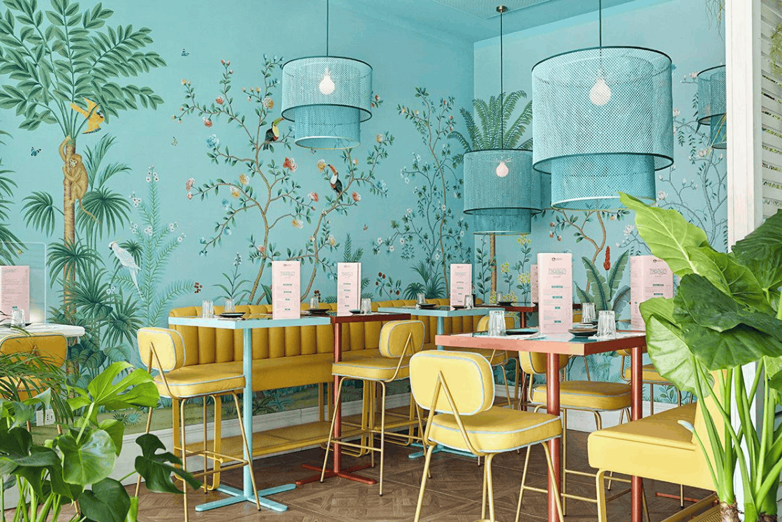
1. Color psychology and the power of first impressions
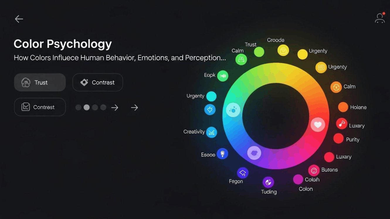
Color psychology is the field that studies how color affects human emotion, behavior and perception. Its foundation is a very everyday observation: each color can evoke its own psychological and emotional reaction, and those reactions are influenced by personal experience, cultural context and social norms. When you associate red with strength, passion, even anger, that is color psychology at work in daily life.
The weight of this factor is clearly shown in studies of consumer behavior. According to the Institute for Color Research, customers usually form a quick judgment about a product within just the first 90 seconds, and between 62% and 90% of that judgment is formed based on color. In other words, before customers have time to read the description, compare prices or look into features, color has quietly finished telling the first story about your brand.
However, it should be recognized with caution that color psychology is not an absolute formula. Academic studies show some fairly clear links, for example red being tied to anger or a sense of urgency, but there are also many emotions not tightly tied to any specific color. One emotion can be tied to many different colors, and the same color can carry opposite meanings depending on culture. For example, white evokes purity in many places but is associated with funerals in some other cultures. Therefore, suggestions about color should be seen as reliable guidance, not unchanging laws, and always need to be placed in the context of your target customers.
2. The emotional journey through each color
Each color carries its own emotional nuance, and understanding them is like learning the alphabet of a visual language. Below are the most common associations you should master.
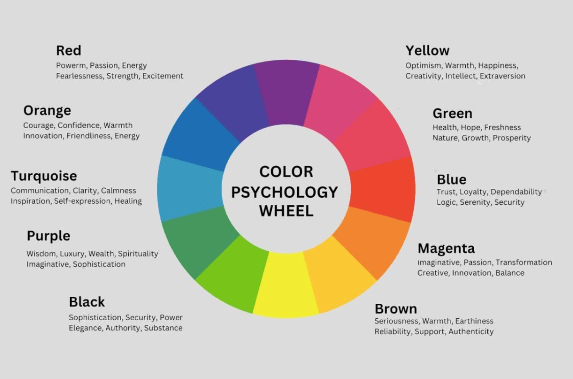
Red is the color of passion, energy and excitement. It creates a sense of urgency and stimulates impulsive action, which is why red appears densely in retail and fast-food brands. If your brand wants to stand out instantly and push customers to decide quickly, red is a very strong choice. However, using too much can make viewers feel tense or pressured.
Orange evokes warmth, joy and liveliness. It is the color of dynamism and friendliness, very suitable for brands that want to create a youthful, creative feeling. One thing to note is that orange used without subtlety can make a brand look immature or less serious.
Yellow represents cheerfulness, optimism and goodwill. It is the color of sunshine, creating a familiar and approachable feeling. Yellow catches the eye very quickly, but it is also a color used for warnings, so the dosage needs to be considered to avoid causing eye strain or anxiety.
Green is tied to growth, nature and relaxation. It conveys a fresh, healthy and environmentally friendly feeling. Green also has a soothing effect on the eyes, so it is favored in healthcare, wellness and brands pursuing sustainable lifestyles.
Blue is a symbol of calm, trust and stability. When a brand needs to build trust and show credibility and professionalism, blue is almost always the first choice. It is no coincidence that most technology and automotive companies use various shades of this color.
Purple is often associated with luxury, creativity and mystery. It has long been the color of royalty, representing wealth, splendor and a depth of history. Purple also evokes intelligence and wisdom, suitable for premium or artistic brands.
Pink is tied to femininity, romance and refinement. It brings a feeling of tenderness, care and softness. However, pink needs to be used strategically, because if placed with the wrong audience, it may inadvertently make a segment of potential customers feel the brand is not for them.
Worth noting is that the emotion a color evokes is not always fixed. Shade, saturation and brightness all change the perception. A deep blue conveys authority and seriousness, while a light blue brings a gentle, airy feeling. So choosing the right color is not enough; you also need to choose the right shade so the message is conveyed most accurately.
3. Harnessing the power of color for your brand
When used properly, color psychology can amplify a brand's message many times over. It is not limited to choosing the color of a logo but seeps into packaging, websites, advertising, store spaces and even specific communication campaigns. Some studies even suggest that consistent use of color can raise brand recognition significantly, and that is an invaluable asset in a crowded market.
Look at the brands that have mastered this art.
Coca Cola uses red boldly to attract immediate attention and evoke instinctive purchasing decisions. Red is also tied to feelings of excitement, energy and joy, very fitting for the image of a drink meant for refreshing moments. It is no coincidence that almost every fast-food brand chooses red, because it is believed to be able to stimulate appetite.
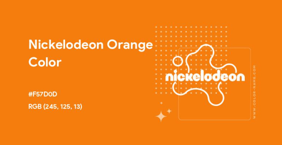
Nickelodeon chose orange with its splat-of-paint symbol. At a mere glance, you understand this is a fun, mischievous brand that does not take everything too seriously. Color here acts as a declaration of personality.
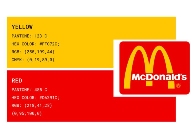
McDonald's owns one of the most famous patches of yellow on the planet. Yellow evokes cheerfulness, optimism and creates an eye-catching effect, making viewers feel happy whenever they see it. Even so, this color needs to be used in moderation, because if too dense, it can cause anxiety or discomfort. McDonald's pairing of yellow with red is a typical example of how to combine colors to balance optimism with the urge to act.
From the examples above, an important lesson can be drawn. Successful brands do not choose colors based on the founder's personal taste, but based on the emotions they want customers to feel. In addition, consistency plays a key role. A color repeated long enough and regularly enough becomes a recognition signal, helping customers recognize you in an instant. In fact, inconsistent use of color often weakens brand identity more than choosing a color that is not truly optimal. Therefore, once you have determined your palette, build a clear set of standards and apply it across all touchpoints, from signage, business cards and websites to social media.
4. Choosing colors that suit your business field
To choose colors for a brand, start from the root, that is, understanding your core customers and how you want them to see you. Do you want to create an image of authority and professionalism, or of friendliness and accompanying customers throughout their buying journey? These introspective questions will guide all the color choices that follow. An effective approach is to write down three to five adjectives describing the brand's personality, then find the colors that truly reflect those adjectives.
Next, explore the "color territory" of your industry. Each field usually gathers around a few familiar color families, because customers have gradually formed certain associations with each industry.
In finance, banking and technology, blue clearly dominates thanks to its ability to evoke trust, stability and professionalism. Green also appears often in finance, representing growth and prosperity, while black is often used when a brand wants to express class and sleekness.
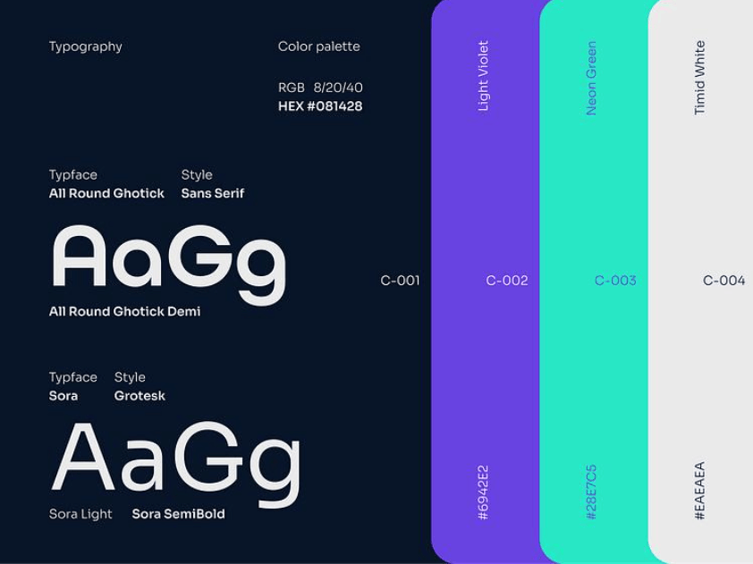
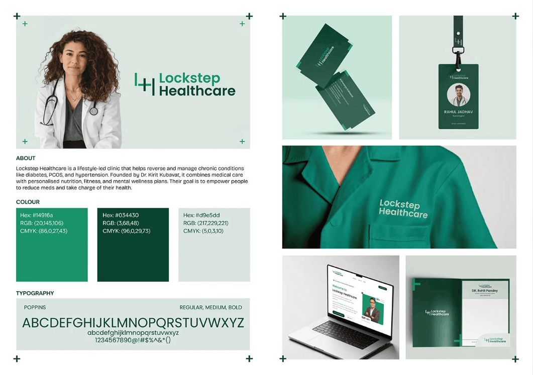
For healthcare and wellness, blue and green are two popular choices. Blue brings a feeling of safety and trustworthiness, while green evokes recovery, nature and balance, both helping patients feel more reassured.
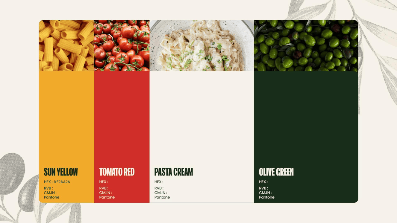
For food, restaurants and hospitality, warm tones such as red, orange and yellow are usually favored because they create a lively feeling, stimulate the appetite and promote quick decisions. Yellow also helps products stand out on shelves among countless competitors.
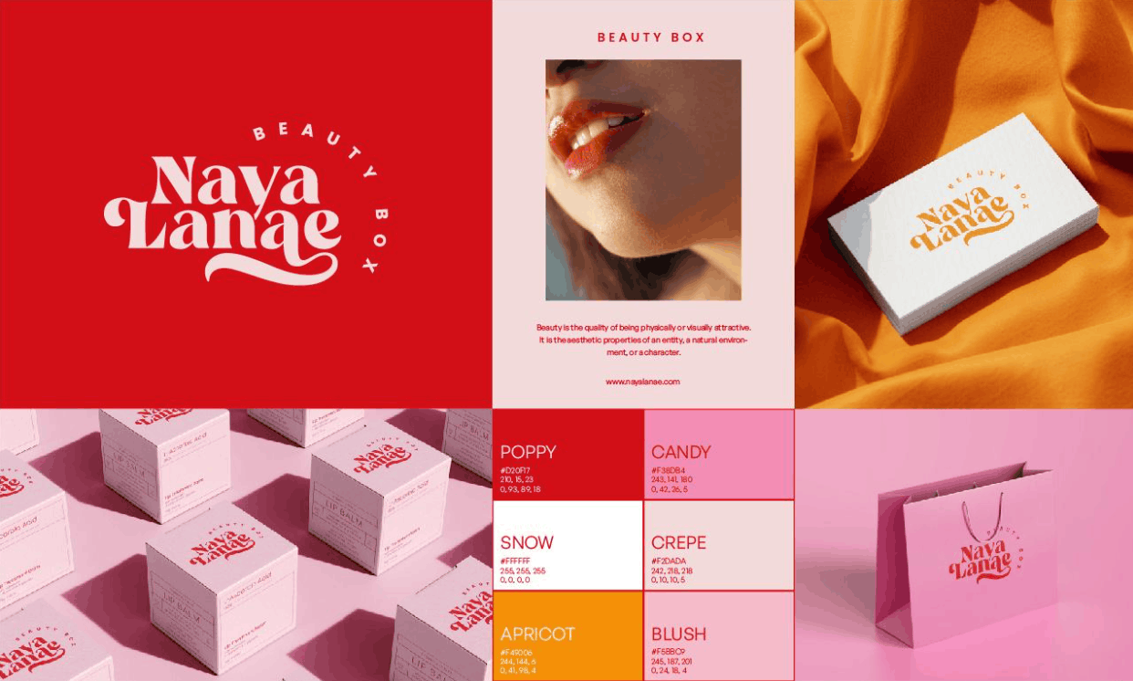
Beauty brands often favor pink, red, metallic gold or purple to express femininity, allure and luxury. Meanwhile, brands oriented toward green living, organic products or sustainability often turn to green and earth tones to reinforce an image close to nature.
Even so, following industry conventions does not mean you must become identical to your competitors. A fairly common mistake is choosing exactly the industry's dominant color but blending into the crowd. When too many logos share the same blue, a new brand is easily lost. The wise approach is to list about ten to twenty competitors along with their dominant colors, then find a direction that both suits the industry and creates differentiation. You can keep the spirit of the industry's standard color but choose a distinct shade, or combine it with a contrasting accent color to create a mark.
A few other practical principles are also worth remembering. Limit your palette to about three to five colors, including one dominant color, one to two secondary colors and one accent color, so the brand stays neat and recognizable. Check visibility across many platforms and materials, from phone screens and printed packaging to outdoor signage. Do not forget accessibility, ensuring contrast is clear enough that even people who have difficulty perceiving colors can still read the content easily. And finally, test colors with real customers, because industry norms are only guidance; data from your own audience is the most reliable answer.
Do not limit yourself to basic colors. The entire color spectrum is material for you to create your own visual language. Expand your color vocabulary, explore subtle shades such as teal, moss green, burgundy red or mustard yellow, and choose the tone that most accurately conveys the message your brand wants to say.
5. Conclusion
Color is not merely a decorative element but part of brand strategy. When you understand the emotion behind each color, observe how big brands apply them and carefully consider the specifics of your industry and your customers, choosing colors will no longer be guesswork but becomes a well-grounded decision. Start from the question of what you want customers to feel, then let color tell that story for you.



















VIP Products






Best Selling Products
Genuine Cheap Canva Pro
39 USD
Windows 10 & 11 Pro Key
36 USD
Upgrade Duolingo Super
29 USD
Copyright Adobe Lightroom Account
59 USD
Plugin Retouch4me
69 USD
MidJourney Account
29 USD
Upgrade Genuine Office 365
49 USD
Adobe Premiere Pro Account
99 USD
Genuine Adobe Illustrator account
99 USD
Freepik Premium Account
59 USD
Adobe Photoshop Copyright - Full App
120 USD
Upgrade genuine Capture One account
120 USD
Autodesk All App Account Copyright
120 USD
Capcut Pro 1 Year
39 USD
ChatGPT Plus Account (GPT-4)
16 USD