Best Selling Products
Genuine Cheap Canva Pro
39 USD
Upgrade genuine Capture One account
120 USD
Windows 10 & 11 Pro Key
36 USD
Autodesk All App Account Copyright
120 USD
Plugin Retouch4me
69 USD
Adobe Premiere Pro Account
99 USD
Adobe Photoshop Copyright - Full App
120 USD

Freepik Premium Account
59 USD
Upgrade Duolingo Super
29 USD

ChatGPT Plus Account (GPT-4)
16 USD

MidJourney Account
29 USD
Genuine Adobe Illustrator account
99 USD
Copyright Adobe Lightroom Account
59 USD
Upgrade Genuine Office 365
49 USD

Capcut Pro 1 Year
39 USD
Contrast in Design: 9 Ways to Create Emphasis and Balance in Any Layout
Nội dung
- 1. Why does contrast play a key role in design?
- 2. Color: the most familiar tool for creating contrast
- 3. Size contrast leads the eye from large to small
- 4. Shape: a dialogue between curves and straight lines
- 5. Typography: letting text become the focal point
- 6. Texture - When a design can be touched
- 7. Pattern: order amid empty space
- 8. Spacing: the art of arranging empty space
- 9. The dialogue between warm and cool in color temperature contrast
- 10. The element of surprise - The detail that makes viewers look again
- 11. Conclusion
Look back at a design that made you pause for a few seconds among the hundreds of images that scroll past every day. Chances are it was no more complicated than the others. What makes it stand out is usually the way the elements within it differ from one another on purpose. That is contrast, one of the foundational principles of design, and also what separates a monotonous layout from one with pull.
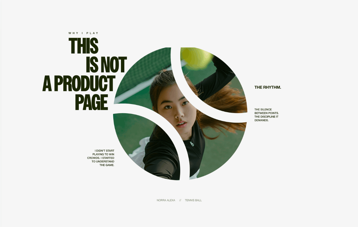
1. Why does contrast play a key role in design?
Contrast is the difference between elements in the same layout, created to achieve a desired visual effect. Instead of letting everything look the same, designers deliberately make elements differ in color, size, shape, texture or position.
This principle meets three main needs. First, it makes the design more interesting. A layout in which every component is uniform often feels bland and struggles to hold viewers. Second, contrast helps build information hierarchy, telling viewers what to look at first, what next and what matters most. Third, contrast contributes to balance. When heavy and light, bright and dark, dense and airy elements are distributed sensibly, a layout can be both lively and harmonious.
In web and app design, contrast also carries meaning for accessibility. Text color and background color need to differ enough that people with low vision, or people viewing under strong sunlight, can still read. Common web accessibility standards such as WCAG recommend a minimum contrast ratio of about 4.5 to 1 for regular text and 3 to 1 for large text sizes. Even so, contrast is not only about color. When you know how to combine multiple forms of contrast, you create layouts that are both easy to read and beautiful.
2. Color: the most familiar tool for creating contrast
Color is the classic and most direct way to create contrast. Just place two different colors side by side, and viewers immediately perceive the boundary between elements. There are three main directions to explore.
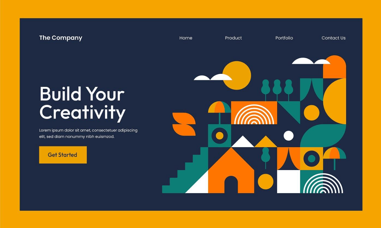
Hue contrast. Hue refers to the basic colors on the traditional color wheel. Using this wheel, you can find color pairs that are already strongly contrasting. Complementary colors sit opposite each other on the wheel, such as blue and orange or red and green. Triadic colors form an equilateral triangle on the wheel, giving a rich palette that stays balanced. Analogous colors sit next to each other and are usually very harmonious, but if you want to increase contrast, you can skip one or two colors in between when choosing.
Light and dark contrast. The ultimate contrasting pair is black and white, but the principle of placing light next to dark applies to any color. You can stay within one hue, such as pale sky blue paired with deep navy, or lavender paired with dark purple. You can also pair a dark color with a light one from a different hue, for example light orange with deep moss green. This approach makes important content stand out without using too many colors.
Intensity contrast. For monochrome designs, you can still create contrast by changing saturation. A highly saturated color will stand out clearly against a paler version of itself, while the overall layout remains unified. This is an ideal choice for brands pursuing a minimalist style that still need an accent.
3. Size contrast leads the eye from large to small
Large-scale elements usually attract the viewer's eye first. However, that does not mean small elements will be overshadowed. When you create size contrast, you are building a clear hierarchy in the layout and leading the viewer's eye from large objects to small ones.
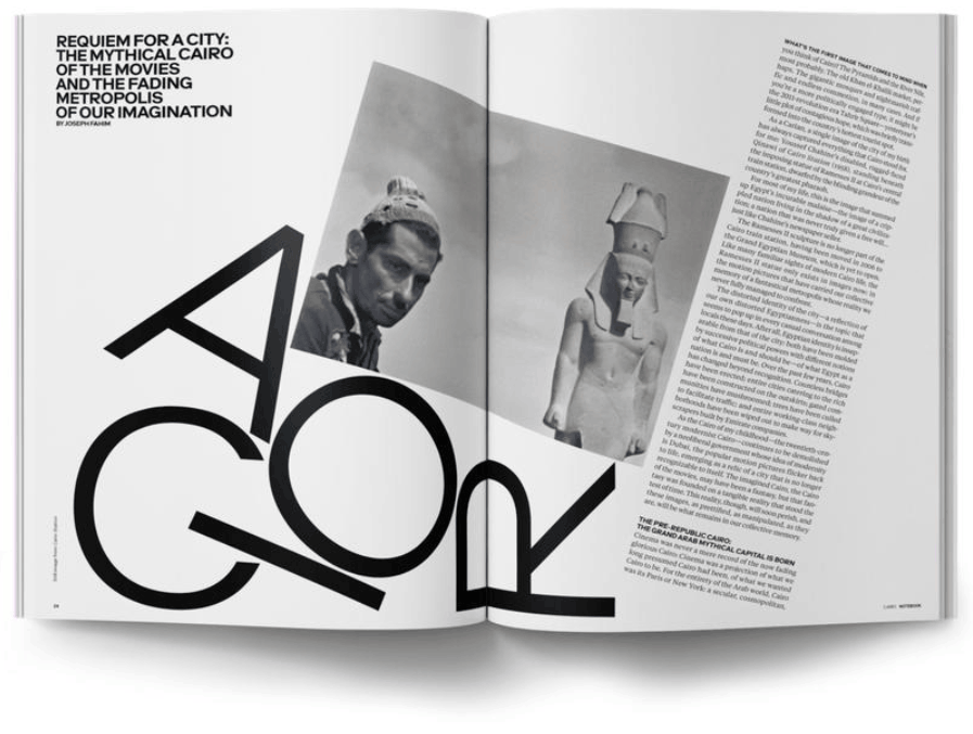
In many cases, the small element plays the role of the finale of the whole design. A call to action, a witty line of text or a small icon are all well suited to a modest size, because viewers will seek them out after absorbing the main message.
Note that if too many elements are close in size, the viewer's eye will not be able to tell which is the priority information. Keep a simple order from large to small, whether it is images, graphics or text. For content-dense layouts, you can combine a large headline with a medium-sized image and small-sized captions to create visual rhythm. A simple test is to squint at your design: if you can still make out the reading order, the size hierarchy is working well.
4. Shape: a dialogue between curves and straight lines
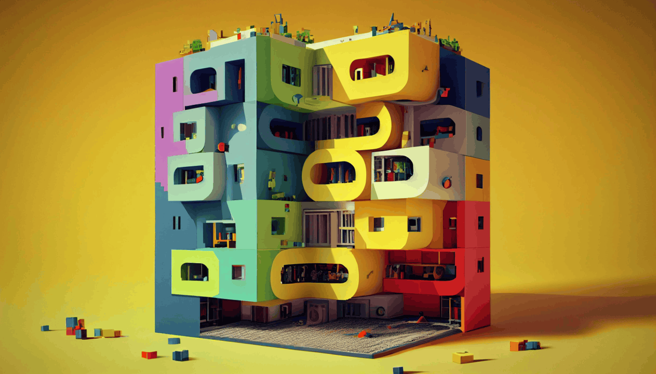
Before processing details, the human brain usually recognizes the overall shape first. If you picture your design as a collection of silhouettes, you will clearly see how shapes appear at first glance and whether they differ enough.
You can take advantage of this natural tendency by placing different shapes next to each other to hold the viewer's gaze. The most common way is to combine organic shapes with soft curves and geometric shapes with sharp edges. Professional designers often use this technique to create a pleasing balance in a layout.
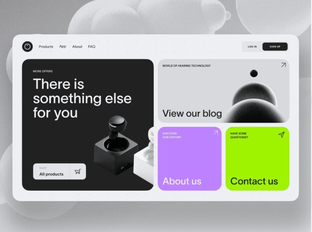
Here are some examples you can apply right away. Formal, serious lettering looks great placed in a round frame. A portrait with soft lines can be balanced with sharp-edged shadow areas or architectural elements with decisive straight lines. A simple circle with a clear outline will stand out strongly when placed next to complex winding lines around it.
5. Typography: letting text become the focal point
Typography can go from bland to striking as soon as you experiment with contrast. The right type pairing makes the message stronger and type-driven designs more balanced. There are four approaches worth trying.
Size and typeface contrast. Dividing text into different sizes is the fastest way to create contrast. You can use a large headline with smaller body content, or a medium-sized quote to give readers a pause. Combining different typefaces is just as effective. A thick, narrow display font for the headline looks great alongside a font with subtle serifs for the body text.
Serif and sans serif contrast. Serif type, with small strokes at the ends of letter strokes, feels traditional and elegant. Sans serif type is cleaner and more minimalist. When combined, these two groups create a natural contrast and a balance between old and new.
Weight contrast. To break up a long block of text, the simplest way is to change the weight of the letters. You can pair a bold headline with an italic quote, or place a thin stroke next to a thick stroke for a stronger effect.
Distinctive type tricks. Enlarging the "&" symbol, experimenting with italics or highlighting a single decorative letter can all create a special editorial impression. This technique often appears in magazines, websites and book covers, where designers need a focal point in a type-driven design. They create contrast through novelty, drawing the eye to an unusual treatment of type.
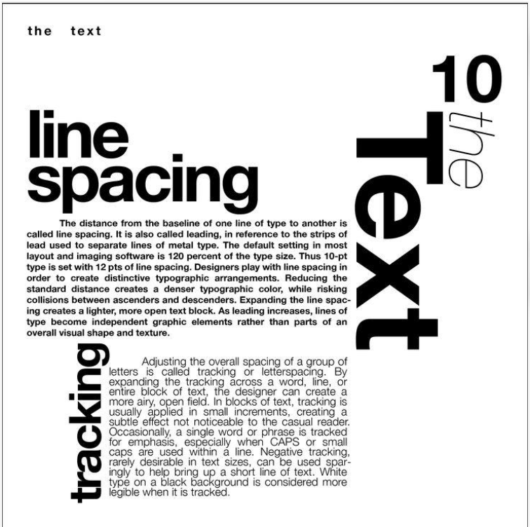
Remember to limit the number of fonts in a design; two to three styles are usually enough. Effective contrast comes from controlled difference, not from using a great many fonts.
6. Texture - When a design can be touched
Texture tricks the eye so viewers feel that a flat design can be touched. In other words, we feel with our eyes. Changing the surface is a great way to create contrast without changing color, size or other attributes, while also increasing the tactile and sensory appeal of the design.
You can place a glossy, liquid-smooth finish next to rough, gritty textures with a grunge feel. You can also combine contrasting materials such as wood with metal or leather with wool. A typical example is a poster with glossy liquid shapes rising above a flat background and faded text, where the very difference in surface leads the viewer's eye to the focal point.
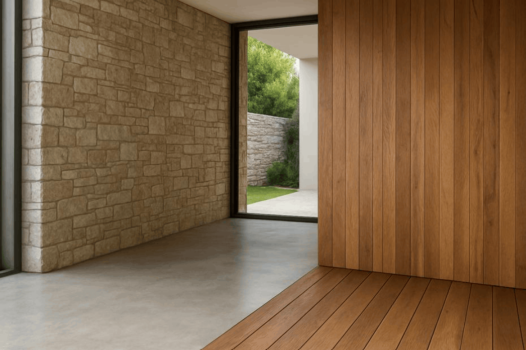
In product photography, this principle is also used a great deal. A metal watch placed on coarse fabric or a clear glass jar placed on a rough stone surface will bring out the material character of the product. In digital design, you can use texture overlays or drop-shadow effects to simulate this feeling.
7. Pattern: order amid empty space
Humans tend to look for order in images. Patterns attract the eye through repetition that the brain easily recognizes, so they are very well suited to creating contrast when placed next to plain backgrounds or graphic elements without patterns.
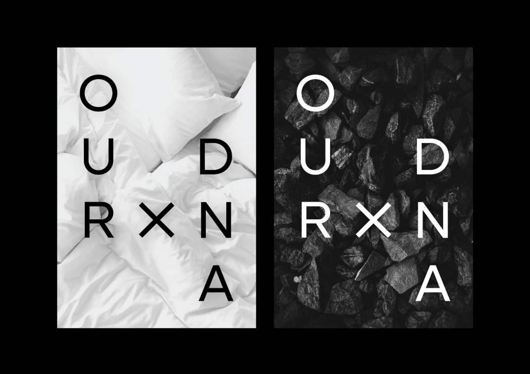
Here are a few practical ways to apply this. You can make a button stand out more by using a pattern instead of an ordinary drop shadow. You can surround an important message with a patterned border to frame it. In packaging design, subtle patterns on a product box attract attention and create a clear difference from the plain text frame beside it. Even irregular patterns, as long as they have components arranged according to rules of color and texture, can still create a very strong visual effect.
The key point is to leave room for the pattern to "breathe." If every area of the design has a pattern, contrast disappears. Choose a certain area to place the pattern and keep the other areas simple, so the pattern truly becomes the focal point.
8. Spacing: the art of arranging empty space
This technique relates directly to layout, that is, how you arrange elements on the page. Graphic designers often use various layout methods, such as using a grid or deliberately breaking the grid, to direct the journey of the eye. You do not need to build a complex grid system to create contrast. What matters is paying attention to the distance between elements.
When two elements are placed close together, they will be perceived as a group. You can create contrast with that group by placing other elements farther away. As a result, repeating elements begin to be read in different ways, with items placed close together contrasting with those occupying wider areas.
White space plays an extremely important role here. White space, also called negative space, is the empty area around components such as images, text and shapes. When you increase the empty space between dense clusters of content, you can focus attention on an important item such as a portrait or the main button.
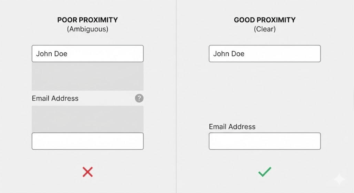
Conversely, even spacing between two images of equal size creates a feeling of absolute balance and quiet. This is a suitable choice when you want a layout to feel relaxing, such as in designs about nature, spas or slow living.
9. The dialogue between warm and cool in color temperature contrast
Color can be divided into three groups by temperature: cool, neutral and warm. Cool colors include blue and green. Warm colors include red, orange and yellow. When you pair a cool color with a warm one, you create a clear temperature difference between elements in the design.
This pairing works well because the brain associates each group with a different feeling. Warm colors evoke energy, warmth and action, while cool colors evoke calm, depth and distance. A red building under a blue sky is a classic example, where two opposing color temperatures create an instant visual effect.
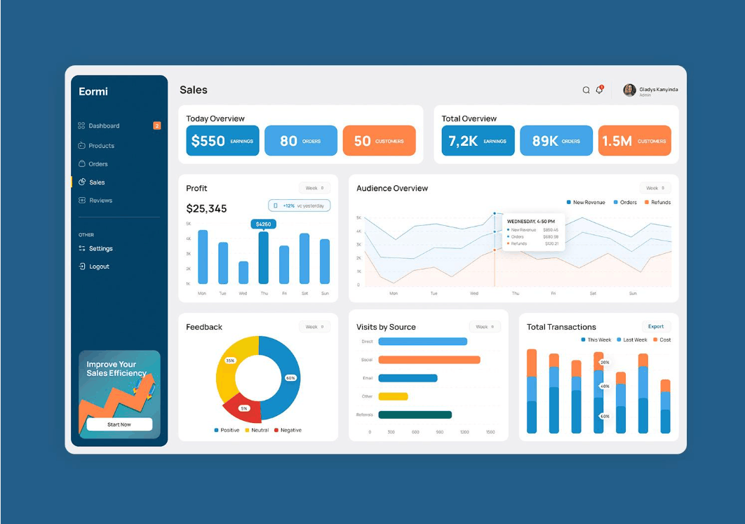
You can also use neutral colors as an anchor in a design that mixes warm and cool. White, gray or black will bring a gentle contrast, helping balance the warm and cool hues competing for attention. A small tip is to place the warm color where you want viewers to look first, because warm colors tend to advance forward while cool colors recede.
10. The element of surprise - The detail that makes viewers look again
Surprise is a great way to create instant contrast. Details that make viewers look a second time break the monotony of an otherwise simple layout. This technique appears often on book covers, where a strange character or unusual visual detail hints at the book's theme, and especially in logo design.
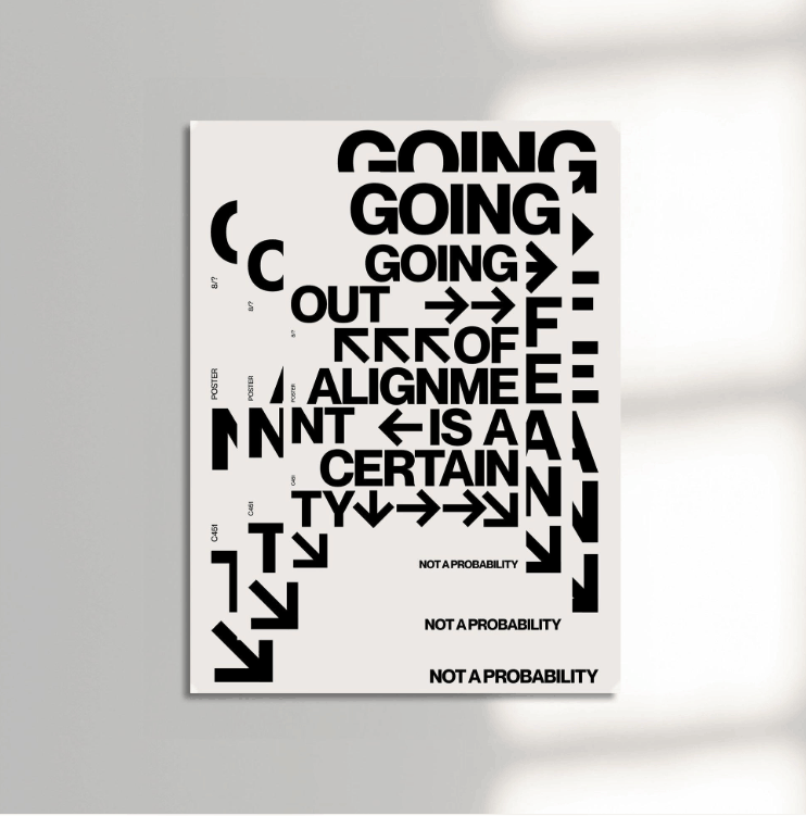
With logos and minimalist designs, an unexpected twist in the layout can act like a spotlight, pulling the viewer's eye to a witty or playful detail and lifting a simple design to another level. You can add an accent patch of color to a black-and-white layout. You can also make a design more approachable with an emoticon or another emotionally rich detail. For example, just adding two small dots to a simple line-drawn logo to form a smiling face gives the design a focal point and strong contrast with the background.
What must be remembered is that surprise only works when the rest of the design is consistent. A strange detail among other strange details is no longer a surprise but becomes noise.
11. Conclusion
Contrast is one of many ways to improve a layout visually, making designs more effective and engaging the audience better. You do not need to make it overly complicated to achieve it. Start with the one technique that best fits your project's goals, then try combining one or two other techniques to enrich the layout.
A practical piece of advice is to always ask yourself: where does the viewer need to look first? The answer will tell you which element needs to be emphasized and which form of contrast to use to do so. When the 9 techniques above become natural reflexes, you will find your layouts have noticeably more depth, rhythm and persuasiveness.








VIP Products


Best Selling Products
Genuine Cheap Canva Pro
39 USD
Upgrade genuine Capture One account
120 USD
Windows 10 & 11 Pro Key
36 USD
Autodesk All App Account Copyright
120 USD
Plugin Retouch4me
69 USD
Adobe Premiere Pro Account
99 USD
Adobe Photoshop Copyright - Full App
120 USD
Freepik Premium Account
59 USD
Upgrade Duolingo Super
29 USD
ChatGPT Plus Account (GPT-4)
16 USD
MidJourney Account
29 USD
Genuine Adobe Illustrator account
99 USD
Copyright Adobe Lightroom Account
59 USD
Upgrade Genuine Office 365
49 USD
Capcut Pro 1 Year
39 USD