Best Selling Products

Copyright Adobe Lightroom Account
59 USD

ChatGPT Plus Account (GPT-4)
16 USD

Windows 10 & 11 Pro Key
36 USD

Freepik Premium Account
59 USD

Capcut Pro 1 Year
39 USD

Genuine Adobe Illustrator account
99 USD

Adobe Premiere Pro Account
99 USD

Genuine Cheap Canva Pro
39 USD

Plugin Retouch4me
69 USD

Upgrade genuine Capture One account
120 USD

MidJourney Account
29 USD

Upgrade Genuine Office 365
49 USD

Autodesk All App Account Copyright
120 USD

Adobe Photoshop Copyright - Full App
120 USD

Upgrade Duolingo Super
29 USD
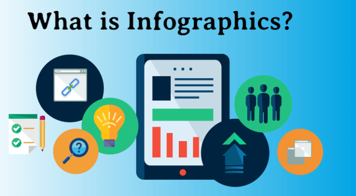
What Is an Infographic? Important Notes to Remember in Infographic Design
Nội dung
- 1. What is Infographic design?
- 2. Why should you design Infographics?
- 3. Some basic notes in Infographic design
- 3.1 Design simply and with focus
- 3.2 Focus on visualizing information
- 3.3 Make use of visual metaphors
- 3.4 Create trust for the transmitted message
- 3.5 Avoid using boring titles
- 3.6 Avoid confusing and hard-to-understand illustrations
- 3.7 Avoid presenting data without clear context
- 3.8 Avoid using too many fonts and text sizes
- 4. The process in Infographic design that you need to remember
- 4.1 Determine the topic for the Infographic
- 4.2 Develop Infographic design ideas
- 4.3 Collect documents and select information
- 4.4 Create and complete the Infographic
- 5. Listing some tools that help you design Infographics more easily
- 5.1 Canva
- 5.2 Photoshop
- 5.3 Illustrator
- 5.4 Figma
- 6. Conclusion
Do you clearly understand what an Infographic is? This is not only a form of presenting visual information but also a powerful tool that helps transform complex content into images that are easy to view, easy to remember, and attractive from the very first glance. Infographics help viewers receive information quickly, while also bringing creativity and impression into every design detail. So what does an Infographic mean, and what should be noted when designing to achieve the highest effectiveness? Let’s explore the details with AI Software World in the article below!
1. What is Infographic design?
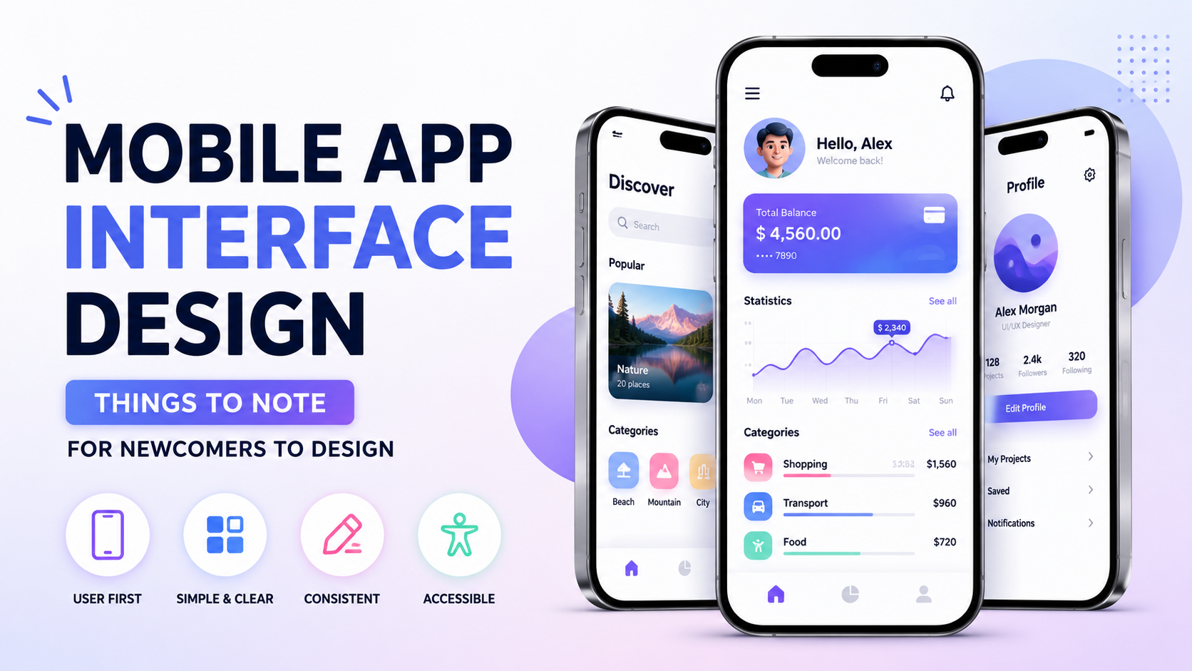
In the era of information explosion, transmitting knowledge, data, or messages quickly and easily becomes a key factor in attracting viewers. This is exactly when Infographic rises as a powerful visual tool. Infographic is short for Information Graphic, meaning information graphics, which is a form of combining text, images, icons, and colors to turn dry numbers or lengthy paragraphs into something more vivid, attractive, and easier to receive.
Infographic design is not simply about putting text and images together. It is an entire creative process of arranging information logically, choosing harmonious colors, and using visual illustrations so that readers can quickly grasp the main ideas at first glance. An effective Infographic both ensures scientific layout and creates aesthetic attraction, helping the content be conveyed clearly, concisely, and leave a strong impression in the viewer’s mind.
.jpg)
2. Why should you design Infographics?
In an age full of content, Infographic is considered a modern communication tool that makes information more accessible and more impressive. Using Infographics brings many benefits in both visual aspects and informational value.
Information becomes more attractive with vivid images and colors.
Present important data scientifically and clearly.
Attract viewers’ attention from the very first glance.
Easier to understand thanks to the combination of concise writing and illustrative images.
Helps content become less boring, creating a more friendly and visual feeling.
Awakens interest and increases interaction from readers.
Easier to access for all audiences, including people with little time.
More convincing when presenting important ideas and data.
Creates long-term memory thanks to vivid visual images.
Communicates information more clearly, logically, and professionally.
3. Some basic notes in Infographic design
3.1 Design simply and with focus
An effective Infographic does not need to contain too much information; what matters most is clarity, conciseness, and focus. When the content is condensed, viewers can easily receive and remember the message you want to convey. The principle “Less is more” is clearly shown in this case, because the simpler an Infographic is, the easier it is to leave a deep impression.
During the design process, you need to carefully select information, keep only the main ideas, and arrange them into reasonable content groups. Illustrations will be a supporting tool, helping express and clarify the shortened information, creating a balance between visuality and ease of understanding.
3.2 Focus on visualizing information
Infographic is a form that combines data and images, so you should not focus too much on text and forget the power of graphics. Adding too many long paragraphs will make the design heavy and lose its inherent neatness. To overcome this, make use of charts, diagrams, icons, or visual symbols to illustrate important data.
When information is expressed in image form, the Infographic becomes more spacious, easier to follow, and keeps viewers’ concentration longer. This is exactly the way to make dry data become vivid and create a clear difference compared to ordinary presentation methods.
.jpg)
3.3 Make use of visual metaphors
One of the secrets that helps an Infographic become unique is using visual metaphors. Instead of expressing things at length with words, you can illustrate a process or number with symbols and images that create association. For example, presenting the journey of recruiting personnel through interview rounds can use images that gradually shrink to represent the remaining number of candidates, allowing viewers to immediately understand the meaning without needing much explanation.
Visual metaphors help information be conveyed concisely, richly in imagery, and easier to receive. At the same time, this method also brings a fresh and creative feeling, making the Infographic become an interesting work instead of just a tool for providing data.
3.4 Create trust for the transmitted message
A beautiful Infographic is not enough; it needs credibility to convince viewers. To do this, you can add reliable references, customer feedback, professional certifications, or statements from experts into the design. These details give the content more weight and build trust with readers.
When the message is supported by official and transparent data sources, the Infographic not only has aesthetic value but also becomes a document with reference value. This is the key to elevating the credibility and communication effectiveness of the design product.
3.5 Avoid using boring titles
The title is the decisive factor in whether viewers stop and continue learning more or not. If an Infographic is named too dryly and lacks attraction, even if the content is appealing, it will still be difficult to keep readers. Therefore, you need to invest in the title with short phrases that arouse curiosity and inspire the desire to explore.
A good title is like an invitation that makes viewers scroll down, learn more, and be willing to spend time following the entire content. This is a small detail but has a very large influence on the success of an Infographic.
3.6 Avoid confusing and hard-to-understand illustrations
Illustrations are an important factor that helps Infographics become vivid, but if overused or if the images are too complicated, viewers will feel confused. This is especially dangerous because once readers do not understand, the entire content will lose its communication value.
Instead of choosing overly elaborate graphics, you should prioritize visual images that are easy to recognize and closely connected to the content. Simple but easy to understand will always have greater power than complexity that makes it difficult to receive information.
3.7 Avoid presenting data without clear context
Data is a core factor in many Infographics, but if it is presented without context, readers cannot properly evaluate its meaning. A growth figure can be positive or negative depending on the time frame and accompanying conditions. Therefore, when designing Infographics, make sure that data is always placed in a specific context.
When viewers clearly understand the meaning of the numbers, the Infographic becomes more convincing and avoids misunderstanding. This is also a way to show professionalism and accuracy in every design detail.
3.8 Avoid using too many fonts and text sizes
Fonts directly affect the aesthetics and readability of an Infographic. Using too many different font styles will make the design confusing, inconsistent, and less professional. Ideally, you should only use two fonts: one for titles and one for content.
Besides that, text size also needs to be arranged reasonably to create information hierarchy and help viewers follow more easily. When text elements are consistent and harmonious, your Infographic will achieve balance between aesthetics and the ability to communicate content.
.jpg)
4. The process in Infographic design that you need to remember
4.1 Determine the topic for the Infographic
The topic is an important foundation that determines the success of an Infographic. Depending on the purpose and target viewers, you can choose different topics, from science and education to business or daily life. Whether the topic is complex or simple, the important thing is to clearly define the message you want to convey so it can serve as the guideline for the entire design process.
A clearly defined topic will help you save time in the data collection stage and avoid adding too much unnecessary information. At the same time, when there is a clear direction, the layout and visual presentation also become more consistent, easier to create an impression, and keep viewers longer.
4.2 Develop Infographic design ideas
The idea is the “soul” of an Infographic. At this step, you need to select words, data, and images so that they match the initial goal. Sketching the layout in advance is also very important because it helps you visualize the entire design and easily arrange information in a logical and scientific way.
If the Infographic is developed in video or website form, you need an even more detailed script. This not only saves time but also reduces confusion during the implementation process. The clearer the idea, the easier it is for the Infographic to achieve creativity and communication effectiveness.
4.3 Collect documents and select information
Accurate information is the key factor that makes an Infographic trustworthy. You can collect data from many sources such as books, newspapers, research documents, or the internet, then compare and select the details most suitable for the idea you have built. When information is carefully filtered, the Infographic will avoid becoming rambling and unfocused.
An important principle when presenting information in an Infographic is that the shorter, the better. Convert long paragraphs into concise sentences and illustrative charts, because viewers usually only skim for a few seconds and need to grasp the main content immediately.
4.4 Create and complete the Infographic
Once you have the idea and information, the next step is to bring the Infographic into design. Currently, vector and monochrome icon styles are often favored because they are both easy to view and aesthetically pleasing. Important data should be shown through visual charts, helping viewers easily compare and remember.
During the design process, you need to choose harmonious colors and avoid overly bright tones that cause discomfort. Limit the overuse of technical effects, because the final goal of an Infographic is not to show off complexity but to help viewers grasp information as quickly as possible. A successful Infographic must harmonize both aesthetics and practical application.
.jpg)
5. Listing some tools that help you design Infographics more easily
5.1 Canva
Canva is considered the most friendly and easy-to-use tool when it comes to Infographic design. With a diverse library of ready-made templates, users only need to drag and drop, change colors, fonts, and images to create a professional Infographic in just a few minutes. This is an ideal choice for beginners or those without much design experience.
If you want to make the most of advanced features such as premium template collections, exclusive image and icon libraries, consider upgrading your Canva Pro account at AI Software World. Owning the premium version not only helps save time but also brings more creative options for your design.
.jpg)
5.2 Photoshop
Photoshop has long been famous as a powerful image editing software and is also very useful in Infographic design. With a flexible layer system and detailed editing tools, you can create unique, creative, and highly personalized designs. The outstanding advantage of Photoshop is its ability to process complex images, suitable for Infographics that require many artistic elements.
However, to fully take advantage of professional features, you should upgrade to a licensed Photoshop version at AI Software World. When owning the upgraded version, you not only get to experience the full editing tools but also feel secure about stability, safety, and dedicated technical support.
5.3 Illustrator
Adobe Illustrator is the top choice for those who want to design Infographics in vector form. The outstanding advantage of Illustrator is the ability to create sharp images that can be enlarged or reduced freely without becoming pixelated. This is especially important when you want to use Infographics for many different purposes such as printing or posting on digital platforms.
To fully experience the power of Illustrator, you should upgrade to licensed software at AI Software World. Using the official version will help you update the latest features while receiving full support throughout the design process, bringing greater peace of mind and higher efficiency.
5.4 Figma
Figma is becoming a modern design trend thanks to its extremely convenient online teamwork capability. With Figma, you and your collaborators can edit an Infographic together on the same interface without needing to install complicated software. This tool also has a rich plugin library, helping you save time and optimize the design process.
To make the most of Figma’s features, upgrading to a professional plan at AI Software World is a smart choice. When upgrading, you will have more project management support tools, increased storage capacity, and a smoother experience during the Infographic design process.
6. Conclusion
Above is some basic information about Infographic design that you need to remember in order to apply it in your work and studies. A beautiful Infographic is not only about eye-catching images but also about clear layout, concise messages, and the ability to make a strong impression on viewers. Hopefully, with the sharing above, you have gained more tips for designing impressive Infographics to convey content in a professional and convincing way.


VIP Products


Best Selling Products
Copyright Adobe Lightroom Account
59 USD
ChatGPT Plus Account (GPT-4)
16 USD
Windows 10 & 11 Pro Key
36 USD
Freepik Premium Account
59 USD
Capcut Pro 1 Year
39 USD
Genuine Adobe Illustrator account
99 USD
Adobe Premiere Pro Account
99 USD
Genuine Cheap Canva Pro
39 USD
Plugin Retouch4me
69 USD
Upgrade genuine Capture One account
120 USD
MidJourney Account
29 USD
Upgrade Genuine Office 365
49 USD
Autodesk All App Account Copyright
120 USD
Adobe Photoshop Copyright - Full App
120 USD
Upgrade Duolingo Super
29 USD