Best Selling Products

Genuine Adobe Illustrator account
99 USD

Upgrade Genuine Office 365
49 USD

Genuine Cheap Canva Pro
39 USD

MidJourney Account
29 USD

ChatGPT Plus Account (GPT-4)
16 USD

Adobe Photoshop Copyright - Full App
120 USD

Freepik Premium Account
59 USD

Copyright Adobe Lightroom Account
59 USD

Capcut Pro 1 Year
39 USD

Plugin Retouch4me
69 USD

Windows 10 & 11 Pro Key
36 USD

Upgrade Duolingo Super
29 USD

Adobe Premiere Pro Account
99 USD

Autodesk All App Account Copyright
120 USD

Upgrade genuine Capture One account
120 USD
What is Layout in Design? Secrets to Creating Beautiful and Attractive Layouts
Nội dung
- 1. What is a layout?
- 2. The Importance of Layout in Design
- 3. Top 5 "secrets" to creating a beautiful layout.
- 3.1 The Rule of Thirds
- 3.2 Odd Number Rule
- 3.3 The Rule of Balance
- 3.4 The Rule of Primary and Subordinate Principles
- 3.5 Grid System Rules
- 4. Tools for creating beautiful layouts
- 4.1 Canva
- 4.2 Adobe InDesign
- 4.3 Figma
- 5. Conclusion
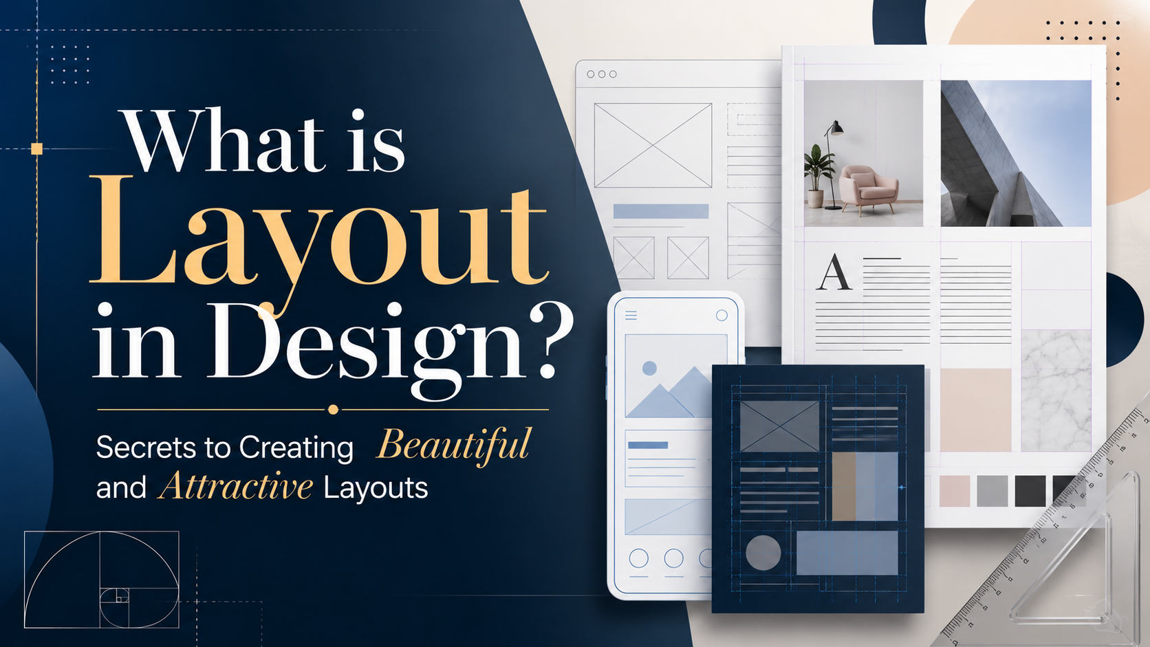
In the world of design, layout plays a crucial role, determining the attractiveness and effectiveness of a communication product.
1. What is a layout?
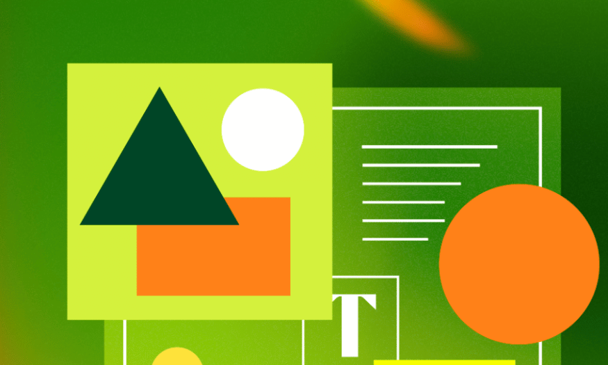
Layout, also known as composition, is a crucial term in design, referring to how elements within a specific space are arranged and organized. It's not simply about placing images, text, or other components next to each other, but rather the art of creating a coherent and engaging visual experience. In graphic design, layout shapes how viewers receive information, directly influencing their emotions and actions.
In the context of web design, layout plays a crucial role in building a user interface. It involves determining the position, size, and spacing of elements such as menus, images, and buttons. A well-designed layout not only makes it easier for users to find information but also creates a smooth experience, keeping them on the website longer. When designing a document or website, careful arrangement of elements determines its attractiveness and the effectiveness of its message.
Ultimately, a good layout needs to be logical and user-friendly. Designers should pay attention to aspect ratios, spacing between content, and overall harmony. These elements not only affect the aesthetics of the design but also contribute to a positive user experience. A visually appealing layout will make viewers feel comfortable and at ease, thereby increasing their attractiveness and retention.
2. The Importance of Layout in Design
If we consider design as building a house, then the layout is the sturdy steel frame that creates the solid structure for the entire building. A well-designed layout will help convey the message clearly, while a poorly designed layout can make the message vague, or even annoying to the viewer. A lack of understanding and application of layout can lead to wasted advertising costs and valuable time.
When a layout is user-friendly and well-organized, it not only keeps customers on the website longer but also helps them remember information more easily. A well-designed layout makes users feel comfortable interacting with the site, increasing the likelihood of them returning or taking the desired action. Creating a positive user experience through layout is a key factor in attracting and retaining customers.
Furthermore, mastering the fundamental principles of layout helps bring unity and cohesion to the entire design. Elements such as color, size, and spacing not only need to harmonize with each other but also need to align with the message the designer wants to convey. A unified layout helps build a strong and easily recognizable brand, thereby creating a lasting impression on users.
3. Top 5 "secrets" to creating a beautiful layout.
3.1 The Rule of Thirds
The rule of thirds is one of the key design secrets that helps you create an attractive and impressive layout. This principle divides the design space into three horizontal and three vertical sections, creating nine equal rectangles. The intersections of rows and columns are considered optimal locations to place key design elements, thereby attracting the viewer's attention.
For example, when designing an advertising image for a product, you can place the product at one of the intersection points instead of in the center. This not only makes the product stand out more but also creates a sense of balance and harmony in the image. Other supporting elements such as the logo or slogan should also be placed near the intersection points to create a connection and attract the viewer's attention.
Visual psychology research shows that the human eye naturally tends to focus on intersections rather than the center of an image. This allows you to create a design that is not only visually appealing but also accessible, helping viewers easily grasp the message you want to convey.

3.2 Odd Number Rule
The rule of odd numbers is a common design principle used to create balance and harmony in graphic design. This principle encourages the use of odd numbers of elements, such as 3 or 5, to create a more visually appealing effect.
When applying the odd number rule, you'll find that the two elements on either side are often positioned to create balance with the element in the middle. For example, in a logo design, you might use three shapes to create a unique symbol. Using an odd number not only makes the design more interesting but also creates a harmonious interaction between the elements.
Additionally, the odd number rule is often applied in information presentation. When you have three images in a layout, they create a natural connection and collaboration, making it easier for viewers to absorb the information. This is especially important in web design, where simplicity and naturalness are essential for creating a good user experience.
3.3 The Rule of Balance
Everything in the world becomes more perfect when there is balance, and design is no exception. Designers must constantly adjust various elements in their products to achieve harmony and balance in their work. A lack of balance in the layout can make a design visually jarring and create a negative impression on customers.
Balance can be achieved through the even distribution of elements in a design. For example, if you have a large image on the left, you can place a smaller element on the right to create balance. Additionally, whitespace is extremely important. Whitespace allows other details to "breathe," creating a comfortable viewing experience and highlighting the main elements of the design.
Paying attention to balance not only makes the design more visually appealing but also creates a professional feel. A well-balanced design will make viewers feel more comfortable and at ease, thereby increasing the likelihood that they will interact with the content you have created.
3.4 The Rule of Primary and Subordinate Principles
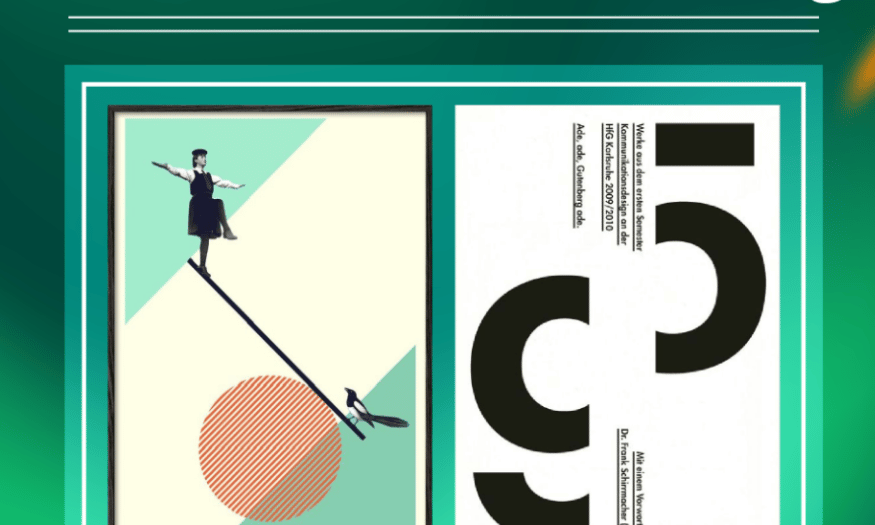
When designing, the viewer's eye often needs a focal point to concentrate. Without a prominent element, viewers may only glance at your design without lingering. The principle of primary and secondary elements helps you clearly identify which is primary and which is secondary, guiding the viewer's gaze.
To convey your message to the viewer, you need to identify the focal point in your design and guide their gaze based on the structure of the layout. For example, in an advertisement, you can highlight the product by using bright colors or large fonts to attract attention. Secondary elements such as additional information or promotions can be placed in less prominent areas, but still easily recognizable.
The primary goal of this rule is to create a coherent visual experience where viewers can easily distinguish between primary and secondary information. This increases the likelihood that viewers will remember the message and motivates them to take the desired action.
3.5 Grid System Rules
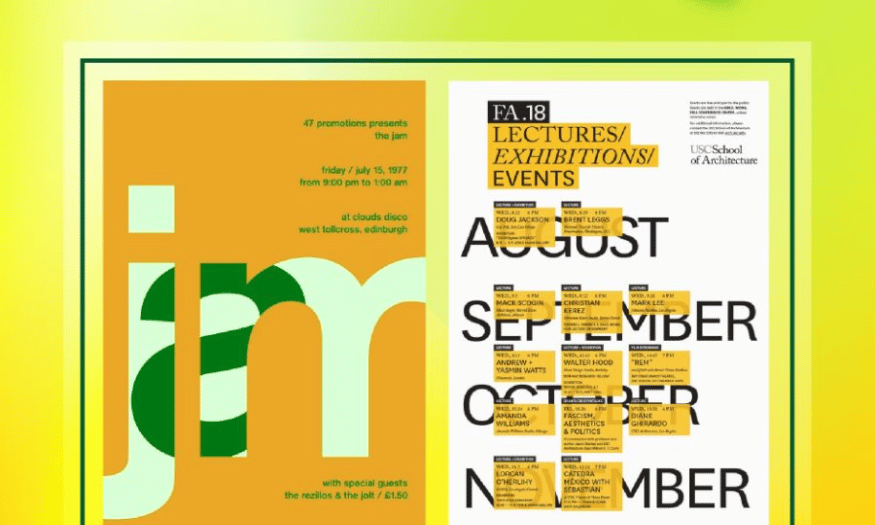
Grid systems are a crucial part of graphic design, helping designers determine where to place different types of content. This rule not only creates consistency in design but also makes the product look cleaner, more efficient, and more functional.
When designing multiple posters or promotional materials for an event, adhering to a grid system will help you organize elements like dates, times, and images logically. A grid system ensures that all elements are interconnected and consistent, resulting in a better user experience.
Furthermore, using a grid system saves a significant amount of time during the design process. Instead of manually adjusting each element, you can easily arrange them according to a predefined grid. This not only saves you time but also ensures that your final product achieves the highest quality.
4. Tools for creating beautiful layouts
4.1 Canva
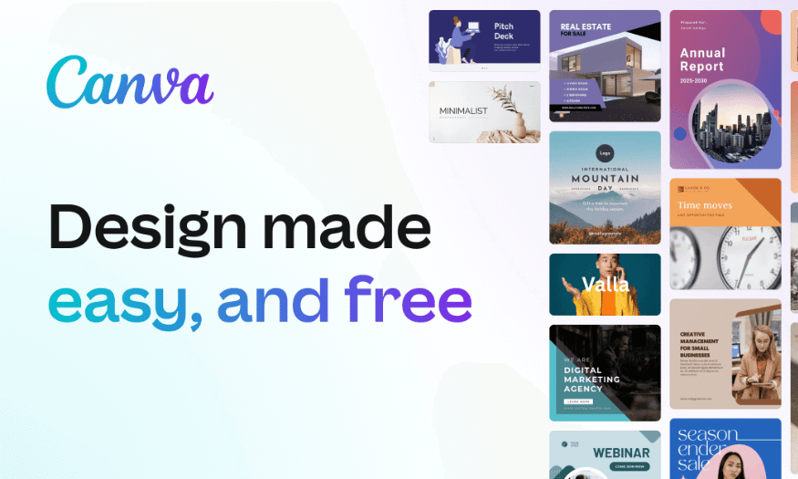
Canva is one of the most popular online graphic design tools today. With its user-friendly interface, Canva allows even non-professional users to create impressive designs without needing much experience. Here, you can find hundreds of diverse layout templates for various types of documents such as posters, flyers, presentations, and much more.
One of Canva's strengths is its extensive resource library. You can easily access millions of free and paid images, icons, and fonts. The available design templates are categorized by theme and style, saving you time and allowing you to quickly find ideas. Furthermore, Canva allows users to customize design elements to their liking, from color to size, to match their brand.
Canva also supports collaborative features, allowing multiple people to edit a project simultaneously in real time. This is very useful for businesses or study groups that need to coordinate to create a shared document. With its powerful features and high flexibility, Canva is truly a great tool for anyone who wants to create beautiful layouts without investing too much time or skill.
4.2 Adobe InDesign
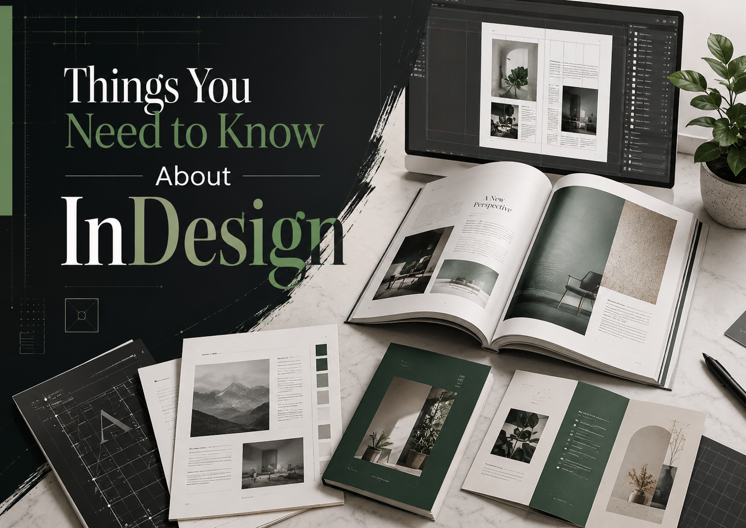
Adobe InDesign is a professional design software widely used in the publishing and graphic design industries. With its ability to create complex documents such as books, magazines, and brochures, InDesign is a top choice for those needing a powerful layout tool. This software offers numerous editing and layout tools to help you create visually appealing and professional products.
One of InDesign's standout features is its ability to work with grid systems and guides. You can create custom grids to arrange elements in your document precisely and consistently. This makes design easier and ensures everything is accurately aligned. Furthermore, InDesign supports both online publishing and print, allowing you to easily switch between formats.
In particular, InDesign integrates well with other software in the Adobe Creative Cloud suite, such as Photoshop and Illustrator. This allows you to easily import and export files from these programs, creating a smooth workflow. With its powerful features and high degree of customization, Adobe InDesign is an ideal tool for professional designers who want to create beautiful and attractive layouts.
4.3 Figma
Figma is a web-based user interface design tool known for its real-time teamwork capabilities. Figma allows multiple people to edit a project simultaneously, making it an ideal tool for design teams. With Figma, you can easily and efficiently create layouts for applications, websites, and many other products.
Figma's interface is very user-friendly, allowing users to quickly familiarize themselves with the design tools. You can easily create frames, icons, and other interface elements. The grid system and guides in Figma are also very flexible, helping you arrange elements accurately. In addition, Figma supports sharing and receiving feedback from team members, making the design process more fluid.
Figma also boasts a rich resource library, allowing you to utilize pre-made templates and design elements. Furthermore, Figma integrates with many useful tools and plugins, expanding your design capabilities. With its powerful collaborative features and user-friendly interface, Figma is an excellent choice for those who want to create beautiful layouts easily and efficiently.
5. Conclusion
In summary, creating a beautiful and engaging layout relies not only on design skills but also on a deep understanding of user psychology and visual principles. By applying principles such as balance, contrast, and emphasis, combined with the judicious use of color and fonts, you can create products that are not only visually appealing but also effective in conveying your message. Always remember, a good layout should not only be impressive but also easy to use and understand. Hopefully, the tips and principles in this article will help you improve your design skills!





















VIP Products








Best Selling Products
Genuine Adobe Illustrator account
99 USD
Upgrade Genuine Office 365
49 USD
Genuine Cheap Canva Pro
39 USD
MidJourney Account
29 USD
ChatGPT Plus Account (GPT-4)
16 USD
Adobe Photoshop Copyright - Full App
120 USD
Freepik Premium Account
59 USD
Copyright Adobe Lightroom Account
59 USD
Capcut Pro 1 Year
39 USD
Plugin Retouch4me
69 USD
Windows 10 & 11 Pro Key
36 USD
Upgrade Duolingo Super
29 USD
Adobe Premiere Pro Account
99 USD
Autodesk All App Account Copyright
120 USD
Upgrade genuine Capture One account
120 USD