Best Selling Products

Copyright Adobe Lightroom Account
59 USD

Capcut Pro 1 Year
39 USD

Upgrade Duolingo Super
29 USD

Upgrade genuine Capture One account
120 USD

MidJourney Account
29 USD

Adobe Premiere Pro Account
99 USD

Plugin Retouch4me
69 USD

Upgrade Genuine Office 365
49 USD

Genuine Cheap Canva Pro
39 USD

ChatGPT Plus Account (GPT-4)
16 USD

Windows 10 & 11 Pro Key
36 USD

Freepik Premium Account
59 USD

Genuine Adobe Illustrator account
99 USD

Autodesk All App Account Copyright
120 USD

Adobe Photoshop Copyright - Full App
120 USD
Leveraging Warm Colors: Why Do Many Big Brands Use Red - Orange - Yellow?
Nội dung
- 1. Understanding warm colors correctly in graphic design
- 2. Why do major brands favor red - orange - yellow?
- 2.1 Red: Power and urgency
- 2.2 Orange: Friendly and creative
- 2.3 Yellow: Cheerful and optimistic
- 3. Common applications of warm colors in brand design
- 3.1 Logo Design
- 3.2 Website and App
- 3.3 Advertising and Poster
- 4. 4 advanced principles for applying warm colors effectively
- 4.1 Put user emotions first
- 4.2 Do not overuse
- 4.3 Combine with neutral colors for balance
- 4.4 Always place it in the context of the overall brand identity
- 5. Design support tool: Canva
- 6. Conclusion
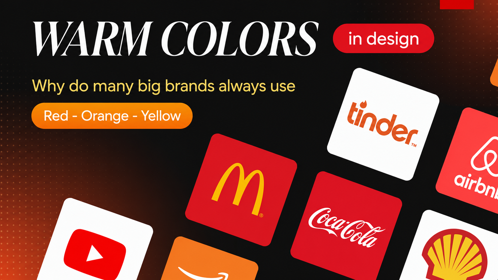
In the modern marketing world, color plays an extremely important role in building brands and attracting customers. Major brands such as Coca-Cola, McDonald's and Ferrari have skillfully used warm tones such as red, orange and yellow to create strong and memorable impressions. Color is not simply an aesthetic factor, but also carries deep meanings about psychology, emotions and consumer behavior. So why do many big brands choose warm colors to convey their messages and values? Let’s explore with Appvip the deeper reasons and effectiveness of leveraging color in brand strategy.
1. Understanding warm colors correctly in graphic design
Warm colors are a set of tones such as red, orange, yellow and their variations (such as orange-red, brownish yellow…). These are colors that evoke warmth, vibrancy, energy, action and sometimes even a sense of urgency. In graphic design, using warm colors not only creates eye-catching products but also deeply affects the emotions and behavior of viewers.
In color psychology, warm colors are often processed faster by the brain, create stronger attention and are easier to make an initial impression than cool colors. This means that when consumers see these colors, they will immediately feel attraction and energy. The warmth and vibrancy of warm colors can make a design become lively, attractive and easier to remember.
Warm colors are not simply bright color tones; they also carry different meanings and emotions. For example, red can evoke passion and power, while yellow brings a feeling of cheerfulness and optimism. When combined properly, designers can create works that are not only visually beautiful but also contain a strong message.
In addition, warm colors are also often used to designate important elements in design, such as call-to-action buttons (CTA) or urgent messages. This helps viewers easily recognize and interact with the main components in the design.
2. Why do major brands favor red - orange - yellow?
2.1 Red: Power and urgency
Red is considered the color of strong emotions, reminding people of love, determination and passion. It is also often associated with a sense of urgency, such as warning lights or stop signs. In marketing, red is often used to stimulate action, such as the buttons "Buy Now", "Shock Discount" or "Flash Sale".
Major brands such as Coca-Cola, Netflix and YouTube have chosen red as their main color because it has the ability to awaken the senses, create curiosity and encourage consumers to buy quickly. Red not only attracts the eye but also encourages action, turning it into a powerful tool in marketing strategy.
Furthermore, red can be easily combined with other colors to create impressive designs. The contrast between red and colors such as white or black can highlight the message and help the brand become easily remembered in the minds of customers.
2.2 Orange: Friendly and creative
If red is too strong, then orange is the perfect blend between energy and comfort. Orange evokes a youthful, playful and approachable feeling, so it is often used by brands targeting young audiences such as Fanta, SoundCloud or Shopee. Orange not only shows a spirit of innovation but also creates a creative atmosphere.
In design, orange is often used to highlight call-to-action buttons (CTA), express friendliness and encourage users to participate. This helps create a positive experience for viewers, making them feel comfortable and ready to interact.
Orange is also very suitable for products related to entertainment, new technology, education or street fashion. The combination of energy and approachability of orange helps brands create a youthful and dynamic image, attracting the attention of young customers.
.png)
2.3 Yellow: Cheerful and optimistic
Yellow, with its bright light, evokes feelings of cheerfulness, optimism and hope. When used in design, yellow often creates a positive atmosphere, encouraging viewers to feel happy and comfortable. This is why many major brands choose yellow to convey a message of trust and positive energy.
Yellow is often combined with blue to create strong contrast, making both colors stand out. This combination not only attracts the eye but also creates a sense of harmony and balance in design. Brands such as McDonald's and IKEA have used yellow to create a friendly and familiar feeling, making it easy for consumers to recognize them.
Besides that, yellow can also be used to indicate special messages, such as promotional programs or special events. Thanks to its ability to attract attention, yellow helps brands stand out in a sea of information and diverse choices.
3. Common applications of warm colors in brand design
Warm colors, including tones such as red, orange and yellow, are not simply outstanding colors but also bring many strong meanings and emotions. In brand design, warm colors are often used to create an initial impression, attract attention and express the personality of the brand. Below are common applications of warm colors in brand design.
3.1 Logo Design
Warm colors help logos become easily recognizable in both physical and digital spaces. A logo designed with warm tones not only attracts the eye but also conveys a strong message about energy and determination. In particular, brands that aim for quick action, have a dynamic nature, or target young customer groups will find warm colors to be a great choice.
Major brands such as Coca-Cola, YouTube and Target have used red to create memorable and recognizable logos. Red not only brings strength but also reminds people of emotions, helping consumers easily connect with the brand. Similarly, orange is also chosen by many brands such as Fanta and SoundCloud to express cheerfulness and creativity. A logo is not only an identification symbol but also a way to express the identity and personality of the brand, and warm colors play an important role in this.
When designing a logo, combining warm colors with geometric elements or unique shapes will create deep impressions. The logo image can be a combination of color and form, creating movement and dynamism, thereby helping the brand affirm its position in the minds of customers.
.png)
3.2 Website and App
In website or mobile application interfaces, warm colors are often used for action buttons such as “Register Now”, “Add to Cart”, or “See More”. Many studies have proven that CTA (Call-to-Action) buttons using warm colors can increase conversion rates by up to 30% if placed in the right position and size. This shows the power of color in guiding user action.
Red, with its outstanding nature, is often used to attract attention immediately, making users unable to ignore it. Besides that, orange also brings a friendly and approachable feeling, encouraging users to interact more. From there, designers can create positive user experiences, helping increase the effectiveness of the website or application.
In addition, warm colors can also be used to divide content sections in the interface, creating clear contrast between elements. This not only helps users easily search for information but also creates an interesting visual experience, making them want to return and use the service more often.
3.3 Advertising and Poster
In outdoor advertising campaigns or on social networks, warm colors help increase the ability to be noticed among the "forest of information". A poster with red as the main tone often makes people scrolling stop more easily than a monochrome or pale design. Warm colors not only create prominence but also express the brand message strongly and clearly.
The combination of warm colors and eye-catching images will create attractive advertisements, making viewers remember easily and recognize the brand. Brands such as McDonald's and KFC often use red and yellow in their advertisements, not only to create attention but also to express friendliness and approachability.
In advertising design, using warm colors can also create a sense of urgency, urging consumers to take immediate action. For example, promotional or discount messages are often presented prominently in red or orange, aiming to encourage customers not to miss the opportunity. This not only improves the effectiveness of the advertising campaign but also significantly increases sales.
.png)
4. 4 advanced principles for applying warm colors effectively
Warm colors, with their power to evoke strong emotions, have become an indispensable part of brand design. However, to use warm colors effectively, designers need to follow certain principles. Below are four advanced principles that help you apply warm colors effectively in design projects.
4.1 Put user emotions first
The first and most important principle is to determine the emotion you want users to feel. The emotion can be stimulation, urgency or excitement, and from there, you will choose the corresponding warm tone. For example, bright red is often associated with action and urgency, while peach orange can bring a creative and friendly feeling. Pale yellow evokes warmth and peace.
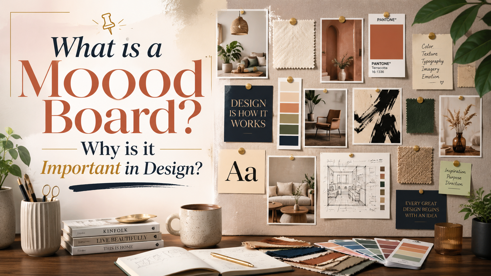
To ensure that the warm color you choose matches the core spirit of the brand, build a brand moodboard. This moodboard will help you visualize the emotional elements that colors bring, thereby serving as the basis for choosing colors in design. This not only helps create harmonious designs but also helps the brand connect deeply with consumers through the emotions that colors evoke.
4.2 Do not overuse
Although warm colors have strong appeal, if overused, they can cause visual "burning", making viewers feel tired and uncomfortable. Therefore, warm colors should be used as highlights rather than the main background for the entire design. A few timely warm color accents are often much more effective than using a glaring block of color.
A common principle in color design is the “60-30-10 rule”. Accordingly, 60% of the background color should be neutral or easy-to-view colors, 30% should be supporting colors, usually cool colors or dark neutral colors, and the remaining 10% should be accent colors, which is the “performance space” for warm colors. Applying this principle not only helps you create balance in design but also highlights the important points you want viewers to notice, such as purchase buttons or titles.
.png)
4.3 Combine with neutral colors for balance
Combining warm colors with neutral colors such as white, black, gray or navy blue is one of the most effective ways to create balance in design. These neutral colors help warm colors "shine" without being overwhelming. This is the principle of "visual makeup" that is very popular among professional designers.
For example, when red is placed next to navy blue, it not only creates a feeling of prestige and power but is also very suitable for industries such as finance, education or technology. Similarly, orange standing out on a white or beige background will bring youthfulness, readability, and evoke associations with sunlight, making it very suitable for food or travel brands. Skillfully combining colors will create designs that are more attractive and easier to remember.
4.4 Always place it in the context of the overall brand identity
Finally, when applying warm colors in design, you need to ensure that the color you choose is within the overall brand color system. Color selection should not only be based on inspiration but must also be considered in the context of the overall brand identity. Consistency in color will help consumers easily connect the brand with color naturally and long-term.
Many designers make the mistake of equating warm colors in temporary promotional campaigns with the main color in the brand identity system. The main difference is that brand colors need to be sustainable, while colors for campaigns can be more flexible and creative. For example, GrabFood uses green as its main brand color, but in "quick order closing" promotional campaigns, they often use red to stimulate immediate action. Similarly, Shopee has an orange color foundation, but when running a “Super Sale” program, they will intensify red to create a sense of urgency.
5. Design support tool: Canva
Canva is a powerful, easy-to-use online design tool that allows users to create beautiful graphic products without professional design skills. With a friendly and intuitive interface, Canva provides millions of diverse design templates for needs such as social media posts, flyers, invitations, and much more.
The strength of Canva is its rich library of images, icons and fonts, helping users easily personalize products. In addition, Canva also supports drag-and-drop features, allowing users to quickly change layouts and add content as desired.
.png)
6. Conclusion
Using warm colors such as red, orange and yellow not only helps major brands stand out from the crowd, but also creates a strong connection with customers. These colors evoke positive emotions, arouse excitement and drive action. Through this article, we have realized that color choices in marketing are not only based on personal preferences, but are also a sophisticated strategy, carefully researched to optimize consumer experience. Therefore, understanding and properly applying these color tones will help brands not only attract but also retain customers more effectively in today’s fiercely competitive market.





















VIP Products








Best Selling Products
Copyright Adobe Lightroom Account
59 USD
Capcut Pro 1 Year
39 USD
Upgrade Duolingo Super
29 USD
Upgrade genuine Capture One account
120 USD
MidJourney Account
29 USD
Adobe Premiere Pro Account
99 USD
Plugin Retouch4me
69 USD
Upgrade Genuine Office 365
49 USD
Genuine Cheap Canva Pro
39 USD
ChatGPT Plus Account (GPT-4)
16 USD
Windows 10 & 11 Pro Key
36 USD
Freepik Premium Account
59 USD
Genuine Adobe Illustrator account
99 USD
Autodesk All App Account Copyright
120 USD
Adobe Photoshop Copyright - Full App
120 USD