Best Selling Products

Autodesk All App Account Copyright
120 USD

Capcut Pro 1 Year
39 USD

Freepik Premium Account
59 USD

Genuine Cheap Canva Pro
39 USD

MidJourney Account
29 USD

Adobe Photoshop Copyright - Full App
120 USD

Upgrade Genuine Office 365
49 USD

Windows 10 & 11 Pro Key
36 USD

Upgrade Duolingo Super
29 USD

Genuine Adobe Illustrator account
99 USD

Plugin Retouch4me
69 USD

ChatGPT Plus Account (GPT-4)
16 USD

Upgrade genuine Capture One account
120 USD

Copyright Adobe Lightroom Account
59 USD

Adobe Premiere Pro Account
99 USD
Gestalt Principles: A Measure to Enhance Aesthetics
Nội dung
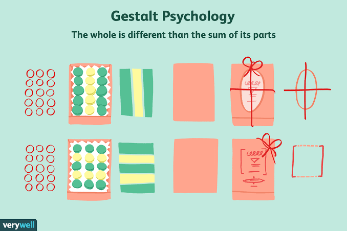
Gestalt principles, an important concept in psychology, have become an effective tool in design and art. Developed in the early 20th century, these principles emphasize how humans perceive and organize information. In today’s context, applying Gestalt principles not only helps create products with high aesthetics but also improves communication effectiveness and user experience. In this article, Appvip will explore Gestalt principles in depth with you, from proximity, similarity to simplicity, and how they can be applied to create impressive and refined designs.
1. Introduction to the Gestalt Concept
Gestalt principles are one of the important concepts in psychology, especially in the fields of design and art. These principles help us understand that complex shapes can be simplified into basic shapes, thereby creating attractive and accessible works. They indicate that humans often tend to grasp the overall view rather than paying attention to independent, separate details. This explains why a painting or a design product can make a strong impression at first glance, thanks to the ability to organize images in a reasonable and harmonious way.
The concept of "Gestalt" originates from German, meaning "the shape of an object" or "the overall view". Discovered by psychologist Max Wertheimer in the early 20th century, this principle quickly attracted the attention of many other researchers such as Wolfgang Köhler, Kurt Koffka and Wolfgang Metzger. They developed and expanded these principles to help us better understand how humans perceive and organize information in the mind.
In this article, we will learn about prominent Gestalt principles, including the Similarity principle, the Proximity principle, the Unified Connectedness principle, the Continuation principle, the Prägnanz principle, the Closure principle and the Figure-Ground principle. These principles are not only theoretically valuable but also bring practical applications in modern design and art.
2. Similarity Principle
The similarity principle, also known as the principle of sameness, is one of the basic principles of Gestalt theory. This principle shows that our eyes tend to group objects with similar shapes, colors or sizes together into one group. This happens naturally, even when those objects are not next to each other. The brain creates an invisible connection between them, making us feel that they have a closer relationship with each other compared to other elements that are not similar. Thanks to this ability, humans can quickly identify and classify information in the surrounding environment.
Similarity is not only expressed through shape and color but also through size and other factors. When similar objects are placed close together, the brain will automatically recognize and create a connection between them. This has important meaning in design, especially in interactive products such as websites and applications. When applying the similarity principle, designers can help users easily grasp information and better understand the relationship between different components.
In interface design, using similar elements such as colors, fonts, and shapes can increase intuitiveness and ease of use. For example, links on a website are often designed differently in color and style so that users can easily recognize them. When users see a piece of text in blue and underlined, they automatically understand that it is a link. Similarly, in a navigation menu, using similar elements to distinguish information items of the same hierarchy helps users quickly find the information they need.
.png)
3. Proximity Principle
The proximity principle, also known as the neighboring principle, indicates that elements that stand close to each other tend to be grouped into a unified unit in human perception. This can be clearly seen in the way we read and understand information. When blocks of text are arranged reasonably, the distance between them will help readers easily distinguish different ideas or information. Without clear spacing, readers will feel vague and have difficulty recognizing the relationship between information.
For example, in newspapers, books or websites, paragraphs are often spaced apart to create separation and ease for readers. Each paragraph usually has its own topic, and without reasonable spacing, readers will have difficulty determining whether the information is related or not. This is especially important in content design, where organizing information clearly will help users quickly grasp the main ideas.
When applying the proximity principle, designers should pay attention to how elements are arranged in space. Using reasonable spacing between paragraphs, images and other elements will not only help readers easily understand information but also create a more comfortable feeling when accessing content. If a website is full of text without any spacing, readers will feel overwhelmed and easily get lost among millions of pieces of information.
4. Unified Connectedness Principle
The unified connectedness principle, also known as the connection principle, shows that elements with some connection in color, lines or shapes will be perceived as having a close relationship with each other. This can happen even when those elements are not similar, as long as there is a connecting factor that creates the link. The unified connectedness principle is often considered one of the strongest principles in Gestalt theory, because it is capable of breaking other principles when necessary.
A typical example of the unified connectedness principle is when a line connects two different shapes, such as a square and a circle. Although they are not similar in shape and size, when connected by a line, the brain will perceive that they have a certain relationship. In design, this can be applied effectively to create connections between elements in an interface.
To apply the unified connectedness principle in design, designers can create links between interactive components, such as buttons, menus or list items. A specific example is arranging input boxes for username, password, and the registration button within the same frame. This not only helps users identify information easily but also creates a more coherent and intuitive usage experience.
The unified connectedness principle not only helps enhance usability but also creates a sense of harmony and consistency in design. When elements in an interface are connected reasonably, users will feel more comfortable when interacting and searching for information.
.png)
5. Continuation Principle
The continuation principle is one of the main principles in Gestalt theory, showing how the human mind automatically searches for connection and continuous movement between elements. When looking at a sequence of images or lines, we do not only recognize each part separately, but also tend to "connect" them together to form a complete and coherent image. Whether straight lines or curves, the brain always wants these elements to lead toward a common destination, thereby creating a seamless and harmonious feeling.
This continuity can be applied in design to create impressive and easy-to-understand works. For example, in a logo with curved lines, the brain will automatically perceive movement and connection between the elements, helping viewers easily remember and recognize the brand. This shows the importance of using negative and positive space in design. The spaces between elements not only help create separation but can also connect them together in the viewer’s eyes.
Applying the continuation principle not only helps enhance intuitiveness but also creates a better user experience. When designing user interfaces, pay attention to how elements are arranged. If buttons, links and information are arranged continuously and reasonably, users will find it easier to interact and search for information. This principle not only helps highlight important components but also creates a smooth and pleasant experience for users.
6. Prägnanz Principle
The Prägnanz principle, originating from German, means "minimalism" or "inherent essence". This principle emphasizes that humans tend to simplify and organize complex information into simpler and easier-to-understand forms. Our minds are not accustomed to disorder or complexity, and to avoid being overwhelmed by strange images, we automatically seek simplicity and clarity in what we observe.
A typical example is when looking at a picture with five imperfect circles, we can easily recognize them as circles. Although the actual shapes may not be perfect, the brain still "fills in" those missing parts and simplifies them into familiar shapes. This is evidence of the power of the Prägnanz principle in helping humans quickly recognize and understand information.
This also has important meaning in design, especially when creating wireframes for websites. Using basic shapes to simulate layouts will help designers visualize more clearly how content will be arranged. This principle shows that design does not necessarily have to be complicated; sometimes, simplicity is the key to bringing the highest effectiveness.
.png)
7. Closure Principle
The closure principle is an interesting phenomenon in Gestalt psychology, showing that humans have the ability to "complete" incomplete images in their minds. When an object has an incomplete or open shape, the human eye often tends to fill in the gaps to create a complete image. This allows us to recognize and understand images more easily, even when they are not drawn completely.
For example, when looking at a broken-line circle, we can still imagine a complete circle because the brain automatically connects the points together. This principle can be applied in design to create creative artworks and interfaces. By using incomplete shapes, designers can stimulate viewers’ imagination and create a more interesting experience.
In practice, applying the closure principle can help simplify design and make it more attractive. When creating logos or icons, using incomplete but recognizable shapes can create a strong impression and make viewers feel closer to the brand. This principle encourages creativity and helps designers explore new ways to communicate and connect with audiences.
8. Common Fate Principle
The common fate principle, also known as the principle of shared destiny, refers to the way objects are recognized as having a close relationship if they move in the same certain direction. This does not necessarily require the objects to actually move, but only needs signs showing that they are heading toward the same destination. For example, when drawing arrows pointing in one direction, viewers will automatically perceive that these objects are connected to each other.
This principle is very useful in graphic design and user interfaces. When components on a website or in an application move or are arranged in the same direction, they create a sense of unity and easy recognition. This helps users easily understand the relationship between components and guides them during the interaction process. For example, if a group of icons or buttons is arranged in a straight line, users will easily recognize that they have the same function or purpose.
Applying the common fate principle in design not only creates harmony but also helps users feel more comfortable when interacting with components on the interface. When all elements in a design point in the same direction or have a clear connection, users will feel that they are in a unified "herd", thereby creating a more intuitive and easier experience.
.png)
9. Figure-Ground Principle
The figure-ground principle shows the natural ability of the human eye to distinguish what is the main subject and what is the background when looking at a photo or image. The stability level of this principle depends on the viewer’s recognition ability, as well as the contrast level between the main and secondary elements.
A prominent example of the figure-ground principle is an image that can create multiple different interpretations. For example, a picture can be perceived as a face or a vase, depending on how the viewer focuses on the elements in the image. This instability shows that the brain does not simply recognize images but also always searches for meaning and relationships between elements.
To apply the figure-ground principle in design, designers need to enhance the contrast between the main and secondary parts. If you want the main content to stand out and attract attention, make sure it is clearly distinguished from the background. This can be achieved through the use of different colors, sizes, brightness, and styles. Otherwise, viewers may become confused and not know what the most important information in the design is.
The figure-ground principle not only helps create an intuitive and easy-to-understand design but also improves the user experience. When viewers can easily distinguish between the main and secondary parts, they will feel more comfortable and find it easier to interact with the content. Therefore, applying this principle is very important in any type of design, from graphics to user interfaces.
.png)
10. Conclusion
Gestalt principles are not only an abstract theory but also a powerful practical tool for designers, artists and marketers. By understanding and applying these principles, we can create works that are not only visually beautiful but also bring a deep experience to viewers. In an increasingly complex world, using these basic principles will help us maintain aesthetics and effectiveness in visual communication. Let Gestalt principles guide us to fresh and inspiring creations!





















VIP Products








Best Selling Products
Autodesk All App Account Copyright
120 USD
Capcut Pro 1 Year
39 USD
Freepik Premium Account
59 USD
Genuine Cheap Canva Pro
39 USD
MidJourney Account
29 USD
Adobe Photoshop Copyright - Full App
120 USD
Upgrade Genuine Office 365
49 USD
Windows 10 & 11 Pro Key
36 USD
Upgrade Duolingo Super
29 USD
Genuine Adobe Illustrator account
99 USD
Plugin Retouch4me
69 USD
ChatGPT Plus Account (GPT-4)
16 USD
Upgrade genuine Capture One account
120 USD
Copyright Adobe Lightroom Account
59 USD
Adobe Premiere Pro Account
99 USD