Best Selling Products

Copyright Adobe Lightroom Account
59 USD

Adobe Photoshop Copyright - Full App
120 USD

MidJourney Account
29 USD

Autodesk All App Account Copyright
120 USD

Plugin Retouch4me
69 USD

Freepik Premium Account
59 USD

Genuine Cheap Canva Pro
39 USD

Genuine Adobe Illustrator account
99 USD

Adobe Premiere Pro Account
99 USD

Upgrade Duolingo Super
29 USD

Upgrade genuine Capture One account
120 USD

Capcut Pro 1 Year
39 USD

ChatGPT Plus Account (GPT-4)
16 USD

Windows 10 & 11 Pro Key
36 USD

Upgrade Genuine Office 365
49 USD
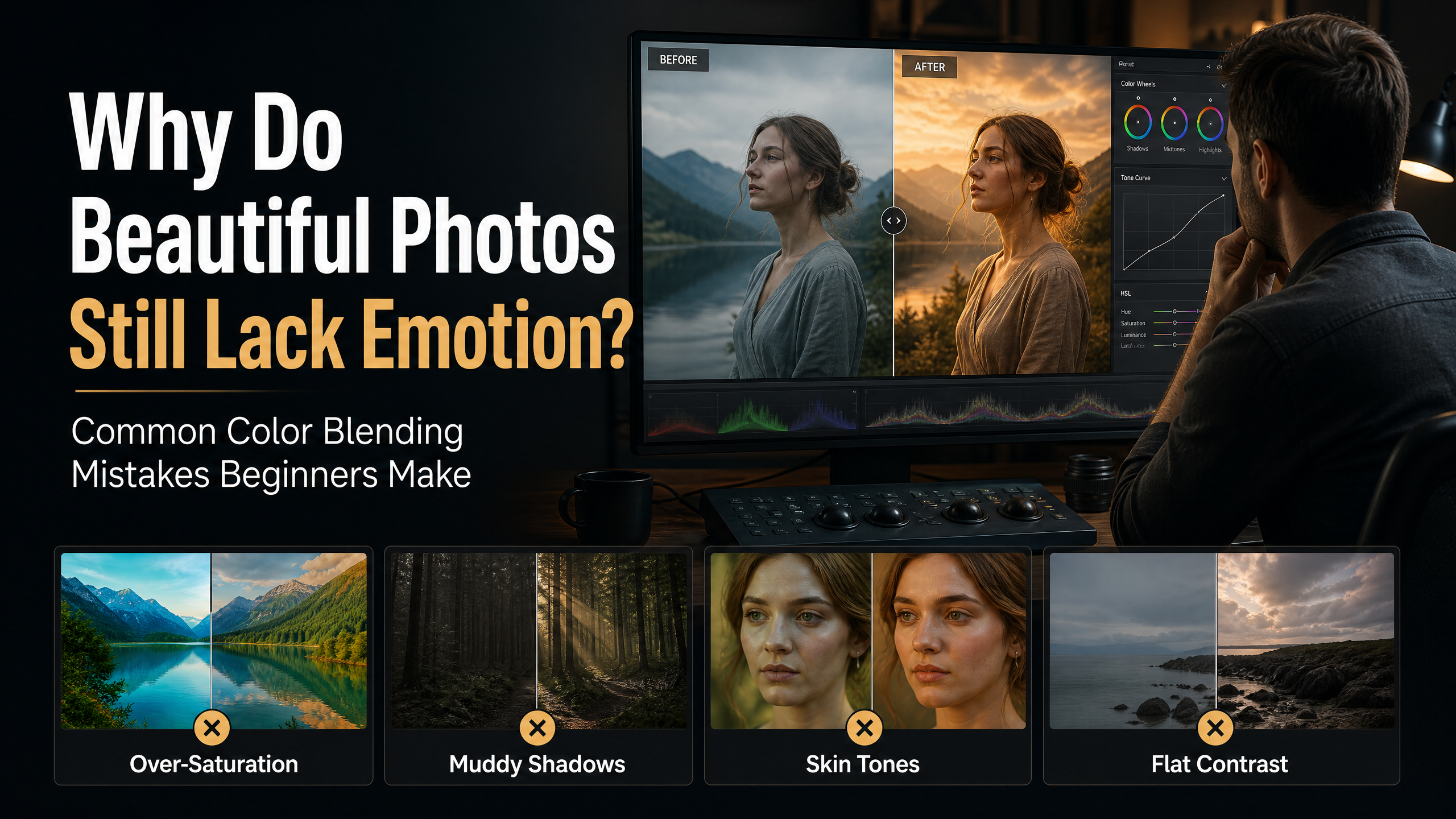
Why Do Beautiful Photos Still Lack Emotion? Common Color Blending Mistakes Beginners Make
Nội dung
- 1. Common mistakes that cause color blending to ruin the soul of a photograph.
- 1.1. Overemphasizing technical specifications and forgetting about emotions.
- 1.2. Choosing a color palette that doesn't match the content.
- 2. Key elements to help you blend colors more subtly and expressively.
- 2.1. Understanding color harmony
- 2.2. Skin Tone Control
- 2.3. Combining Light and Contrast
- 3. The right mindset to elevate your color blending skills.
- 3.1. Learn to observe reality.
- 3.2. Master the tools instead of blindly following the software.
- 4. Color blending is about telling stories through emotions.
- 5. Conclusion
Color blending is not just about changing colors to make a photo more visually appealing; it''s also an art of conveying emotions and stories to the viewer.
1. Common mistakes that cause color blending to ruin the soul of a photograph.
Color blending is the most creative stage in the post-processing of an image. However, it's also the stage where beginners are most likely to make mistakes. Without a clear understanding of the true role of color, many people unintentionally transform an emotionally rich photograph into a beautiful but soulless product.
1.1. Overemphasizing technical specifications and forgetting about emotions.
One of the most common mistakes is focusing too much on technical parameters. Beginners often spend hours adjusting Saturation, Vibrance, HSL, Curves, Split Toning, or Color Grading, thinking that the more adjustments they make, the more professional the photo will look.
Unfortunately, drastic changes often distort the original emotion. A portrait taken in twilight, which is inherently gentle and romantic, can become heavy and oppressive if the contrast is pushed too high. A warm family moment can lose its intimacy if the colors are pulled to an extreme, cold tone.
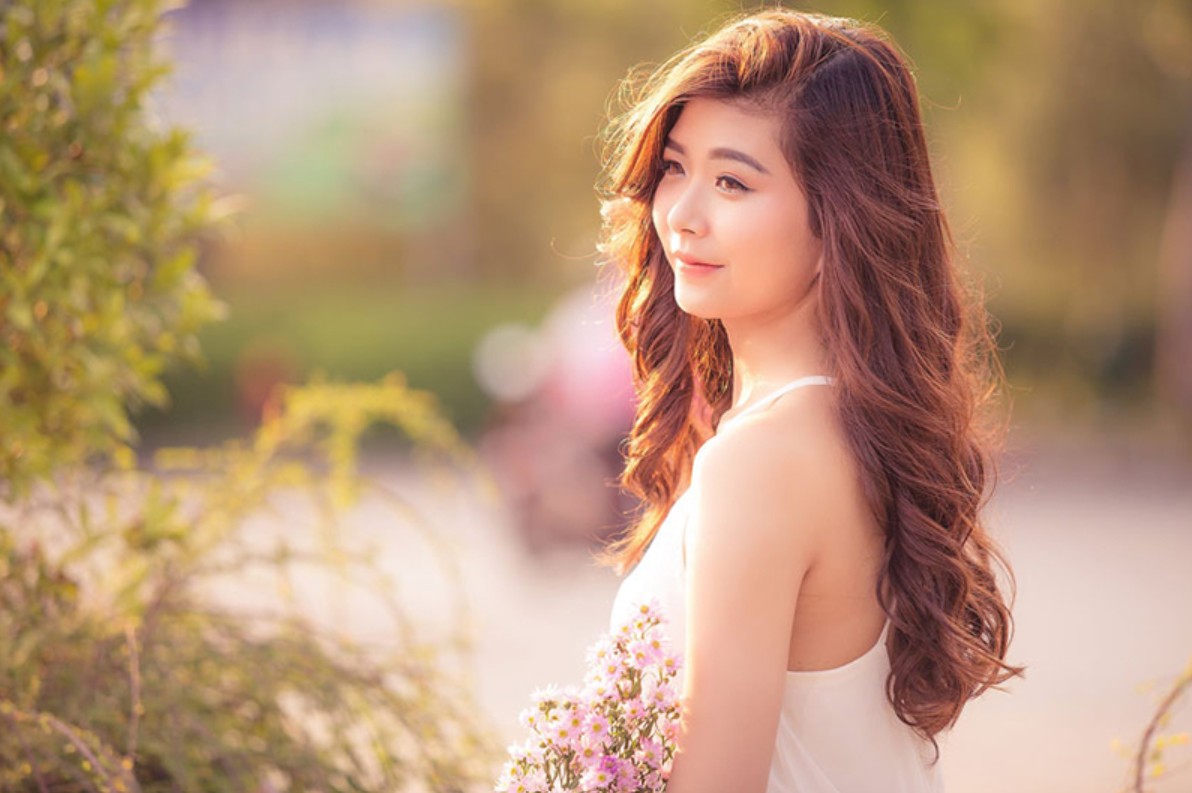
Many beginners learning color blending tend to download popular presets online and apply them indiscriminately to all their photos. This creates a uniform look but simultaneously diminishes the unique character of each image. Presets aren't magic formulas; they're just starting points and always need to be adjusted to suit each specific context.
A good photographer never asks, "How can I make this photo look like this preset?" but always asks, "What do I want the viewer to feel when they look at this photo?"
1.2. Choosing a color palette that doesn't match the content.
The second common mistake is choosing a color palette that doesn't match the story of the photograph.
Each color carries its own unique psychological associations. Yellow and orange often evoke feelings of warmth, closeness, and happiness. Blue creates feelings of peace or loneliness. Red conveys energy, passion, or tension.
Without understanding this, photo editors can easily create a conflict between the image and the emotion.
Imagine a wedding photoshoot taken in the sunset light being edited to a cool blue tone. Technically, it might not be wrong, but the romantic and warm feeling would be significantly diminished.
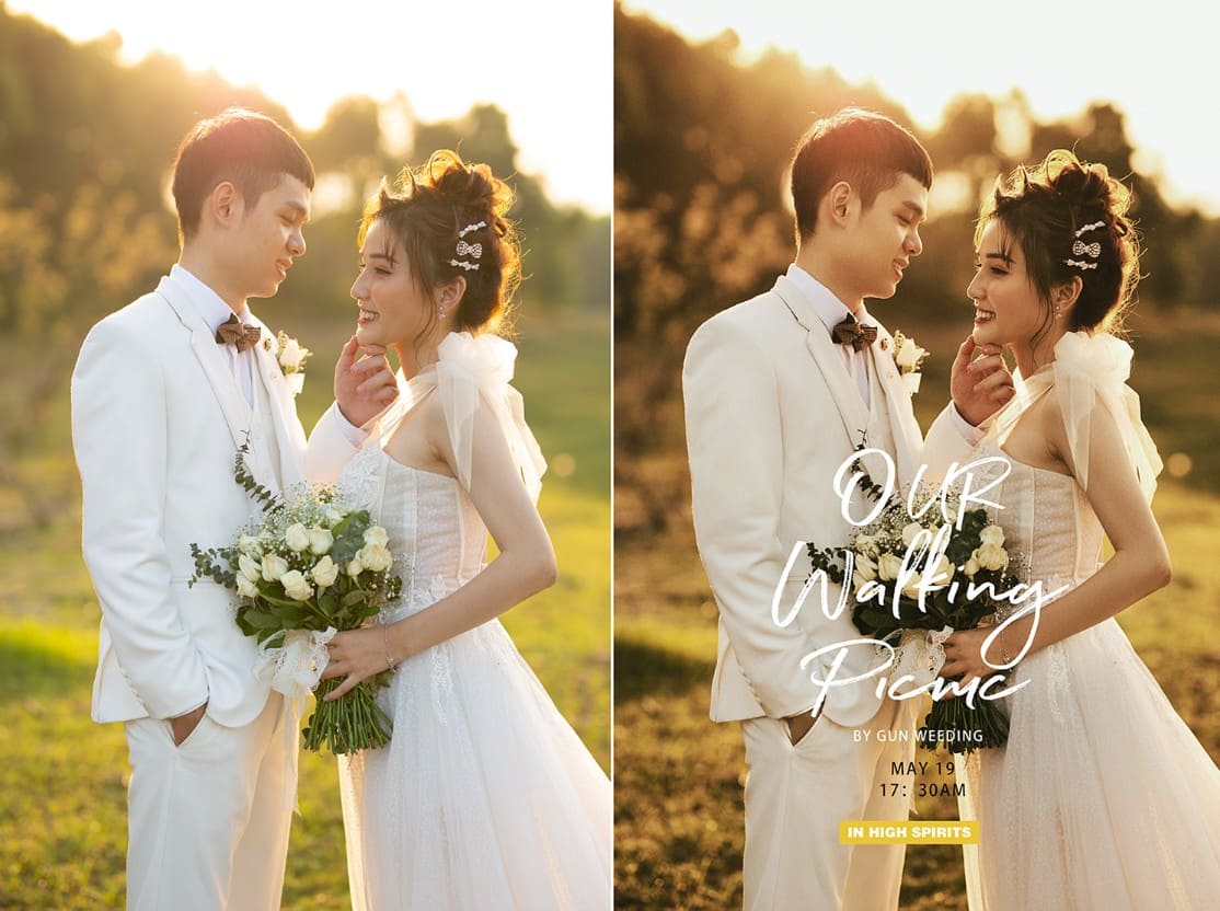
Conversely, a street fashion photoshoot with a strong and modern spirit will lose its personality if it's overlaid with overly soft pastel colors.
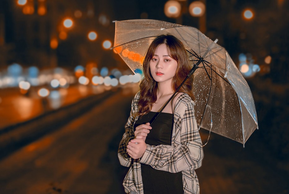
Color not only enhances the beauty of an image but also serves as a language of emotion. When the color palette doesn't match the content, viewers will sense that something is amiss, even if they can't pinpoint the exact reason.
2. Key elements to help you blend colors more subtly and expressively.
After avoiding the basic mistakes, the next step is to build a foundation so that color truly becomes a tool for conveying emotion.
2.1. Understanding color harmony
A good photograph typically doesn't contain too many competing colors. Instead, the colors are arranged in a harmonious structure that makes it easy for the viewer's eye to process the information.
Color harmony is a fundamental principle in painting, design, and photography. When applied correctly, this principle creates a natural connection between colors in an image, resulting in a pleasant and engaging experience.
Beginners often make the mistake of trying to highlight all the colors in the frame. As a result, the photo becomes cluttered and lacks focus.
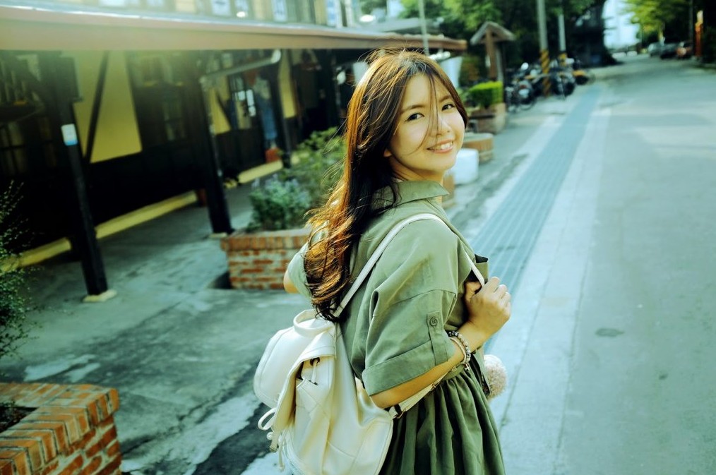
Conversely, experienced photographers often limit the number of primary colors that appear in their images. They create a tonal unity to guide the viewer's gaze.
Color harmony isn't about making everything look the same, but about creating a logical relationship between different colors. This is what makes a photo look more professional, even when using very simple color tones.
2.2. Skin Tone Control
If there's one factor that determines the success of a portrait photograph, it's skin tone.
Humans are very quick to recognize abnormal skin tones. Even slightly bluish, reddish, or excessively yellow skin can make a photograph appear unnatural to the viewer.
This is why many beginners in color blending struggle. They focus on creating the overall effect but forget that skin tone should always be the top priority.
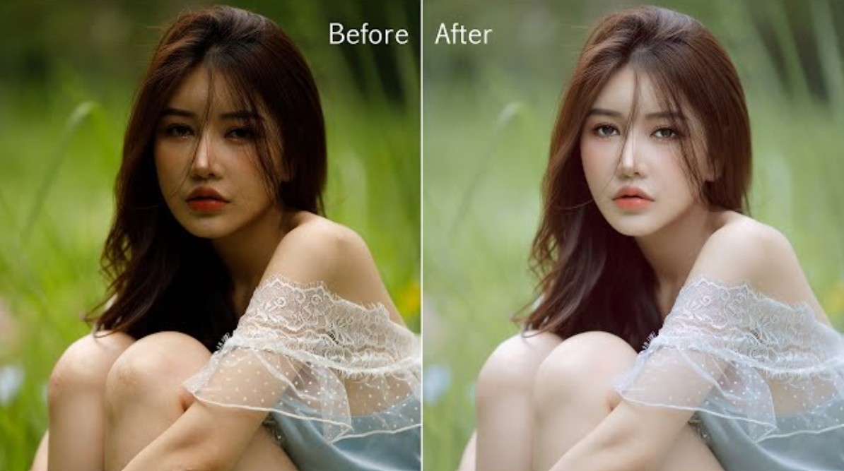
A photograph with beautiful, cinematic colors but where the skin tone is a harsh orange hue is still considered a failure. Conversely, a photograph with simple color correction that preserves natural skin tones often looks much more professional.
When working with skin tone, always remember that the goal isn't to achieve perfect skin, but to maintain its authenticity. The subtle nuances of skin tone are what give the face depth and emotion.
An important tip is to frequently zoom in on the skin area to check during the editing process. Don't just look at the overall picture because sometimes small discrepancies in skin tone will be overlooked when viewed at a larger size.
2.3. Combining Light and Contrast
Color doesn't exist in isolation. It's always linked to light and contrast.
Many beginners learning color blending focus only on HSL or Color Grading, forgetting that lighting is the key factor in how colors are perceived.
A shade of blue appearing in a bright area will create a completely different feeling compared to the same shade of blue in a dark area. Similarly, a warm tone can become very emotionally rich when placed within the right lighting system.
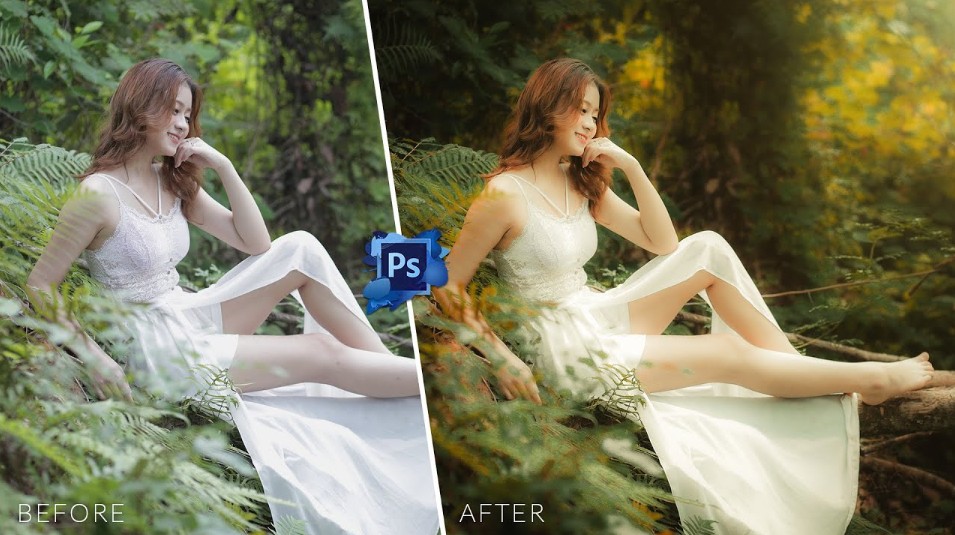
Contrast also plays a crucial role in shaping emotions. High contrast often conveys a strong, dramatic, and modern feeling. Low contrast creates a softer, more nostalgic, and romantic atmosphere.
Good photographers always view light, contrast, and color as a unified system rather than three separate elements.
3. The right mindset to elevate your color blending skills.
Techniques can be learned in a few months, but color perception is something that takes years of experience to develop.
3.1. Learn to observe reality.
The biggest mistake beginners make is learning about color entirely from social media. They save hundreds of presets and refer to thousands of photos, but rarely observe colors in real life.
The truth is, the best sources of inspiration are always right in front of us. An autumn afternoon, sunlight filtering through the trees, streets after a rain shower, or the warm glow of a café—all hold invaluable lessons about color.
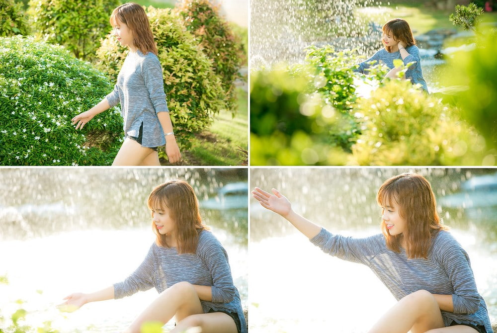
When you observe in reality, you'll understand that color is not just about RGB values or HSL specifications. It's about emotion, atmosphere, and experience.
Make it a habit to ask yourself why a particular scene makes you feel peaceful. Why does a certain light create a feeling of loneliness? Once you understand this, color blending will become much more purposeful.
3.2. Master the tools instead of blindly following the software.
Many newcomers believe that new software will make their photos look better. They constantly switch between Lightroom, Photoshop, Capture One, or many other applications.
In reality, software is just a tool. A photographer who understands color can create outstanding photos on any platform. Meanwhile, someone lacking color perception will struggle even with the most powerful software.
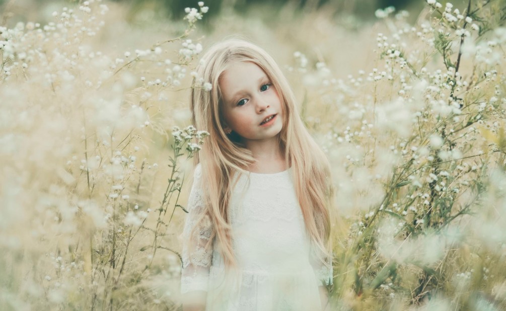
Lightroom is known for its fast and convenient workflow. Photoshop excels at in-depth editing. Capture One is highly regarded for its skin tone processing. Each tool has its own advantages. The important thing isn't which software you use, but how well you understand it. When you master a tool, you'll spend less time searching for technical solutions and more time on creativity.
4. Color blending is about telling stories through emotions.
One of the most important realizations for any photographer is to understand that color blending is not the final finishing touch.
Color is part of the story. In film, directors use color to guide the audience's emotions. Photography does the same. A cool color palette can make viewers feel lonely. A warm color palette can evoke memories and intimacy.
When blending colors, don't think of it as editing an image. Think of it as building emotion. If the photo depicts youth, the colors should support that spirit. If the photo evokes nostalgia, the colors should create a sense of timelessness. If the photo speaks of strength, the colors should contribute to amplifying that energy.
This is the mindset that helps professional photographers create works that viewers will remember forever.
5. Conclusion
To blend colors effectively, avoid chasing fleeting trends or specifications. Instead, learn to observe reality, understand color psychology, control skin tones, utilize light, and develop a storytelling mindset through color. When you do that, color will no longer be just makeup applied to the image, but will become the soul that gives your work depth, personality, and lasting vitality in the viewer's mind.





















VIP Products








Best Selling Products
Copyright Adobe Lightroom Account
59 USD
Adobe Photoshop Copyright - Full App
120 USD
MidJourney Account
29 USD
Autodesk All App Account Copyright
120 USD
Plugin Retouch4me
69 USD
Freepik Premium Account
59 USD
Genuine Cheap Canva Pro
39 USD
Genuine Adobe Illustrator account
99 USD
Adobe Premiere Pro Account
99 USD
Upgrade Duolingo Super
29 USD
Upgrade genuine Capture One account
120 USD
Capcut Pro 1 Year
39 USD
ChatGPT Plus Account (GPT-4)
16 USD
Windows 10 & 11 Pro Key
36 USD
Upgrade Genuine Office 365
49 USD