Best Selling Products
Why do you need a monitor color balance for your computer?
Nội dung

Screen color scale is a problem that has puzzled people for years. Popular questions like Why do you need a color balance for your computer have created a debate. In the following article we will tell you why you NEED to calibrate your monitor.  color balance This is very important for print, not only that if your monitor transmits colors that are too warm or too cold, most of your customers will be less impressed with how the image you edit on that screen looks like. There are two main contenders for screen calibration: the Datacolor Spyder system and the X-Rite Colormunki. While there are slight differences between the two, they both largely do the exact same thing - that is, accurately calibrate the colors and brightness of your screen.
 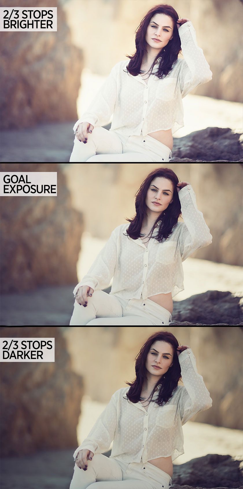 the brightness This means that the brightness and exposure of your images will be displayed correctly on the screen, instead of showing you really overexposed or underexposed photos as if they were at the target exposure. . Certainly the built-in histograms will help you decide where the white and black points are in the image. However, one thing the histogram can't give you exactly is color readability on your image.
 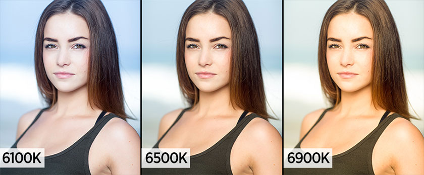 Accurate color rendering
What is Screen Color Scale?
Screen color scale is the process in which you adjust the colors, brightness, and different spectrums of your screen to get the most accurate color results for your photos. color balance
First of all about the brightness
There is no correct or incorrect brightness for your monitor. This is because the settings are completely dependent on many variables, such as screen light output and ambient light. The color balance system comes with both a sensor system to read your screen brightness, as well as an ambient light sensor. To make sure your brightness is correct for the room you're editing. the brightness
Accurate color rendering
Another key component with screen calibration is printing accurate color rendering, which will fix any color issues your monitor may have. Basically, monitors are designed to have a color temperature of 6500K and a brightness of 100cd/m² for their default settings. These numbers are great for editing, however, monitors are mass-produced and it is not possible to achieve these numbers with exact accuracy. A slight variation in these numbers means you're leaving images with too warm or too cold color temperatures, resulting in inaccurate readings during editing. Whether you're editing images for a portfolio, or for a client, you certainly don't want to correct the wrong color temperature in the first place without realizing it. Accurate color rendering
Misconception about color balance
IPS display and Apple Monitor do not need color balance
This is completely wrong. While these types of monitors are rated as the best for editing and color accuracy, that doesn't change the fact that they need color balance. For example, the term IPS screen simply means a screen with large viewing angles, so even though looking at the screen at an angle, you should not experience color inconsistencies. While these monitors are typically at a higher price point and are color-balanced during the manufacturing process, this does not mean that they are still color-balanced after a few weeks or months of use. Most color balance software recommends re-colorizing your monitor every 2-6 weeks to ensure color accuracy. Think of it like general maintenance for your monitor. Over time, the LEDs and pixels will weaken and the color balance will simply make sure everything runs with the right brightness and accuracy.Phone/Tablet with accurate color output
It’s wrong. Phones, tablets, and other mobile devices often have more inconsistent colors than even your batch computer monitor. These screens for mobile devices are designed to be as cheap as possible, so color variation often occurs during manufacturing. Besides, how often do you adjust your smartphone brightness throughout the day? During the day, my phone can't seem to read it at full brightness. At night, the brightness is similar to a blinding spotlight. If you confirm that your monitor is calibrated at 6500K and your client's uncalibrated monitor is set at around 6200K, their monitor will look better if yours is also uncalibrated. and set at around 6800K. These seemingly subtle changes can make a big difference in your image. But don't take my word for it, just play with the White Balance slider a bit in the Raw Converter. So, through here you understand why you need to balance the screen color for your computer! Please refer to other useful articles from SaDesign Retouching. See more Introduction to color management Sadesign Co., Ltd. provides the world's No. 1 warehouse of cheap copyrighted software with quality: Panel Retouch, Adobe Photoshop Full App, Premiere, Illustrator, CorelDraw, Chat GPT, Capcut Pro, Canva Pro, Windows Copyright Key, Office 365 , Spotify, Duolingo, Udemy, Zoom Pro...
Contact information
SADESIGN software Company Limited
Sadesign Co., Ltd. provides the world's No. 1 warehouse of cheap copyrighted software with quality: Panel Retouch, Adobe Photoshop Full App, Premiere, Illustrator, CorelDraw, Chat GPT, Capcut Pro, Canva Pro, Windows Copyright Key, Office 365 , Spotify, Duolingo, Udemy, Zoom Pro...
Contact information
SADESIGN software Company Limited


