Best Selling Products
10 Classic Fonts Every Designer Cannot Miss
Nội dung
- 1.Why Fonts Are A Core Element In Design
- 2. Criteria for Choosing Classic Fonts
- 2.1 Flexibility and Wide Applicability
- 2.2 Timeless Beauty
- 2.3 Readability and Recognition
- 3. Top 10 Classic Fonts Every Designer Must Know
- 3.1. Helvetica: Symbol of Modernism
- 3.2. Garamond: Classic, Refined Beauty
- 3.3. Futura: The Pioneer of Modernism
- 3.4. Times New Roman: The Standard of Journalism and Writing
- 3.5. Bodoni: Impressive Elegance
- 3.6. Frutiger: Clarity and Friendliness
- 3.7. Baskerville: The Beauty of Power
- 3.8. Gill Sans: English Elegance
- 3.9. Rockwell: The Power of the Square
- 3.10. Georgia: The Power of Web Fonts
- 4. Conclusion
Discover 10 classic fonts that every designer should know. These fonts are not only iconic but also help you enhance your designs and make your mark.
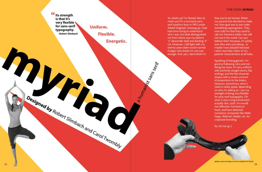
Fonts are the soul of every design. A right choice not only enhances aesthetics but also conveys the personality and brand message. Among the countless choices, there are names that have stood the test of time, become "classics" and are indispensable in the treasure trove of any designer. In the article below, sadesign will introduce 10 legendary fonts that every designer, whether professional or beginner, should master.
1.Why Fonts Are A Core Element In Design
Fonts are more than just a means of conveying language. Each typeface is a visual form that helps shape the viewer’s perception, emotions, and experience. The harmonious combination of fonts and other elements such as color, layout, and images will create a design that is deep, memorable, and convincing.
Using classic fonts not only brings sophistication, but also ensures professionalism, readability and recognition. These fonts have been tested over time, used in thousands of projects large and small, from print to digital.
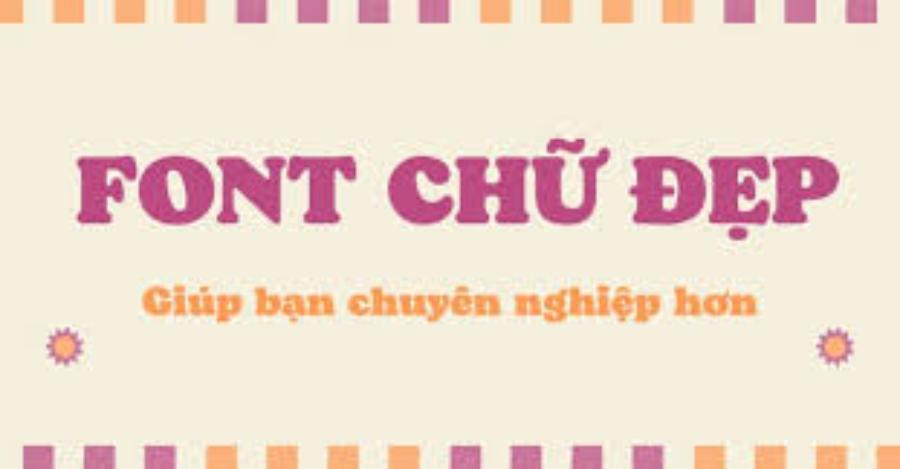
The history of fonts goes hand in hand with the development of printing technology and later digital technology. From letters carved by hand in stone, to typefaces cast in metal for printing, and now the millions of digital fonts available on computers, each stage marks an important step forward in the communication of information and art. The importance of fonts in design lies not only in the ability to display text clearly, but also in the ability to create a unique visual experience. A talented designer always knows how to exploit the power of fonts to convey messages most effectively.
When choosing a font, designers need to consider many factors: the audience, the project's purpose, the overall style, and readability. A beautiful font that is difficult to read will not be effective. On the other hand, a simple but easy-to-read font can be an ideal choice for long documents or user interfaces. Understanding font types, their characteristics, and their applications is a solid foundation for anyone who wants to succeed in the design field.
2. Criteria for Choosing Classic Fonts
For a font to become a “classic,” it must pass strict criteria of time and application. Not every font can achieve this title. Classic fonts often possess common characteristics, making them immortal and loved by many generations of designers.
2.1 Flexibility and Wide Applicability
A classic font should be able to adapt to many different types of designs. It can be used for headlines, body copy, logos, packaging, websites, mobile apps, and more. This versatility comes from its balanced design, not being too specific or dated, allowing it to blend well with other design elements. A classic font is not limited to one style or trend. It can fit both modern and classic designs, creating a harmonious and professional look.
2.2 Timeless Beauty
Design trends change all the time, but classic fonts remain beautiful and relevant. They don’t become outdated with changing tastes, but instead, they maintain their appeal. This comes from the elegance of their lines, their proportions, and their overall aesthetic. These fonts are created based on solid design principles, ensuring they will always look good and professional, no matter the era. Timelessness is the key to keeping fonts relevant.
2.3 Readability and Recognition
No matter how beautiful a font is, it cannot become a classic if it is difficult to read. Legibility refers to the clarity of individual characters, while readability refers to the ease with which long passages of text can be read. Classic fonts are always designed to ensure optimal legibility, allowing readers to easily absorb information without straining their eyes. This is especially important in print publications, websites, and applications where text is the main element.
3. Top 10 Classic Fonts Every Designer Must Know
Now, let’s explore 10 fonts that have made their mark in the history and present of the design industry. Each font has its own story, characteristics and applications, creating an irresistible appeal.
3.1. Helvetica: Symbol of Modernism
-
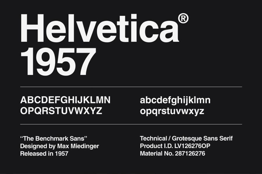
History and Origin: Helvetica, launched in 1957 by Max Miedinger and Eduard Hoffmann in Switzerland, was originally called Neue Haas Grotesk. The name Helvetica was coined in 1960, inspired by "Helvetia" - the Latin name for Switzerland. The birth of Helvetica marked a new era in font design, aiming for simplicity, clarity and neutrality.
-
Features: Helvetica is a Sans-serif font, with clean, neat lines and optimal spacing between characters. What makes Helvetica special is the uniformity in the height of the lowercase letters and the width of the characters, creating a balanced and easy-to-read block of text. It comes in many variations (weights) from Thin to Black, suitable for all purposes.
-
Why it's a classic: Neutrality, versatility, and superior readability have made Helvetica one of the most widely used fonts in the world. It carries no emotion or bias, allowing the content to speak for itself.
-
Popular uses: Helvetica is widely used in brand logos (Jeep, Panasonic, Nestle), traffic signs, public wayfinding systems (New York City Subway), and government documents. It is a top choice for designs that require clarity, professionalism, and minimalism.
3.2. Garamond: Classic, Refined Beauty
-
History and Origin: Garamond is a family of serif typefaces named after Claude Garamond, a 16th-century French engraver. Although many different versions of Garamond have been developed over the centuries, all are based on his original design principles, characterized by elegance and artistry.
-
Outstanding features: Garamond belongs to the Serif font family (with feet), with small feet and smooth, delicate lines. Garamond characters have harmonious proportions, moderate contrast between bold and light strokes, creating a soft and pleasant feeling when reading. Garamond is characterized by lowercase letters with a relatively small x-height (height of the letter 'x'), giving a classic and luxurious feeling.
-
Why it's a classic: Garamond's classic beauty, elegance and readability have made it the top choice for literary publications, books and formal documents. It conveys a sense of prestige and tradition.
-
Common uses: Garamond is widely used in book publishing (textbooks, novels), magazines, and high-end print publications. It also often appears in logo designs for luxury brands, wedding invitations, and artistic materials.
3.3. Futura: The Pioneer of Modernism
-
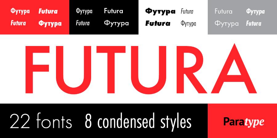
Features: Futura is a Sans-serif font with straight lines, clean angles, and perfect curves. Futura’s letters are designed based on simple shapes, creating a strong, modern, and organic feel. It comes in a variety of weights, from Light to Extra Bold, and also comes in condensed and extended versions.
-
Why it's a classic: Modernity, strength, and adaptability to many uses have made the Futura an icon of modernism in design. It exudes the future and innovation.
-
Popular uses: Futura is widely used in logos (Volkswagen, Nike, Supreme), advertising headlines, movie posters (Gravity, Interstellar), and materials that call for a groundbreaking, avant-garde feel. NASA also uses Futura for its logos and materials.
3.4. Times New Roman: The Standard of Journalism and Writing
-
Features: Times New Roman is a traditional serif font, with symmetrical strokes and sharp feet. It is optimized for readability on densely packed paper. It has a moderate contrast between bold and light strokes, and the characters are designed to occupy as little space as possible while maintaining legibility.
-
Why it's a classic: Its superior readability, space efficiency, and widespread popularity in the publishing industry have made Times New Roman an indispensable standard. It has been the default font on many operating systems and word processing software for a long time.
-
Common Uses: Times New Roman is the default font for many academic documents, reports, essays, and newspaper publications. It is an ideal choice for long texts where readability is a top priority.
3.5. Bodoni: Impressive Elegance
-
Highlights: Bodoni stands out with its high contrast between dark and light strokes, thin and sharp legs, and clear geometric structure. Bodoni's curves are rounded and symmetrical, creating a sense of elegance and luxury. Bodoni's large x-height gives it a strong and modern look.
-
Why it's a classic: Bodoni's dramatic, elegant beauty has made it a favorite for major headlines, fashion ads, and high-end publications. It conveys a sense of power and sophistication.
-
Popular uses: Bodoni is often used in fashion magazines (Vogue, Harper's Bazaar), perfume and jewelry advertisements, and luxury publications. It is also a popular choice for logos of high-end brands.
3.6. Frutiger: Clarity and Friendliness
-
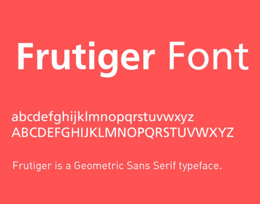
Notable Features: Frutiger is a humanist sans-serif, with clean, open lines and good spacing. It is designed to be readable on screen and at different sizes. Frutiger's characters have a "human" quality that makes them look more natural and approachable than geometric sans-serifs.
-
Why it's a classic: Superior readability, user-friendliness, and flexibility have made Frutiger the first choice for information systems, user interfaces, and public documents.
-
Common applications: Frutiger is widely used in signage systems (airports, hospitals), user interfaces (Microsoft Windows), manuals, and documents that require clarity and accessibility.
3.7. Baskerville: The Beauty of Power
-
Features: Baskerville is a Serif font with stronger contrast than older serif fonts, sharp serifs and elegant letter shapes. The straight and curved lines of Baskerville are well-balanced, creating a sense of stability and authority. The lines of Baskerville are highly refined, giving it a luxurious look.
-
Why it's a classic: The combination of classic beauty and modernity, along with good readability, has made Baskerville a favorite choice for academic, legal, and formal publications. It conveys a sense of trust and authority.
-
Common uses: Baskerville is often used in book publications, legal documents, academic journals, and brands that want to convey formality, tradition, and trustworthiness.
3.8. Gill Sans: English Elegance
-
Notable Features: Gill Sans is a humanistic Sans-serif font, with straight strokes and soft curves, creating a friendly and elegant feel. It has some unique features, such as the double-decker 'a', the hooked 'g', and the square-dot 'i'. Gill Sans comes in a variety of weights, from Ultra Light to Extra Bold.
-
Why it's a classic: Gill Sans' elegance, versatility, and wide range of uses have made it an icon of British design. It feels friendly yet professional.
-
Popular uses: Gill Sans is widely used in logos (BBC, Monopoly), publications, advertising, and signage (London Underground). It is a popular choice for brands that want a modern look, but still retain a classic feel.
3.9. Rockwell: The Power of the Square

-
Notable Features: Rockwell has very thick, square serifs, with almost uniform stroke weights. This gives the font a strong, solid, and trustworthy look. It is one of the most influential Slab Serif fonts, giving it an industrial and solid feel.
-
Why it's a classic: Rockwell's strength, reliability, and versatility in letterhead design have made it a popular choice for advertising collateral, logos, and attention-grabbing projects.
-
Common uses: Rockwell is often used in advertising headlines, logos (Absolut Vodka, Blockbuster), posters, and other designs that have a strong, dramatic character.
3.10. Georgia: The Power of Web Fonts
-
Features: Georgia is a Serif font with a tall x-height, clean lines, and moderate contrast. Georgia's characters are designed to be easy to read even at low resolutions, making text on screen clear and accessible. It has strong serif strokes, which help to separate characters and enhance readability.
-
Why it's a classic: Superior readability on computer screens and widespread popularity on the web have made Georgia one of the most important web fonts.
-
Popular uses: Georgia is widely used in websites, blogs, e-readers, and digital documents. It is an ideal choice for long texts in online environments.
4. Conclusion
The journey of discovering 10 classic fonts that every designer must know has come to an end. From the powerful neutrality of Helvetica to the classic beauty of Garamond, the pioneering of Futura or the usefulness of Times New Roman, each font has its own story and mission. Mastering the history, characteristics and applications of these fonts will not only help you improve your design skills but also open the door to a world of unlimited creativity.
