Best Selling Products

Adobe Photoshop Copyright - Full App
120 USD

Windows 10 & 11 Pro Key
36 USD

Copyright Adobe Lightroom Account
59 USD

ChatGPT Plus Account (GPT-4)
16 USD

Capcut Pro 1 Year
39 USD

Plugin Retouch4me
69 USD

MidJourney Account
29 USD

Genuine Adobe Illustrator account
99 USD

Adobe Premiere Pro Account
99 USD

Upgrade genuine Capture One account
120 USD

Genuine Cheap Canva Pro
39 USD

Upgrade Duolingo Super
29 USD

Autodesk All App Account Copyright
120 USD

Freepik Premium Account
59 USD

Upgrade Genuine Office 365
49 USD
6 Things You Need to Know About Color Space in Lightroom to Avoid Color Errors
Nội dung
Why can the colors of the same photo change after being exported from Lightroom? One reason lies in how the color space is managed. This article will help you understand the issue and choose the appropriate settings for your specific needs.
1. What is Color Space?
A color space is a system that defines how colors are displayed in a digital photograph. This system establishes a specific range of colors, allowing devices and software to process colors consistently. Each color space can contain a different range of colors; some color spaces display a wider spectrum of colors, while others are limited to a smaller range. This difference directly affects how the image appears on screen, as well as how colors are processed throughout the editing and export process. In Lightroom, color space plays a crucial role because it impacts how images are displayed and processed throughout the workflow. Choosing the appropriate color space depends on the image's ultimate purpose, such as editing, sharing, or printing.
2. How Lightroom Handles Color Space
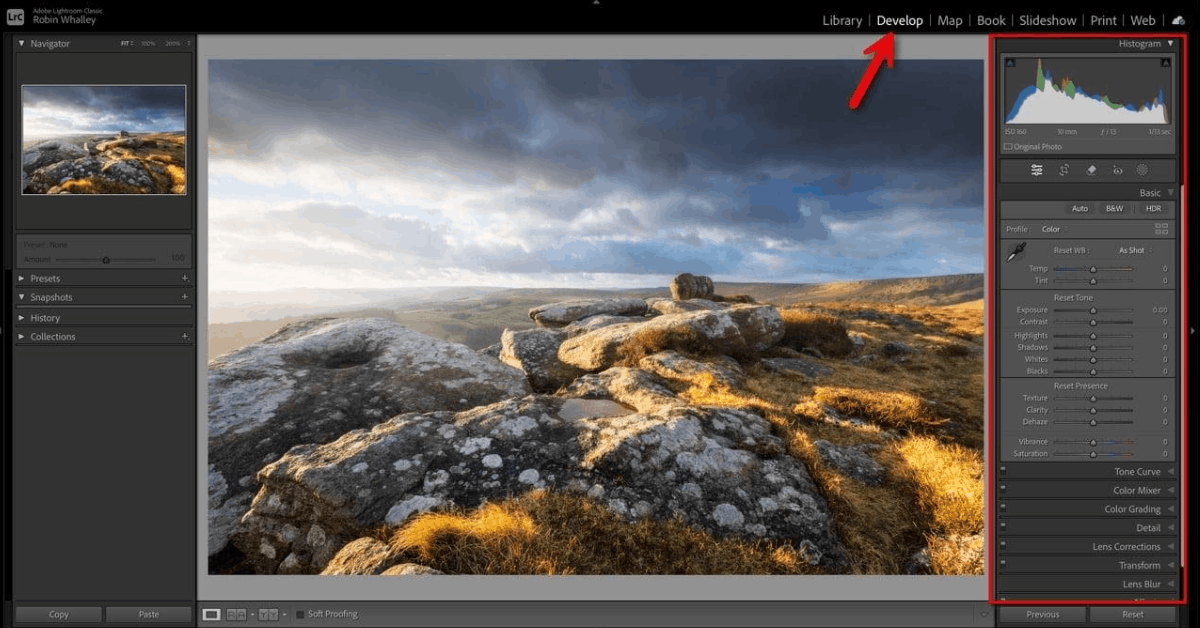
Lightroom uses color spaces at various points during the editing and export process. Each color space has a specific range of colors that it can display or store, often referred to as the color gamut. During editing, Lightroom works with a very wide color gamut, which helps preserve as much color information as possible when users make adjustments to the image. Users don't need to select a color space every time they start editing a new photo, because the color space only really becomes important at the export stage. Choosing a color space at this stage can affect how colors appear in the final file and is directly related to whether the image will be printed or shared online.
In addition, Lightroom applies different color spaces to each specific stage. The Develop module uses an internal color space with a very wide color gamut to retain as much color data as possible throughout the adjustment process.
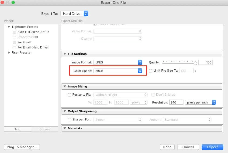
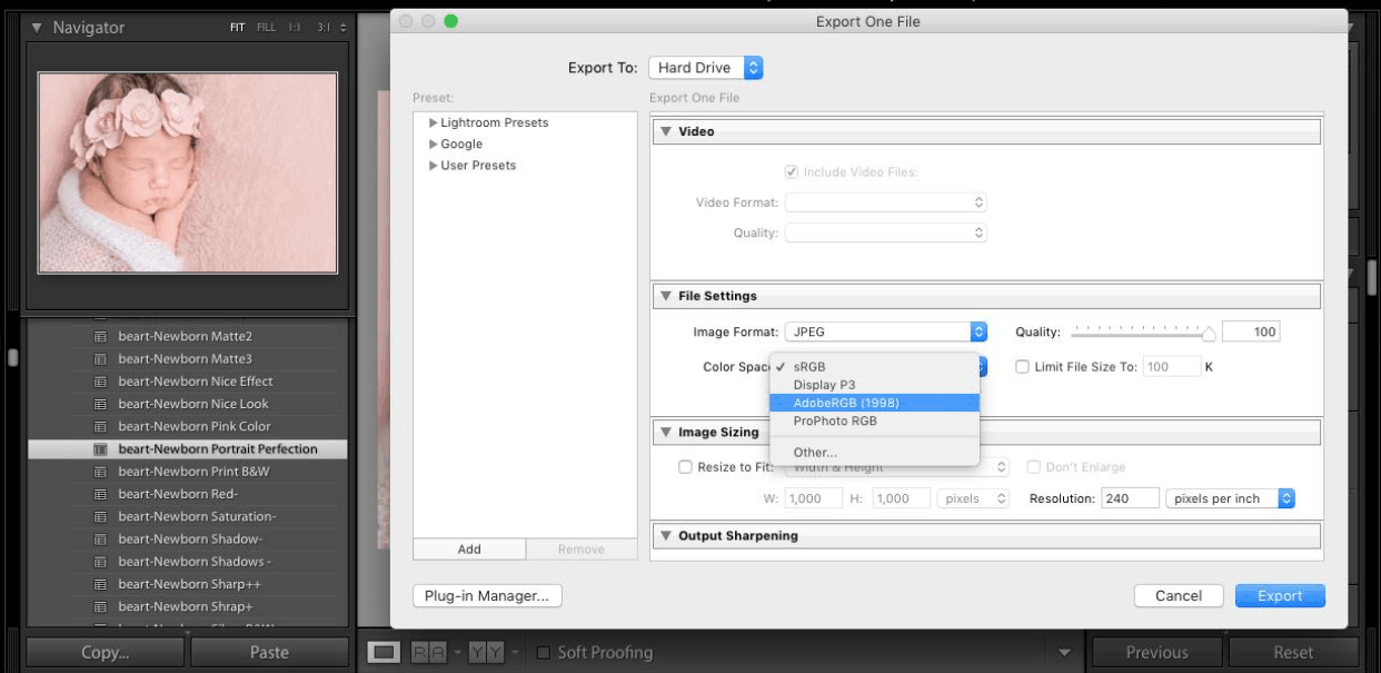
Meanwhile, the color space of the output file depends entirely on the output settings chosen by the user. Lightroom allows you to select the color space for the final file, with the three most common options being sRGB, Adobe RGB, and ProPhoto RGB. sRGB has a narrower color gamut but is suitable for most web and screen use, Adobe RGB has a wider color gamut and is often useful for some printing processes, and ProPhoto RGB boasts the widest color gamut, helping to retain more color information from the original image. The key point to remember is that Lightroom handles most of the color management automatically in the background, and the most important user choice usually only comes up at the output stage. Choosing the right color space will help the final image be closer to the desired result where it is used.
3. Common Color Spaces in Photography
Color space defines the range of colors a photograph can contain, and also affects how colors are displayed on a screen as well as in print. Lightroom supports multiple color spaces for different parts of the workflow, with the three most common being sRGB, Adobe RGB, and ProPhoto RGB.
3.1 sRGB
sRGB is the most popular color space for photos shared online. It works well across most screens, browsers, and devices, making it ideal for photos used on websites or social media. Although the sRGB color gamut is smaller than Adobe RGB and ProPhoto RGB, it remains a good choice for most everyday use and helps maintain color consistency across various devices.
3.2 Adobe RGB
Adobe RGB boasts a wider color gamut than sRGB, allowing for the storage of more colors, especially in the green and blue ranges. This color space is commonly used in photo printing and workflows requiring a wider color range. Compared to sRGB, Adobe RGB can provide more color information for specialized needs.
3.3 ProPhoto RGB
ProPhoto RGB boasts a very wide color gamut, wider than both sRGB and Adobe RGB. Therefore, this color space is very useful in editing processes that require a large color range, helping to retain more color information throughout the editing process. However, ProPhoto RGB is not as widely supported for display purposes as sRGB, so the final color space needs to be chosen to suit how the image will be used.
4. Color Space in Lightroom Compared to Color Space in Export Images
Lightroom uses color spaces at different points throughout the entire editing and export process. The color spaces used during editing and those used during export serve two completely different purposes. Color spaces in Lightroom influence how colors are handled during editing, helping Lightroom manage the colors the user sees and adjusts within the workspace.
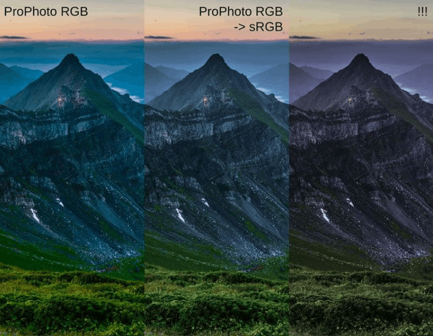
Meanwhile, the color space applied during image export is only used at the time the final image file is saved. This setting determines the color space assigned to the output file. These two settings should not be confused, as one relates to the editing process, while the other relates to the final file. Understanding this difference will help users choose the more appropriate setting for their workflow.
Setting the output settings is most important in the final stage of the editing process. Choices at this step can affect how the colors in the saved file display on other software or devices. Simply put, Lightroom's color space is part of the editing process, while the color space when exporting is part of the final result.
5. Color Management Tips in Lightroom
Color settings can affect the appearance of a photograph throughout the editing process and after export. Lightroom offers many tools to help manage color throughout the workflow. First, users should check the color space being used, which helps keep color changes more consistent. Pay attention to how the image displays on the screen being used, as the image may look different on a different screen or after export. Checking the image at various stages of the workflow, while maintaining consistent color settings from editing to export, will help the colors appear closer to what is displayed in Lightroom and avoid significant color shifts later on.
Setting up the output image is equally important. Users should check the color space before saving the final file and choose settings appropriate for the image's intended use, as web images may require different settings than those intended for printing. Small color changes are sometimes difficult to detect during editing, so carefully check skin tones, vibrant colors, shadows, and other important parts of the image. This careful checking will help detect color changes before finalizing the editing process.
6. Conclusion
Choosing the right color space helps maintain color consistency in your photos from editing to export. Lightroom automatically handles much of the color management throughout the editing process, so users can primarily focus on the color space selected for the final file. sRGB is recommended for most web-related needs, social media, and display devices. Adobe RGB is suitable for processes requiring a wider color gamut, including some printing processes. Meanwhile, ProPhoto RGB is ideal for editing processes that require a very wide color gamut and need to retain as much color information as possible.
Before exporting a file, users should clearly define where the image will be used and select the appropriate color space for export. Simultaneously, reviewing the file after export is also essential, including observing color changes, shifts in skin tone, and other areas where color plays a crucial role. A clear color management process will help the image maintain its appearance close to the desired result. Carefully monitoring color settings throughout the editing and export process is a simple habit that can help prevent color issues in the final image.
7. Frequently Asked Questions
What color space is best suited for images used on the web?
sRGB is a suitable choice for most web and social media use, as this color space is widely supported across various screens, browsers, and devices.
Is Adobe RGB better than sRGB?
Adobe RGB has a wider color gamut than sRGB and can be useful for certain printing processes as well as jobs that require more color information. Which is better depends on the specific purpose of the image.
What is ProPhoto RGB used for?
ProPhoto RGB has a very wide color gamut, making it suitable for editing processes that need to retain as much color information as possible throughout the editing process.
What is the difference between the color space in Lightroom and the color space used when exporting an image?
Lightroom's color space is part of the editing process, while the color space when exporting an image is assigned to the final saved file. These two settings serve different purposes in the workflow.
Will choosing the wrong color space alter the colors of the image?
Yes. An inappropriate color space for the workflow can cause color distortion, making the image look different in different software, on different devices, or after exporting the file.
Which color space should be used when printing photos?
This choice depends on the printer or printing service the user is using. It's advisable to check the color requirements of that service provider before exporting the image file.
Does color space affect image quality?
Yes. Color space affects the range of colors an image file can contain, and also impacts how colors are displayed on different software and devices.
Should you double-check images after exporting them?
Yes. It's advisable to check the exported image before sharing or printing, carefully observing the colors, contrast, skin tones, vibrant colors, and shadows to detect any unwanted changes promptly.





















VIP Products








Best Selling Products
Adobe Photoshop Copyright - Full App
120 USD
Windows 10 & 11 Pro Key
36 USD
Copyright Adobe Lightroom Account
59 USD
ChatGPT Plus Account (GPT-4)
16 USD
Capcut Pro 1 Year
39 USD
Plugin Retouch4me
69 USD
MidJourney Account
29 USD
Genuine Adobe Illustrator account
99 USD
Adobe Premiere Pro Account
99 USD
Upgrade genuine Capture One account
120 USD
Genuine Cheap Canva Pro
39 USD
Upgrade Duolingo Super
29 USD
Autodesk All App Account Copyright
120 USD
Freepik Premium Account
59 USD
Upgrade Genuine Office 365
49 USD