Best Selling Products

Autodesk All App Account Copyright
120 USD

Upgrade genuine Capture One account
120 USD

Plugin Retouch4me
69 USD

Windows 10 & 11 Pro Key
36 USD

Adobe Premiere Pro Account
99 USD

Upgrade Genuine Office 365
49 USD

Capcut Pro 1 Year
39 USD

Copyright Adobe Lightroom Account
59 USD

Genuine Cheap Canva Pro
39 USD

Genuine Adobe Illustrator account
99 USD

ChatGPT Plus Account (GPT-4)
16 USD

MidJourney Account
29 USD

Freepik Premium Account
59 USD

Adobe Photoshop Copyright - Full App
120 USD

Upgrade Duolingo Super
29 USD
9 Tips for Choosing Fonts to Create Unique Designs
Nội dung
- 1. Determine your brand personality to choose the right font.
- 2. Prioritize readability when choosing fonts.
- 3. Carefully evaluate the technical factors when choosing a font.
- 4. Try out the fonts before deciding to buy.
- 5. Consider licensing and budget when choosing fonts.
- 6. Keep the number of fonts to a minimum to create harmony.
- 7. Do thorough research before choosing a font.
- 8. Consider the display medium when choosing fonts.
- 9. Keep it simple.
- 10. Conclusion
In graphic design, fonts are not only a means of conveying a message but also determine the aesthetics and appeal of a product.
1. Determine your brand personality to choose the right font.
Choosing a font isn't just a matter of aesthetics; it reflects the personality and core values of a brand. A suitable font can make a brand more recognizable, help build a lasting impression in the minds of customers, and reinforce the image the brand wants to convey. When defining a brand's personality, you first need to understand its mission, vision, and values. For example, a high-end brand might choose an elegant serif font, while a youthful brand might prefer a modern sans-serif font.
Darren Richardson, co-founder and creative director at Gardiner Richardson, emphasizes that typography acts as a “memory structure” in building brand identity. He compares typography to a brand's unique typeface, a visual element that consistently conveys its identity. However, finding a balance between uniqueness and practical factors such as cost or long-term usability is a significant challenge.
If you're having trouble choosing a font, you should look to brands with similar orientations to see what typefaces they use. This research isn't about copying, but about gaining insight into how other brands utilize fonts. Tools like Fonts in Use can help you see what typefaces are being used in practice and assess how they perform in different contexts. Alexandra Lunn, a brand manager, advises that fonts should be closely tied to the brand's personality to convey the message clearly and consistently.
Finally, remember that font choices need to support the creation of a strong and distinctive brand image. Each font selection should contribute to creating a positive impression, helping the brand stand out in a competitive market.
2. Prioritize readability when choosing fonts.
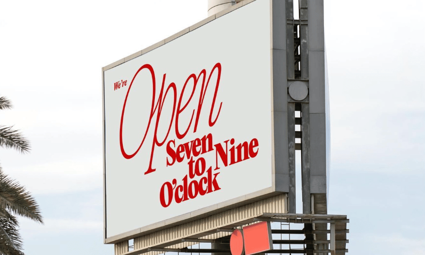
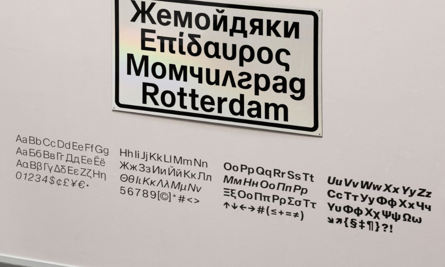
Readability is the most important factor when choosing a font, especially in graphic design and communications. A font can be very beautiful, but if it's difficult to read, it will hinder the communication of the message. Grace Ellins, a senior graphic designer, emphasizes that an ideal font should not only be beautiful but also support a wide range of languages. In particular, factors such as letter height and typeface variety will help improve readability at small sizes.
The importance of readability varies depending on the application. For web projects, fonts need to ensure clarity and easy information hierarchy. Product designer Stan Potra also recommends that while fonts used for decorative purposes can be more creative, for core content, simplicity and readability should be the top priority.
An important principle is to choose a font with an optimal thickness to avoid visual heaviness. In particular, the font should also be compatible across various devices and browsers. This will help ensure that the content remains consistent and easily accessible to readers. When users feel comfortable and at ease while reading, the message will be more effectively conveyed.
Finally, consider the user experience. A good font not only makes the content more accessible but also enhances the quality of message delivery, creating a pleasant reading experience.
3. Carefully evaluate the technical factors when choosing a font.
When choosing fonts, designers need to consider not only aesthetics and readability but also many other technical aspects. A typeface can be beautiful but lack the necessary technical elements, potentially leading to design limitations. Sarah Cowan, a typeface designer, notes that many clients have complete brand identities, but their fonts lack crucial elements such as italics or small uppercase.
The lack of details such as column numbers or superscript/subscript numbers can affect the overall quality of a product. This is especially crucial for brands that need to present numerical data or use text in various formats.
In addition, character spacing (kerning), line spacing (leading), and font spacing (tracking) are also crucial in creating a balanced layout. Design expert Khurram Shahzad emphasizes that paying attention to these elements will help create uniform and aesthetically pleasing text.
For web design, font loading speed and consistent display across devices also need to be considered. This is to avoid display inaccuracies that affect user experience. In summary, carefully evaluating technical factors when choosing fonts not only enhances aesthetics but also ensures that your design works effectively across different platforms.
4. Try out the fonts before deciding to buy.
Choosing a font isn't simply about looking at the typeface and judging its style; it also requires practical experience to ensure suitability. Many typefaces may look perfect at first glance, but when applied to real-world projects, they can reveal limitations such as uneven character spacing or a lack of necessary variations. Daan Hornstra, co-founder and lead designer at TIN, emphasizes that "try before you buy" is crucial to ensure you make the right choice.
Before deciding to invest in a typeface, you should download trial versions from reputable providers. Use design tools like Figma or Illustrator to create visual overviews, test the typeface in various sizes and weights, and place them in real-world layouts. This not only helps you assess how well the font suits your project but also allows you to compare multiple options before making a final decision.
Beyond visual inspection, consider how the font interacts with other elements in the design, such as color and imagery. A font might be beautiful, but if it doesn't harmonize with the rest of the design, it can create a sense of inconsistency. Therefore, practical testing will help you avoid costly mistakes and ensure that the font you choose is not only aesthetically pleasing but also works effectively within your design context.
5. Consider licensing and budget when choosing fonts.
Choosing a font isn't just about finding an aesthetically pleasing style; it also requires considering financial factors and licensing requirements. This is a crucial but often overlooked aspect, leading to unexpected costs. Many designers have found themselves having to adjust or abandon a design proposal simply because licensing fees exceeded their initial budget.
Leigh Whipday, co-founder of ToyFight, shared an experience: “We introduced a typeface the client loved, only to later discover the licensing cost was $20,000 just because their website had a million monthly visits.” To avoid similar problems, you need a clear strategy for font selection.
First, carefully check the license before using it in commercial projects. Many fonts are advertised as “free” but are actually limited to personal use only. Second, determine your budget from the outset. Cost assessment shouldn't just focus on the initial purchase price but also consider potential future expenses.
If licensing fees are too high, consider alternative options. One option is to design a custom typeface, as Leigh Whipday and his team did. Finally, clearly communicate font costs to clients from the outset to avoid financial awkwardness during project implementation. This transparency not only builds trust but also facilitates collaboration.
6. Keep the number of fonts to a minimum to create harmony.
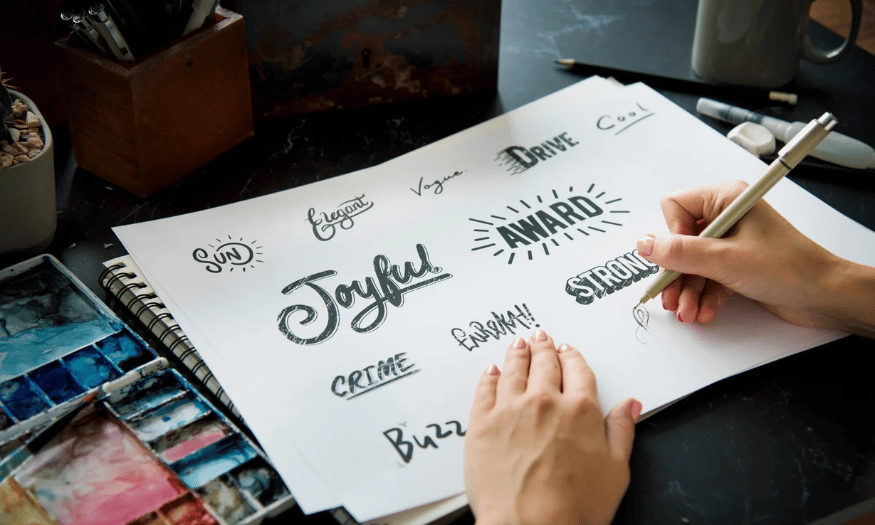
In design, combining multiple fonts can create visual interest, but if not carefully controlled, it can lead to a cluttered and inconsistent layout. A well-structured typography system will make the design more coherent, professional, and accessible. Alexandra recommends limiting the number of fonts to two to three complementary styles.
Using bold fonts for headlines creates emphasis, while lighter typefaces make the main content easier to read. This not only maintains balance in the design but also helps define the brand's style. This approach is also adopted by many experienced designers, such as design director Mason Brownlow, who is impressed by the method of renowned graphic designer Aaron Draplin, who adheres to the philosophy of using certain typefaces.
While a minimalist approach may not suit everyone, it emphasizes the value of unity in the font system. Having too many typefaces without clear direction can distract the message and reduce viewer focus. Keeping the number of fonts to a minimum creates a harmonious, accessible design that makes a stronger impression on the viewer.
7. Do thorough research before choosing a font.
When choosing fonts, thorough research is an essential part of the design process. Olly Sussams, design director, emphasizes that each typeface choice should be based on sound reasoning, rather than simply picking a readily available font without consideration. Research not only broadens design thinking but also ensures that the font you choose aligns with the overall concept and brand strategy.
One crucial step is to follow trends, but it's also important to avoid blindly following what's already become too popular. Olly advises observing what's trending and considering taking a different approach. Instead of choosing overly common typefaces, explore archives to find unique styles that can inspire you. Independent font design studios often offer creations that are different from popular typesets, and researching them will help you find unique options.
Beyond trends, understanding the historical context of a typeface is crucial. Each typeface originated in a specific era, reflecting the design needs of that time. Understanding the history of typefaces not only helps you make informed decisions but also creates a stronger connection with your target audience. Ryan Grandmaison, a motion graphic designer, encourages learning about typeface history to narrow down your choices and make more informed decisions. Fonts are not just visual elements; they are an important part of the brand story.
8. Consider the display medium when choosing fonts.
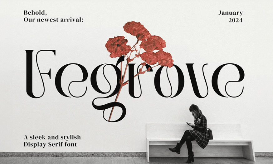
When choosing a font, you need to carefully consider the environment in which it will be used. A typeface might look great in print but lose its readability on a screen, especially on small devices like mobile phones. Khurram Shahzad once made the mistake of choosing a handwritten typeface for an advertising campaign. Although it looked perfect in print, when deployed on a mobile platform, the typeface became difficult to read, reducing the effectiveness of the message.
Each display medium has its own typography requirements. For print, fonts can have intricate details and varying stroke thickness while maintaining clarity. However, on digital screens, especially on websites or applications, fonts need good contrast and clear characters. Testing fonts in real-world scenarios such as phone screens, tablets, or on various types of paper will help you more accurately assess their suitability.
Testing across multiple platforms before deciding to use a font will avoid errors that could affect user experience and content delivery effectiveness. Ensuring that the font is not only aesthetically pleasing but also performs well under all conditions will help you create impressive and effective designs.
9. Keep it simple.
When choosing fonts, simplicity is often key to achieving an effective design. A typeface might make a strong impression at the moment, but if it doesn't suit the brand or its intended purpose, it will quickly become outdated. Katie Ehrlich, a graphic designer and photographer, once encountered this situation when she proposed a variable typeface for a client's brand guide. Despite its creative potential, the client rejected it because they felt it wasn't necessary.
Simplicity doesn't mean a lack of sophistication in design. Instead, it's about optimizing typography to ensure readability and brand recognition. A stable, versatile typeface is always more valuable than complex choices made solely for aesthetic reasons. When choosing a font, ask yourself if it's truly necessary and if it effectively meets the project's needs.
Keeping the number of fonts to a minimum helps create a harmonious and accessible design. A well-structured font system will make the message clearer, thereby creating a strong and lasting impression on the target audience. Avoiding complex typefaces and focusing on simplicity will help you achieve higher quality and more effective designs.
10. Conclusion
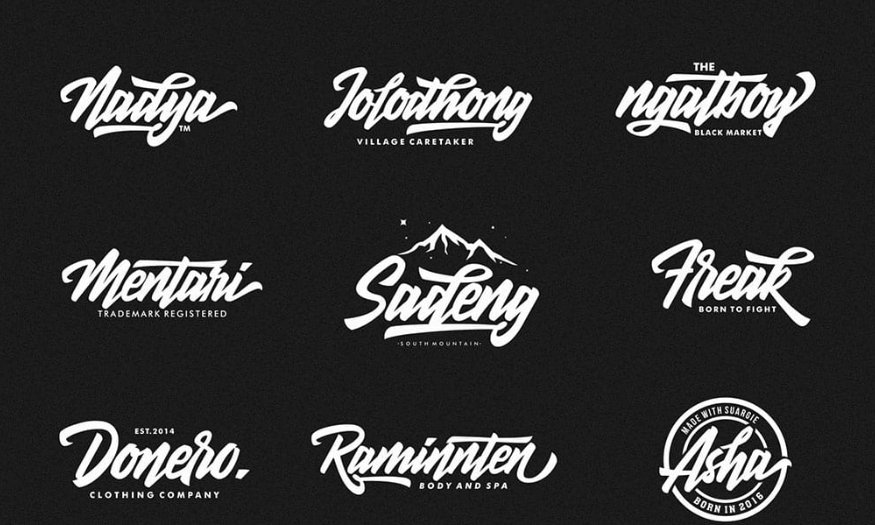
Choosing the right font is a crucial step in the design process, significantly impacting how viewers perceive and receive the message. By applying the tips we've shared, you'll be able to create unique, relevant, and more engaging designs. Always remember that fonts are not just a aesthetic choice but an integral part of building brand identity. We wish you success in creating impressive designs!





















VIP Products








Best Selling Products
Autodesk All App Account Copyright
120 USD
Upgrade genuine Capture One account
120 USD
Plugin Retouch4me
69 USD
Windows 10 & 11 Pro Key
36 USD
Adobe Premiere Pro Account
99 USD
Upgrade Genuine Office 365
49 USD
Capcut Pro 1 Year
39 USD
Copyright Adobe Lightroom Account
59 USD
Genuine Cheap Canva Pro
39 USD
Genuine Adobe Illustrator account
99 USD
ChatGPT Plus Account (GPT-4)
16 USD
MidJourney Account
29 USD
Freepik Premium Account
59 USD
Adobe Photoshop Copyright - Full App
120 USD
Upgrade Duolingo Super
29 USD