Best Selling Products

MidJourney Account
29 USD

Genuine Adobe Illustrator account
99 USD

Upgrade Genuine Office 365
49 USD

Capcut Pro 1 Year
39 USD

Adobe Premiere Pro Account
99 USD

ChatGPT Plus Account (GPT-4)
16 USD

Genuine Cheap Canva Pro
39 USD

Upgrade Duolingo Super
29 USD

Upgrade genuine Capture One account
120 USD

Freepik Premium Account
59 USD

Autodesk All App Account Copyright
120 USD

Windows 10 & 11 Pro Key
36 USD

Plugin Retouch4me
69 USD

Adobe Photoshop Copyright - Full App
120 USD

Copyright Adobe Lightroom Account
59 USD
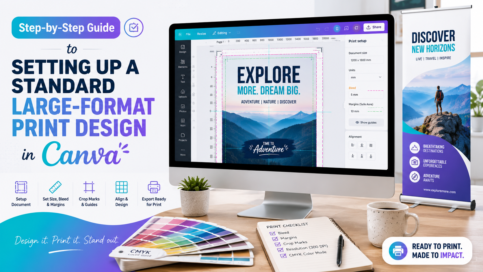
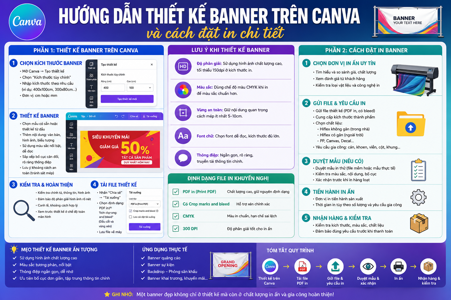
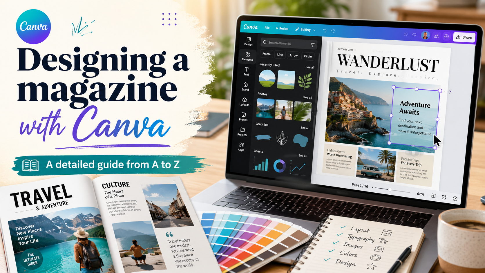
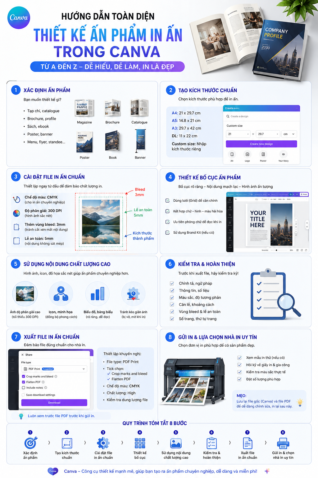
A comprehensive guide to designing print-ready publications in Canva, from A to Z.
Nội dung
Designing publications in Canva not only needs to be visually appealing but also properly prepared to ensure quality when printed.
1. Set up the correct documentation.
Before starting the design process, the first step is to determine the final product dimensions . This is a crucial parameter because the entire layout, images, text, and graphic elements are built upon these dimensions.
Depending on the intended use, publications can be A4, A5, DL, business cards, flyers, posters, or many other custom sizes. In Canva, users can search for suitable designs or create a document with a specific size.
For example, if designing an A4 document, determine from the outset that the final product needs to be A4 size, rather than designing it at any size and then changing it later. Changing the size at the last stage can disrupt the layout, misalign text, or render images irrelevant.
After creating the document, you need to enable the bleed area , also known as the cropping area. In Canva, this is done by following this path: File → Show print bleed
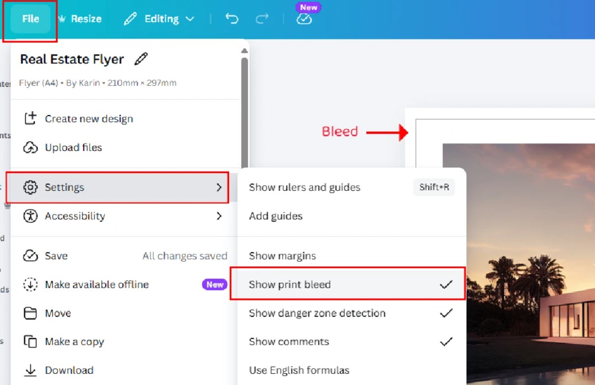
When this option is enabled, Canva will display boundary lines related to the print and crop areas. Designers need to use these lines to control important elements in the layout.
A simple rule is to avoid placing text, logos, or important information right at the edge of the design . Important elements should be kept at least 5 mm from the edge to reduce the risk of being cut during processing.
Meanwhile, backgrounds or images that need to cover the entire page should be stretched to the bleed area. This helps minimize the risk of white borders appearing when the product is cut.
2. Use high-quality images.
Image quality directly impacts the quality of the printed product. A picture that looks quite clear on a computer screen may not necessarily be of sufficient quality when transferred to paper.
For print design, 300 DPI is generally considered ideal for images of standard print sizes. High-resolution images retain more detail and minimize blurring or pixelation.
Conversely, if you use a small image and then enlarge it to overlay it on a poster or banner, the image may become blurry, pixelated, and lose detail. Canva allows users to easily stretch images, but that doesn't necessarily mean the image quality is improved accordingly.
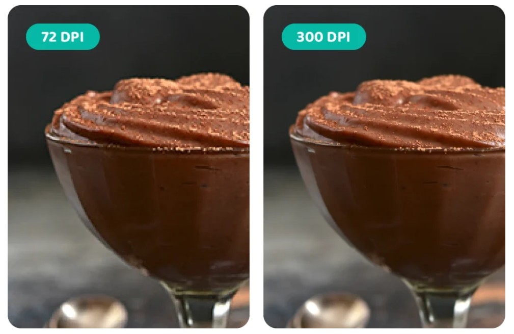
A simple rule of thumb is: if an image is blurry when viewed on a screen, the defect will usually be even more noticeable when printed .
Especially for publications containing product images, portraits, logos, or highly detailed graphics, it's essential to use high-quality images from the outset. Don't wait until the design is complete to discover that the images lack sufficient resolution.
Additionally, check that the image is sized correctly for actual printing. An image might look very sharp when enlarged on a screen but produce different results when reduced in size or printed at a larger size.
3. Understanding color differences
One common problem when designing printed materials is that the colors on the screen don't exactly match the colors after printing .
Phone, computer, and tablet screens primarily use the RGB color system, while the printing process uses ink based on the CMYK color system. Due to the different color creation mechanisms, the colors displayed on the screen may change when transferred to a printing environment.
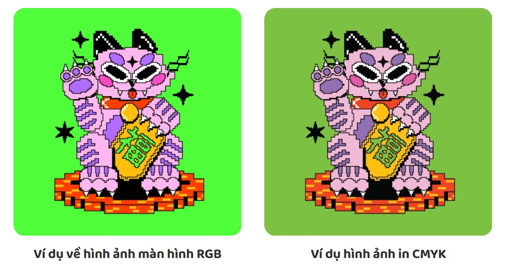
Some colors are particularly prone to distortion. Bright blues, greens, neon colors, or highly saturated colors may look striking on a screen but lose some of their vibrancy when displayed on paper.
Darker color areas also need attention. A color that looks just right on a screen can sometimes appear darker when printed, especially when the design uses many bold colors.
This doesn't mean that designs in Canva can't achieve beautiful colors. Designers just need to understand that the colors on the screen are a preview, not always an exact replica of the printed product .
If color is particularly important, such as in brand identity design, packaging, or promotional materials requiring consistent brand colors, it's advisable to discuss this with the printing company before mass production. Checking the file and agreeing on color requirements from the outset will help minimize unwanted discrepancies.
4. Use effects in a controlled manner.
Canva offers a wide range of visual effects to help designs stand out. Users can add drop shadows, glow effects, transparency, soft color transitions, or blurring effects.
These effects are particularly effective when designing for screens. However, when the document is prepared for printing, they may be processed differently than how users see them on Canva.
During the file export and processing by the printing system, some effects may be converted into images or flattened. Therefore, the smooth effects displayed on the screen may sometimes appear slightly soft, heavy, or not entirely the same as the original design.
A common example is Drop Shadow , or the shadow effect.
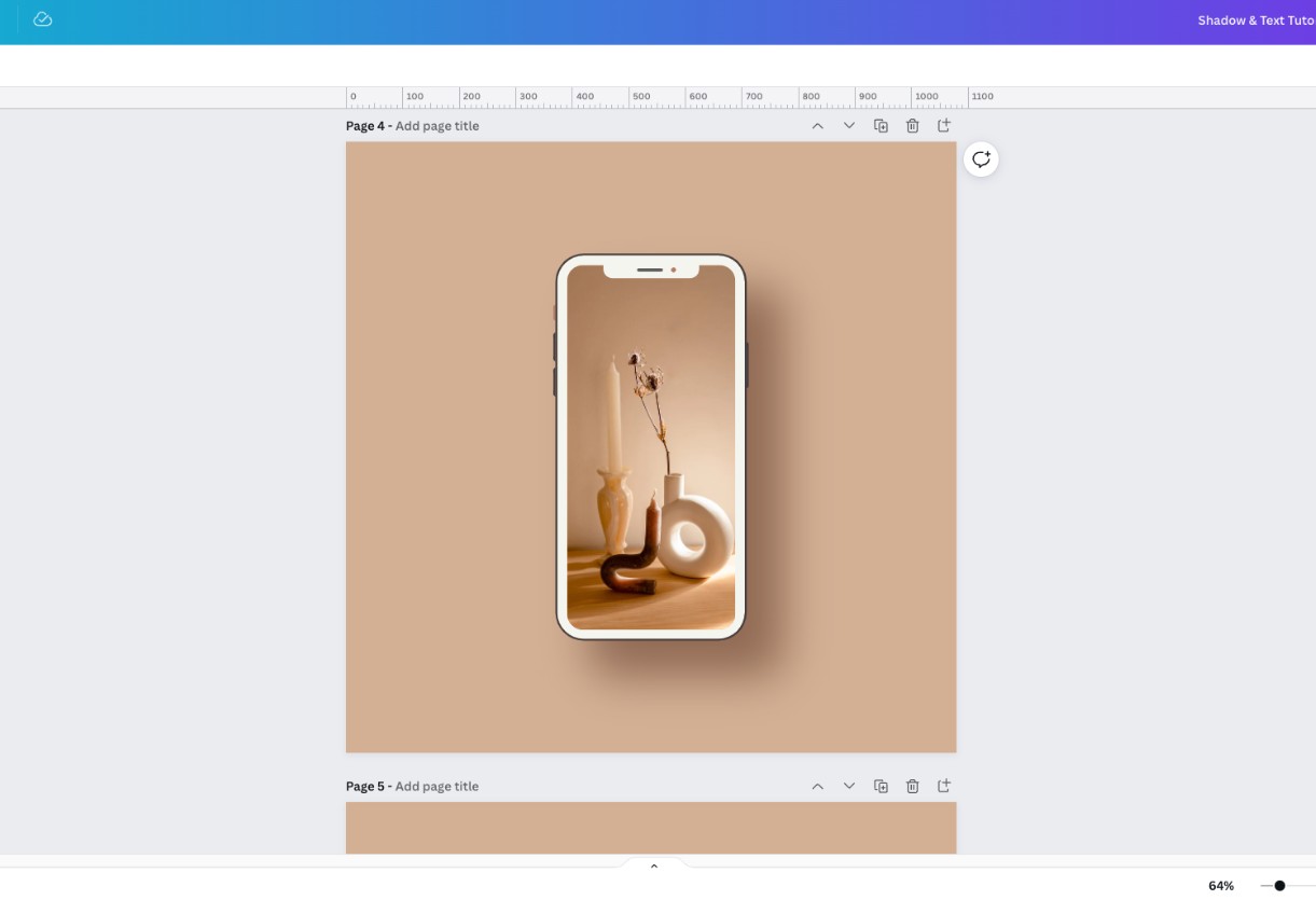
In Canva, shadows aren't always treated as a true vector effect. When exporting the file, the shadow area might become a flattened image region. When printed, this sometimes makes the shadow appear less smooth or slightly pixelated.
Some potential issues include slightly blurred edges of the effect, darker shadows than expected, the appearance of borders or rectangular areas around the effect, and some minor color variations.
To minimize risk, effects should be used sparingly. Avoid creating shadows that are too large or too soft, especially with important elements such as logos, headlines, and product images.
Once completed, check the design at the actual print size instead of just enlarged on the screen. If preparing for large-scale printing, it's advisable to ask the printing company to review the file before production begins.
5. Leave a safe distance when cutting.
After printing, the paper sheets are usually cut to achieve the desired finished size. This process may have a small margin of error, which is normal in printing production.
Therefore, critical components should not be placed directly on the cutting line.
For backgrounds, colors, or images that need to cover the entire page, drag them into the bleed area . When the paper is cut, the excess in the bleed area will be removed, resulting in a clean, white-borderless finished product.
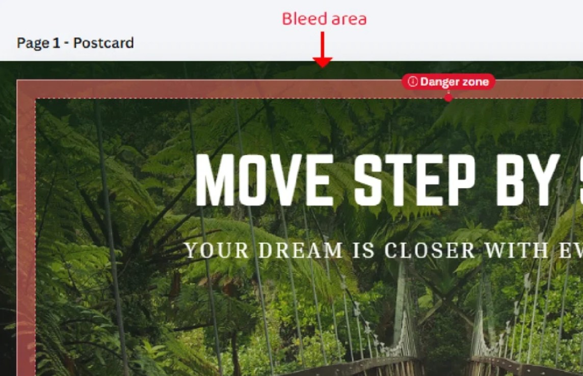
Conversely, text, logos, phone numbers, website addresses, or other important information should be placed approximately 3–5 mm from the edge , or within the safe zone required by the design template.
Some Canva print templates may display a “danger zone ,” which is an area where users should avoid placing text or important elements.
You shouldn't position a line of text perfectly on the cutting line just because it looks balanced on the screen. Even a small shift in the paper during cutting can cause the text to be too close to the edge or cut into the paper.
Clearly distinguishing between bleed areas, cut lines, and safe zones is one of the key factors in achieving more professional print results with Canva designs.
6. Export the file in the correct format.
After completing the design and checking the entire layout, the next step is to export the file for printing.
For designs intended for print, the recommended option is: PDF Print
During the file export process, you should enable the Crop Marks and Bleed options if the printing company requires them or if the printing process uses these parameters.
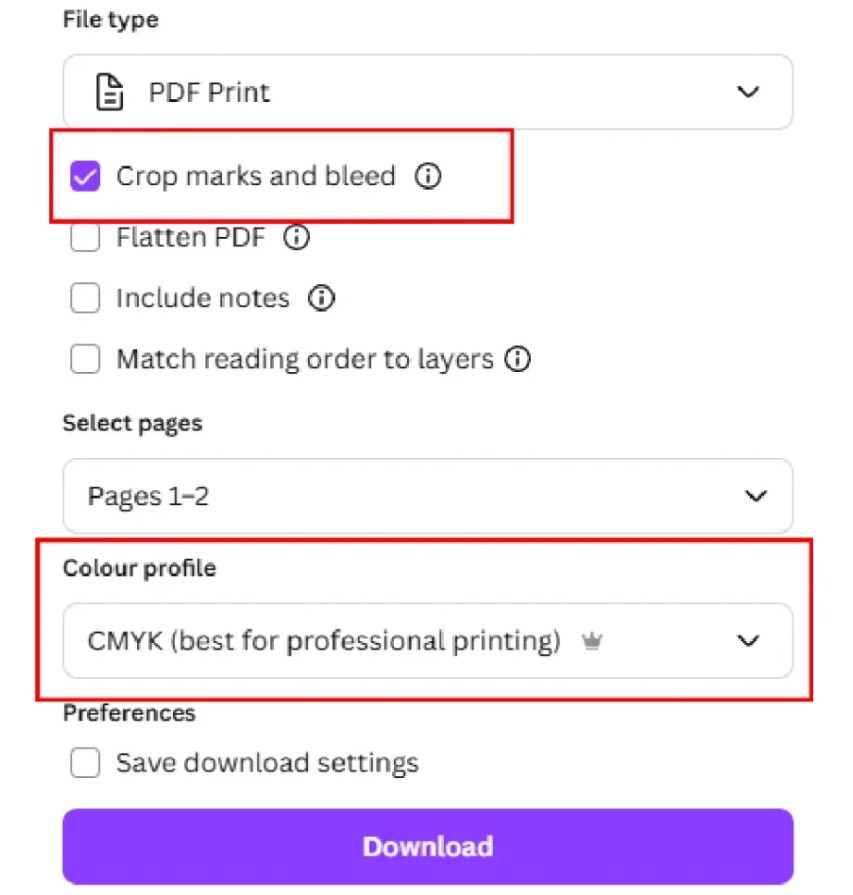
Exporting designs as PDF prints helps preserve the layout and provides a more suitable file for the printing process.
Conversely, you shouldn't automatically export print files as JPG or PNG unless specifically requested by the printing company. JPG and PNG are suitable for many digital purposes, but they aren't always the optimal choice for every printing process.
In particular, you shouldn't just send screenshots of the design. Screenshots can reduce quality and may not contain all the necessary information for the printing process.
Before submitting, double-check the PDF export options, bleed areas, and cut marks to ensure the file meets the production unit's requirements.
7. Final check
A quick check before sending a file can save a significant amount of time and reduce the risk of having to reprint.
Review the entire design and ask yourself these crucial questions: Are the elements aligned correctly? Is the image sharp enough? Are any letters or logos too close to the edges? Does the background cover the bleed area? Is the effect too strong? Do the colors meet your printing expectations?
At the same time, check for spelling errors, phone numbers, addresses, websites, product prices, and other important information. These may seem like minor mistakes, but they can cause the entire batch of products to need corrections or reprinting.
If possible, view the file at a size close to the final product size. Checking in this way helps detect problems that a magnified view on the screen might hide.
A beautiful design on screen doesn't necessarily make a good print file. Proper preparation from the start will help minimize white borders, blurry images, cropped text, unwanted effects, and unnecessary color inaccuracies.





















VIP Products








Best Selling Products
MidJourney Account
29 USD
Genuine Adobe Illustrator account
99 USD
Upgrade Genuine Office 365
49 USD
Capcut Pro 1 Year
39 USD
Adobe Premiere Pro Account
99 USD
ChatGPT Plus Account (GPT-4)
16 USD
Genuine Cheap Canva Pro
39 USD
Upgrade Duolingo Super
29 USD
Upgrade genuine Capture One account
120 USD
Freepik Premium Account
59 USD
Autodesk All App Account Copyright
120 USD
Windows 10 & 11 Pro Key
36 USD
Plugin Retouch4me
69 USD
Adobe Photoshop Copyright - Full App
120 USD
Copyright Adobe Lightroom Account
59 USD