Best Selling Products

Plugin Retouch4me
69 USD

Copyright Adobe Lightroom Account
59 USD

Adobe Premiere Pro Account
99 USD

Upgrade Genuine Office 365
49 USD

Autodesk All App Account Copyright
120 USD

Genuine Adobe Illustrator account
99 USD

Genuine Cheap Canva Pro
39 USD

Freepik Premium Account
59 USD

Capcut Pro 1 Year
39 USD

Upgrade genuine Capture One account
120 USD

Windows 10 & 11 Pro Key
36 USD

Upgrade Duolingo Super
29 USD

Adobe Photoshop Copyright - Full App
120 USD

MidJourney Account
29 USD

ChatGPT Plus Account (GPT-4)
16 USD
Beautiful color editing apps: Secrets to choosing the right app, achieving stylish color grading, and keeping photos natural.
Nội dung
- 1. What are good color editing apps and why should you use them?
- 1.1. Color correction is the "finishing step" that determines the emotional impact of the photograph.
- 1.2. Key benefits of choosing the right app for beautiful color editing.
- 2. Criteria for choosing a color editing app that suits your needs
- 2.1. The presets have a good "style" but are still easy to control.
- 2.2. The ability to "save the image" when shooting conditions are not ideal.
- 2.3. Export images while maintaining quality and color without "smudging".
- 3. Popular color styles and how to choose them quickly
- 3.1. Light tones: clean, easy to use, suitable for many types of content.
- 3.2. Film tone: possesses depth, emotion, and artistic quality.
- 3.3. Warm tones: friendly, suitable for food and sunlight.
- 3.4. Cool tones: modern, elegant, suitable for urban and technological environments.
- 4. Quick color correction process in 5 to 7 minutes
- 4.1. Step 1: Adjust brightness first, then color.
- 4.2. Step 2: Whiten the skin to prevent dullness.
- 4.3. Step 3: Select a suitable preset and make minor adjustments.
- 4.4. Step 4: Adjust HSL to give the image a "stylish" look.
- 4.5. Step 5: Increase sharpness and reduce noise to a sufficient level.
- 5. Common mistakes that make color-corrected photos look "old" or artificial.
- 5.1. Over-saturation results in an orange hue and harsh background.
- 5.2. Overexposure causes the image to lose depth.
- 5.3. Applying a preset that doesn't suit the lighting context.
- 6. Suggestions on how to build a personal "color system" for consistent photos.
- 6.1. Choose one main tone and two secondary tones.
- 6.2. Save the preset separately after tweaking.
- 7. Introduction to http://appvip.ai/appvip.ai
- 8. Color grading checklist for beautiful photos ready to post.
- 9. Conclusion
Discover great color editing apps, learn how to choose presets to suit your style, get tips on adjusting skin tone for a natural look, and discover quick and easy post-processing steps for social media.
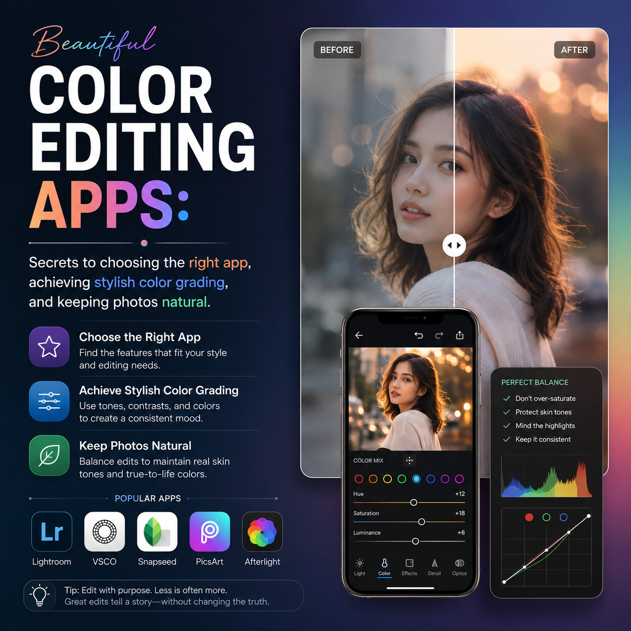
1. What are good color editing apps and why should you use them?
Color correction apps are software or digital tools that allow users to adjust and optimize the colors of images to achieve the desired visual effect. These apps are often equipped with many advanced features such as white balance, brightness and contrast adjustment, and a variety of color filters.
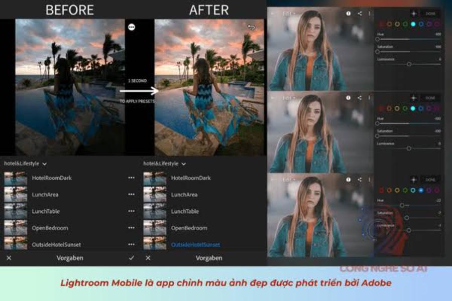
1.1. Color correction is the "finishing step" that determines the emotional impact of the photograph.
A good color correction app is an application that helps adjust elements such as lighting, contrast, saturation, color temperature, dominant tones, and detail in light and dark areas. Unlike simply applying filters, proper color correction aims to create a harmonious overall effect: the subject stands out, skin tones aren't gray, the background isn't tinted, and the image retains its natural look.
When colors are pleasing to the eye, viewers tend to linger longer. That's why many personal accounts, online shops, and creators focus on color correction to make their photos look consistent and instantly recognizable as having a unique style.
1.2. Key benefits of choosing the right app for beautiful color editing.
A good app should not only have beautiful presets, but also give you detailed control. The obvious benefits include:
-
Quickly improve image quality : adjust brightness, white balance, and reduce yellow or blue tints in just a few steps.
-
Create a consistent style : your Instagram feed, sales photos, and personal lookbook should look neat and have a distinct color scheme.
-
Optimization for multiple purposes : portraits, food, landscapes, and products all require different editing techniques.
-
Save time : use a preset as a background, adjust a few parameters, and that's enough.
Using color correction apps not only improves image quality but also showcases creativity and personalization in each photo. Especially in the context of rapidly developing social media, visually appealing and impressive images can attract a large audience, thereby enhancing the brand value of individuals or businesses. Furthermore, using these apps saves time and effort compared to manual editing, while delivering professional and consistent results.
2. Criteria for choosing a color editing app that suits your needs
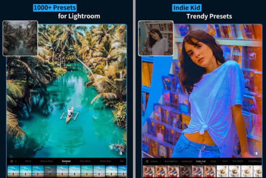
2.1. The presets have a good "style" but are still easy to control.
Presets help you quickly adjust the tone, but good presets should allow you to fine-tune details so your photos don't look formulaic. Prioritize apps that have:
-
Preset tones: film, bright, vintage, cool, warm, Korean, travel
-
Basic adjustment sliders: Exposure, Contrast, Highlights, Shadows, Temperature, Tint
-
Advanced color tools: HSL or Color Mix to adjust each color individually.
Presets are just the starting point. Beautiful, long-lasting color comes from the ability to fine-tune and maintain a natural look.
2.2. The ability to "save the image" when shooting conditions are not ideal.
Real-life photos often suffer from issues such as backlighting, underexposure, indoor lighting burn-in, and dull skin tones. A good color correction app is essential:
-
Adjust highlights and shadows effectively.
-
Reduce noise or increase sharpness moderately.
-
Smart white balance tool
-
Adjust the selective setting to process skin and background separately.
If you take many photos indoors, this is a very important criterion to prioritize.
2.3. Export images while maintaining quality and color without "smudging".
Many people find their edits look great in the app, but when they post them online, the colors are washed out or the sharpness is reduced. Choose an app that has:
-
Export high-resolution images
-
Clear quality options
-
Avoid excessive image compression.
-
Supports compatible formats for each platform.
A beautiful photo isn't just about looking good on the editing screen; it has to look good when you post it.
3. Popular color styles and how to choose them quickly
3.1. Light tones: clean, easy to use, suitable for many types of content.
This style provides moderate brightening, reduces color cast, keeps skin looking fresh, and foundation looking neat. Suitable for:
-
Everyday life photos, family photos, travel photos
-
Product photos should clearly show the product.
-
lifestyle content, reviews
Tip: Slightly increase Exposure, decrease Highlights to avoid overexposure, and boost Shadows just enough to give the image a "light" feel.
3.2. Film tone: possesses depth, emotion, and artistic quality.
The film's tone is typically less saturated, with a slight black fade, creating a nostalgic feel. Suitable for:
-
Street style, café, artistic portrait photography.
-
lookbook, concept photos
-
photograph taken in cloudy or soft light.
Tip: Reduce overall saturation, slightly increase contrast, and use HSL to control skin tone and prevent it from looking dull.
3.3. Warm tones: friendly, suitable for food and sunlight.
Warm tones create a cozy, visually appealing, and energetic atmosphere. Suitable for:
-
Photos of food, restaurants, and handicrafts.
-
photos taken in the sun, photos of the sea
-
photos of children or outdoor activities
Tip: Increase the temperature moderately, avoid adding too much yellow which can make the skin look orange and the foundation look patchy.
3.4. Cool tones: modern, elegant, suitable for urban and technological environments.
Cool, bluish tones create a sleek and modern feel. Suitable for:
-
architectural photos, street photos, skyline photos
-
technology product photos
-
minimalist content, fashion
Tip: Increase tint to avoid a bluish tint that makes the skin look gray, control blues in HSL so the sky doesn't look harsh.
4. Quick color correction process in 5 to 7 minutes
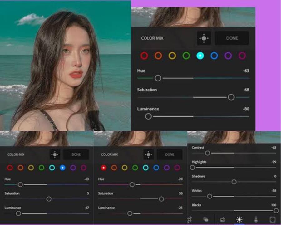
4.1. Step 1: Adjust brightness first, then color.
A common mistake is adjusting the color when the image is still dark or overexposed. The correct procedure is as follows:
-
Adjust the exposure to get the right brightness for the image.
-
Reduce highlights if the sky or forehead is too bright.
-
Raise Shadows to see details of hair, clothing, and background.
-
Adjust the contrast slightly to give the image a "standout" effect.
When the lighting is good, colors will come out easily and won't look artificial.
4.2. Step 2: Whiten the skin to prevent dullness.
Human skin is the easiest "measure" to reveal flaws. Adjust it:
-
Temperature: decrease if the image is too yellow, increase if the image is too cold.
-
Tint: increase slightly if the image has a bluish tint, decrease if it has a pinkish tint.
The goal is to achieve healthy-looking skin, not pale or overly orange.
4.3. Step 3: Select a suitable preset and make minor adjustments.
Choose a preset that closely matches the style you want. Then:
-
Reduce the preset intensity if the app allows (usually 60% to 85% is ideal for a natural look).
-
Check skin tone and foundation
-
Adjust the saturation or vibrancy to make the image look "fresh" but not harsh.
A good preset is one that requires minimal revisions.
4.4. Step 4: Adjust HSL to give the image a "stylish" look.
If the app has HSL/Color Mix, this is where the difference lies. Here are some quick adjustments:
-
Orange (skin tone): slightly reduces saturation, increases luminance for brighter skin.
-
Green (grass): Reduce Saturation to avoid glare, shift Hue to olive if you want a film effect.
-
Blue (sky): Reduce Luminance for a deeper sky, avoiding neon blue.
Even a few percent difference is enough to create a professional impression.
4.5. Step 5: Increase sharpness and reduce noise to a sufficient level.
Phones often produce noise when shooting in low light. If the app has Sharpen/Clarity/Noise Reduction:
-
Slightly increase Sharpen for better detail.
-
Avoid a high Clarity level as it can easily reveal rough skin.
-
Reduce noise just enough to make the image clean but not blurry.
A good photo is one that looks "smooth to the eye," not one that has been excessively retouched.
5. Common mistakes that make color-corrected photos look "old" or artificial.
5.1. Over-saturation results in an orange hue and harsh background.
Many presets boost saturation significantly, which looks appealing at first but can easily cause eye strain. When you see:
-
skin turns orange
-
unusually bright red lips
-
The blue background is too bright.
Reduce the overall saturation or reduce the saturation of the Orange/Red channel specifically in HSL.
5.2. Overexposure causes the image to lose depth.
Overexposure makes the subject appear "flat," lacking depth. Instead of constantly increasing the exposure, try this:
-
Reduce Highlights
-
Increase Shadows moderately
-
Slightly increased contrast
This method helps to brighten the image while still maintaining depth.
5.3. Applying a preset that doesn't suit the lighting context.
Applying a warm-light preset to indoor photos can result in flat colors. Applying a cool preset to photos taken under yellow light can result in gray tones. Presets should be grouped accordingly:
-
preset for sunny
-
preset for shade
-
indoor presets
-
night preset
Simply grouping the files will significantly speed up the editing process.
6. Suggestions on how to build a personal "color system" for consistent photos.
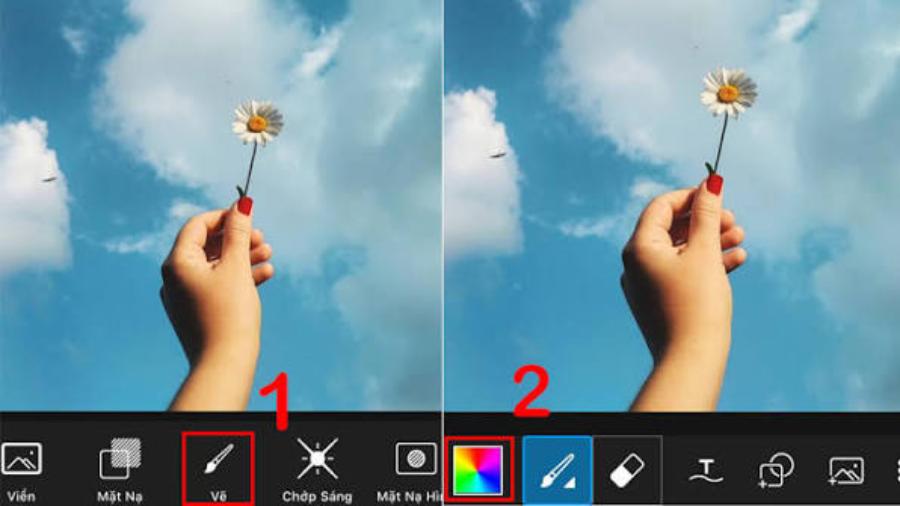
6.1. Choose one main tone and two secondary tones.
To make your feed look good, you don't need 20 color styles. You should choose:
-
1 main tone: bright, transparent, or film-like, or warm, or cool
-
2 secondary tones: used when changing settings (e.g., indoors and outdoors)
Maintaining a consistent tone helps viewers recognize you more quickly.
6.2. Save the preset separately after tweaking.
After editing a photo to your liking:
-
Save the preset with a clear name (e.g., "Soft Sunlight", "Indoor Yellow Light", "Shady Film").
-
Use that preset for photos under the same conditions.
This method saves time and avoids the problem of each photo being different.
7. Introduction to http://appvip.ai/appvip.ai
appvip.ai is a website that helps optimize images quickly and easily, suitable for when you need to process photos to achieve harmonious colors, neat composition, and a polished look before uploading. With a user-focused workflow,http://appvip.ai/helps users shorten editing time while maintaining natural image quality, meeting both personal and professional needs.
8. Color grading checklist for beautiful photos ready to post.
Quick action checklist:
-
Adjust the exposure to a moderate brightness.
-
Reduce highlights to avoid overexposing bright areas.
-
Increase shadows to make the image clearer and the subject more distinct.
-
Balance temperature and tint for a natural skin tone.
-
Apply the preset to a moderate level, then fine-tune Saturation/Vibrance.
-
Adjust HSL slightly for skin and foundation.
-
Enhance sharpness, reduce noise just enough.
-
Export high-quality images before posting.
9. Conclusion
Choosing the right color grading app is the first step, but the key lies in a proper editing process and moderation. When you prioritize balanced brightness and white balance to achieve accurate skin tones, use presets as a base, and gently adjust HSL, your photos will have a stylish yet natural color palette. Maintaining a stable color system also makes your content look more professional, creates lasting positive impressions, and sustainably improves the quality of your personal images.





















VIP Products








Best Selling Products
Plugin Retouch4me
69 USD
Copyright Adobe Lightroom Account
59 USD
Adobe Premiere Pro Account
99 USD
Upgrade Genuine Office 365
49 USD
Autodesk All App Account Copyright
120 USD
Genuine Adobe Illustrator account
99 USD
Genuine Cheap Canva Pro
39 USD
Freepik Premium Account
59 USD
Capcut Pro 1 Year
39 USD
Upgrade genuine Capture One account
120 USD
Windows 10 & 11 Pro Key
36 USD
Upgrade Duolingo Super
29 USD
Adobe Photoshop Copyright - Full App
120 USD
MidJourney Account
29 USD
ChatGPT Plus Account (GPT-4)
16 USD
Articles on the same topic