Best Selling Products

Autodesk All App Account Copyright
120 USD

Genuine Adobe Illustrator account
99 USD

Freepik Premium Account
59 USD

Copyright Adobe Lightroom Account
59 USD

ChatGPT Plus Account (GPT-4)
16 USD

MidJourney Account
29 USD

Capcut Pro 1 Year
39 USD

Plugin Retouch4me
69 USD

Upgrade Duolingo Super
29 USD

Upgrade genuine Capture One account
120 USD

Adobe Premiere Pro Account
99 USD

Windows 10 & 11 Pro Key
36 USD

Genuine Cheap Canva Pro
39 USD

Adobe Photoshop Copyright - Full App
120 USD

Upgrade Genuine Office 365
49 USD
Building Brand Identity in Modern Website Design
Nội dung
- 1. Leverage Brand Colors with Striking Contrast
- 2. Develop a Unique Logo Set Using the Brand's Distinctive Shapes
- 3. Make Brand Typography the Main Design Language
- 4. Prioritize Authentic Images Over Stock Photos.
- 5. Establish a Clear Layout with Coherent Visual Order
- 6. Applying Movement to Reinforce Brand Spirit
- 7. Paying Attention to Every Small Detail That Leaves a Brand Imprint
- 8. Tell the Brand Story Throughout the Entire Page Layout
- 9. Conclusion
Modern website design trends are shifting strongly towards conveying clearer brand signals, creating a stronger visual focal point, and building greater trust with users. This article will analyze nine key principles that help fully express brand identity on a website, thereby helping designers and business owners effectively apply them to their real-world projects.
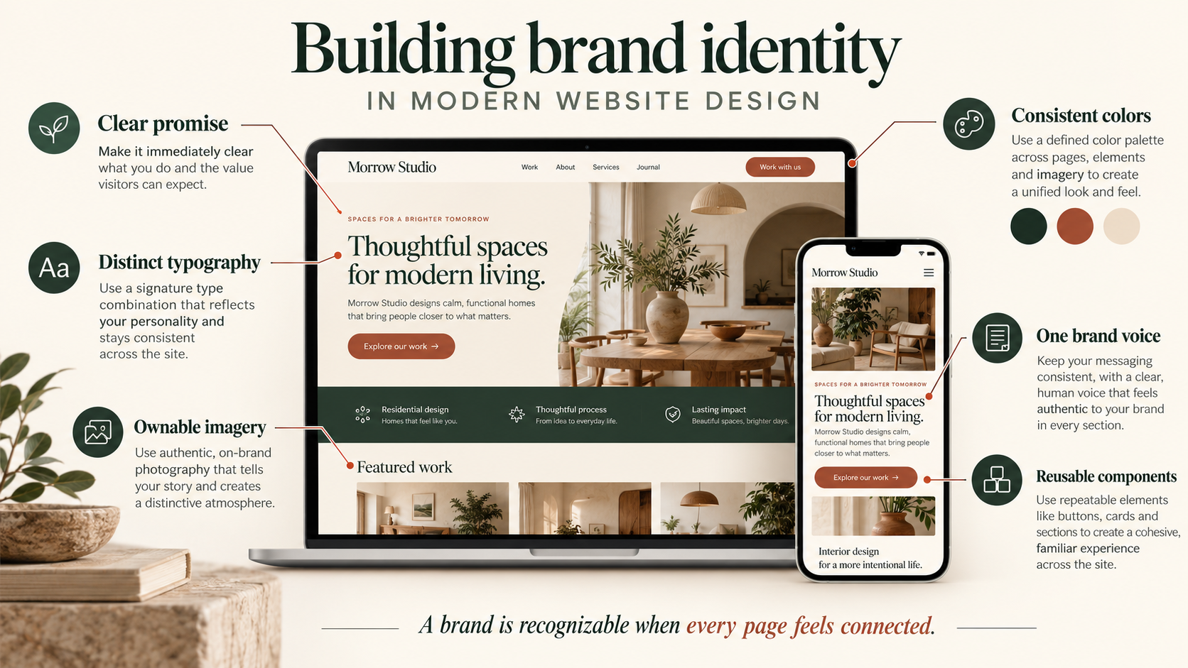
1. Leverage Brand Colors with Striking Contrast
Brand colors are no longer used haphazardly or blended into the background of a website. Modern designers place brand colors in positions with strong contrast, allowing each area of the page to confidently showcase its role. This approach helps users remember the brand better and navigate the page smoothly without feeling overwhelmed or disoriented.
For example, a website in the financial technology sector might use a deep blue as its primary brand color. Instead of spreading this blue throughout every corner of the page, designers typically only place it in the header, buttons, and pricing area, while the rest of the layout remains in white or light gray tones. This deliberate color scheme helps maintain focus on key actions, such as account registration or contacting a consultant.
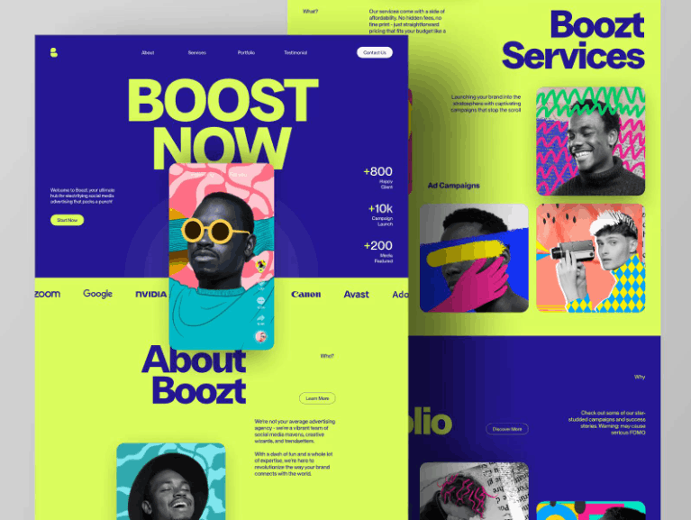
A fashion brand could choose a soft beige as the main background color, combined with bold black for the text and buttons. This combination gives the website a clean look while still maintaining the brand's spirit clearly and consistently.
High contrast also offers practical benefits when users read content on mobile phone screens. When text and background are clearly separated, users tend to stay on the page longer and scroll through more content. In other words, this trend revolves around the designer's control; they proactively choose where brand colors appear instead of letting them overwhelm the entire page, resulting in a website that is both clear and user-friendly.
2. Develop a Unique Logo Set Using the Brand's Distinctive Shapes
The readily available logo sets on the internet are gradually losing their value in the eyes of users, as they often appear repeatedly on thousands of different websites and lack any unique identity. The current trend is for brands to create their own logo sets, developed based on the distinctive shapes of their logo and brand motifs. This approach ensures that every small detail on the website is closely connected to the overall brand identity.
For example, if a brand's logo uses rounded edges, then the entire system of icons should follow a similar rounded style. Conversely, if the logo uses sharp lines, the system of icons should also adopt corresponding angles. This consistency makes the entire website feel like a complete and purposeful system, rather than a disjointed collection of unrelated elements.
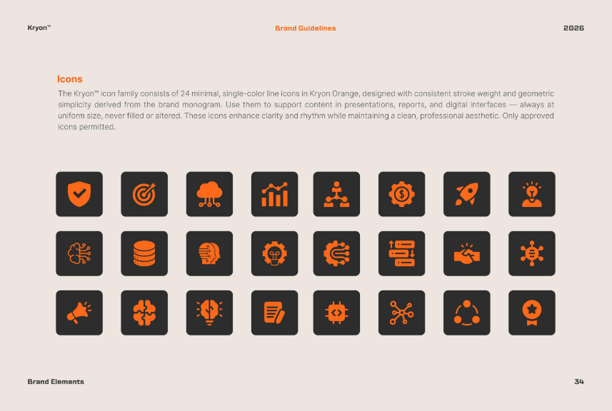
A healthcare brand might use a stylized leaf within its service, customer support, or product packaging icons. Meanwhile, a technology brand might prefer a logo style with clean lines and sharp angles, creating a modern and precise feel.
These icons often appear throughout menu bars, feature introduction areas, and user dashboards. When customers encounter these same icons again on a mobile app or in branded emails, they immediately associate and connect with the same brand. This trend helps build brand memory subtly without overusing large logos everywhere, while also making the website feel more carefully crafted and personalized.
3. Make Brand Typography the Main Design Language
Today, fonts are no longer simply used to convey content in an accessible way. Typography has become an important part of a brand's voice, and many businesses now use typography as a primary visual element on their websites.
Some brands opt for large headlines that fill half the screen to make a strong first impression. Others prefer narrow blocks of text with wide line spacing, creating a spacious and sophisticated feel. The choice of font clearly reflects the brand's personality, indicating whether it is serious, friendly, or bold.
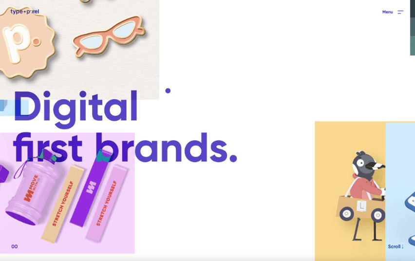
For example, a law firm might choose an elegant serif font with wide spacing, conveying a sense of calm and trustworthiness. Meanwhile, a young startup might prefer a rounded sans serif font with high boldness, creating a feeling of openness and modernity.
Some major brands even invest in designing their own exclusive font sets. These fonts are then used throughout their websites, mobile apps, advertisements, and social media posts. Over time, customers can recognize the brand simply through its distinctive typography, without even seeing the logo. This trend has transformed text into a true part of visual identity, rather than just a tool for conveying information.
4. Prioritize Authentic Images Over Stock Photos.
Stock photos purchased from online photo libraries often feel artificial and lack emotional depth. Therefore, brands today tend to use real photos of their own staff, offices, and products. This approach helps build customer trust and showcases the human side of the brand.
A food brand can showcase authentic moments in the kitchen along with real-life cooking steps. A software company can present images of its team at work and a product interface in use. A travel brand can share real trips and people, rather than staged, illustrative photos.
These photos don't necessarily have to be absolutely perfect. In fact, small imperfections sometimes make the images more authentic and trustworthy in the eyes of the viewer. Some brands even choose to use short videos instead of still images, such as a quick greeting from the team or a visual product introduction, to make the website more dynamic.
This trend helps users feel closer to the brand because they see real faces, real work, and real stories behind each product or service.
5. Establish a Clear Layout with Coherent Visual Order
Modern website layout trends strongly focus on a clear structure, where each area on the page plays a specific role. Users can quickly glance across the page and still understand where to focus their attention.
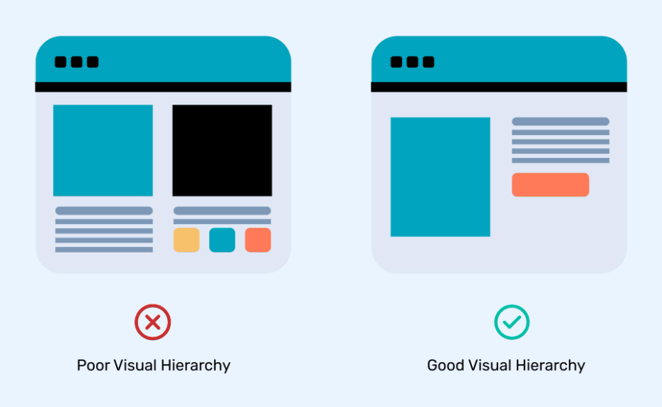
Designers often use grid systems and appropriate spacing to guide the viewer's gaze in a natural sequence. The most important content always appears first, followed by supporting content, and buttons are placed in positions where users can easily anticipate and find them.
For example, a service website might begin with a brief message and a single action button, followed by a more detailed explanation of the service, and finally showcasing real-world results or logos of past clients.
Such a logical arrangement contributes to building user trust, preventing them from feeling confused or lost while exploring the website. Brand identity is also clearly expressed through the way content is organized and presented. A brand with a calm style often uses ample spacing between content blocks, while a bold, individualistic brand often prioritizes closely spaced content blocks with large text sizes. Overall, the overall layout becomes an inseparable part of the brand story.
6. Applying Movement to Reinforce Brand Spirit
Modern website animation is used cautiously and purposefully, no longer merely as decorative additions. Each animation needs to serve a purpose, reinforcing the brand's spirit and personality.
A tech brand might prioritize smooth fade effects and gently sliding content panels. A video game brand might use fast and decisive transition effects. Meanwhile, a mental health brand might opt for slow, relaxing scrolling effects.
For example, when a user clicks a button, that button can gently enlarge before the next page loads. When an information card appears on the screen, it can slide in naturally from the side. Such small movements help guide the user's attention, while also making the website more lively and engaging.
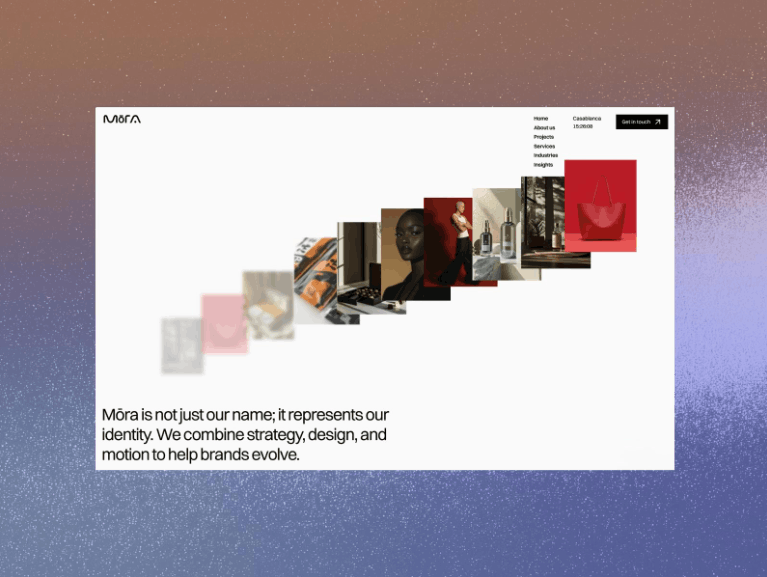
The key here is control. The movement needs to be natural, not distracting or unpleasant, and most importantly, it must align with the overall tone of the brand.
7. Paying Attention to Every Small Detail That Leaves a Brand Imprint
The smallest details on a user interface are now more important than ever. Buttons, form input fields, sliders, and navigation menus can all become platforms to showcase a brand's unique style.
A brand can design unique hover effects for buttons, a subtle color shift on an icon, or a soft shadow on information cards. For example, when a user hovers over a button, the background could slide from left to right in the brand's color scheme. When a form input field is activated, the border could subtly illuminate in the brand's signature color tone.
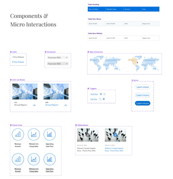
Such meticulous details give the website the feeling of being carefully crafted down to the last centimeter. Users may not immediately notice every specific detail, but they will certainly sense the subtle difference these details make, even subconsciously. It is these small details that often make the big difference between a polished, professional website and one that merely meets basic requirements.
8. Tell the Brand Story Throughout the Entire Page Layout
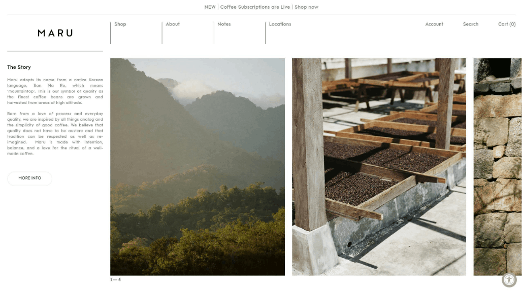
Today, brand stories are cleverly integrated into the very structure and layout of a website. Users gradually discover and understand the brand as they scroll down the page.
The first section typically introduces the industry in which the brand operates. The second explains the reason for the brand's existence and its mission. The third presents how the brand delivers value and supports its customers. The fourth provides concrete evidence, such as real-world reviews or impressive data, to reinforce trust.
For example, a startup company might begin with a simple message, then present the problem customers are facing, followed by introducing the solution the brand offers, and finally demonstrate it with real-world results.
Images, text, and layout work together seamlessly throughout this journey, creating a clear and coherent brand story that naturally and persuasively guides users from the beginning to the end of the page.
9. Conclusion
Brand identity in modern website design revolves around three core elements: control, clarity, and user engagement. Every choice of color, typography, imagery, and layout contributes to shaping how users perceive and feel about the brand. Strong brands today view design as a complete system, not merely a decorative outer shell.
Websites are no longer simply static information pages; they have truly become vibrant living spaces where brands are fully expressed through the smallest details. When colors, typography, images, layout, movement, and subtle touches blend together consistently, a website will not only serve the purpose of providing information but also become a powerful tool for building trust, creating differentiation, and leaving a lasting impression on customers.





















VIP Products








Best Selling Products
Autodesk All App Account Copyright
120 USD
Genuine Adobe Illustrator account
99 USD
Freepik Premium Account
59 USD
Copyright Adobe Lightroom Account
59 USD
ChatGPT Plus Account (GPT-4)
16 USD
MidJourney Account
29 USD
Capcut Pro 1 Year
39 USD
Plugin Retouch4me
69 USD
Upgrade Duolingo Super
29 USD
Upgrade genuine Capture One account
120 USD
Adobe Premiere Pro Account
99 USD
Windows 10 & 11 Pro Key
36 USD
Genuine Cheap Canva Pro
39 USD
Adobe Photoshop Copyright - Full App
120 USD
Upgrade Genuine Office 365
49 USD